Selection
Selection helps users choose options or items, understand what is selected and when it takes effect, and revise their choices.

Use selection when users need to provide a value, change the current experience, or mark items for a later action. Make the available choices, allowed number of selections, current selection, and effect of the choice clear.
Selection covers the choice and its shared behavior. It does not cover navigation, temporary interaction states such as focus or press, text highlighting, or the complete workflows that build on a selection. See Interaction states for temporary and visual states, Filtering for refining results, and Bulk editing for actions performed on selected items.
Understandable
Make it clear what's available to select and what's currently selected. Communicate when and how the choice takes effect.
Purposeful
Match the selection approach to the task and consequence. Avoid choosing for users, unless you have high confidence in the selection.
Predictable
Let users review and revise selections, and communicate when a context change makes a selection unavailable, incompatible, or invalid.
Commit a value
The choice becomes submitted, stored, or saved data.
| User need | Selection behavior | Recommended approach |
|---|---|---|
Choose one value from a set of options | One option stays selected until the form submits | Use radio buttons for four or fewer options when users need to see and compare them |
Choose multiple independent values | Any number of options can be selected and submitted together | Use checkboxes |
Make one yes-or-no choice in a form | The single binary choice submits with the form | Use a single checkbox |
Choose an existing object as a value | An address, account, or other object becomes the answer | Treat the object as a single-choice option, using radio buttons, a dropdown, or another approved picker based on the number and complexity of the choices |
Choose a date or bounded span | The value is a date, range, or bounded number | Use a date field or approved range input; follow Filtering when the range refines results |
Change the current experience
The choice changes a setting, persistent item state, section-level view, or result set.
| User need | Selection behavior | Recommended approach |
|---|---|---|
Turn a setting on or off | The setting changes immediately | Use a switch |
Watch, save, like, or favorite an item | A persistent item state changes immediately | Use a toggled icon button |
Change a section-level state, sort, or view | One of up to four mutually exclusive choices takes effect immediately | Use a segmented button for section-level choices, not navigation |
Compare visually differentiated options | One or more choices change what's shown or available | Outside forms, use a toggle button group when stronger visual emphasis helps users compare options |
Refine a result set | Selected criteria change which results appear, immediately or after explicit application | Follow Filtering |
Mark items for a later action
Item selection marks existing items for a later action, while value selection uses the chosen item to answer a question or set a value.
| User need | Selection behavior | Recommended approach |
|---|---|---|
Mark one or more items for a later action | Items form a temporary selected set; count and scope stay visible even when selected items are out of view | Use checkboxes within a list row or table, then follow Bulk editing or the relevant task pattern |
Selection in menus
A menu is a presentation context, not a selection approach. See Menus for platform-specific presentation guidance.
Delete, Share, and Edit are actions, not selections. Don't treat them as selection controls.
Starting state
When to pre-select values
Pre-select values only when they reflect saved data, a restored in-progress selection, or a strong, context-appropriate default that users can easily change. Do not pre-select a value merely to remove a step or steer users toward a choice.
For selections involving consent, privacy, legal, financial, policy, or trust considerations, work with your Legal, Privacy, and Policy partners to determine if explicit user action is required.
Application and dismissal
Immediate application
Apply a choice immediately when the control represents an immediate state change and the component supports it.
Examples:
- A switch changing a setting
- A toggled icon button adding an item to Watchlist
- A menu-based radio or checkbox updating a value
Explicit application
Use explicit application when users need to review multiple selections together, complete dependent information, or confirm a result that's hard to reverse.
Changes remain drafts until the user commits them. Cancelling discards the drafts and restores the previously applied state.
Don't present a draft selection as applied.
Examples:
- Bulk deleting selected items
- A date range where start and end dates both need to be set before the selection is meaningful
- Editing preferences in a settings sheet where each toggle would trigger a separate save if applied immediately
Keep application separate from dismissal
Treat selection, application, and dismissal as separate steps. Keep the selection surface open while users review options, complete dependent fields, or confirm a consequential result.
A single-select menu, popover, or bottom sheet can close on selection when the choice is low-risk and easy to reverse, no further input is needed, and the component supports selection-triggered dismissal.
Keep multi-select and multi-step surfaces open while users make or review their choices. When the surface uses explicit application, provide a commit action before closing.
On web, arrow keys change the selection in form-based radio groups. Keep the containing surface open when users need to review other options.
Persistence and context changes
Keep selections while the task stays the same
Keep selections intact within a task when their meaning and scope haven't changed, including when sorting, paging, adapting layouts, or opening related content.
When selected items are outside the current view, show the total count, the scope, what the next action affects, and how to review or clear the full selection.
Keep temporary item selections within the current task. Persist them across tasks, sessions, or devices only when an explicit product requirement defines them as saved data or a remembered preference.
Respond when context changes
When a context change affects a selection's meaning, availability, or scope, don't silently retain an invalid selection or discard the user's work without explanation.
| When the selection is | Behavior |
|---|---|
Valid but no longer visible | Preserve the selection and continue communicating its total count and scope |
Temporarily unavailable | Keep the selection identifiable, explain why it cannot currently be used, and provide a recovery path when possible |
Incompatible or invalid | Do not continue presenting it as a valid applied selection; require users to resolve it or clearly communicate an appropriate automatic change |
Removed or no longer exists | Remove it from the current selection, update any count or summary, and communicate what changed |
Dependent value reset by a parent choice | Make the relationship and reset visible rather than allowing the previous value to disappear without feedback |
Dependent content and system feedback
Don't nest interactions inside selection controls
When a selection reveals related fields, links, buttons, or actions:
- Place dependent content next to the selection control, not inside it
- Use layout and proximity to show the relationship
- Don't put interactive controls inside a radio label, checkbox label, toggle button, or other selection control
Pending, success, and failure states
When an update is delayed, use the component's selected state to acknowledge the input and its pending or loading state to show that the update is in progress. Prevent repeat changes while it's pending.
On success, show the new applied state and update any related counts, summaries, or dependent content.
On failure, return to the last valid applied state, explain that the change didn't complete, and offer a retry when appropriate. Never show a state the system didn't apply.
Labels and terminology
Name the decision and choices
Use a group label or heading that identifies the category or decision users are making. Prefer a specific label such as Choose a payment method or Condition over a generic instruction such as Select an option.
Write option labels as noun phrases that describe the choice from the user's perspective. Keep labels grammatically parallel within a group.
Selected vs. applied vs. saved
Use these terms to distinguish where a choice is in its lifecycle. A value may be selected before it is applied, or applied immediately without becoming a saved preference.
| Use | When |
|---|---|
Selected | The option, value, state, or item is currently chosen in the UI |
Applied | The selection affects data, results, settings, or the surrounding experience |
Saved | The selection is stored and will persist beyond the current task or session |
Values, counts, and scope
Show selection count and scope
When selected items may extend beyond the current view, show both count and scope. For example: 6 selected or All 126 items selected.
A count alone may be insufficient when users cannot tell whether it covers the current page, visible items, filtered results, or all items.
Follow Numerals for formatting.
Actions and feedback
Choose action labels by outcome
Use the Writing glossary as the source of truth when it defines a domain-specific action.
| Label | Use when |
|---|---|
Apply | Committing draft selections so they begin affecting the current experience |
Save | Committing information that will remain beyond the current task or represents stored data |
Done | Ending an interaction after its changes have already taken effect |
Cancel | Discarding uncommitted changes and retaining the previously applied state |
Clear | Removing the current selection and returning to no selection, when no selection is valid |
Reset | Returning to the experience’s defined initial or default state |
Deselect | Removing one option or item from the current selected set |
Remove | Removing a directly represented object or applied value |
Explain changed or failed selections
When a selection becomes unavailable, invalid, or removed, explain what changed, whether it remains applied, what users need to do next, and whether it can be restored.
Don't rely on a disabled appearance alone to communicate the change. When an update fails, explain that it didn't complete and offer recovery when available.
Avoid separate success feedback when the changed control state already communicates the result.
Localization
Don't build selection messages from separately translated fragments, and don't assume category, value, and count appear in the same order across languages. Use localized plurals and consistent terminology across responsive and platform-specific presentations.
Accessibility depends on the components and presentation. Review each component’s Accessibility guidance alongside this page. The Accessibility foundation defines shared outcomes; implementation varies by platform.
Use approved controls and semantics
Use approved Evo components so names, roles, values, and states are communicated accurately. Give each control a clear, visible name; name related groups when required; use supported semantics and visual states; and do not rely on color alone or recreate radio buttons, checkboxes, switches, or buttons through visual styling.
Preserve expected behavior and focus
Preserve each component’s documented interaction model across keyboard, screen reader, touch, and pointer use. Moving through or selecting options should not unexpectedly apply a consequential change, dismiss a surface, navigate away, or move focus.
When a supported single-select surface closes after selection, follow its documented dismissal and focus-restoration behavior. When selection reveals dependent content, keep reading, visual, and focus order aligned.
Communicate changes caused by selection
Make changes caused by selection available to assistive technology when they occur outside the selection control or may otherwise be missed. Examples include a filter updating a result count elsewhere on the page, a choice revealing dependent content, or a selection becoming invalid or changing scope.
When the control’s state communicates the complete outcome, additional feedback may not be needed.
Verify platform behavior
Keep selection intent and outcomes consistent across responsive web, iOS, and Android. Use approved platform components and conventions. Add platform guidance only when it affects a design decision and platform and Accessibility owners verify it.
Match the control to the number of choices
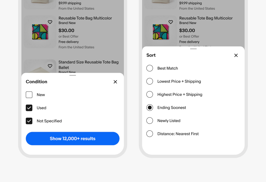
Do use radio buttons when only one option can remain selected, and checkboxes when users can select multiple independent options.
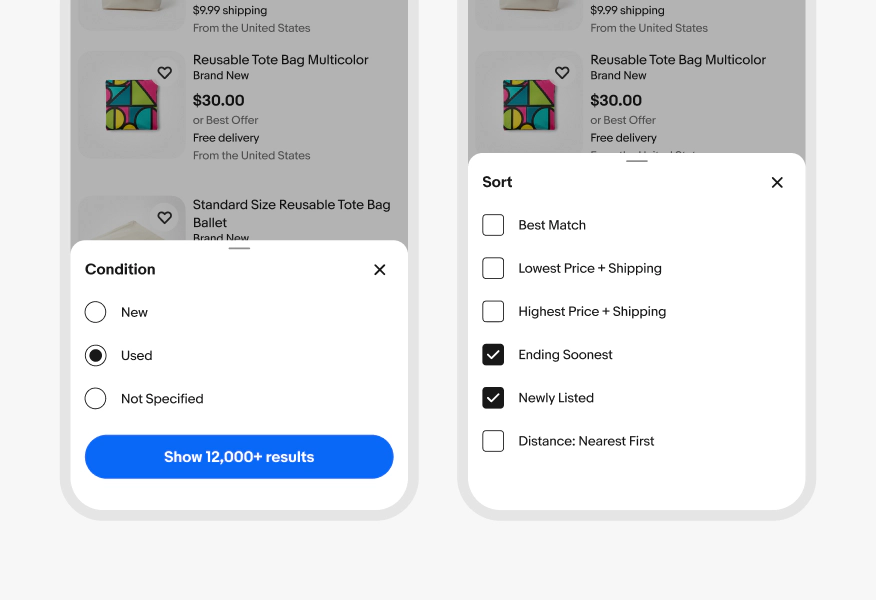
Don’t use checkboxes for mutually exclusive choices or radio buttons when users need to select more than one option.
Communicate what has been selected
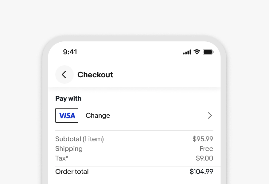
Do keep the selected value visible after the selection control closes.
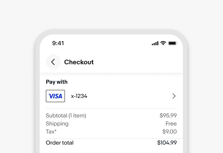
Don’t make users reopen the control to remember what they selected.