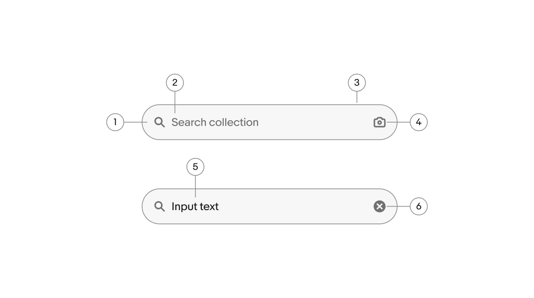
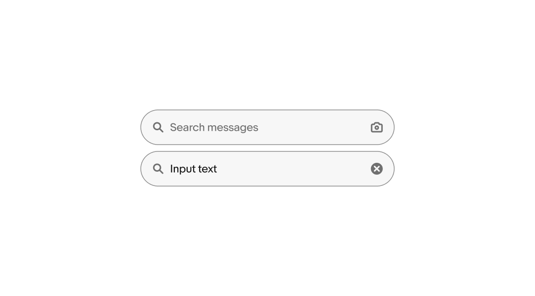
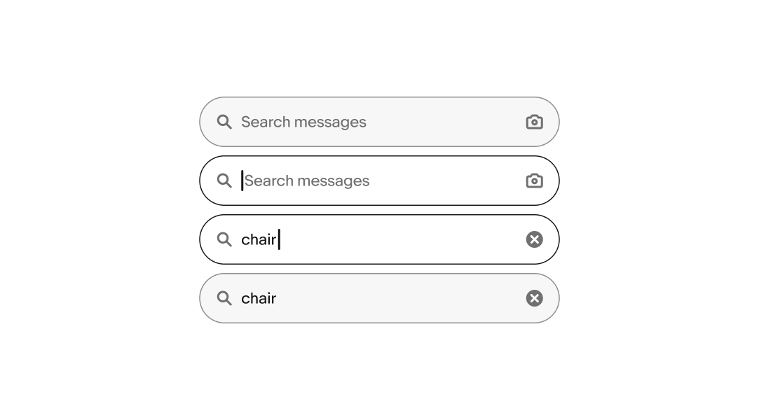
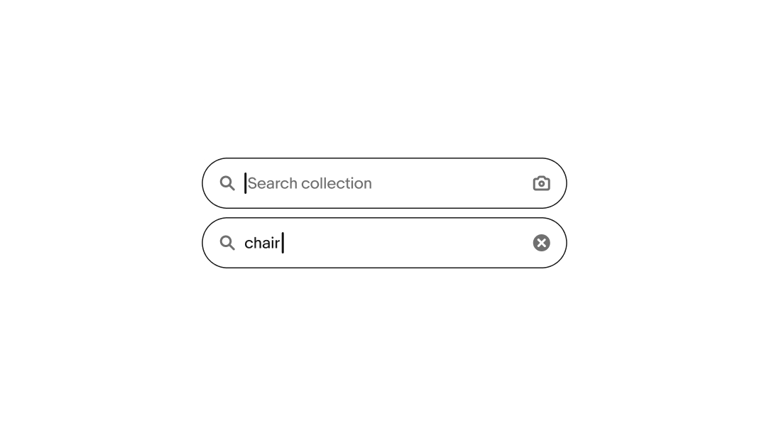
Search field
v2.1
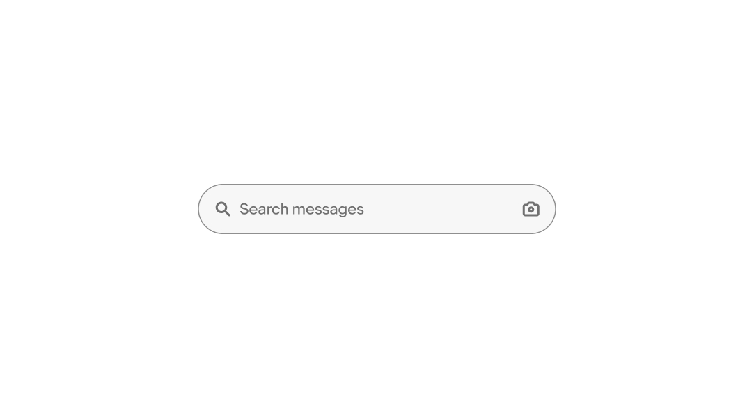
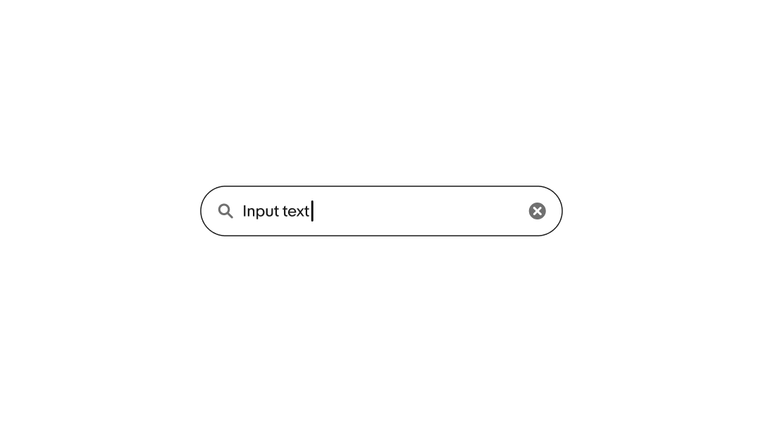
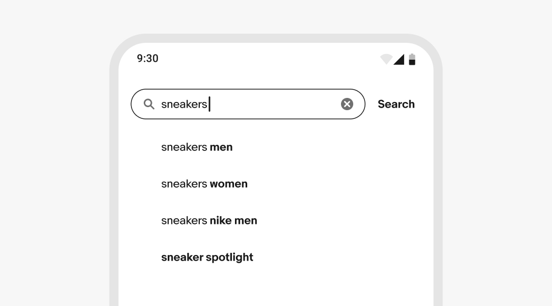
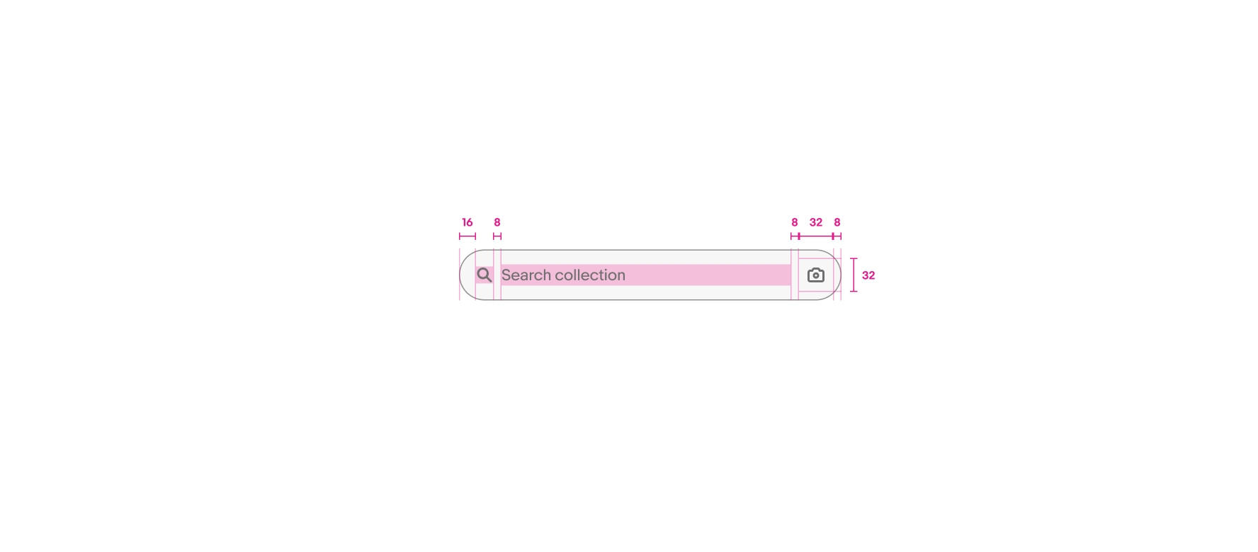
The search field filters a list using custom characters and keywords.
- CSS
- Marko
- React
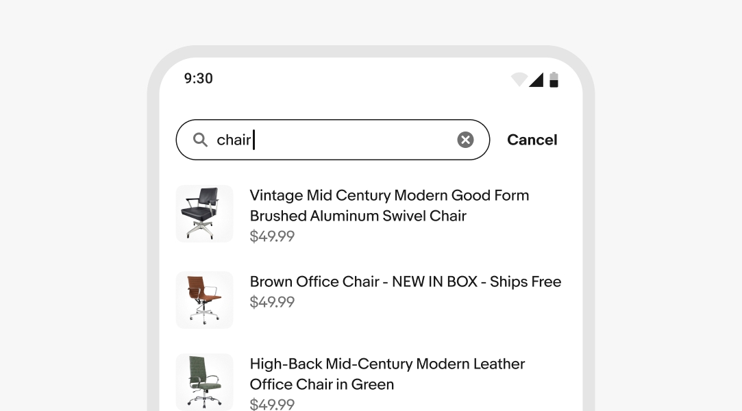
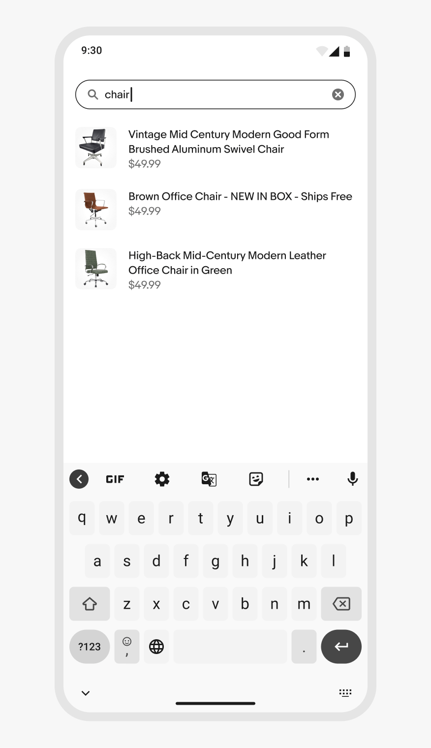
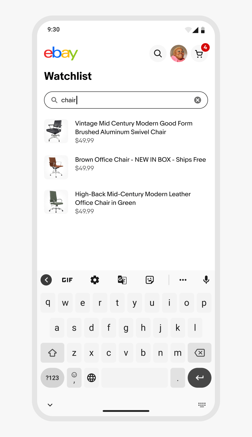
Small screens
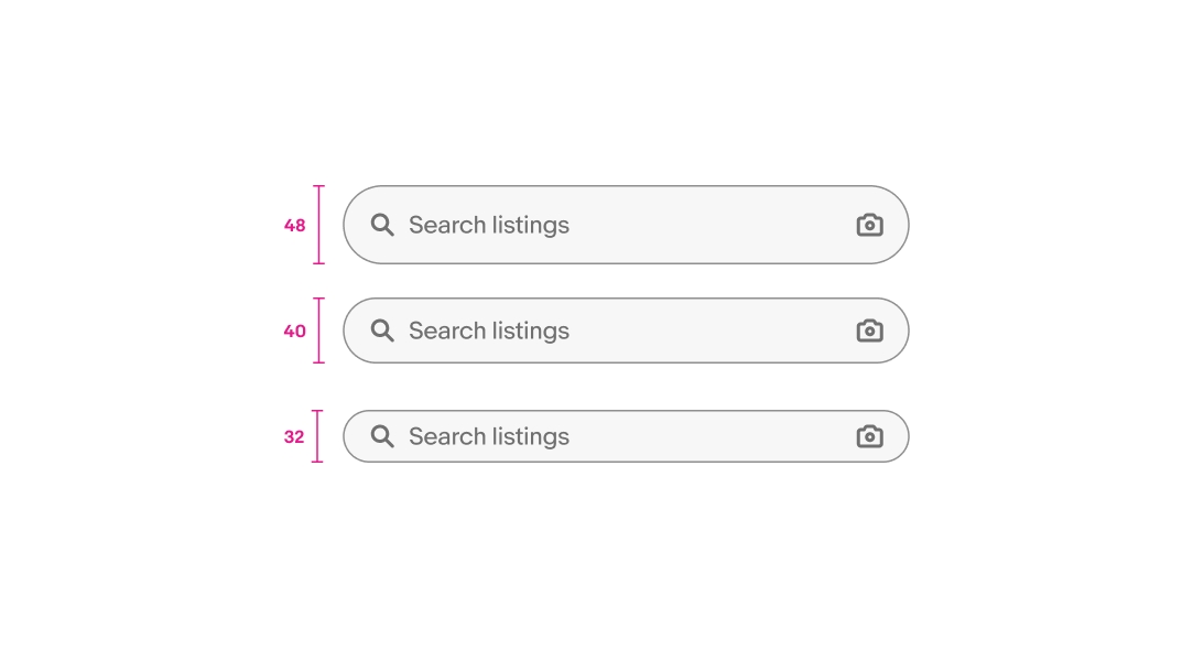
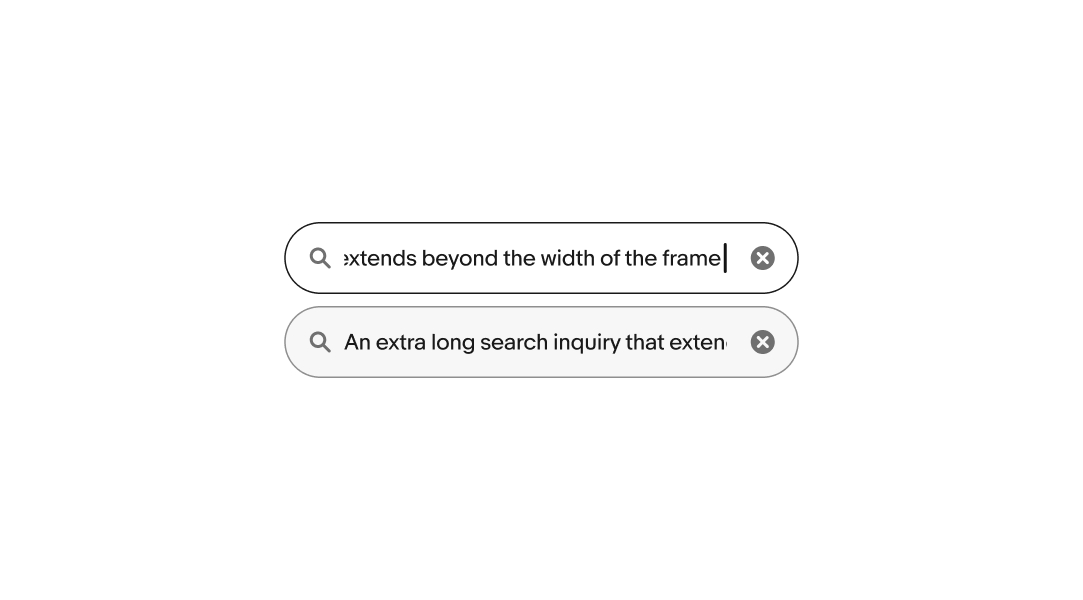
Search fields span the full width of the container on smaller screens. The search field should be near the top of the page to ensure there’s enough room for the device keyboard and the first few results to be visible. The screen will scroll to keep the search field in view when receiving focus.
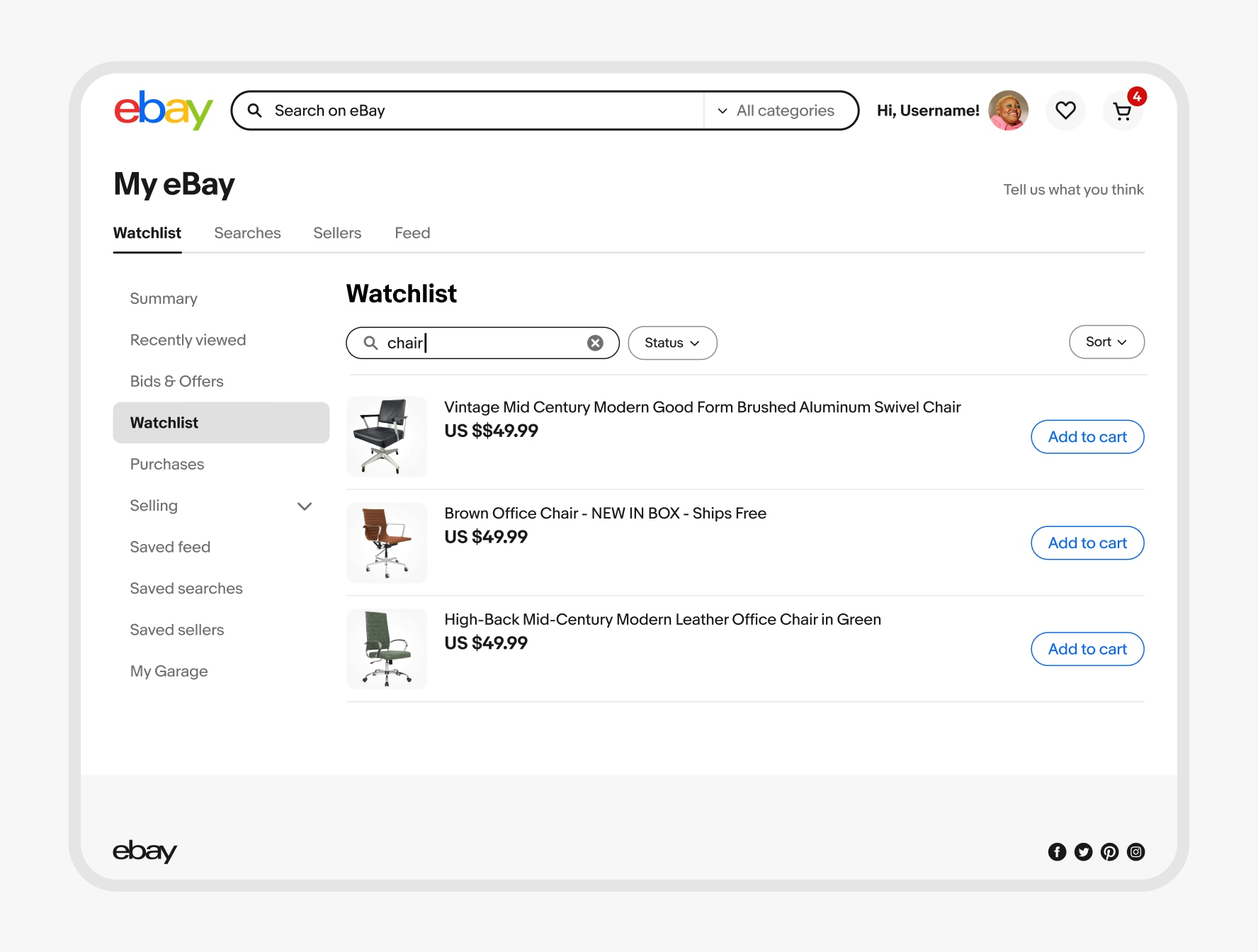
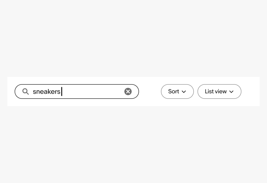
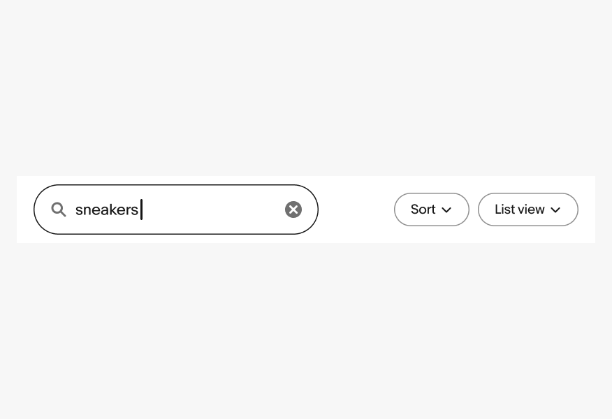
Medium and large screens
Medium and large screens across platforms can use the search field inline with other elements, like filter buttons in an action bar.