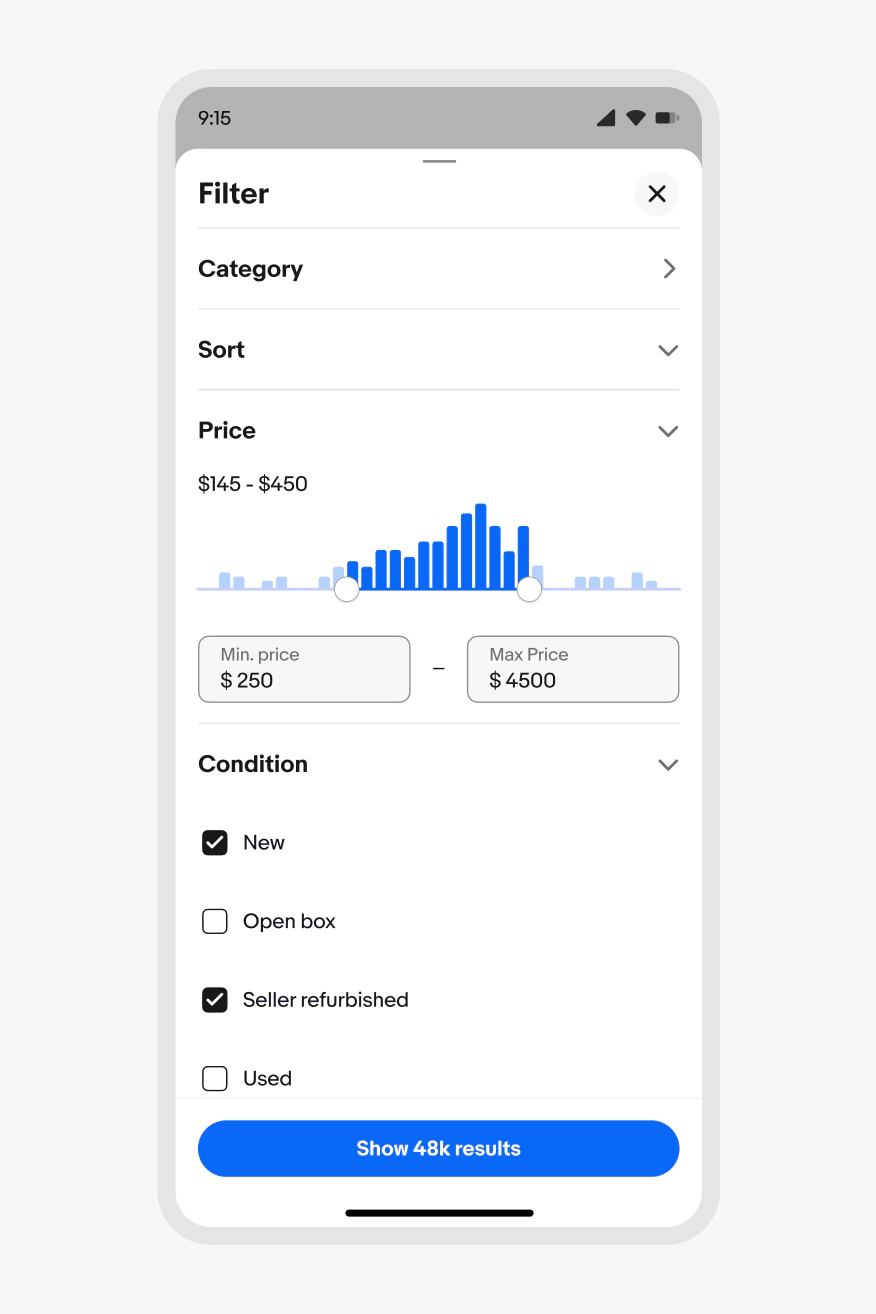
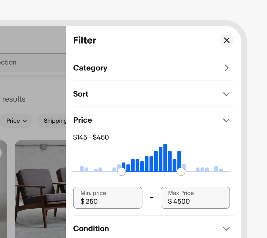
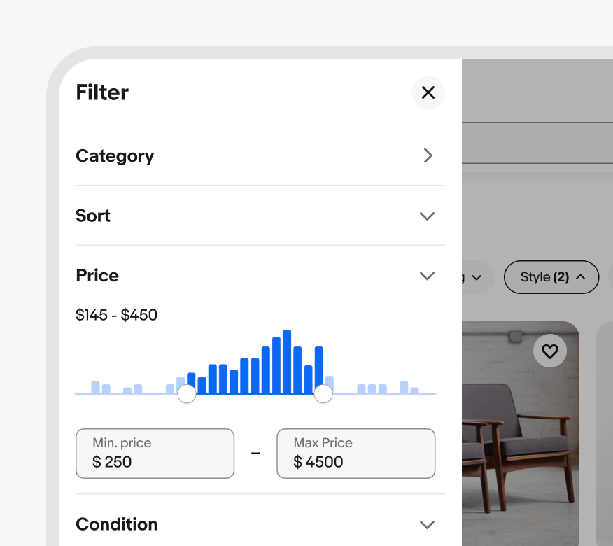
Skip to main contenteBay Playbook
  • Get started
  • Foundations
  • Design system
  • Expressions
  • Resources
  • Articles

Design system

  • Overview
    • Overview
    • Color
    • Dimension
    • Spacing
    • Typography
    • Breakpoints
    • Shadow
    • Shape
    • Opacity
    • Motion
    • Overview
    • Status
    • Accordion
    • Action bar
      • Overview
      • Inline notice
      • Page notice
      • Section notice
    • Avatar
    • Badge
    • Banner
    • Breadcrumb
      • Overview
      • Branded button
      • CTA button
      • Icon button
      • Link button
    • Card
    • Carousel
    • CCD
      • Filter chip
      • Input chip
      • Graphs
      • Metrics
    • Date picker
    • Dialog
    • Divider
    • Education notice
    • EEK rating and range
    • Expansion
      • Checkbox
      • Combobox
      • Dropdown
      • Numeric stepper
      • Password
      • Phone number
      • Radio button
      • Select list
      • Switch
      • Text area
      • Text field
    • Item tile
    • List row
      • Overview
      • Expressive loader
      • Skeleton loader
    • Media container
      • Top navigation bar
    • Pagination
    • Popover
    • Progress stepper
    • Search field
    • Section header
    • Segmented button
      • Bottom sheet
      • Panel
    • Signal
    • Snackbar
    • Tab
    • Table
      • Tooltip
      • Tourtip
    • Toggle button group
    • Video player
    • Overview
    • Bulk editing
    • File uploading
      • Text link

Panel

v2.2

Panels present supplemental information and input methods directly related to the primary content.

  • CSS
  • Marko
  • React
Stylized artwork of a panel.
Panelv2.2

On this page

  • Considerations
  • Anatomy
  • Properties
  • Behavior
  • Screen sizes
  • Best practices
  • Specs
PreviousBottom sheet
Things.People.Love.
  • Get started
  • Foundations
  • Design system
  • Expressions
  • Resources
  • Articles
  • Careers
  • Press
  • Privacy policy
© 2026 eBay. All rights reserved.

eBay Evo, the eBay trademark, and the eBay logo are the intellectual property of eBay Inc.

    Considerations

    Complimentary

    Panels directly support and enhance interaction with the primary content.
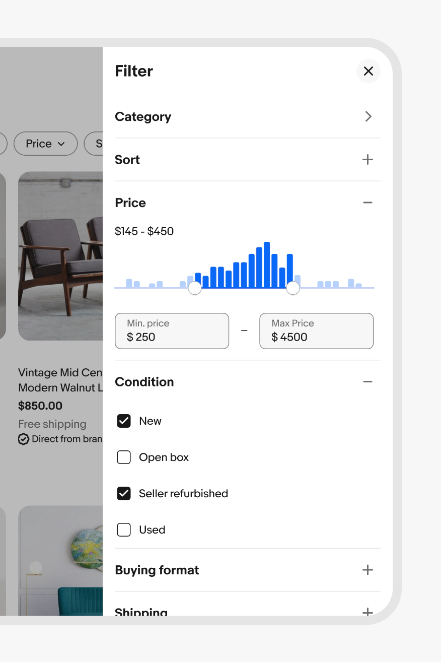
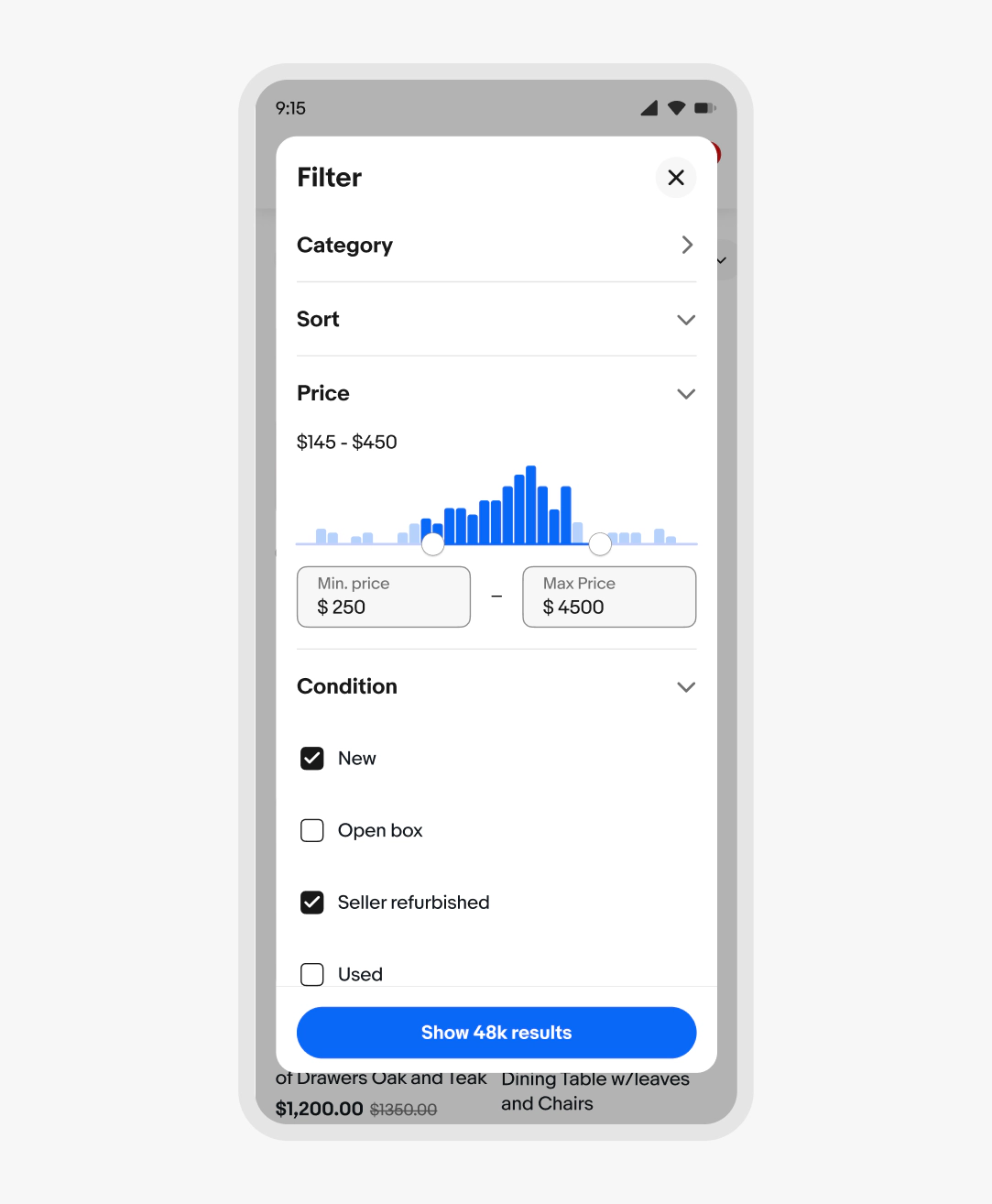
    Contextual

    Panels appear and disappear according to screen size and needs. They become a fullscreen overlay or spoke page on small screens.

    Flexible

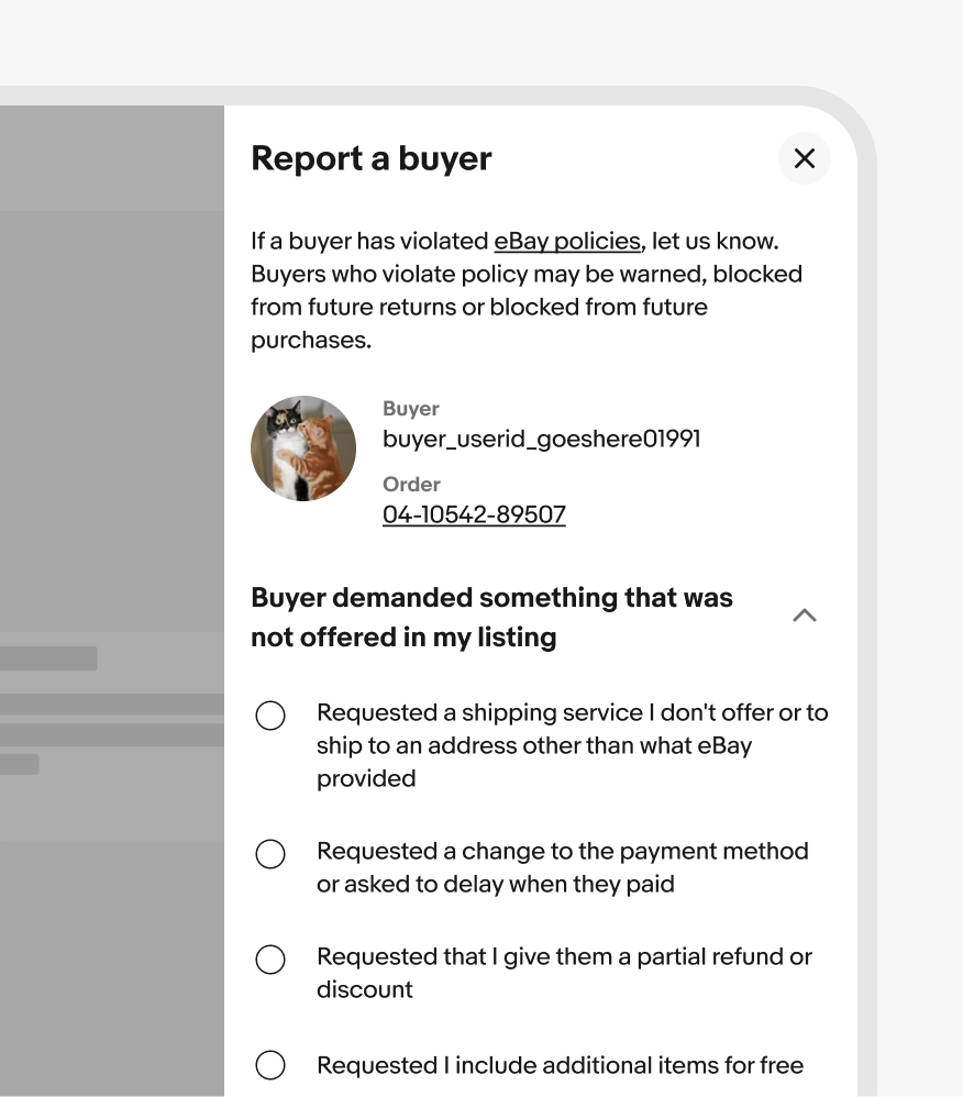
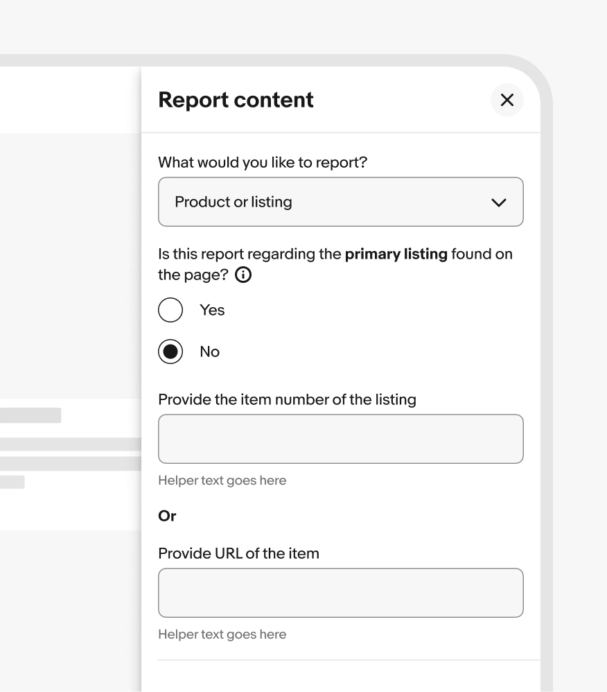
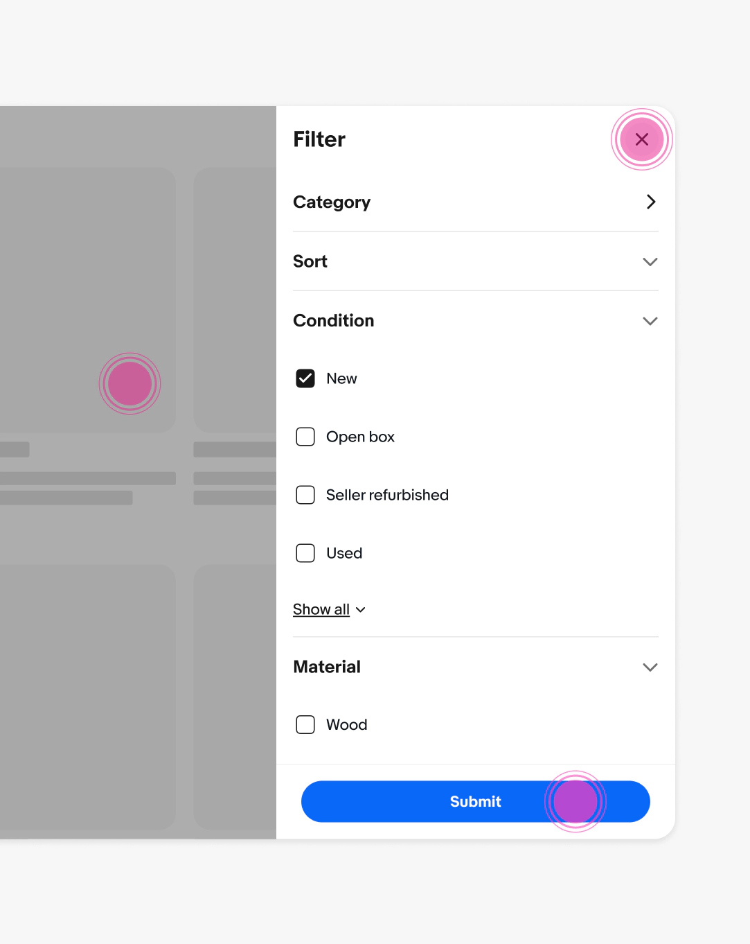
    Panel content can include a variety of input elements and information.
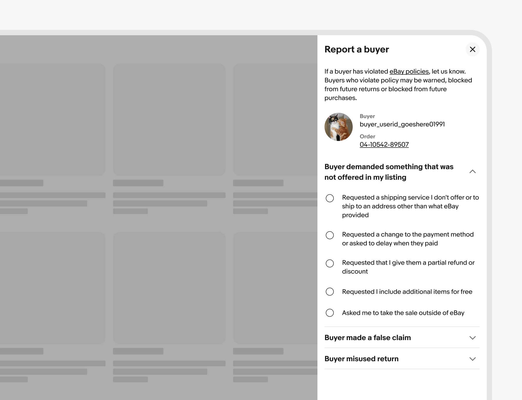
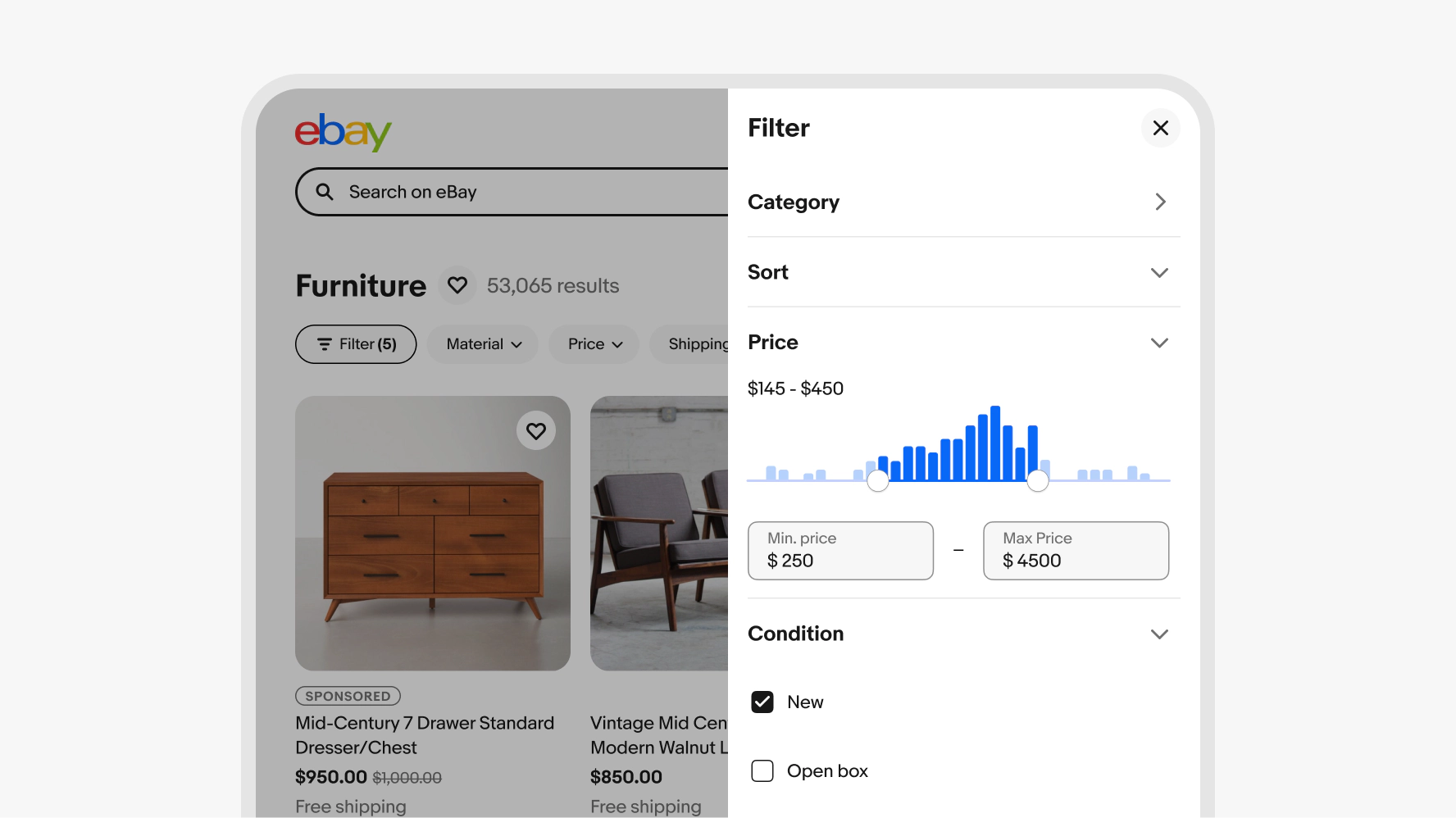
    Anatomy

    Properties

    Behavior

    Modality

    Panels can be modal or non-modal. Modal Panels present over a scrim that disables interaction with the base layer. Non-modal Panels omit the scrim and allow users to manipulate content on the base layer. Modal is the default presentation for Panels.

    Use a modal Panel when manipulating data that will update the base layer or when the content on the base layer is complex and distracting. Use a non-modal Panel for content that is purely referential and doesn’t update data.

    Screen sizes

    Best practices

    Specs

    A panel diagram with 2 elements numbered: 1. Scrim, 2. Container.
    1. Scrim
    2. Container

    Container

    Panels can contain a variety of content, so the container is the only required element. A header is included with a title and close button.

    A panel container.

    Scrim

    The scrim blocks interaction with the main page and is active by default. Use a scrim to focus on the task within the panel.

    The scrim can be turned off when interaction with the main page is needed, like navigating a map where the panel contains information about a selected location or when the Panel is acting as a reference for content on the main page.

    A scrim sits behind a panel container.

    Presentation

    Panels slide in from the right and remain pinned to the right of the screen.

    A Report a buyer panel on the right side of a screen.

    Width

    The panel is a fixed width of 384px for screens above 384px width. The panel becomes a fullscreen overlay on screens smaller than 384px.

    The width of a panel is 384px wide.

    Dismissing

    Panels can be dismissed in various ways:

    • Tapping the close button
    • Tapping the primary action
    • Swiping to the right (touchscreens)
    • Tapping the scrim (modal-only)

    If the base layer updates asynchronously, any changes made in the panel will be preserved even after it is closed. If the updates need to be submitted before the base layer is updated, dismissing via the scrim, close button, or swipe gesture will cancel any actions taken within the panel.

    A panel is shown with 3 tap indicators displaying where to dismiss a panel: Tapping the scrim, tapping a close action, or tapping the primary action.

    Navigation

    Panels can contain hub-spoke navigation. A back button appears in the leading position of the panel header when viewing a spoke view.

    Keep in-panel navigation to a minimum, no more than 2 levels. Opt for accordions and expansions in panels to reduce the need for navigation levels.

    A panel is shown with 3 tap indicators displaying where to dismiss a panel: Tapping the scrim, tapping a close action, or tapping the primary action.

    Small native

    Bottom sheets are only used on compact screens. They animate in from the bottom of the screen for ergonomic access to a selection.

    A bottom sheet is used in place of a panel on the eBay mobile app.

    Small web

    Panels are full height inset dialogs aligned to the bottom of the screen on web.

    An inset dialogue sheet is used in place of a panel on the eBay mobile web page.

    Medium and large screens

    Panels appear from and pin to the right side of the screen. They extend the full height of the parent window.

    A Filter panel is shown on a larger screen.
    A Report a buyer modal panel.

    Modal panel

    A Report content non-modal panel.

    Non-modal panel

    A panel with specs is shown. The width of the panel is 384px. The padding on the left, right, top, and bottom of the panel container is 16px. The height of the close button is 32px. The padding between the close button and the content space is 16px. The padding on the left, right, top, and bottom of the footer is 16px. The padding between the primary action button and secondary action button is 8px.

    Stacking

    Use one panel per experience.

    A scrim and a panel container.

    Avoid launching other modal elements within a panel.

    A modal is placed within a panel.

    Presentation

    Panels are pinned to the right.

    A panel pinned to the right of the screen.

    Don’t move panels to the center or left side of the screen.

    A panel pinned to the left of the screen.

    Navigation

    Do keep navigation within a panel simple and shallow.

    A panel titled Category.

    Avoid deep navigation within a panel. Link to another browser tab or page if navigation is likely to go beyond 3 levels.

    A panel titled Category/…/Shoes.

    Actions

    Do use actions that complete the primary task and close the panel. Secondary actions should support the completion of the primary task.

    A Filter panel with a Show 7 results primary action button situated at the bottom of the panel.

    Don’t use actions in the footer as a close affordance. In this case, omit the footer and rely on the persistent close affordance in the top right.

    An eBay Assistant panel with a Close secondary action button situated at the bottom of the panel.