Filter chip
Filter chips provide quick access to values that refine a list of content.
- CSS
- Marko
- React

Clear
Filter chips clearly indicate the selected value(s) and there’s a clear way to adjust or reset them.
Flexible
Filter chips work for a wide variety of filter values across screen sizes.
Focused
Filter chips surface the top filter values or filter groups without overwhelming users.

- Leading icon
- Container
- Trailing icon
- Title

- Leading accessory
- Container
- Title
Styles
Filter chips have two options: Default and Expressive. Default chips only contain text with the option of an icon, while expressive chips utilize imagery to better convey their filter values.
Make sure expressive chip labels clearly reflect the associated icon or image.

Title (Filter label)
The title labels what the user is filtering by. Use a noun or noun phrase that names the value, category, or filter.
- Use sentence case
- No ending punctuation
- Avoid verbs, articles, or full sentences
- Keep between 1–3 words
- Max character count: 37

Lead accessory
A lead accessory is optional and should be used sparingly. Lead accessories should be always be placed before the text and be clear, obvious and directly related to the content within the chip. If images are used, they should all be visually similar: lifestyle images with full bleed backgrounds or transparent images with white backgrounds

Discrete selection
Chips that represent a single discrete value will immediately filter content when selected. They can be unselected by interacting with the chip again. Discrete chips are the default and preferred version because they only require a single interaction.

Dropdown selection
Single select
Single select options within a menu apply a value immediately after an option is selected. The label is updated to represent the value selected.
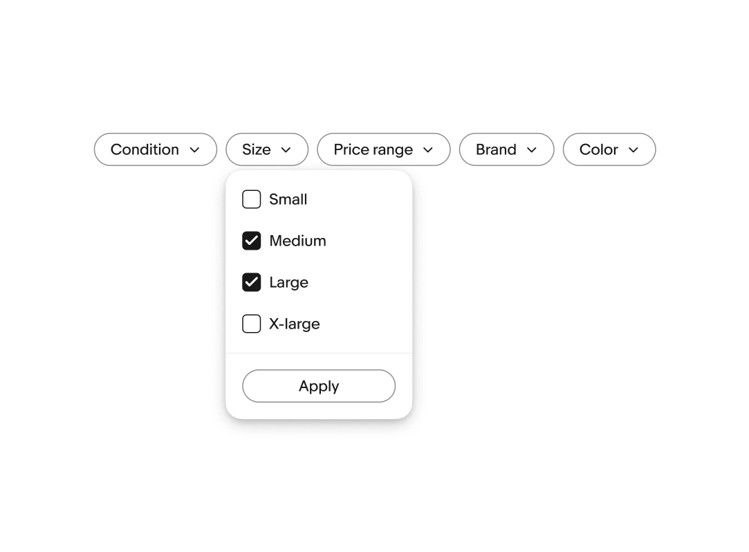
Multi select
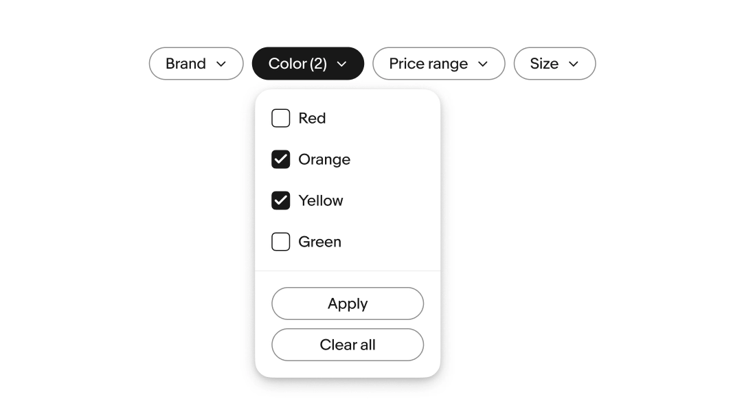
Dropdown chips that represent multi-selection have checkboxes next to each value label within the menu. Selecting values appends a counter to the label representing how many values are being applied. The data set should asynchronously update as each value is selected within a menu. If asynchronous updates aren’t possible, an apply button needs to be present to submit the selection.
Writing guidelines
Standardize range labels with a consistent pattern and keep parallel structure across options (e.g., “Under $25”, “$25–$50”, “Over $50”).
Counter
Counters communicate how many options are currently selected within a menu. The count appears directly after the label in parentheses and updates as selections are made. Avoid extra words like ‘selected”.
Clearing filters
Provide a clear, predictable pattern for clearing filters:
- When a single filter is applied, utilize the trailing icon to remove the filter
- Use “Clear all” for a control that removes all applied filters
Default chips
Filter chips are a smart choice when users need to quickly filter or refine content. They support multi selections, provide immediate visual feedback, and offer a clear hierarchy to a layout. To ensure clarity and usability, keep labels short, group related filters logically.

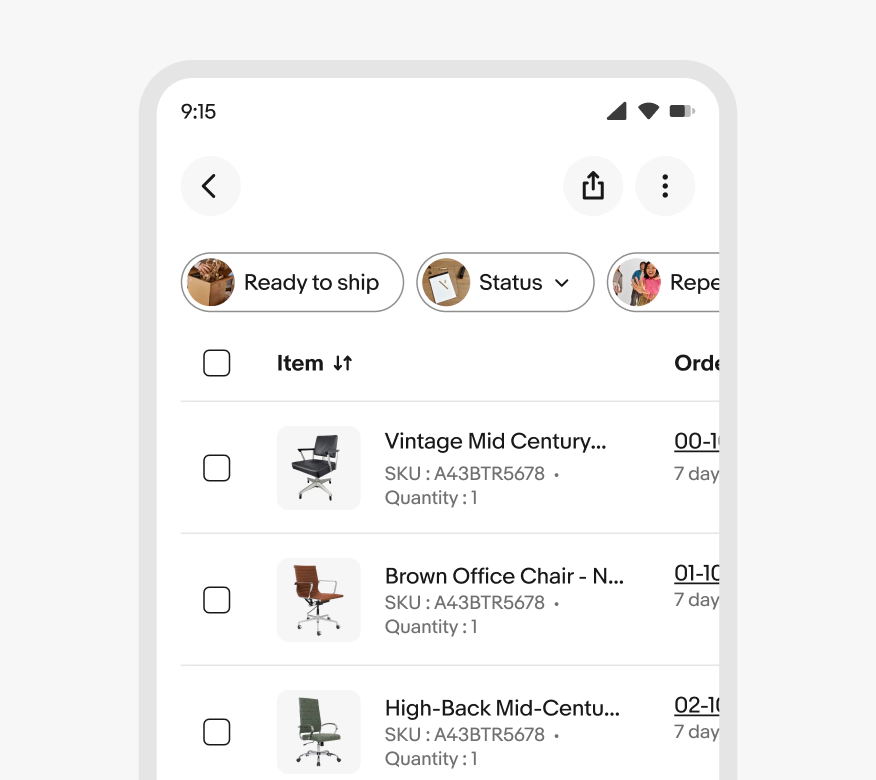
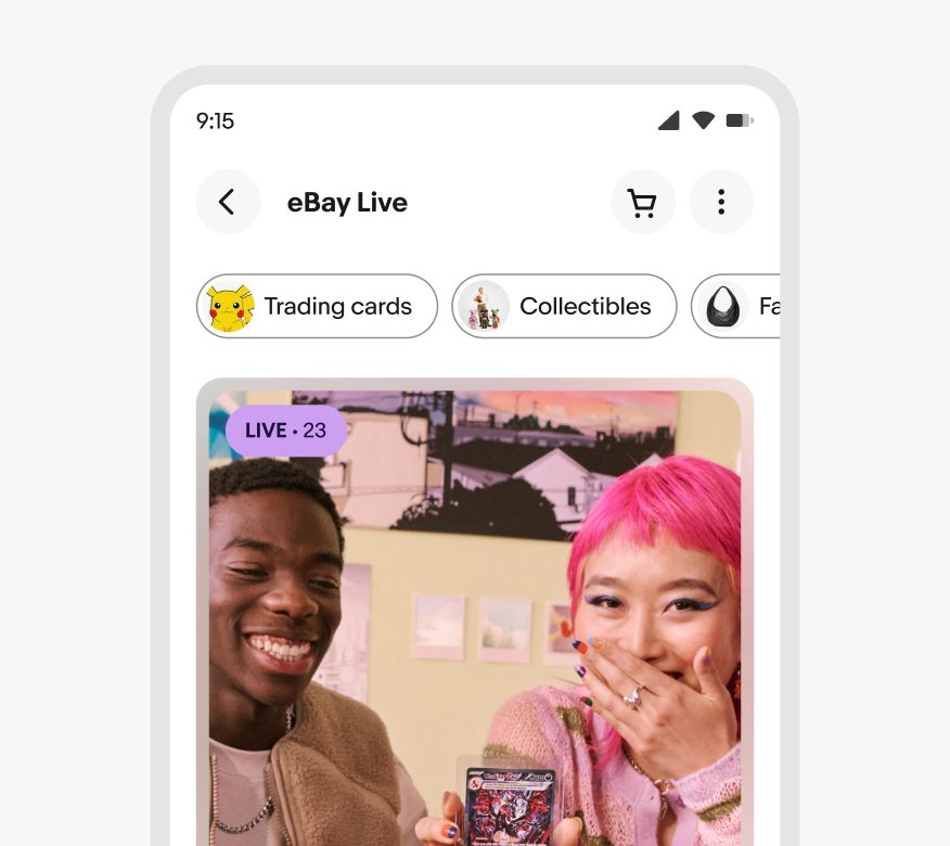
Expressive chips
Expressive chips are intended for immersive browsing moments and intentionally guide users through rich categories of content. They update content within a section or layout to keep users engaged and not disrupt their flow.

States
Chips leverage our state layers for interactions.

Width
Filter chips have a minimum width of 56px and a maximum width of 296px. Expressive chips have a minimum width of 72px and a maximum width of 296px.

Counter
A counter is appended to the label when multiple values are selected within multi-value dropdown filters.
Small
Filter chips can be wrapped in a horizontally scrollable container to ensure all chips are accessible when wider than the screen.

Large screens

Label length
Do keep labels short and focused on a single value or summary of a filter group.

Don’t override the height of chip to allow label wrapping. Allow the label to be truncated if it cannot be reduced.

Lead accessory
Do use a rounded image as the lead accessory in expressive chips.

Don’t use other lead accessories like icons or square images in expressive chips.

Navigation
Do use filter chips to refine the current view.

Don’t use filter chips to navigate users to new experiences or views. Use tabs instead.

Filtering
Do use filter chips when filtering content.

Don’t use filter chips for input.

Stacking types
Do use a single row of chips.

Don’t stack or wrap filter chips.

Dropdowns
Do use expressive chips for discrete values.

Don’t add dropdown behavior to expressive chips. Use filter chips instead.

Browsing vs. utility
Do use expressive chip for immersive browsing moments
Don’t use expressive chips for utility and task-based filtering or flows, like data tables. Use filter chips instead.