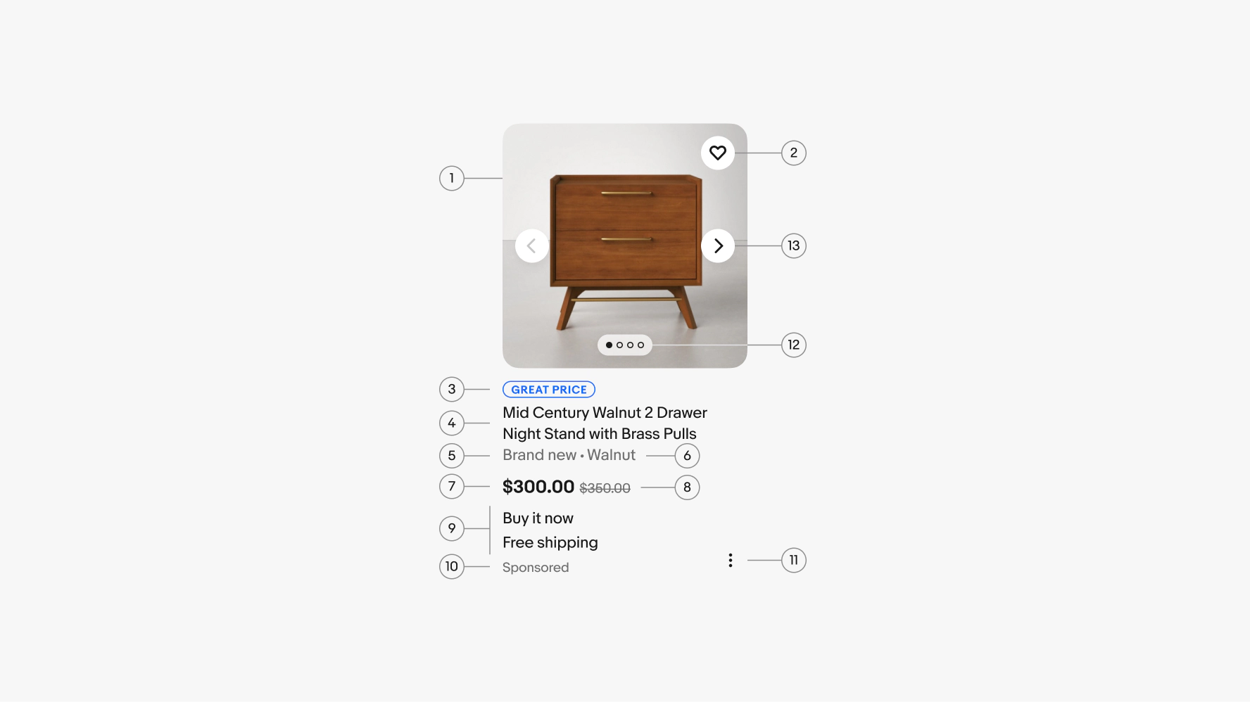
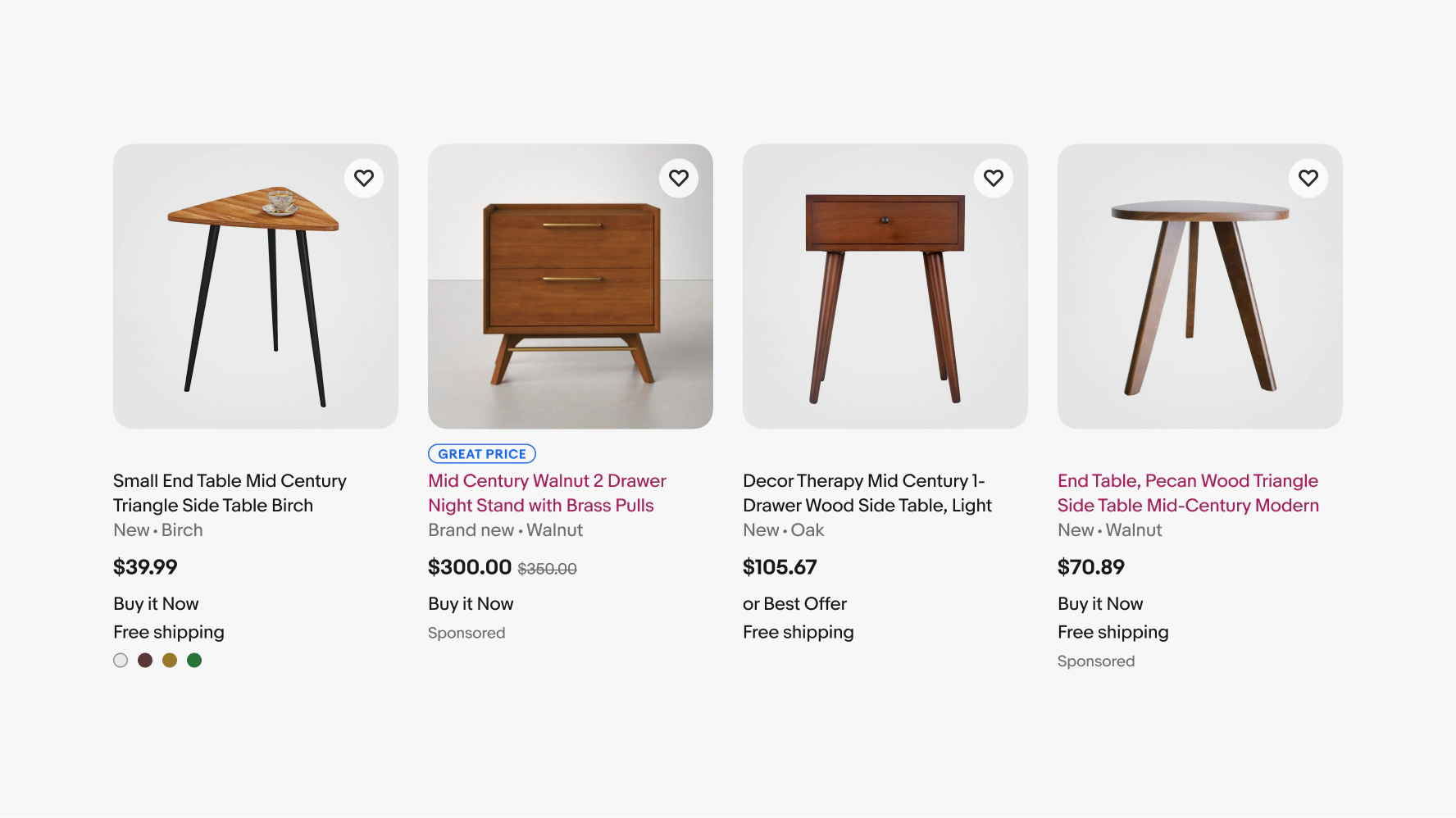
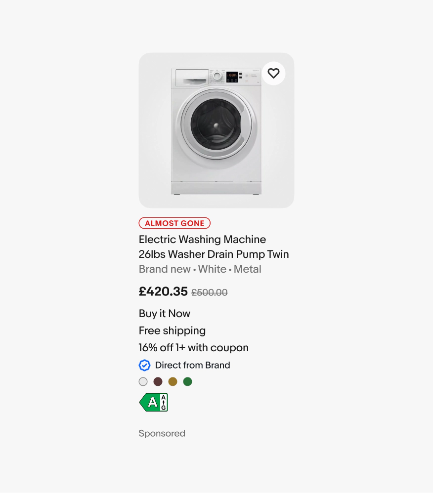
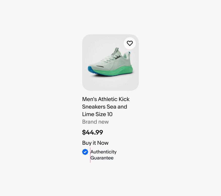
Item tile
v2.2
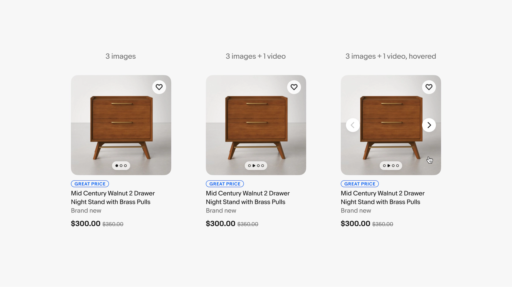
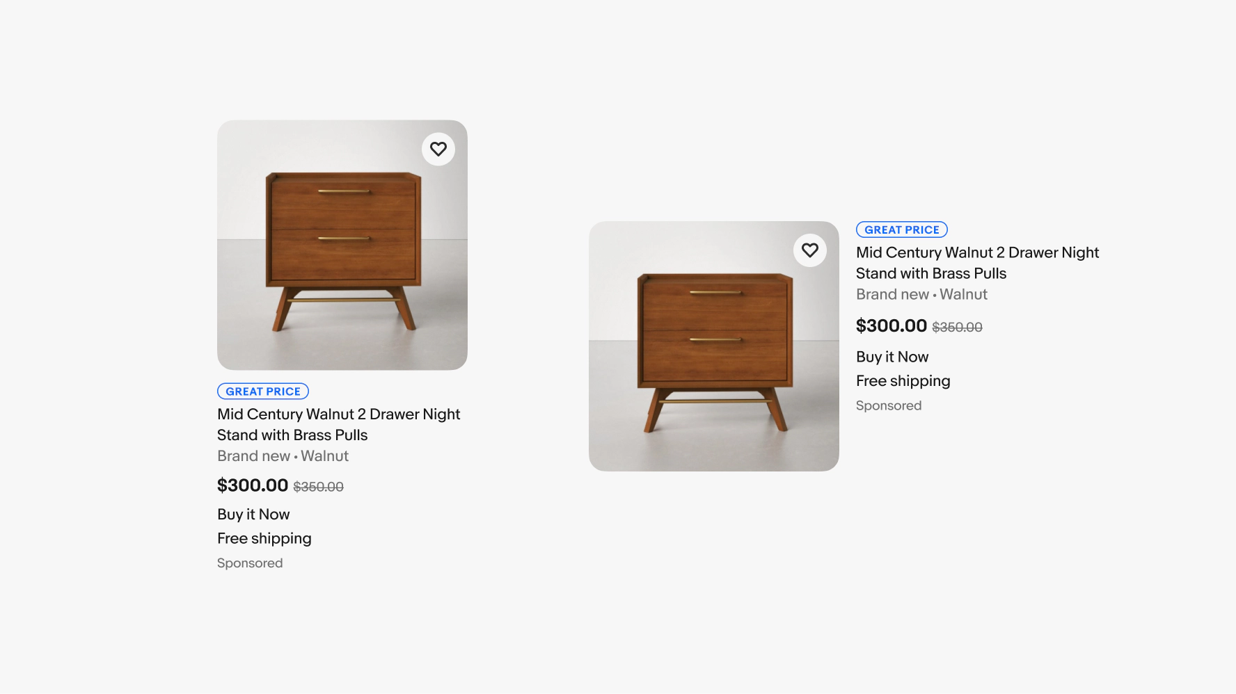
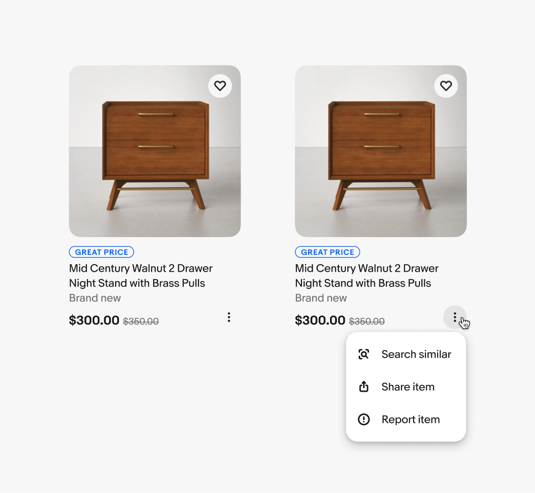
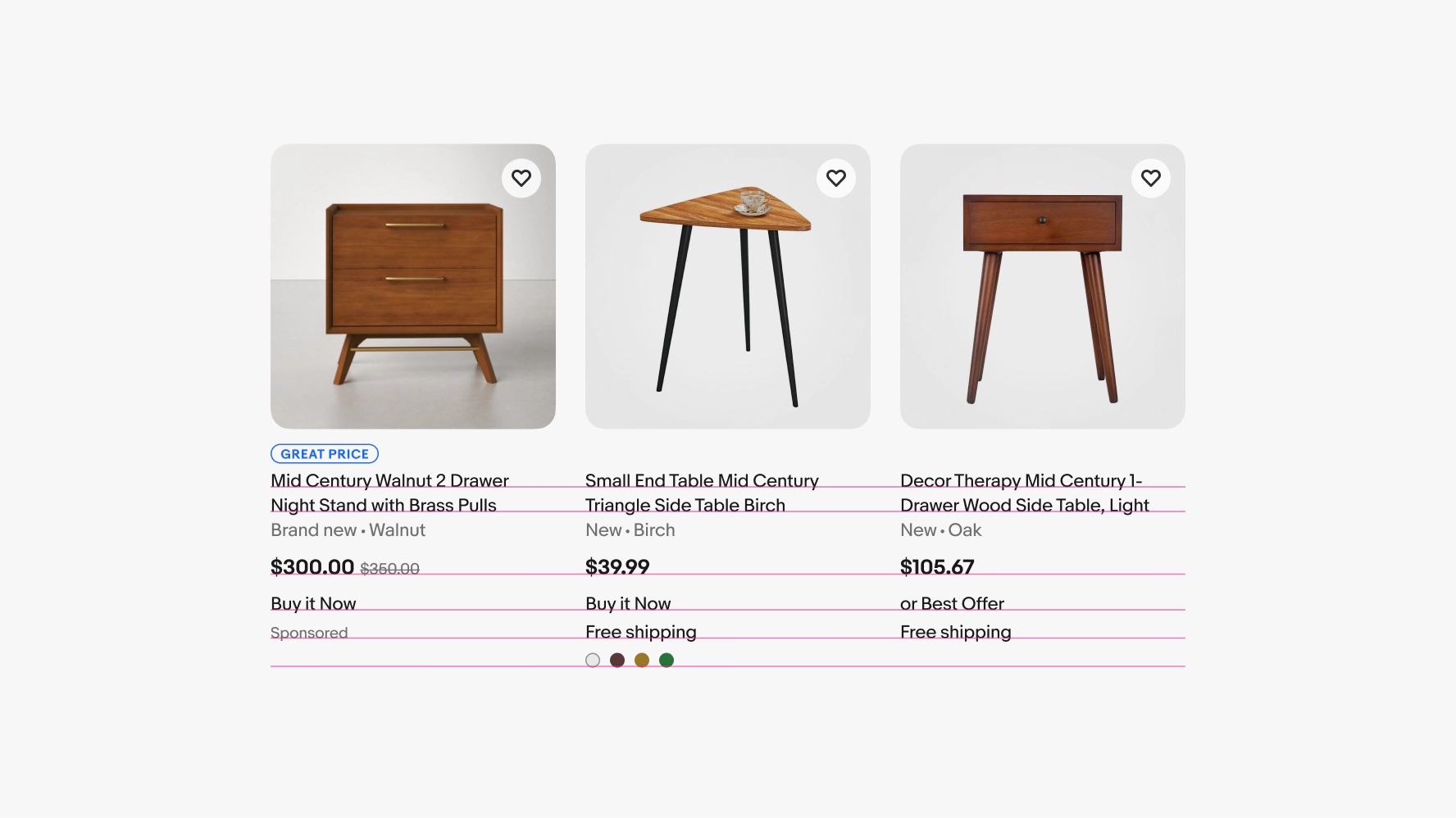
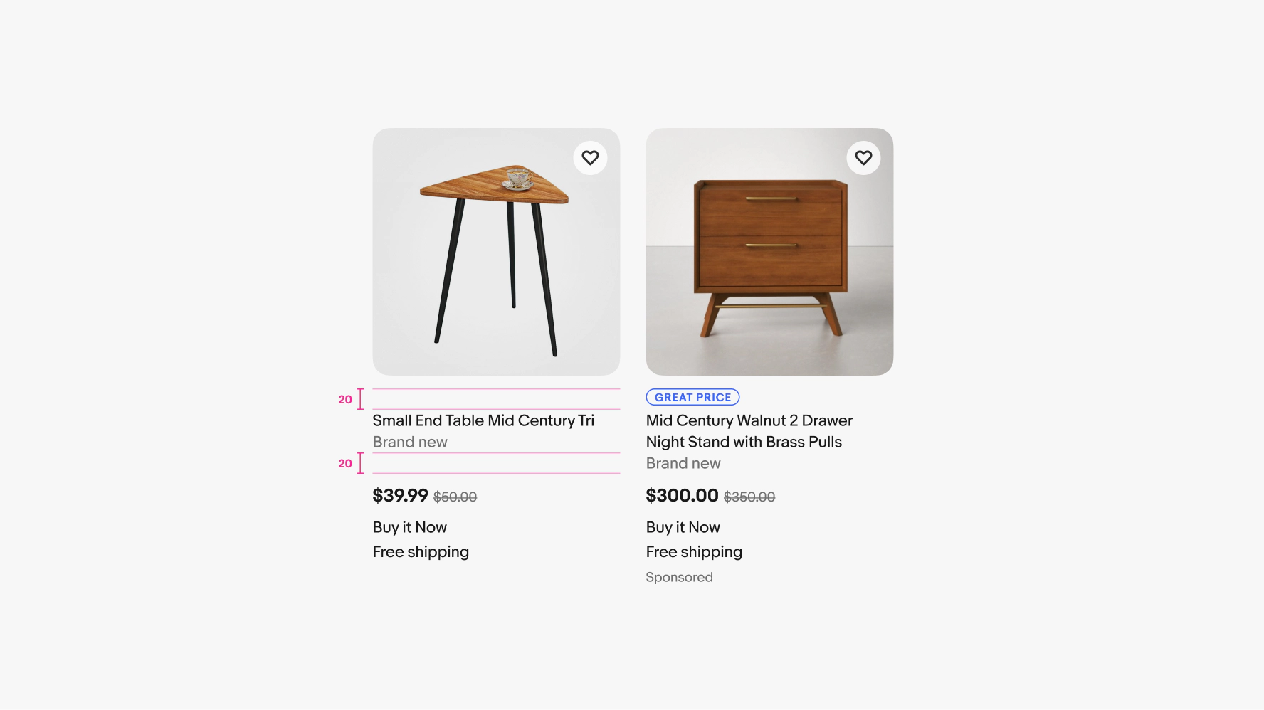
Item tiles display an item preview with key details for further decision-making and quick comparison of similar items.
- CSS
- Marko
- React

Summarize
Item tiles surface a few key product details at a time.
Scannable
Items tiles can be scanned quickly to preview and compare.
Supportive
Item tiles drive quicker decisions at the early stages of exploration.
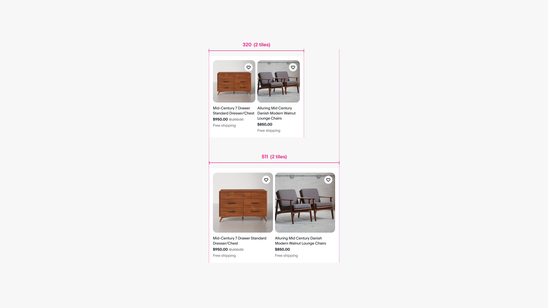
Small tile count
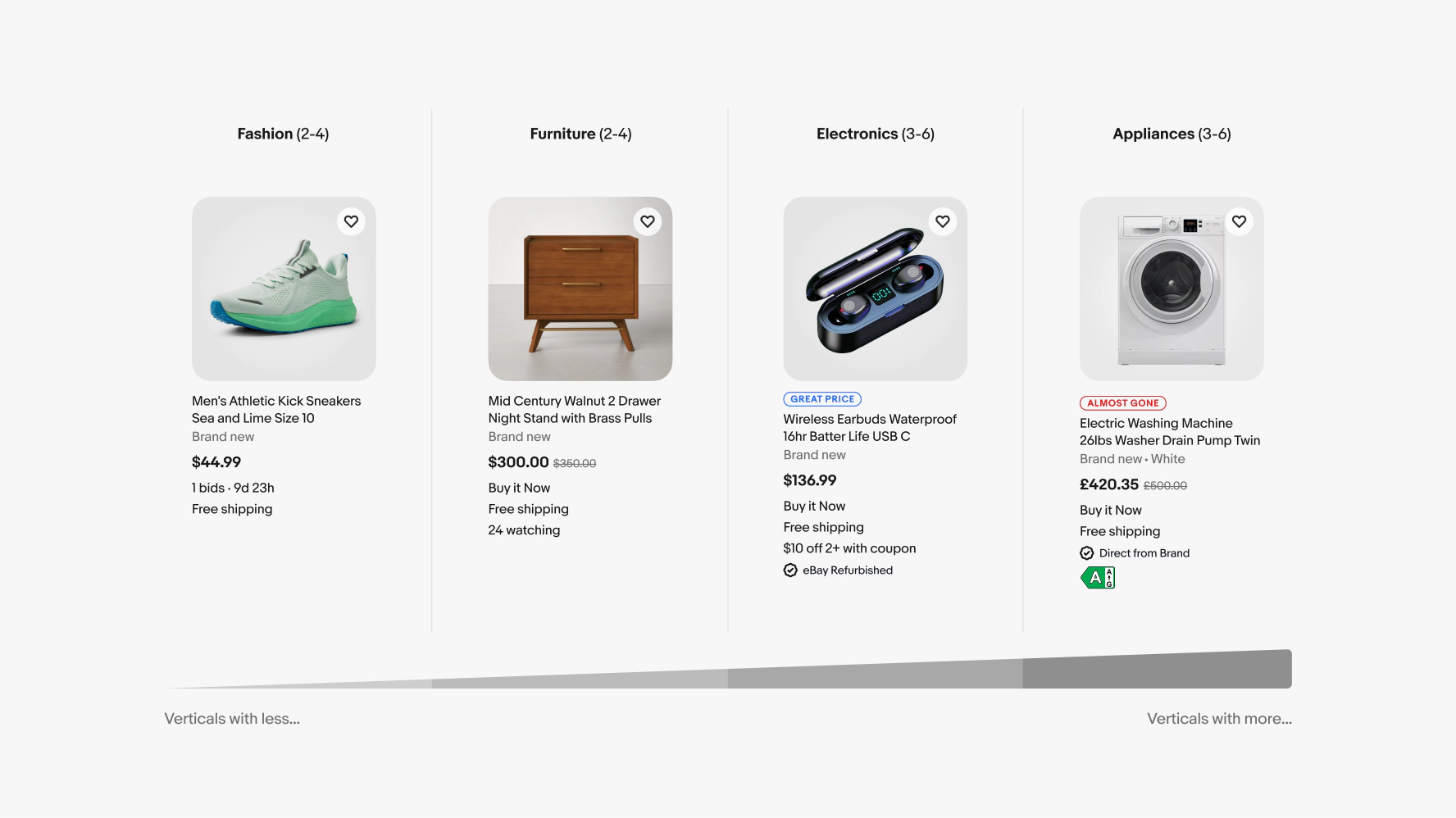
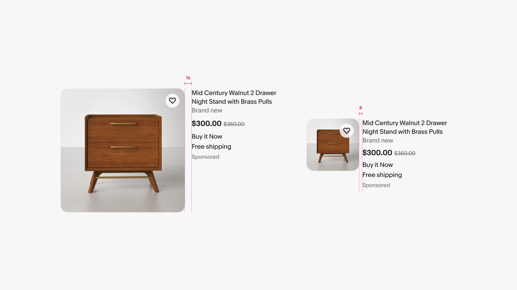
Uniform grid
- Uniform grids have 2 tiles from 320px to 511px.
- The horizontal spacing between tiles is 8px.
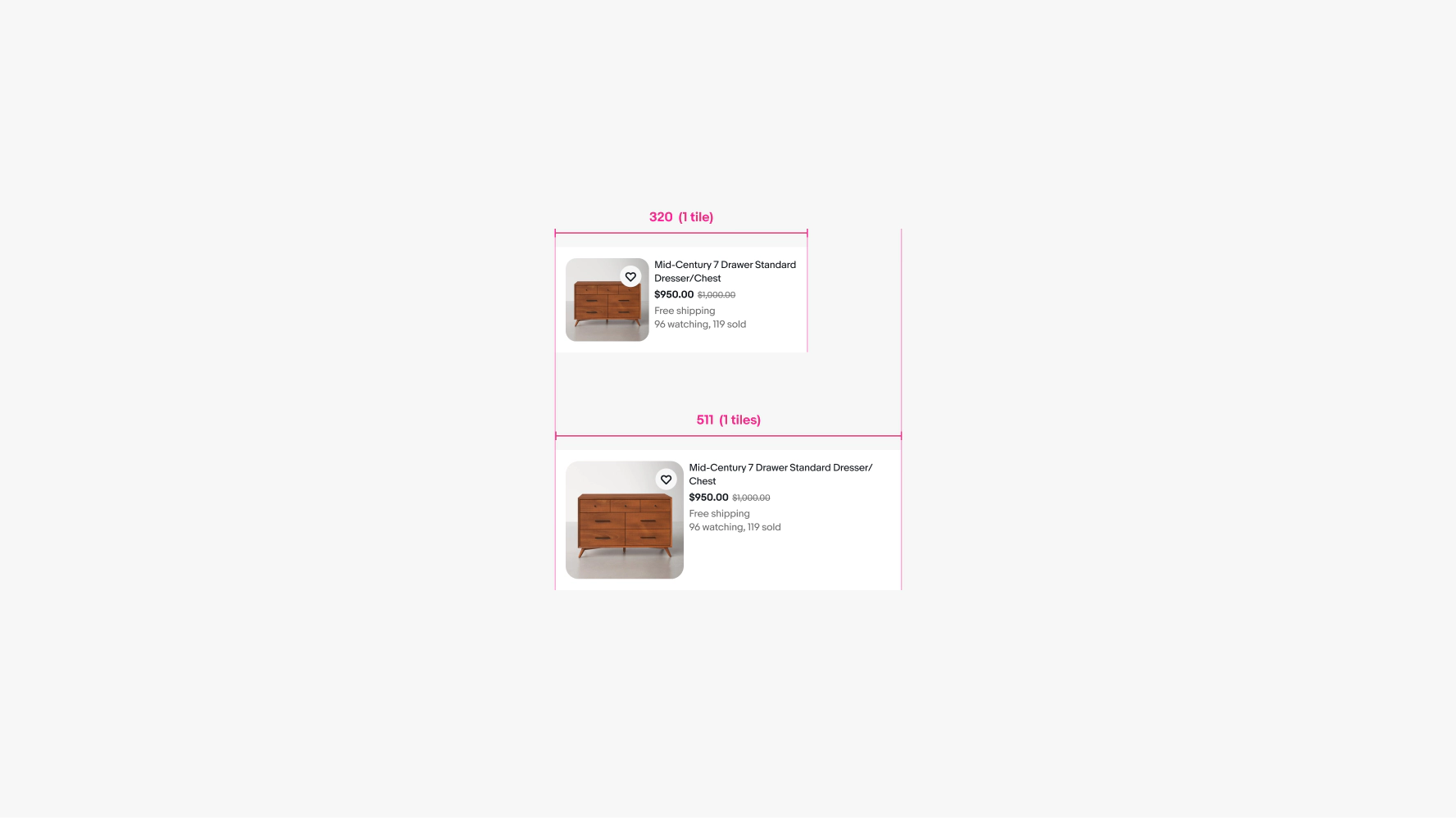
List grid
- List grids have 1 tile from 320px to 511px.
- The spacing between media containers and text is 8px.
Medium tile count
Uniform grid
- Uniform grids have 2 tiles at 512px, 3 tiles at 768px, and 4 tiles 1024px.
- The horizontal spacing between tiles is 8x for 512px and 16px for 768px and 1024px.
- When the left hand navigation is present at 1024px, a tile is removed.
List grid
- List grids have 1 tile at 512px, 768px, and 1024px.
- The spacing between media containers and text is 8px for 512px, and 16px for 768px and 1024px.
Large tile count
Uniform grid
- Uniform grids have 5 tiles at 1280px and 1440px.
- The horizontal spacing between tiles is 16px.
- When the left hand navigation is present at 1280px and above, a tile is removed.
List grid
- List grids have 2 tile at 1280px and 1440px.
- The horizontal spacing between tiles is 16px.
- The spacing between media containers and text is 16px.
X-Large tile count
Uniform grid
- Uniform grids have 5 tiles at 1680px and above.
- The horizontal spacing between tiles is 16px.
- When the left hand navigation is present at 1680px and above, a tile is removed.
List grid
- List grids have 2 tiles at 1680px and above.
- The horizontal spacing between tiles is 16px.
- The spacing between media containers and text is 16px.
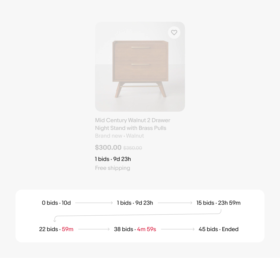
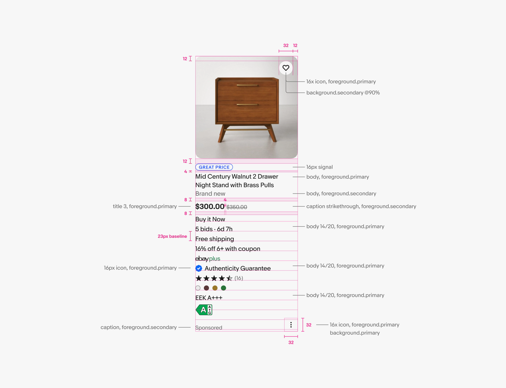
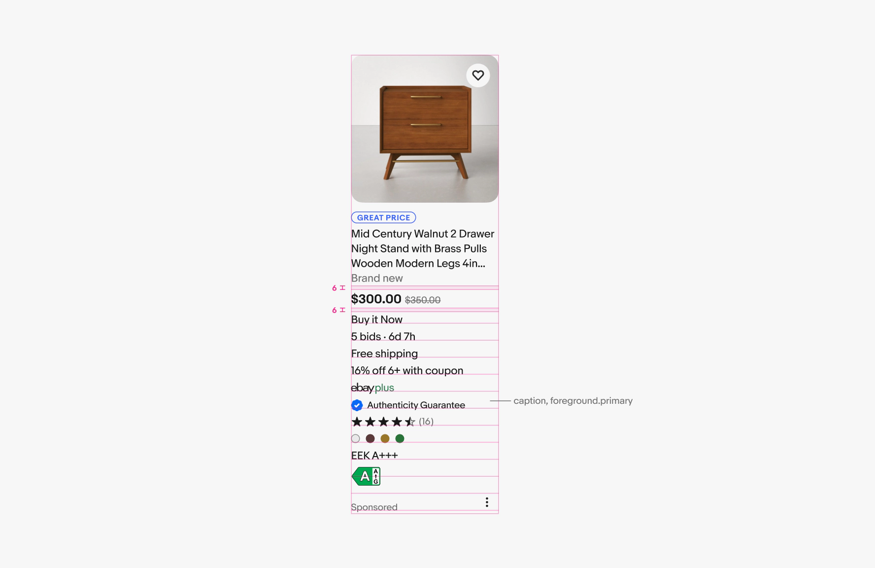
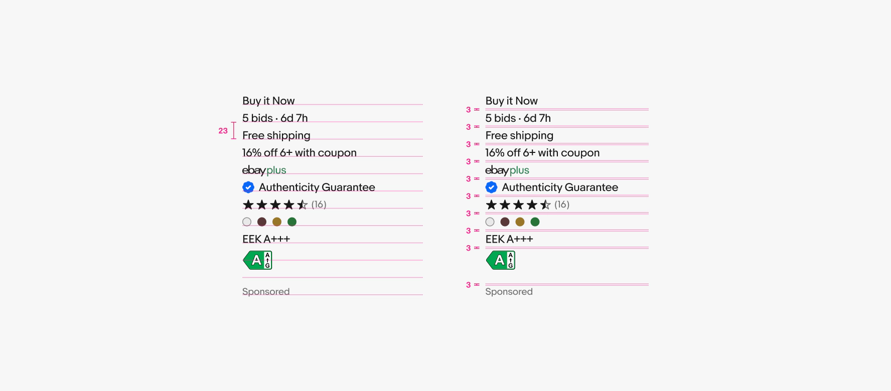
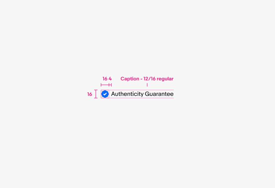
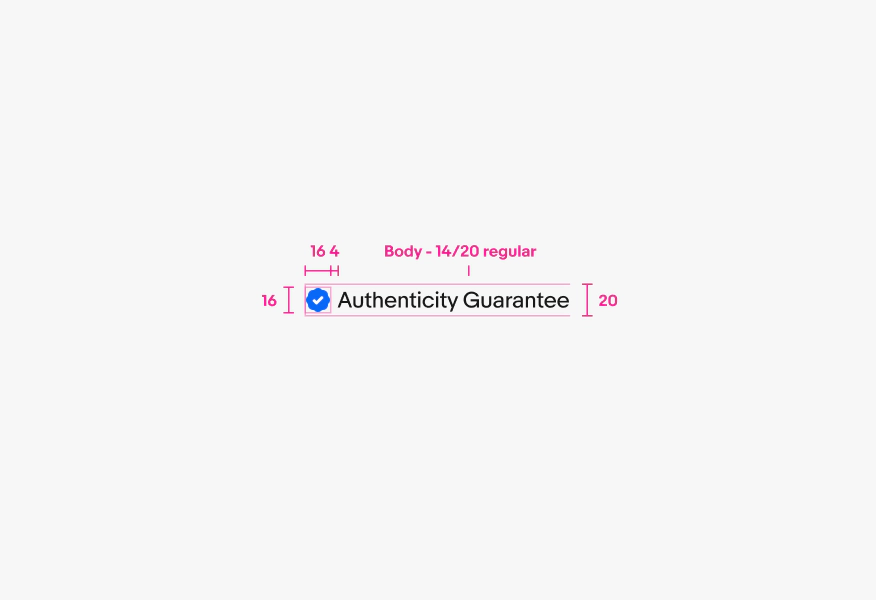
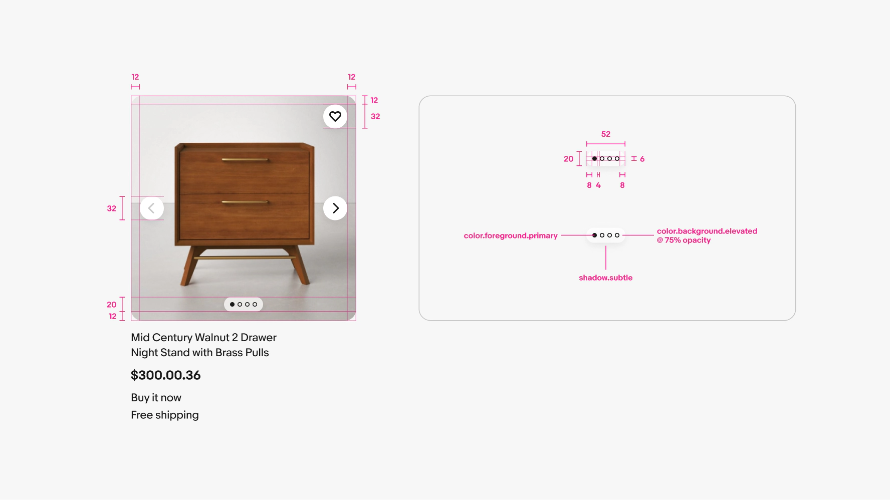
Stacked attributes
Attributes align to a 23px baseline grid. This grid is based on our body text line height of 20px with 3px of space between lines. In order for all attribute types to align on the baseline grid, unique top and bottom padding is needed for the different options.
Individual attributes
Each line height should add up to 20. The exception is the EEK icon.