Dropdown
Dropdown fields allow for selection of a value within a predetermined dataset.

Performant
Forms allow users to complete fields effortlessly.
Accessible
Anyone, no matter their abilities, can complete forms.
Dynamic
Forms provide dynamic feedback so users can correct errors quickly and confidently.

- Label
- Value
- Helper text
- Container
- Icon
Label
Required. The label names what the dropdown controls.
- Use sentence case
- No ending punctuation
- Use a noun or noun phrase
- Aim for 1–3 words

Value
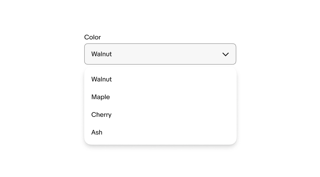
The value is the option the user selects. Each option should be short, distinct, and easy to scan. Show a maximum of 10 values in one dropdown.
- Use sentence case, except for proper nouns or branded terms
- No ending punctuation
- Use parallel structure
Layout
Input dropdowns have multiple layout options.
- Stacked: The field’s label is outside and above the field.
- Floating: The label is inside the text box and animates upward on focus to make room for the input value.

Required/Optional fields
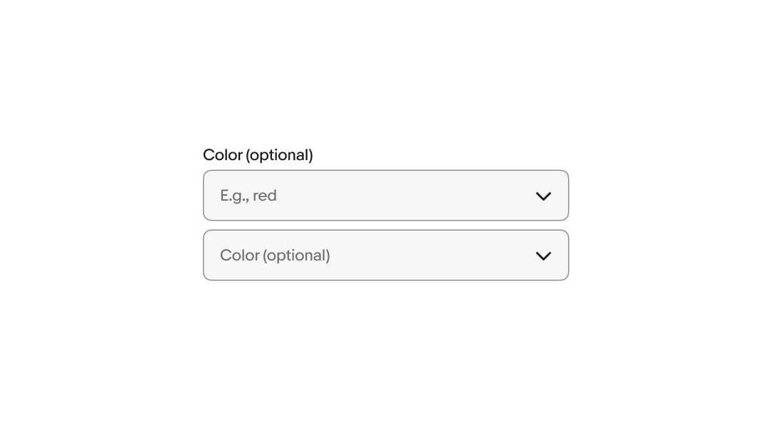
Use an asterisk to indicate a field is required. Display the word “optional” in parentheses next to the field label if the field isn’t required.
If most fields are required, only indicate the optional fields. If most fields are optional, only indicate the required fields.
Placeholder text
Placeholder text, or “ghost text,” gives users a hint about the expected input format. Use realistic examples of what a user might enter, not descriptions of the field.
Placeholder text disappears when the user starts typing, so don’t use it for instructions or required information.
- Use sentence case
- No ending punctuation
Helper text
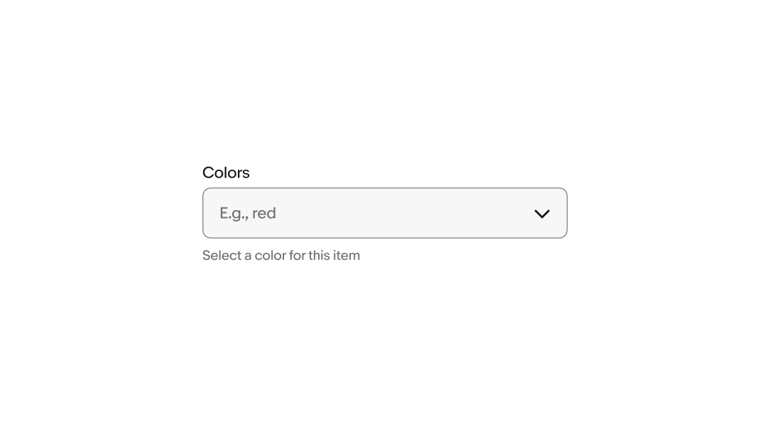
Helper text is placed below the field and informs the user of any requirements or disclaimers. Helper text can be shown persistently or on focus.
Error messages
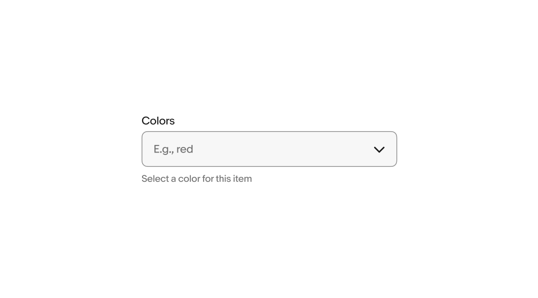
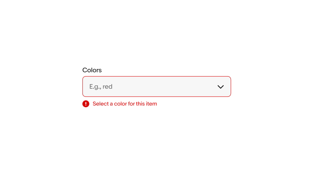
Error messages appear below the field when the input doesn't meet the required format or conditions. The error message replaces any existing helper text.
Keep the tone neutral, don’t blame or scare the user. Clearly inform users know how to fix it.
- Use sentence case
- No ending punctuation
- Avoid technical language or filler words like “please”, “sorry”, or “oops”
Size
There are two sizes available: 40px and 48px. These match our button sizes to account for situations where they are inline together. Avoid mixing different sizes in a single form.

Read-only
Users cannot focus on or change read-only fields. Their input is derived from other parts of the UI and is intended to be viewable for reference. The input is submitted with the form.

Disabled
Users cannot focus on or change disabled fields. Their availability depends on certain requirements. No value will be submitted from disabled fields.

Overflow
Content that extends beyond the width of the field is truncated before the icon.

Min width
Bordered dropdowns have a minimum width of 2x their height. Borderless dropdowns do not have a minimum width since they hug their contents.

Max width
Dropdown buttons and menus have a max width of 280px.

Small
Dropdown input fields launch a sheet or a popover menu depending on the platform.

Native
Native apps launch a sheet or fullscreen modal when interacting with the dropdown field. The choice between the modal size is determined by the size and complexity of the list.

Web
Small screens on web disclose a list in a popover menu.
Medium and large
Dropdown input fields disclose a list in a popover menu on medium and large screens across all platforms.

