Page notice
A page notice is a prominent message for high-priority conditions that impacts what users can do in the product or on a specific page, like account restrictions, blocking issues, or urgent required actions.
- CSS
- Marko
- React
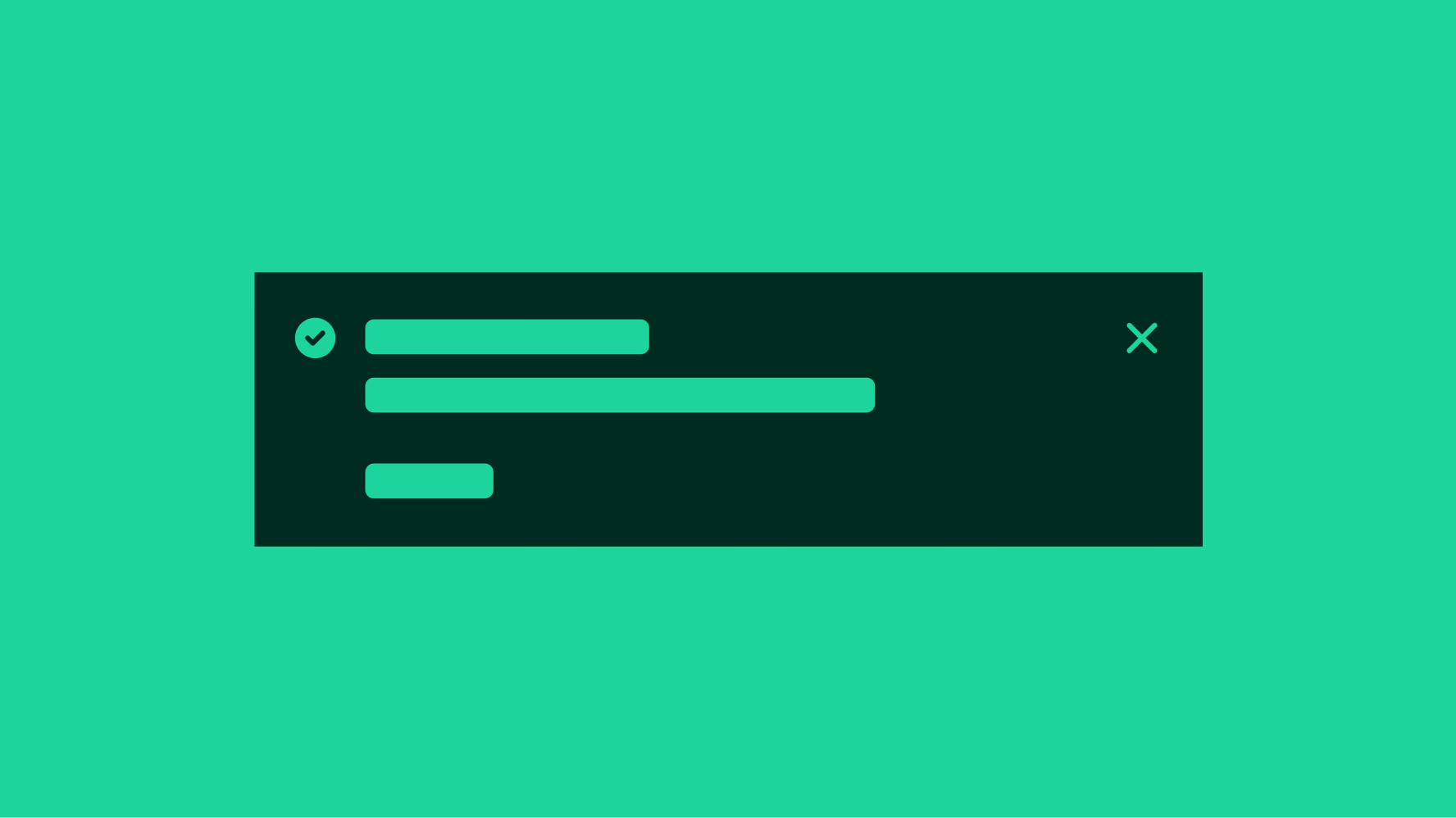

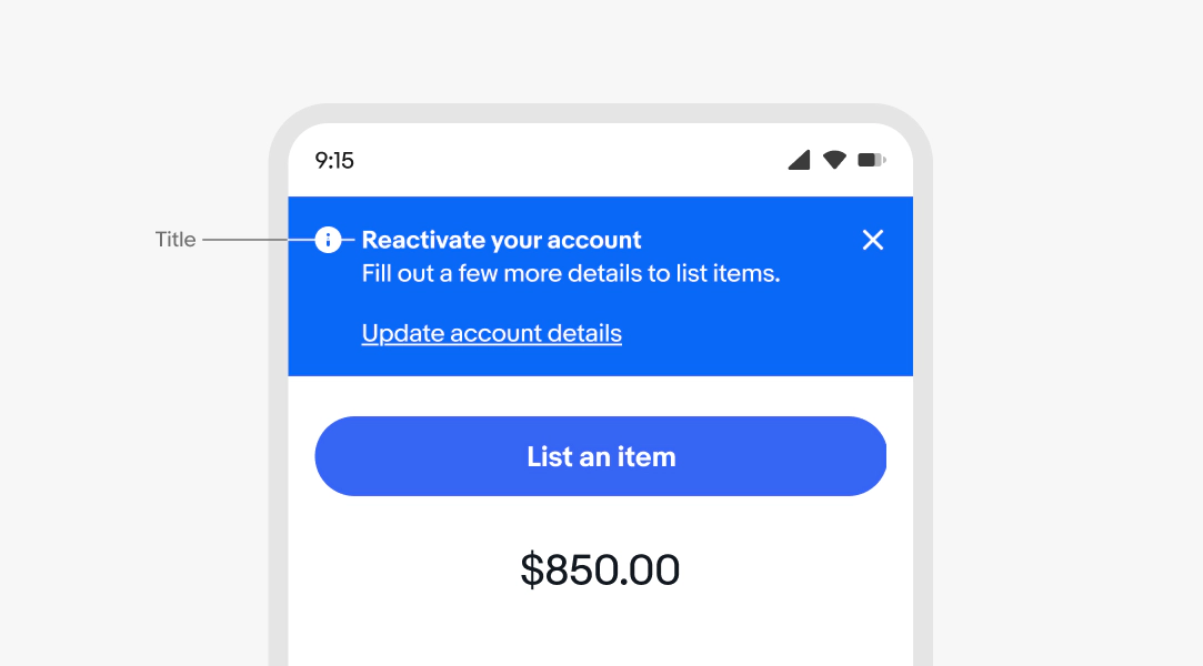
- Title
- Icon
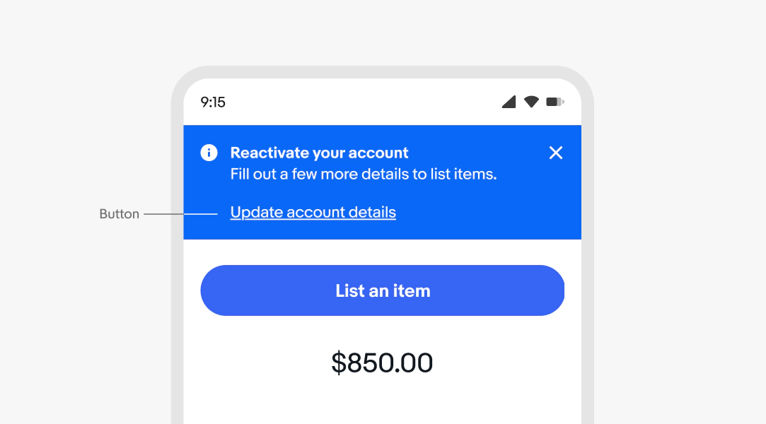
- Button
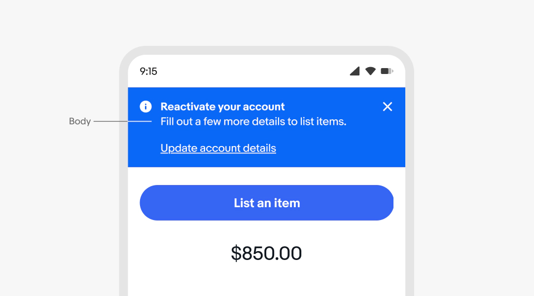
- Body
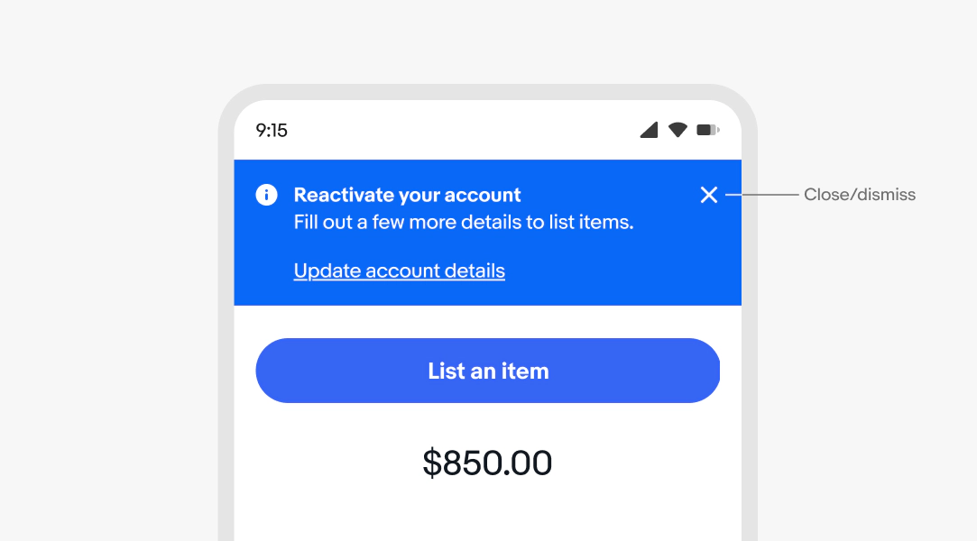
- Close/dismiss
Title
Optional. The title gives users an immediate signal of what the notice is about.
Lead with what happened, what went wrong, or what the user needs to do. Keep it specific to the component or action it references.
- Bold the text
- Use sentence case
- No ending punctuation
- Avoid repeating body text
- Max character count: 60
Body
Required. The body provides the context or detail users need to understand the notice and act on it, if needed.
For actionable notices, tell the user what to do next. Don't repeat nearby content.
- Use sentence case
- Use ending punctuation
- Avoid repeating the title
- Keep to 1-2 lines
- Only one text link (optional)
Dismiss button
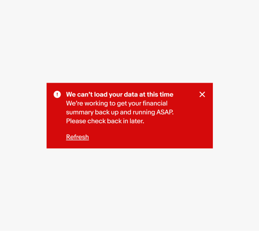
Alert notices can include a dismiss button that removes the notice from the page layout. This is helpful for general or supplemental information provided by the notice.
Actionable
Actionable notices include a link button below or beside the body text. Include actions if the user needs to complete a step to resolve the notice.
Link button
Link buttons provide a clear next step for users to resolve or engage with the notice. Make the verbs in the title and button correspond, and tell users what will happen when they interact.
- Use sentence case
- No ending punctuation
- Use a [verb] [noun] or [verb] [article] [noun] pattern
- Aim for 4 words or fewer
See Button text for more guidance.
Semantic type
All alert notices are semantic. The available options are information, attention, confirmation, warning, and neutral. Get writing tips, and view more details for each type on the alert notice overview page.

Placement
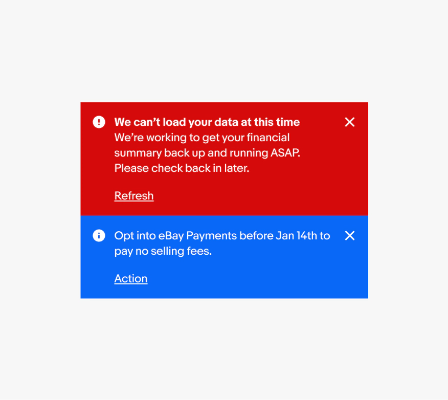
Page notices appear on load as part of the page layout and extend edge to edge. Evaluate the existing page level notices to prevent stacked messages and overwhelming users. Content shifts to fill the space when a page notice is dismissed. Alert page notices should always be dismissible or resolvable, not a permanent part of a design.

Overflow
All text content will wrap if wider than the container. Avoid wrapping for button titles and titles where possible.

Layout
The action can be stacked below the content or inline with the content. By default, small screens have the action below, while large screens have the action pinned to the right.
The action should remain below the body content if it spans more than 2 lines on small screens.

Small
Page notices are full-width and directly beneath the global header. The action can be below or beside the body content depending on the content length. Inline and section notices appear near their related elements.

Large
Page notices are positioned directly beneath the top navigation elements. The notice’s background spans the full page width (edge to edge) until it reaches the max width of the page grid (1680px). See Layout in product for responsive grid details. Section and inline notices appear next to their related elements.
Timing
Do keep page notices temporary and provide a solution to remove the page notice.

Don't use page notices without a clear solution or as a permanent part of the design.

Content
Do keep body copy in regular weight to maintain enough visual separation from the action.

Don’t use bold weight for the body copy. The button becomes more difficult to discern from the main content.

Stacking
Do show one page notice at a time and replace it with next priority page notice after the user dismisses or addresses it.
Avoid stacking page notices. Stacked page notices can quickly become overwhelming.