Inline notice
An inline notice is a contextual message tied to a single element, like a tile or row item, used for field-level guidance, reminders, or validation.
- CSS
- Marko
- React

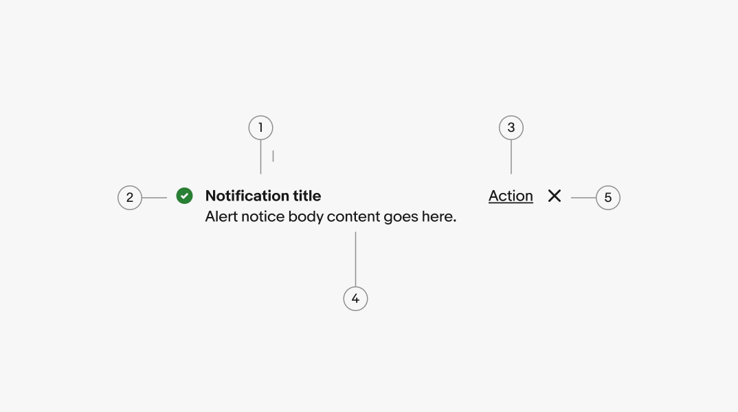
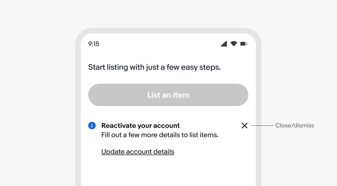
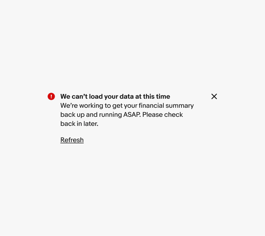
- Title
- Icon
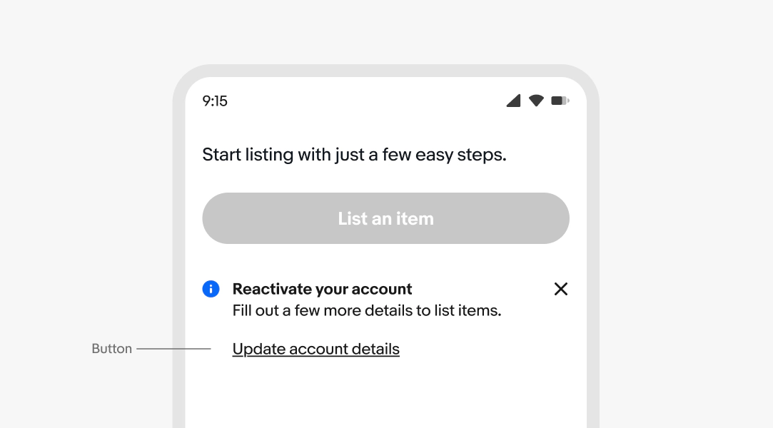
- Button
- Body
- Close/dismiss
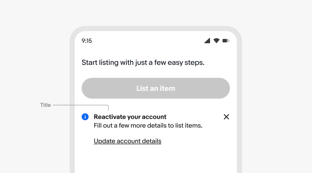
Title
A bolded title is optional. Title copy is specific and scannable, which quickly summarizes the purpose of the notice.
Lead with the most important information—what went wrong, what happened, or what users need to do. Don’t add long explanations or include multiple actions. Keep headlines contextual to the information or action related to the component you’re referencing.
- Use sentence case
- No ending punctuation
- Keep to 1 line and don’t repeat the body text
- Max character count: 60
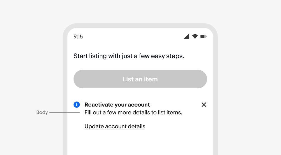
Body
Required. The body provides the context or detail users need to understand the notice and act on it, if needed.
For actionable notices, tell the user what to do next. Don't repeat nearby content.
- Use sentence case
- Use ending punctuation
- Use the active voice
- Avoid repeating the title
- Keep to 1-2 lines
- Only one text link (optional)
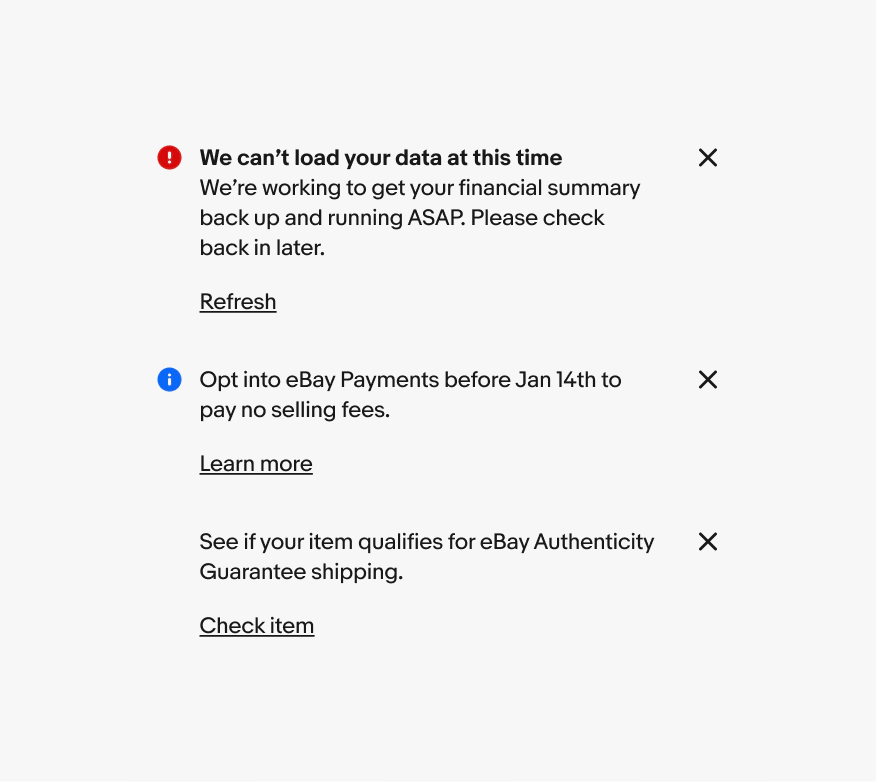
Dismiss
Alert notices can include a dismiss button that removes the notice from the page layout. This is helpful for general or supplemental information provided by the notice.
Actionable
Alert notices can include a dismiss button that removes the notice from the page layout. This is helpful for general or supplemental information provided by the notice.
Link button
Link buttons provide a clear next step for users to resolve or engage with the notice. Make the verbs in the title and button correspond, and tell users what will happen when they interact.
- Use sentence case
- No ending punctuation
- Use a [verb] [noun] or [verb] [article] [noun] pattern
- Aim for 4 words or fewer
See Button text for more guidance.
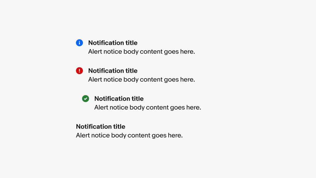
Semantic
All alert notices are semantic. The available options are information, attention, confirmation, warning, and neutral. Get writing tips, and view more details for each type on the alert notice overview page.
Placement
Inline notices appear on load as part of the page layout and are inset. Content shifts to fill the space when an inline notice is dismissed. Inline notices should always be dismissible or resolvable, not a permanent part of a design.

Overflow
All text content will wrap if wider than the container. Avoid wrapping for titles and button titles where possible.

Layout
The button is always stacked below the content for inline notices. This applies to both small and large screens.

Small
On small screens, inline notices are positioned next to the related elements, with the button placed below the main content.

Large
On large screens, inline notices are positioned beside their related elements. If a button is included, it is placed below the main content. Unlike page and section notices, which can include a right-aligned button, inline notices do not have this option.
Inline proximity
Do keep inline notices close to and focused on their target element.

Don’t use inline notices for sections, page-level content, or attention account information. Use a section or page notice notice instead.

Content
Do keep body copy in regular weight to maintain enough visual separation from the action.

Don’t use bold weight for the body copy. The button becomes more difficult to discern from the main content.

Stacking
Do show one inline notice at a time and replace it with the next priority inline notice after the user dismisses or addresses it.
Avoid stacking inline notices. Stacked inline notices can quickly become overwhelming.