Accordion
An accordion is a vertically stacked set of sections that can be individually expanded or collapsed to show or hide a block of related content, allowing users to scan headings and reveal details on demand.
- CSS
- Marko
- React

Progressive
Accordions reduce visual complexity and information density.
Empower
Users decide what information they want to see and when.
On-demand
Revealing and hiding information is a single tap away.

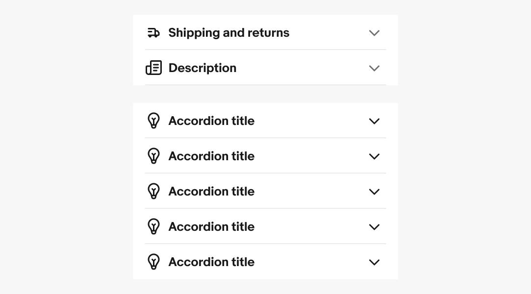
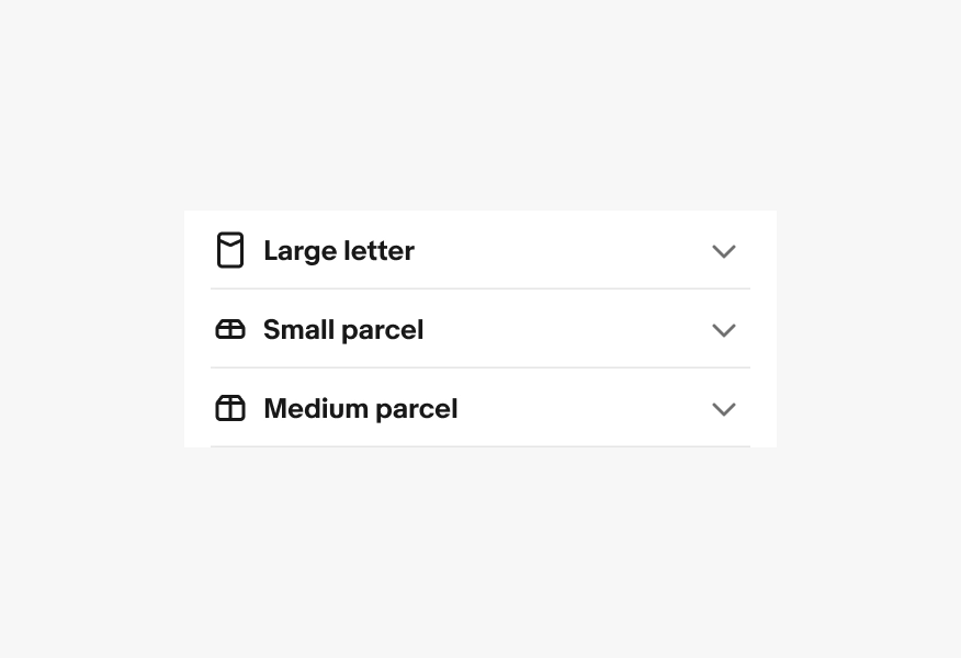
- Title
- Icon button
- Content
- Divider
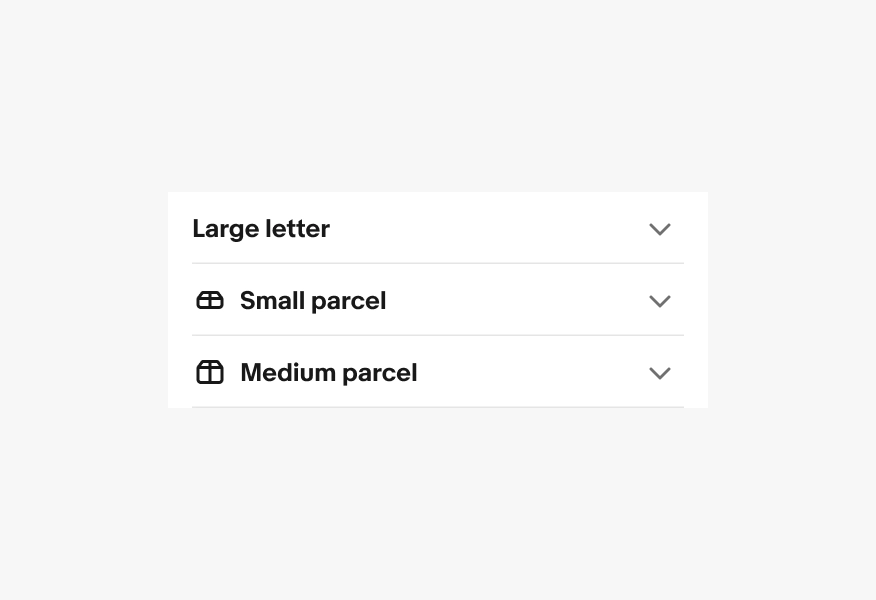
Title
The title describes what the accordion section is about.
Use clear, specific language so users can decide whether to expand without reading anything else. Keep syntax parallel across all items so the accordion is easy to scan.
- Use sentence case
- No ending punctuation
- Use nouns or noun phrase
- Max character count: 30

Icon
Icons can be used next to the title. The icon size stays the same for both the small and large title size.
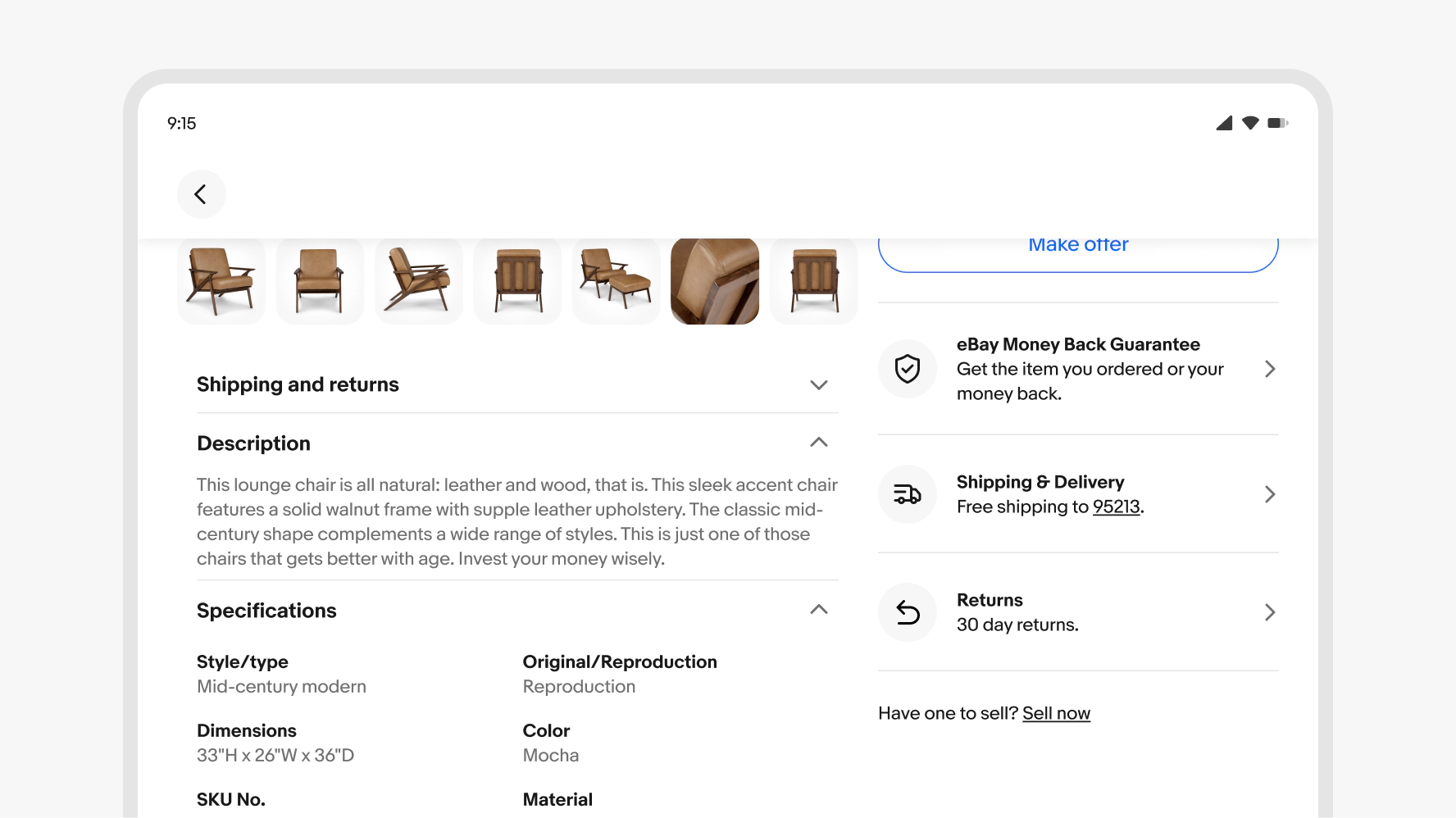
Content
The content area of an accordion row primarily includes text, but can also contain images or other components.
Lead with the most important information and keep it focused on the topic described in the title. Break long content into short paragraphs, bulleted lists, or use subheadings.
- Use sentence case
- Use ending punctuation
- Use complete sentences
- Max character count per line: 75 characters

Divider
Dividers are shown between accordion rows to aid visual clarity.

Expand/Collapse
Selecting any part of the row, including the title or icon button, will expand or collapse the individual row. The icon adjusts to indicate the closed or open state of each row. Rows remain open until closed manually unless auto-collapsing is configured. See motion specs.
Note: Accordions require two or more rows. If only one row is needed, consider the expansion component.

Layer states
Hover and focus states are applied to each title row. See Interaction states for more details on layer state styling.

Text overflow
Accordions use a flexible layout so that titles and text content will wrap to multiple lines without limits or truncation. The accordion height will flex to fit various types of content.

Small
Accordions fill the entire width of the content area on small screens up to a max of 480px.

Large
Accordions fill the width of the parent containers on large screens.
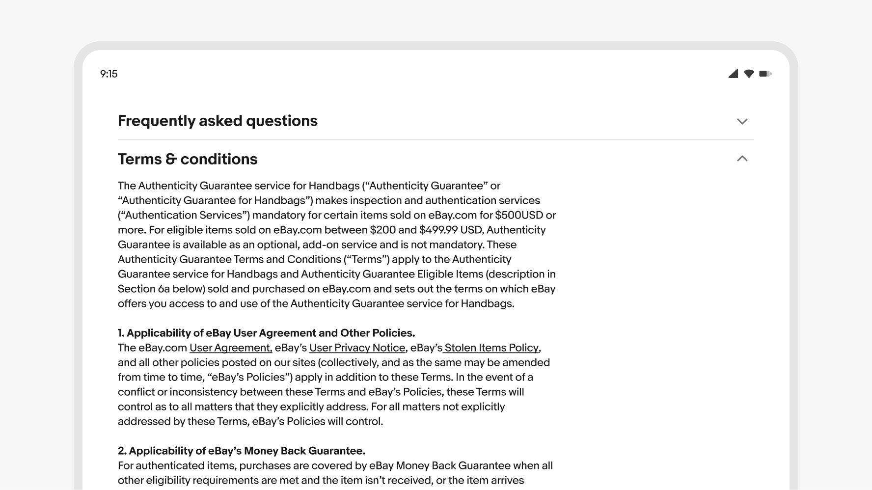
Full-width
Text-heavy examples like a marketing or FAQ page can use accordions that fill the content area with larger title text sizes.
Button title
Keep the title short and concise. Only add additional qualifiers if it’s necessary to clarify the expected content.

Don’t use long or wordy titles. Extra long titles can negatively affect the overall hierarchy.

Icon
When using icons, they must be present for each title.
Don’t use icons for only some titles
Sub sections
Use clear sub sections inside of accordion rows.

Don’t nest accordions or use complex layering.

