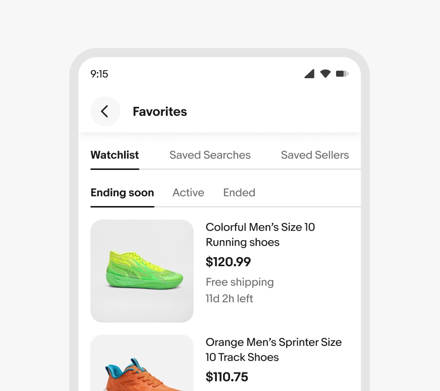
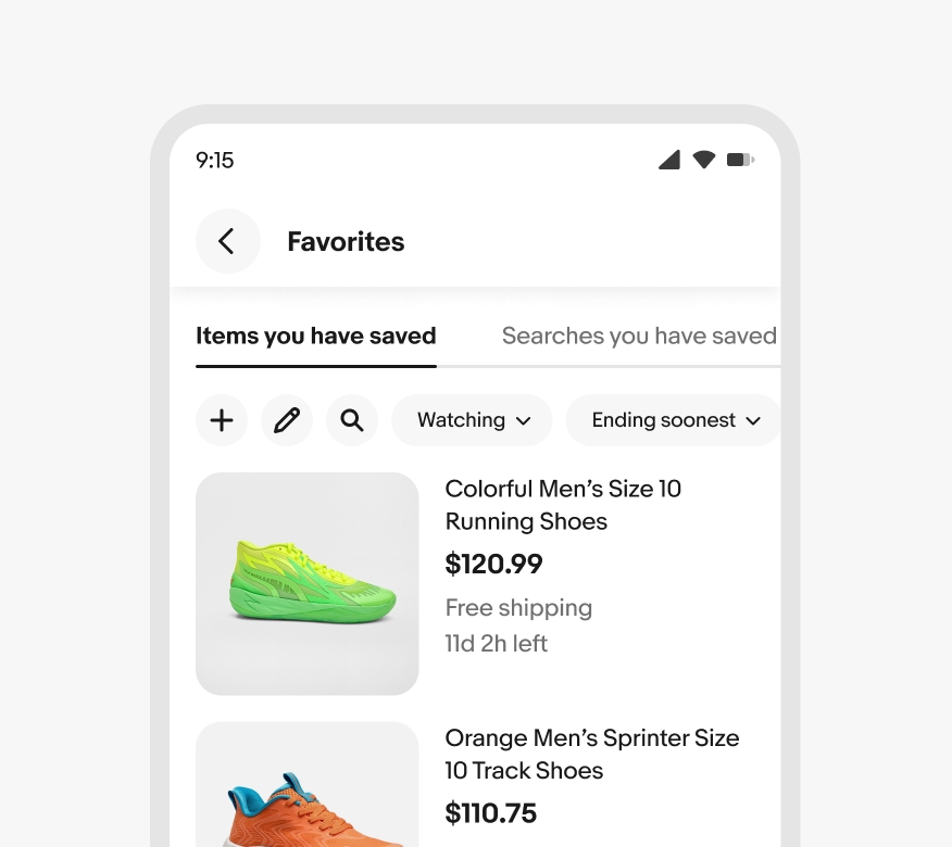
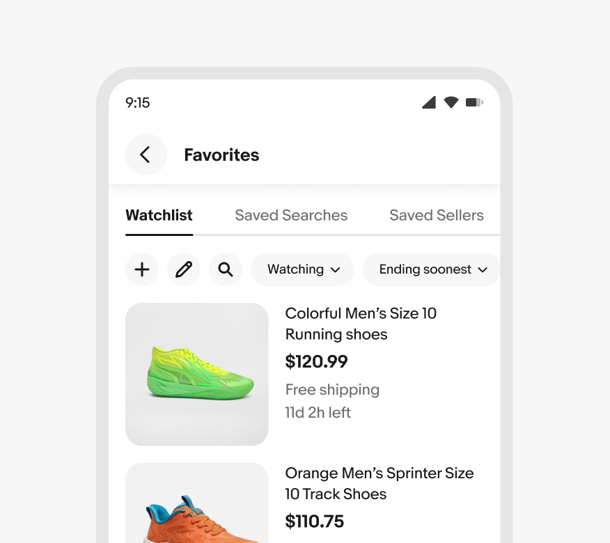
Tab
Tabs organize and manage content within an interface, allowing users to navigate between different sections or views without leaving the current page.
- CSS
- Marko
- React

Context preservation
Tabs allow users to switch between sections without losing context on the page they’re on. Tabs only change the content below them.
Flexible
The number of tabs may vary depending on experience and context.
Organizational
Tabs can help divide content into more manageable and easier-to-digest sections.
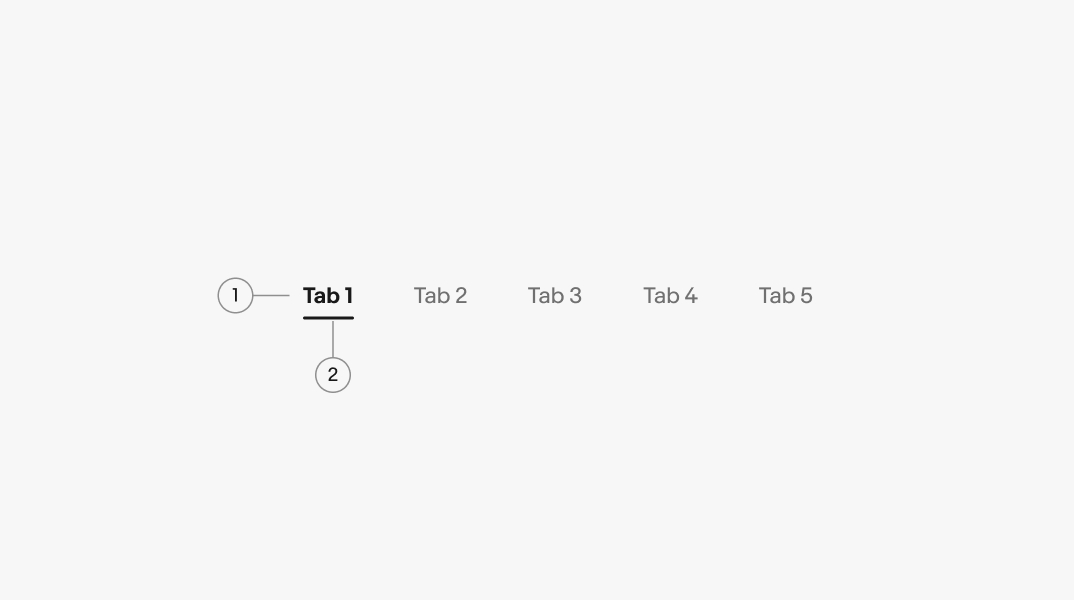
- Label
- Active indicator
Title
All tabs must have a title. It should be brief and descriptive, using one or two words.

Divider
To create greater separation and prominence, a divider can be added along the bottom of a tab set.
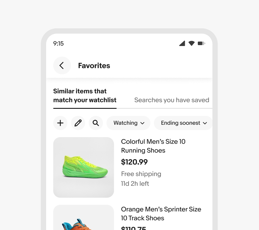
Scrolling
Tabs extending beyond the screen are scrollable. The space between tabs can be adjusted to allow a glimpse of the content on the right.

Number of tabs
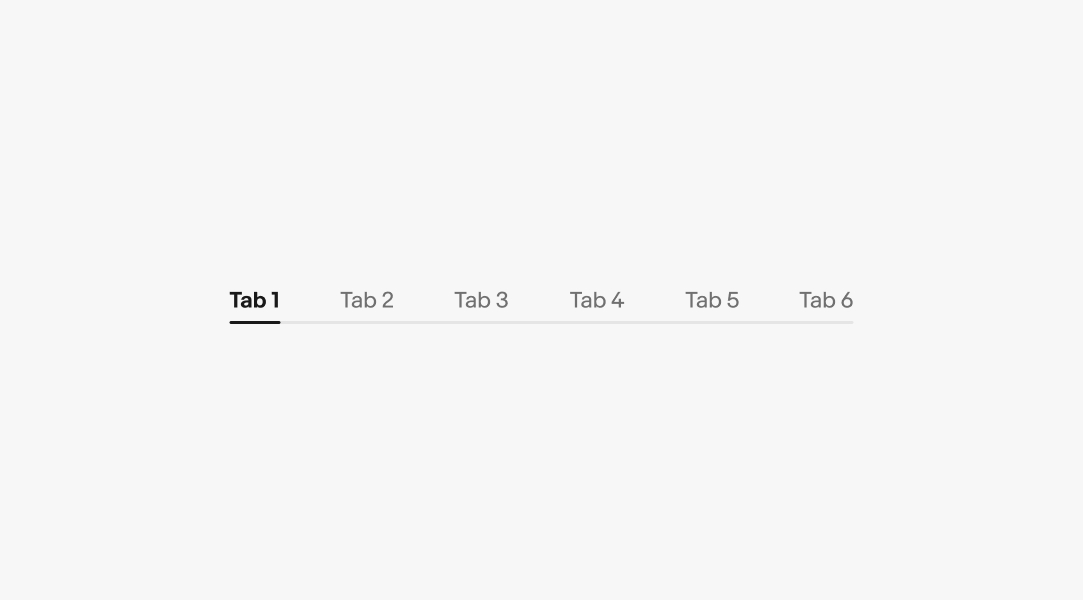
Tab sets must have at least two tabs. Aim for no more than 7 tabs where possible.

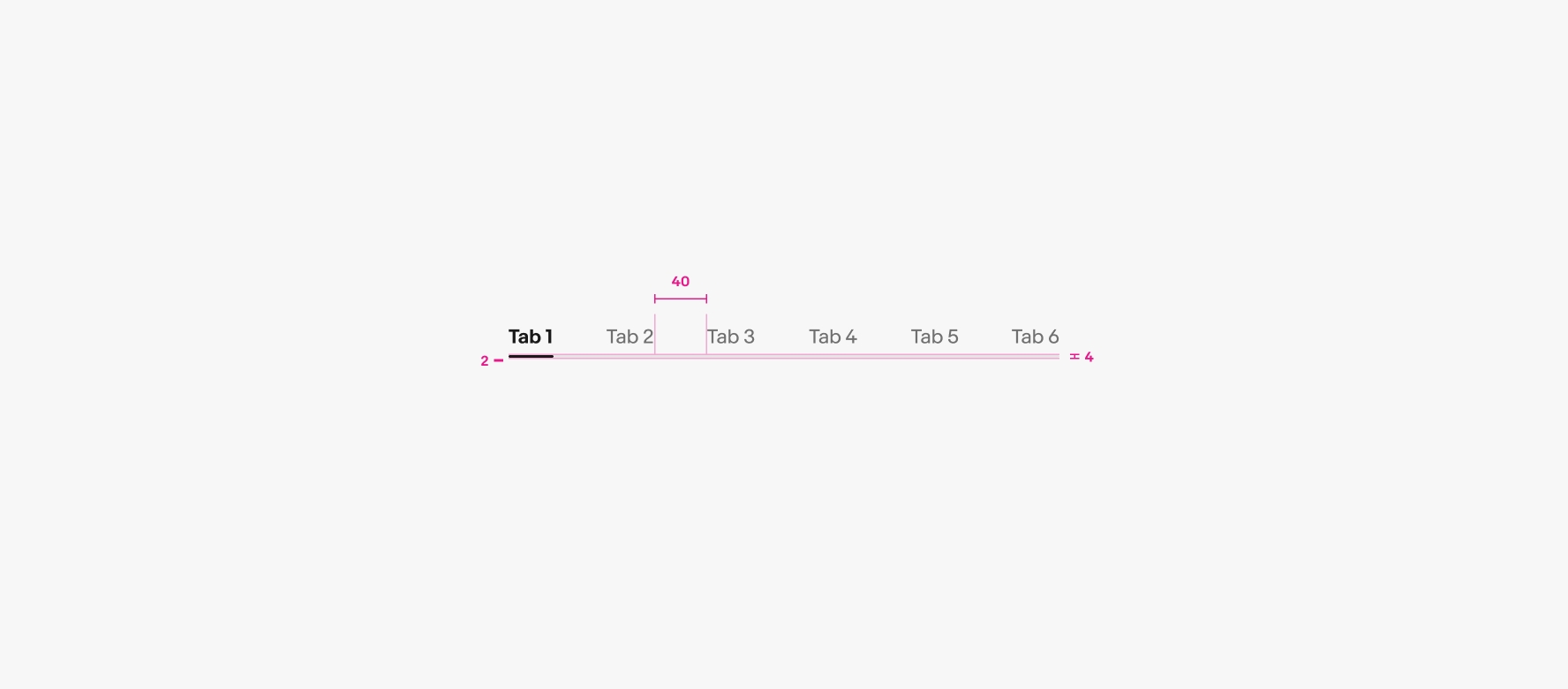
Space between tabs
Default spacing between tabs is 40px. However, the spacing will be adjusted automatically to ensure a peek on the right when tabs extend beyond the screen.

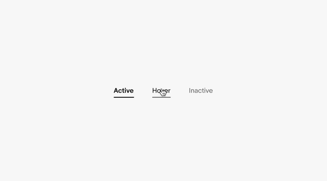
States
Tabs can be either active or inactive. When inactive, they have a hover state. Active state indicator lines span the width of their text.
Labels
Aim for fewer than 12 characters in tab labels, with a maximum length of 32 characters.
Small
Tabs are located beneath the header. If the content of the tabs exceeds the screen size, they can be scrolled left or right.
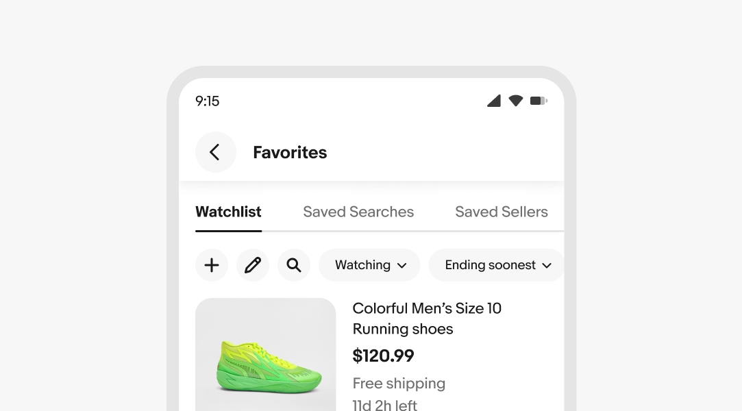
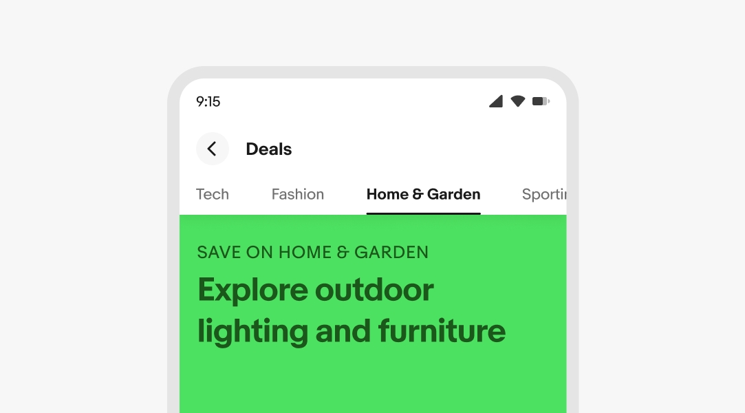
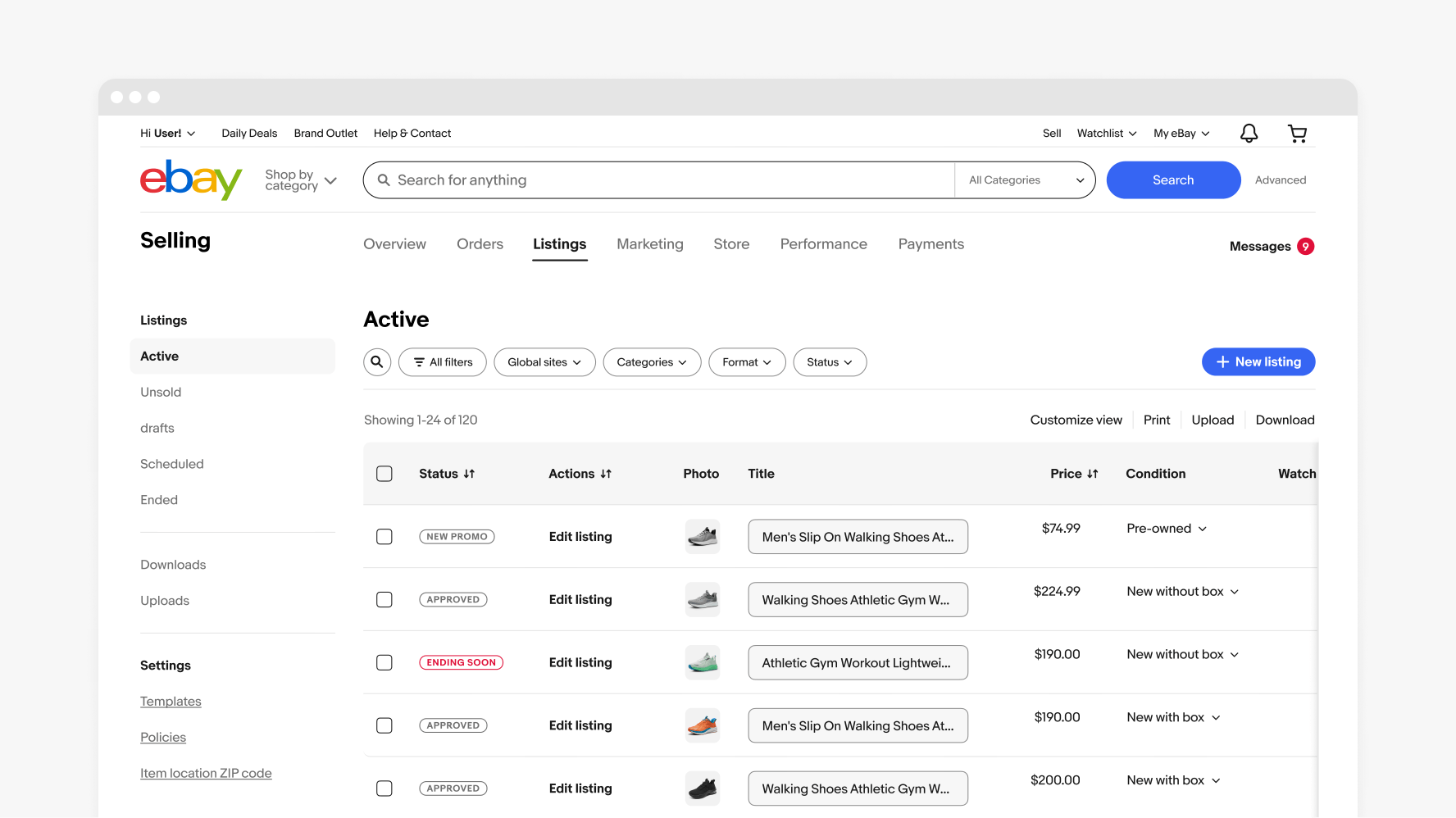
Medium and large
Tabs are typically placed at the top left in a contextual navigation bar located directly beneath the primary navigation.
Nesting
If required, use filtering for in-page content refinements.

Don’t use tabs for additional content refinements.
Label length
Do keep tab labels short and concise.

Avoid using long tab labels. Having fewer tabs will make them fit better on the screen and reduce the need for scrolling.
Do follow the maximum character length for tab labels.
Don’t exceed the 32 maximum character length. Labels should never wrap to two lines.