Skip to main contenteBay Playbook
  • Get started
  • Foundations
  • Design system
  • Expressions
  • Resources
  • Articles

Design system

  • Overview
    • Overview
    • Color
    • Dimension
    • Spacing
    • Typography
    • Breakpoints
    • Shadow
    • Shape
    • Opacity
    • Motion
    • Overview
    • Status
    • Accordion
    • Action bar
      • Overview
      • Inline notice
      • Page notice
      • Section notice
    • Avatar
    • Badge
    • Banner
    • Breadcrumb
      • Overview
      • Branded button
      • CTA button
      • Icon button
      • Link button
    • Card
    • Carousel
    • CCD
      • Filter chip
      • Input chip
      • Graphs
      • Metrics
    • Date picker
    • Dialog
    • Divider
    • Education notice
    • EEK rating and range
    • Expansion
      • Checkbox
      • Combobox
      • Dropdown
      • Numeric stepper
      • Password
      • Phone number
      • Radio button
      • Select list
      • Switch
      • Text area
      • Text field
    • Item tile
    • List row
      • Overview
      • Expressive loader
      • Skeleton loader
    • Media container
      • Top navigation bar
    • Pagination
    • Popover
    • Progress stepper
    • Search field
    • Section header
    • Segmented button
      • Overview
      • Context sheet
      • Focus sheet
    • Signal
    • Snackbar
    • Tab
    • Table
      • Tooltip
      • Tourtip
    • Toggle button group
    • Video player
    • Overview
    • Bulk editing
    • File uploading
      • Text link

Media container

v2.2

The media container displays a variety of visual content.

  • CSS
  • Marko
  • React
Media containerv2.2

On this page

  • Considerations
  • Anatomy
  • Properties
  • Behavior
  • Best practices
  • Specs
PreviousLoading: Skeleton loader
Things.People.Love.
  • Get started
  • Foundations
  • Design system
  • Expressions
  • Resources
  • Articles
  • About eBay Design
  • Careers
  • Press
  • Privacy policy
© 2026 eBay. All rights reserved.

eBay Evo, the eBay trademark, and the eBay logo are the intellectual property of eBay Inc.

    Considerations

    Discernible

    Media content will draw more attention than other elements within the UI.

    Common

    The container is familiar no matter the context or size.

    Unobtrusive

    The image container is a simple container for rich visual content. The container itself doesn’t distract from the content.
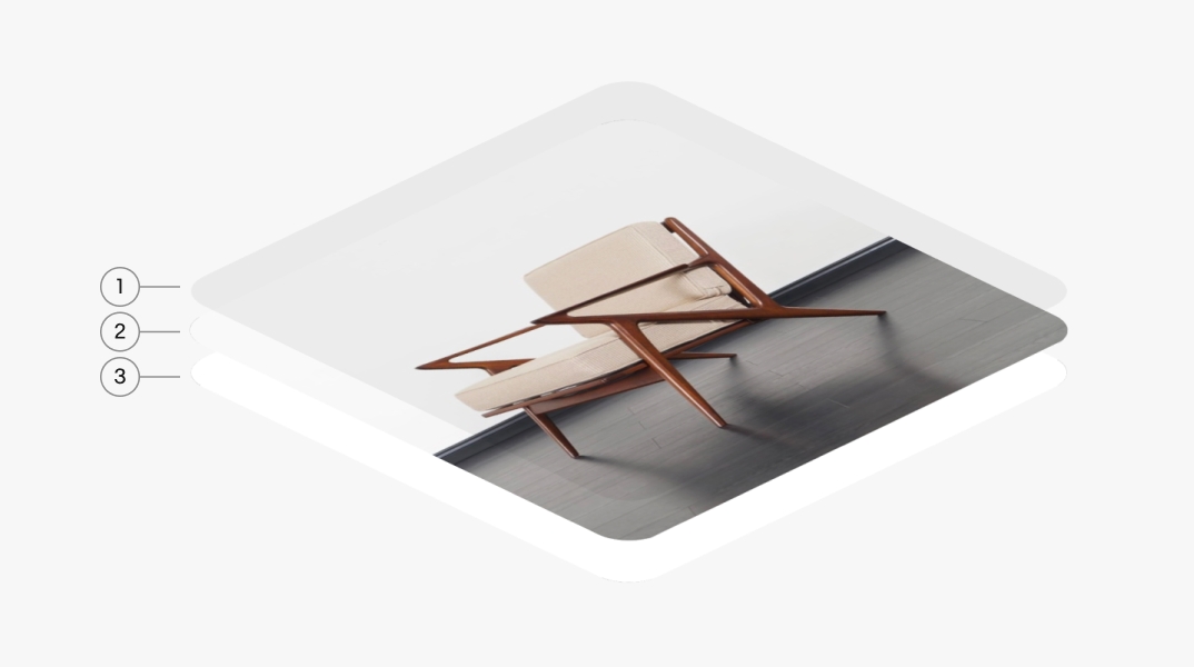
    Anatomy

    Properties

    Behavior

    Best practices

    Specs

    Anatomy of a media container. Number 1 points to the scrim. Number 2 points to the media. Number 3 points to the matte.
    1. Scrim
    2. Media
    3. Matte

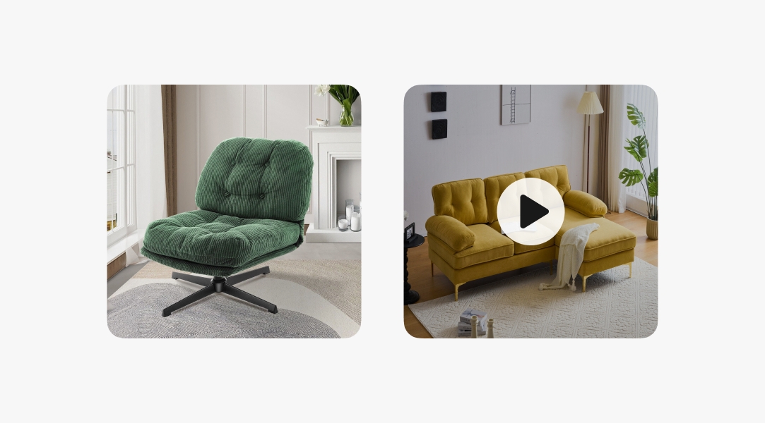
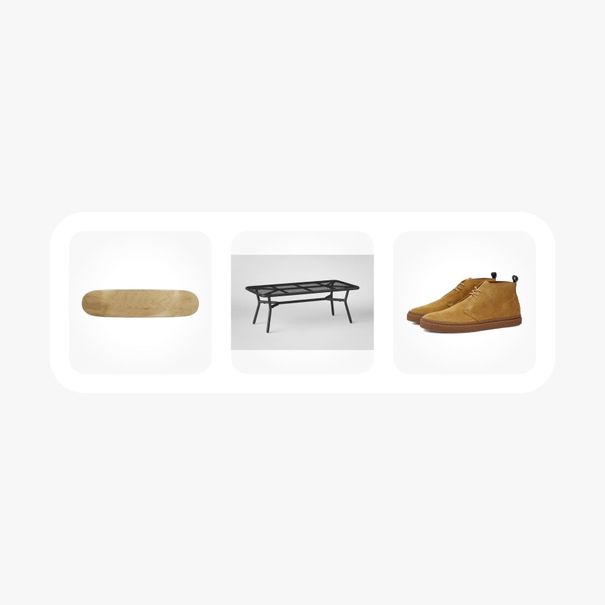
    The media container supports both still and animated graphics, including images, videos, GIFs, 3D assets, and Rive animations.

    Two media examples with furniture content. One is an image and the other is a video. The video has a play button.

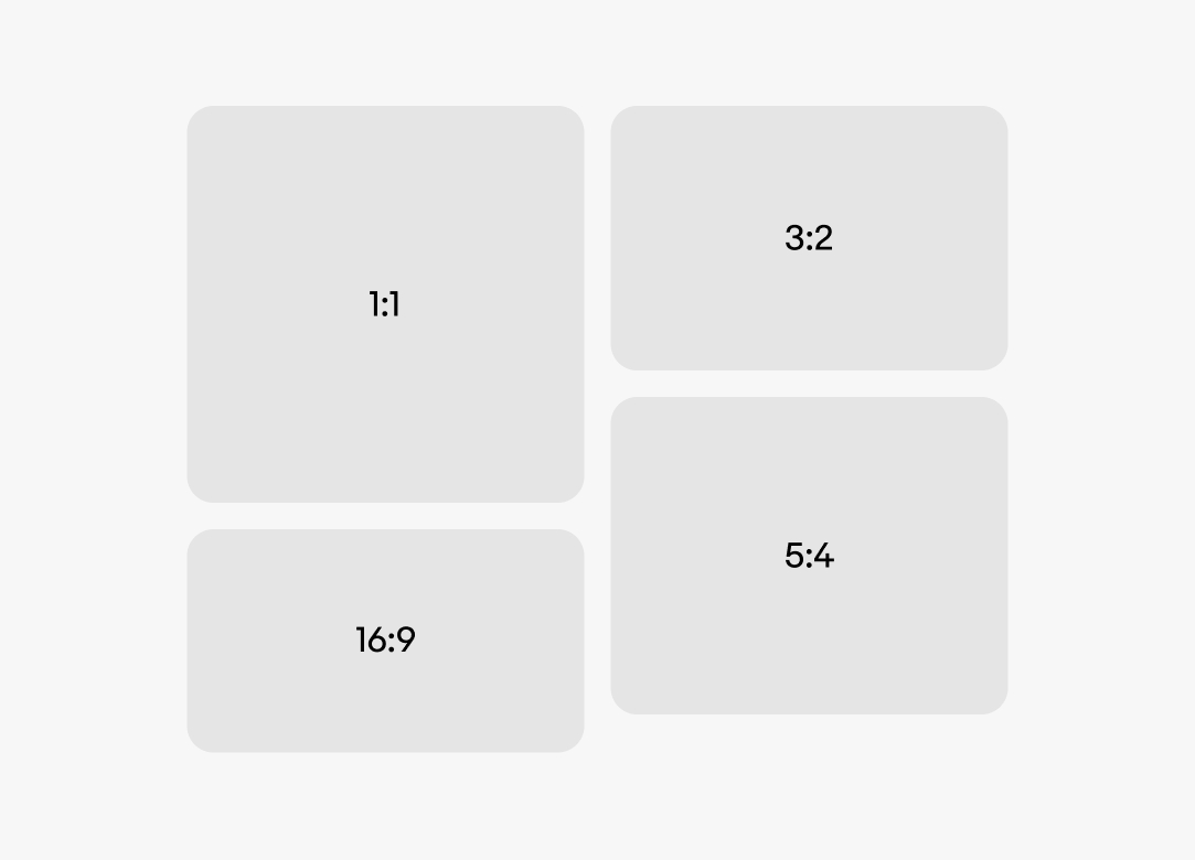
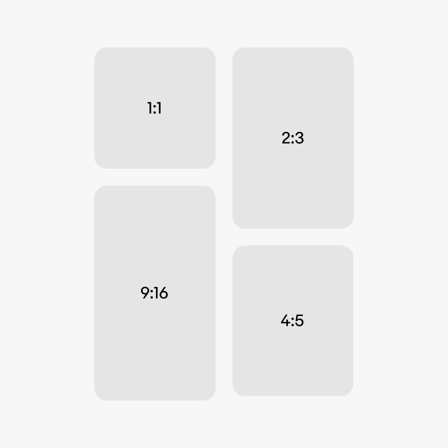
    There are 4 container ratios available, a 1:1, 2:3, 4:5, and 16:9. Certain contexts may force one ratio. Other contexts, like a masonry grid, can use the best ratio available for the content.

    The 4 media ratio options. They are 1:1, 2:3, 4:5, and 9:16.

    Orientation

    The container can be in a portrait or landscape orientation. The orientation depends on the content and its context. Some contexts may force a ratio and orientation. Others, like a masonry grid, may allow for the best orientation for the content.

    Landscape and portrait oriented images. Landscape has a skateboard and portrait has a full hockey stick.

    Fill type

    The container can either fill or fit its content. Fill is the default.
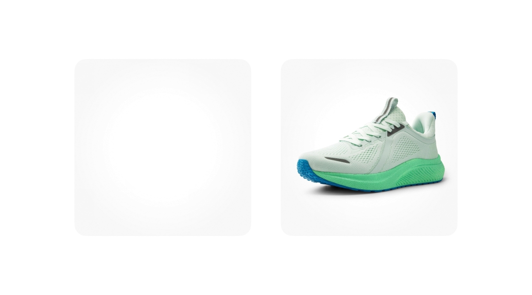
    Two images each with a fill and fit type. The fill type fills the space to all edges. The fit type has a letterbox effect.

    Auto-fill

    The media content can be set to automatically fill the container if the source media has a ratio close to the container’s. The default tolerance is 75% of the container.
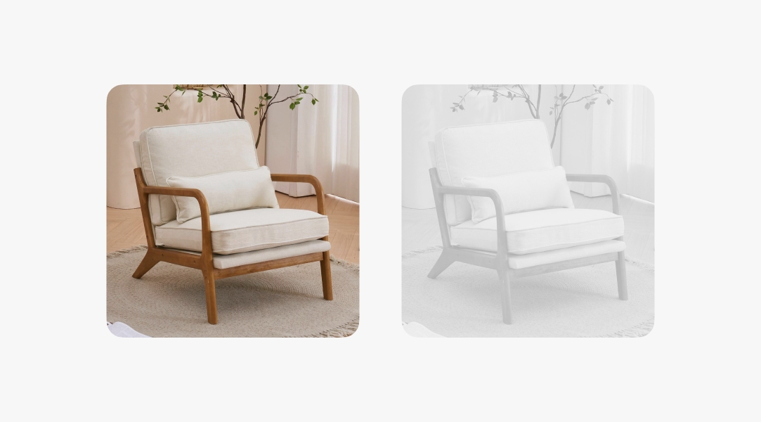
    An image showing the 75% auto-fill threshold marked in pink. The consecutive image shows the image auto fill to fill the space.

    Disabled

    Images used in interactive contexts can be disabled until prerequisites are met. Disabled images are desaturated and the opacity is lowered to reduce its contrast against enabled content.
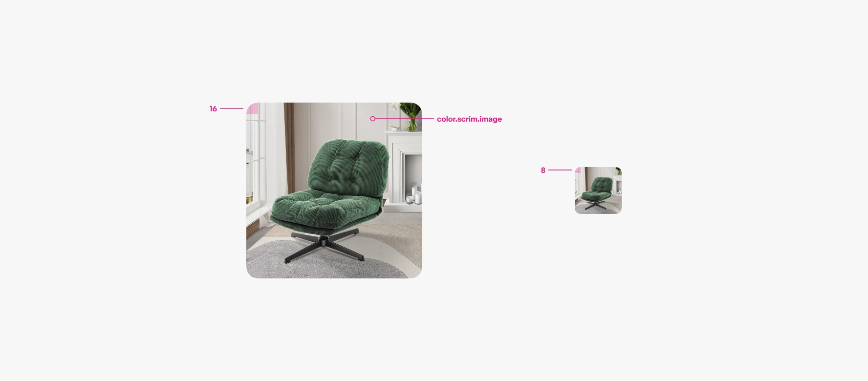
    Scrim

    A light radial scrim is applied over images by default to define a consistent shape. The radial gradient leaves a percentage of the center clear to avoid altering key details of the image. The scrim can be toggled off and is generally not used for assets other than photography and video.
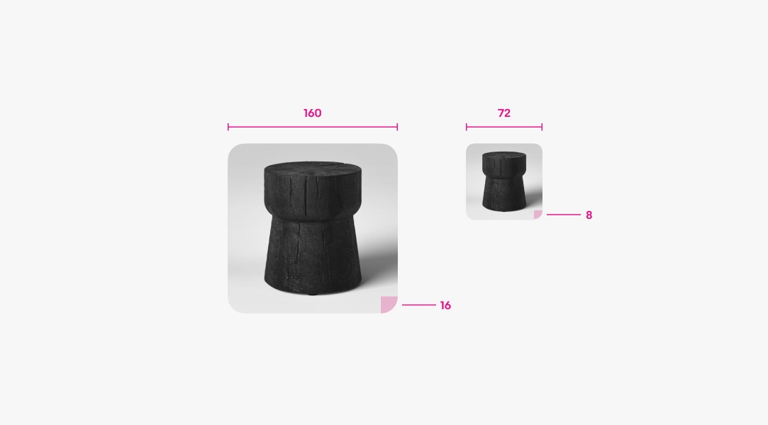
    A scrim fill placed next to an image.

    Border radius

    The border radius adjusts according to the size of the container. The radius is 16px for images 80x80 and larger. Containers smaller than 80x80 use 8px.
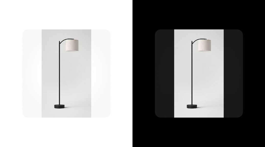
    Two containers with the radius called out. The first is 160px with 16px radius. The second is 72px with 8px radius.

    Dark mode

    The image scrim remains the same across light and dark mode. However, the matte behind the image adjusts between modes to maintain the container shape when images are set to fit.

    An container with a letter-boxed image. The scrim adjusts between light and dark mode.

    Ratio

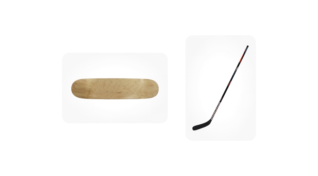
    Do use one of the 4 ratios available.

    The four approved ratios. They are 1:1, 2:3, 16:9, and 4:5.

    Don’t use arbitrary ratios. This will introduce inconsistency and result in visually distracting layouts.

    Arbitrary unapproved ratios. They are 5:6, 1:2, 3:5, and 3:4.

    Fill type

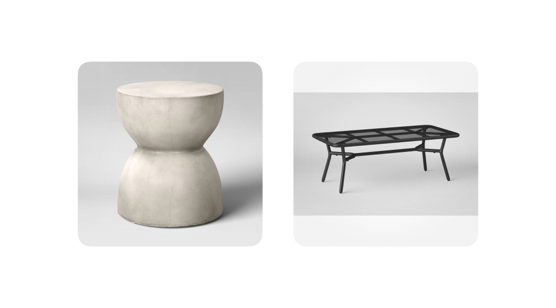
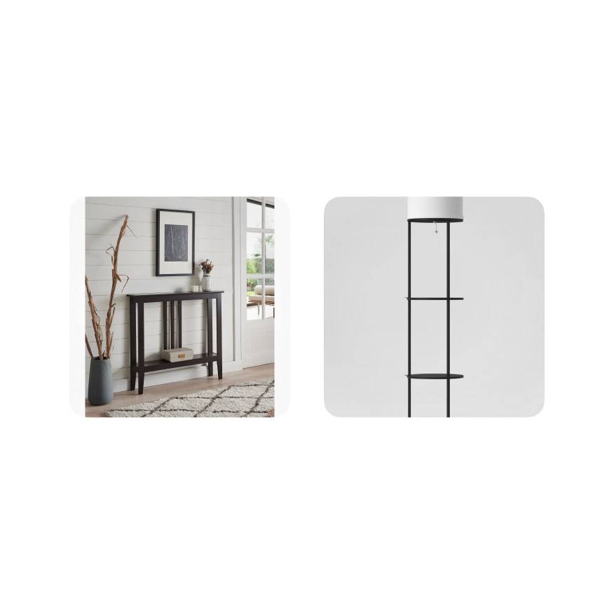
    Do choose to fill the content whenever possible. Only fit content with extreme or unusual dimensions.

    Containers with images that fit and fill properly.

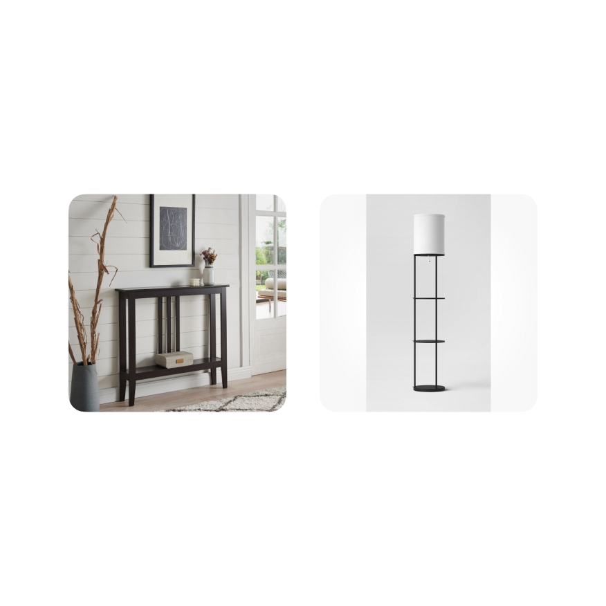
    Don’t fit the content if it can fill without losing detail. Don’t fill the content if it has an unusual ratio as this will crop important details.

    Containers with images that don’t use fill or fit properly for the given images.

    Scrim

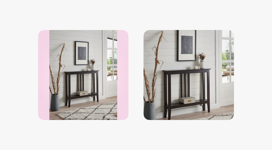
    Do keep the scrim to maintain a consistent shape across item tiles in a collection.

    Three images with the image scrim applied. A clear container shape is visible across all.

    Don’t override the scrim to adjust its opacity, as this will create visual inconsistency between media.

    Three images without the image scrim applied. No clear container shape is visible and the images look random in size.
    A large container with 16px corner radius. “color.scrim.image” is called out. A small container with 8px corner radius.