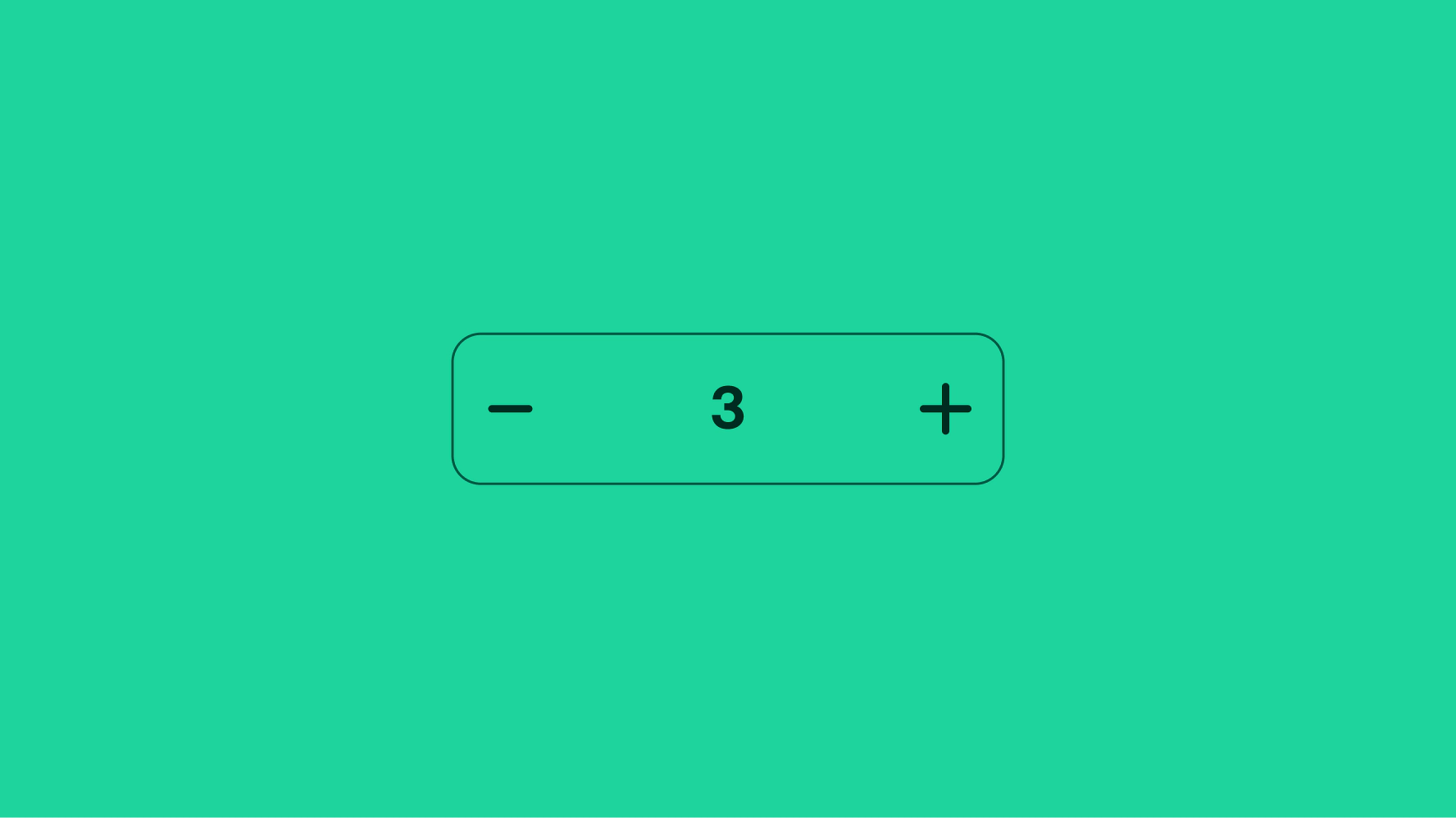
Numeric stepper
A numeric stepper is a control for editing a numeric value with buttons to decrease or increase the value.
- CSS
- Marko
- React
Friendly
Numeric stepper is interactive and provides subtle delight to the experience.
Control
The stepper gives quick control to adjust numeric values through tap or type.
Lightweight
Numeric steppers don’t dominate or interrupt the hierarchy. They fit neatly into a form or page content.

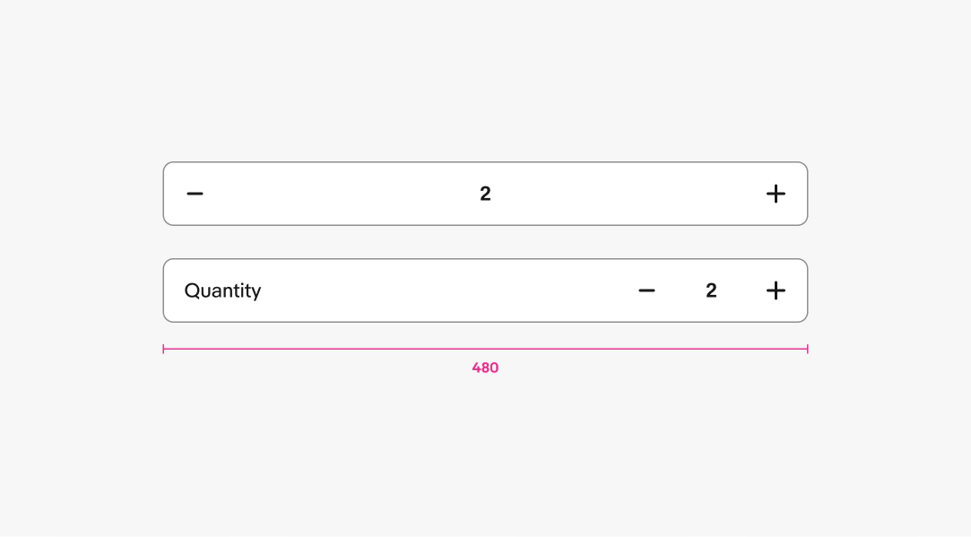
- Label
- Hint text
- Container
- Decrease value
- Value
- Increase value
Label
Recommended. The label names what the user is adjusting.
- Use sentence case
- No ending punctuation
- Use a noun or noun phrase
- Aim for 1–3 words

Layout
There are two layouts available for labels: compact and inline. The compact option hugs the actions and value. The inline option has a label positioned horizontally within the stepper.
Consider using the inline layout option when placing the stepper in a form. The compact option should be used when paired with a parent item or associated content, such as an item preview in a cart or when the context is clear and obvious.

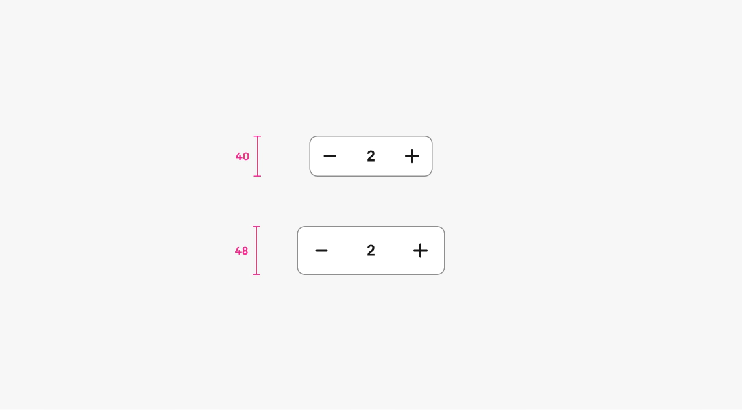
Size
There are 2 sizes available for the stepper: default and large.
Hint text
Hint text appears below the stepper and should be used sparingly. Use it to clarify the value, signal urgency, or communicate a limit. Only show quantity context when the number is low enough to influence the user’s decision.
- Use sentence case
- No ending punctuation
- Use numerals for numbers
- Use “only” or “maximum” to signal constraints

Minimum value
A minimum value may be set for a stepper, such as a minimum price or item quantity. The default minimum value is zero.
When the minimum value is zero, the decrease button transitions to a delete button when the next action decrements to zero.
When the minimum value is greater than zero, the decrement button is disabled when the value matches the minimum value.
Video description: An animation showing an example of the numeric stepper when it reaches the minimum quantity available. As the user selects either button, the quantity number animates directionally up or down, bringing in the next value in sequence. When the minimum quantity is reached, the icon turns grey and receives a horizontal bump movement to bring further attention to the user. The numeric value also overshoots its final position to emphasize that as well.
Maximum value
A maximum value may be set for a stepper. Once the max value is reached the “add” action is set to a disabled state. The default maximum value is null.
Video description: An animation showing an example of the numeric stepper when it reaches the maximum quantity available. As the user selects either button, the quantity number animates directionally up or down, bringing in the next value in sequence. When the maximum quantity is reached, the icon turns grey and receives a horizontal bump movement to bring further attention to the user. The numeric value also overshoots its final position to emphasize that as well.
Delete
When the minimum value is zero, the decrease button can transitions to a delete button when the next action decreases to zero or removes the associated content.
When the minimum value is greater than zero, the delete button is disabled when the value matches the minimum value.
CAUTION
The delete action is only to be used when the numeric stepper is pair or associated with an item tile such as item list in cart.
Video description: An animation showing the delete function on our stepper. When the user has reached the lowest possible value when in screens such as cart, the icon is a trash can. When selected the container for that item swipes off screen to the left, revealing a delete text and trash can icon within a red color block. The lid of the trash can icon animates up, and then lands back in position. The entire red block then animates up off screen, and the item below moves up into its place.
Layer states
Hover is applied at each tapper. Focus is handled at the container level. A disabled state can be applied to the tappers or the container. See Interaction States for more details on layer state styling.

Truncation and text wrapping
The title wraps to a second line when extending beyond the width of its container.
The value is clipped or truncated if the value extends beyond the width of its container.

Tap targets
Each focusable element has a minimum tap target to avoid mistaken clicks or taps.

Width
Numeric steppers fills the width of it’s parent element up to a max width of 480px.
Input
Tapping or clicking on the value transitions the field to a focused state that accepts a custom input value, similar to a text field. The typing indicator appears at the trailing end of the value and the device keyboard is presented on phones and tablets.

Error
An error message appears when the value is invalid. The message should be concise, direct, and clearly explain how to address the error. The error message replaces any visible helper text and reappears when the error is resolved.

Small

Medium and large

Whole numbers
Do always increment and decrement by whole numbers.

Do not use decimals in the value as the range is too large for steppers.

Text fields vs. Numeric steppers
Do use a text input when flexibility in value entry is required or when strict range boundaries are not critical to the user's task.

Do not use a numeric stepper when users need to input custom values or when precise range limits are not crucial to the experience.

Messaging
Do keep hint text outside of the stepper as they are strictly for unit values.

Do not add subtitles, promos or other info inside of steppers.

