Section header

v4.1

Section headers separate bodies of content to create hierarchy throughout the experience. They help drive focus and navigation.

  • CSS
  • Marko
  • React
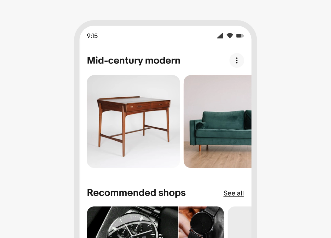
Stylized artwork of a section header.

Considerations

Anchoring

Section headers establish hierarchy and delineation between groups of content.

Scannable

Headers allow users to quickly scan content and identify where they’d like to focus.

Succinct

Headers are short and summarize the content they group.

Anatomy

A section header with 3 elements numbered: 1. Title, 2. Subtitle, 3. Trailing accessory.
  1. Title
  2. Subtitle
  3. Trailing accessory

Properties

Title

Required. The title explains why these items are grouped together so users can quickly orient themselves.

  • Use sentence case, except for proper nouns and branded terms
  • No ending punctuation
  • Use a noun or noun phrase
  • Aim for 1-3 words
A ‘Mid Century Modern’ section header title.

Subtitle

Optional. Subtitles provide context beyond the title, such as an applied filter or result count. Don't restate the title.

  • Use sentence case
  • No ending punctuation
  • Use a short phrase
A ‘Recommended for you’ section header title with a ‘Find answers and inspiration’ subtitle.

Trailing action

Optional. This can be a link button or an icon button.

Link button

The link button leads to a page with more results.

"See all" is the default label and works when the title provides enough context. For less obvious destinations, use a more specific label (e.g., “See all cameras”).

Learn more about writing for link buttons.

Overflow icon button

If there is more than one additional action, they will collapse into an overflow icon button.
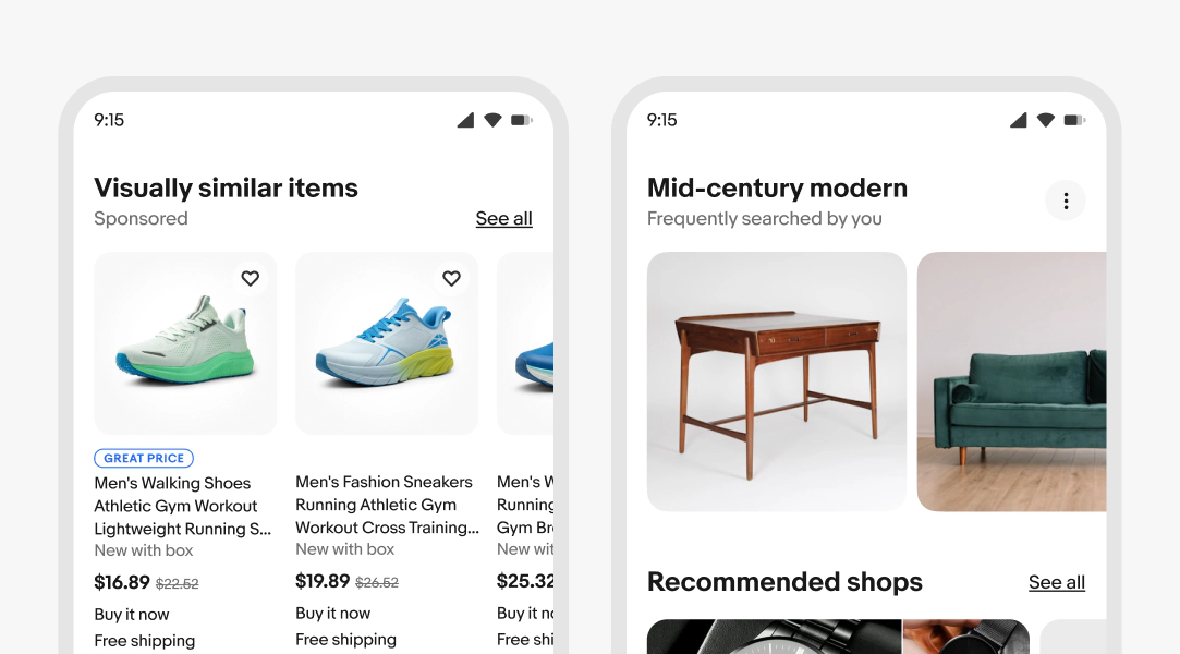
A ‘Visually similar items’ section header title, a ‘Sponsored’ subtitle, and a ‘See all’ text link. A “Mid Century Modern header title, a “Frequently searched by you” subtitle and and overflow icon button.

Behavior

Text wrapping

The title and subtitle will wrap to multiple lines when wider than the container. Aim for no more than 2 lines where possible.

The trailing accessory will align differently depending on the type of accessory. Links will align to the baseline of the title or subtitle, and icon buttons will vertically center.

Three examples of text wrapping in section headers: The first example displays the title wrapping to two lines, and the subtitle below spanning one line. The trailing accessory (‘See all’ text link) is aligned to the baseline of the subtitle. The second example displays the title wrapping to two lines, and the trailing accessory (‘See all’ text link) is aligned to the baseline of the title. The third example displays the title wrapping to two lines, and the subtitle below spanning one line. The overflow icon button is vertically centered to the title and subtitle.

Screen sizes

Small

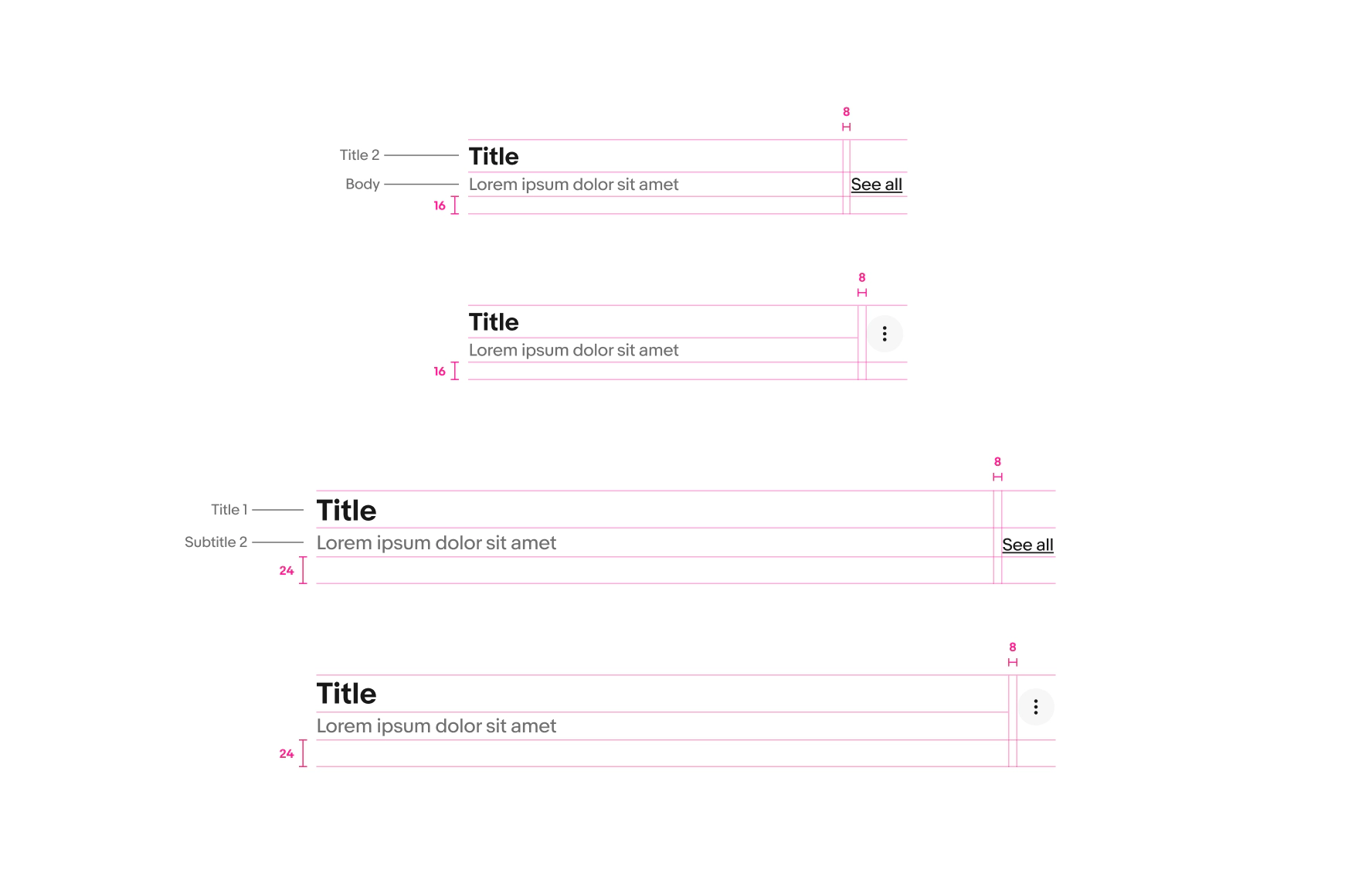
The title and link button text are smaller on small screens. The spacing below the title is also smaller.
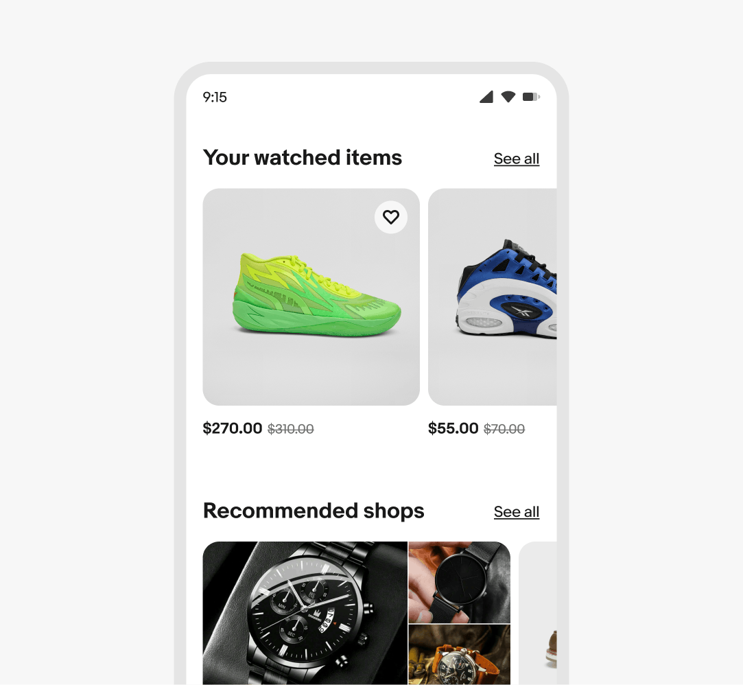
Section headers are shown on an eBay mobile screen.

Medium and large

Font sizes and bottom padding increase on larger screens.

Section headers are shown on a larger eBay screen.

Best practices

Length

Keep section headers short. Aim for a single line and use subtitles to add more detail.

A section header title spanning one line and a subtitle spanning two lines, with a ‘See all’ link.

Don’t let titles get too wordy. Simplify the title as much as possible, and add a 1-2 line subtitle if necessary.

A section header title spanning three lines with a ‘See all’ link.

Link button text

Do use the default link button content.
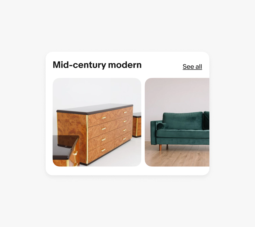
A section header title, subtitle, and a ‘See all’ link.

Don’t change the link button content.
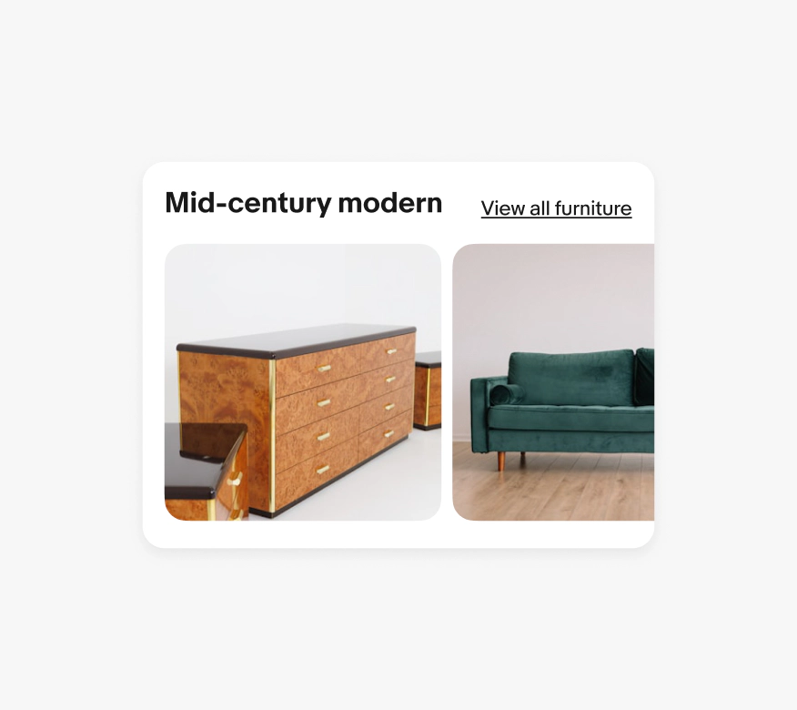
A section header title, subtitle, and a ‘View all furniture’ link.

Specs

Section headers are shown with specs highlighted. Specs for section headers on compact small screens: The Title is sized to the ‘Title 2’ type style, the subtitle is sized to the ‘Body’ type style. The padding below the section header is 16px, and the padding between the titles and trailing accessories (text link and overflow icon button) is 16px. Specs for section headers on larger screens: The Title is sized to the ‘Title 1’ type style, the subtitle is sized to the ‘Subtitle 2’ type style. The padding below the section header is 24px, and the padding between the titles and trailing accessories (text link and overflow icon button) is 16px.