Select list
v4.0
Select list is a web-only, form-based component that discloses a simple list of actions or options using the browser’s native <select> element.
- CSS
- Marko
- React

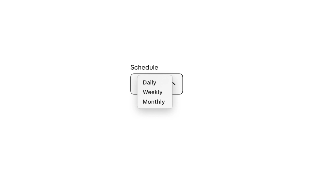
Required. The label names the category of options in the list.
The value is the option the user selects. Each option should be short, distinct, and parallel.
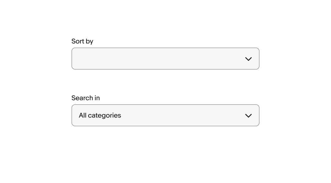
The default value is what the select list shows before user makes a selection. It can be empty or set to a pre-selected value.
Empty value (default)
Pre-selected value
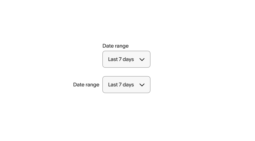
The label can be positioned above or beside the field.
Related fields in the same form or group should use the same label position. Consistent label placement helps users scan and compare fields quickly.
The label can be visible or hidden.
A visible label is strongly recommended to maintain accessibility and usability. However, if content elsewhere on the page is sufficiently acting as a label, like a section header or title element, the visual label can be hidden.
There are two styles available for select lists, bordered and Borderless.
Bordered: has a visible container with a stroke for increased prominence.
Borderless: has no visible container for lower prominence.
Select lists are available in a large and small size.
The list style is determined by the browser and platform.
Select works the same across all screen sizes. The list menu style is determined by the device’s browser and operating system.
Select works the same across all screen sizes. The list menu style is determined by the device’s browser and operating system. Larger screens will try opening the list with the selected value aligned with the field’s value.
Do use a select list when the list values are simple and short.
Don’t use a select list if the list values need to use subtext or grouping. Use a Dropdown instead.
Do use a select list when the list is small and simple.
Don’t use a select list for extra large lists that could benefit from filtering. Use a Combobox instead.
Do use a select list for lists larger than 3 items.
Don’t use a select list for 3 or fewer items. Use a Radio button group instead.
Do use the same selection style within groups. If some selections require the additional functionality of a Dropdown, use a Dropdown for all items in the group.
Don’t mix selection styles in the same group.
Do use select lists within forms.
Don’t use select lists outside of a form as it is a traditionally form-based element.