Badge
A badge is a visual indicator that notifies users of numeric values.
- CSS
- Marko
- React
Noticeable
Badges stand out from the surrounding UI to highlight important information.
Minimal
Badges are just loud enough—easily noticed but not distracting.
Global
A badge tracks notifications globally across the experience.
- Label
- Container
Labels
Labels are required to indicate the number of notifications available.
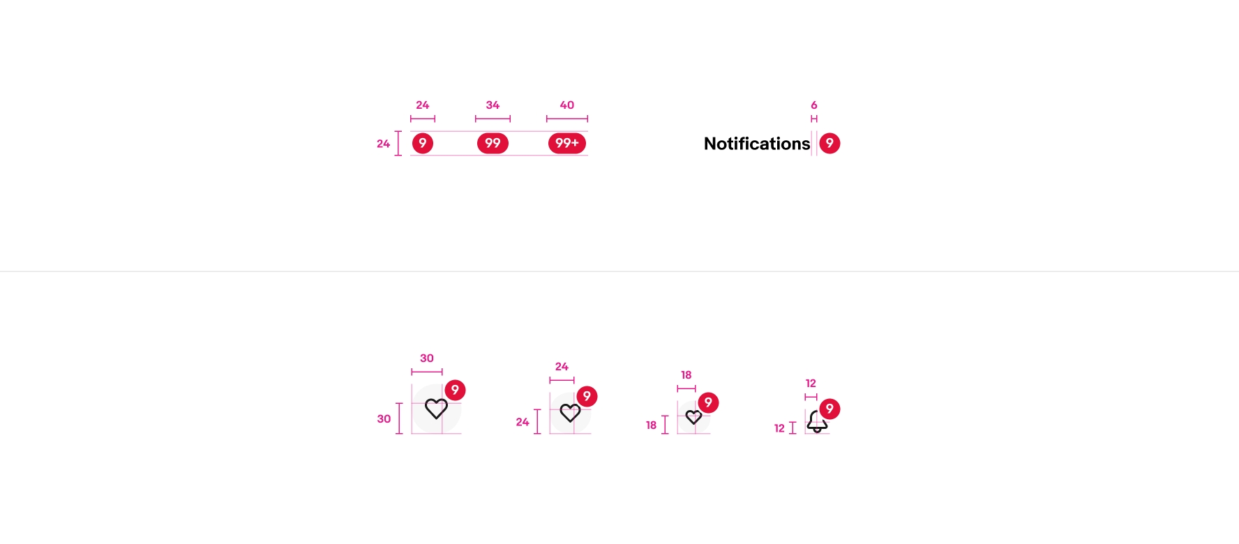
Size
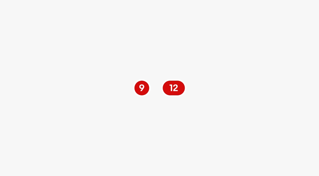
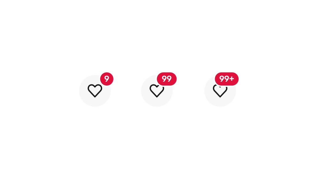
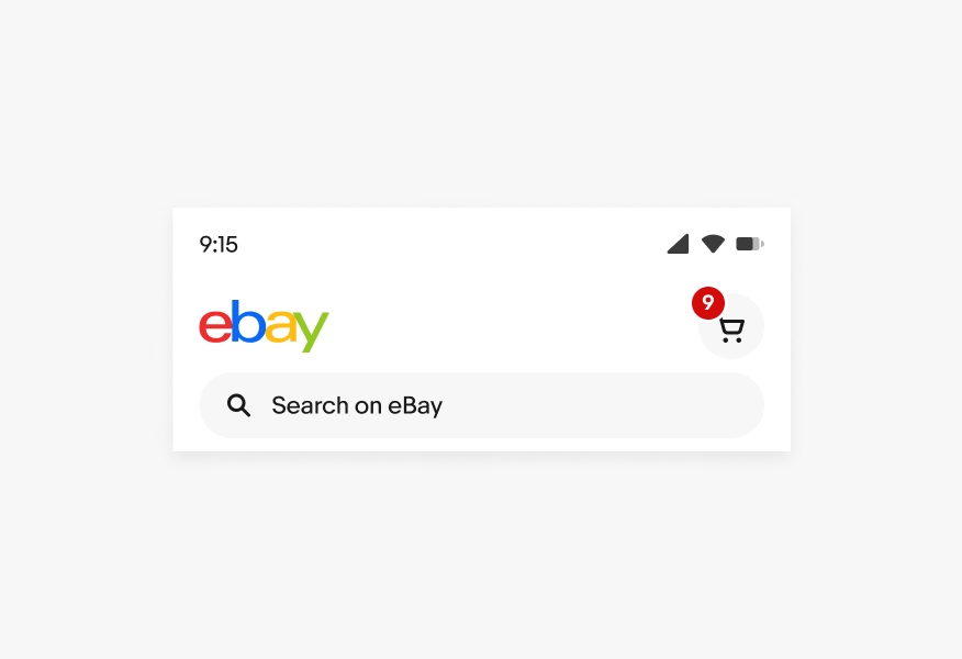
There are 3 sizes available to fit values in the ones, tens, and hundreds values.
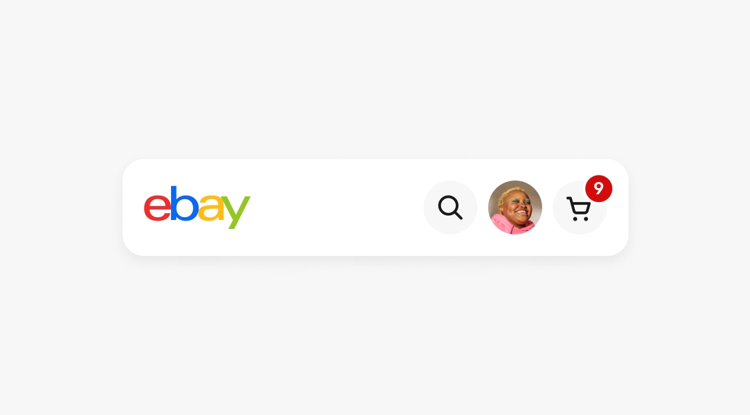
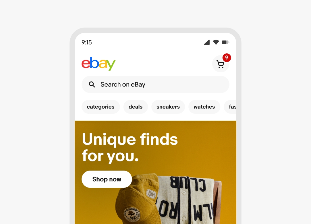
Icon buttons
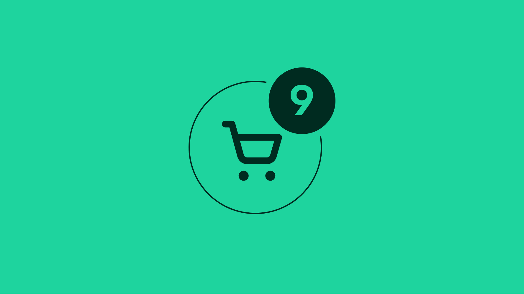
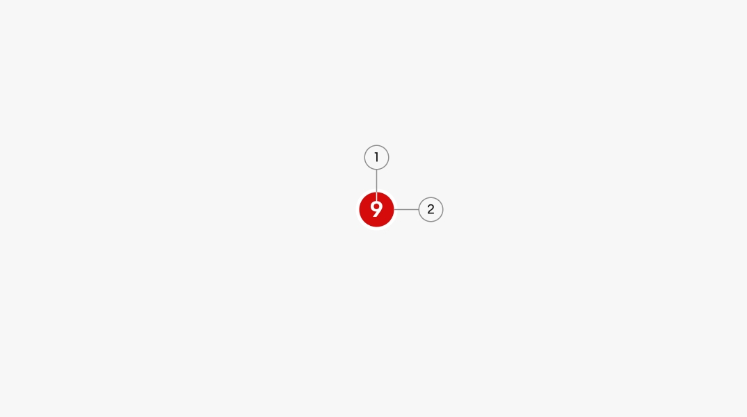
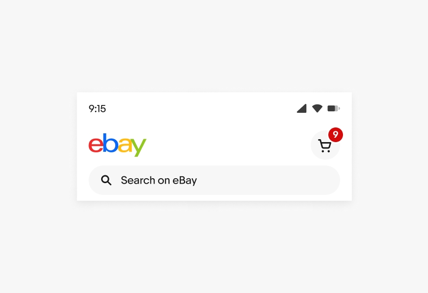
Badges are placed in the top-right quadrant of an icon button to avoid obscuring the icon within the button.
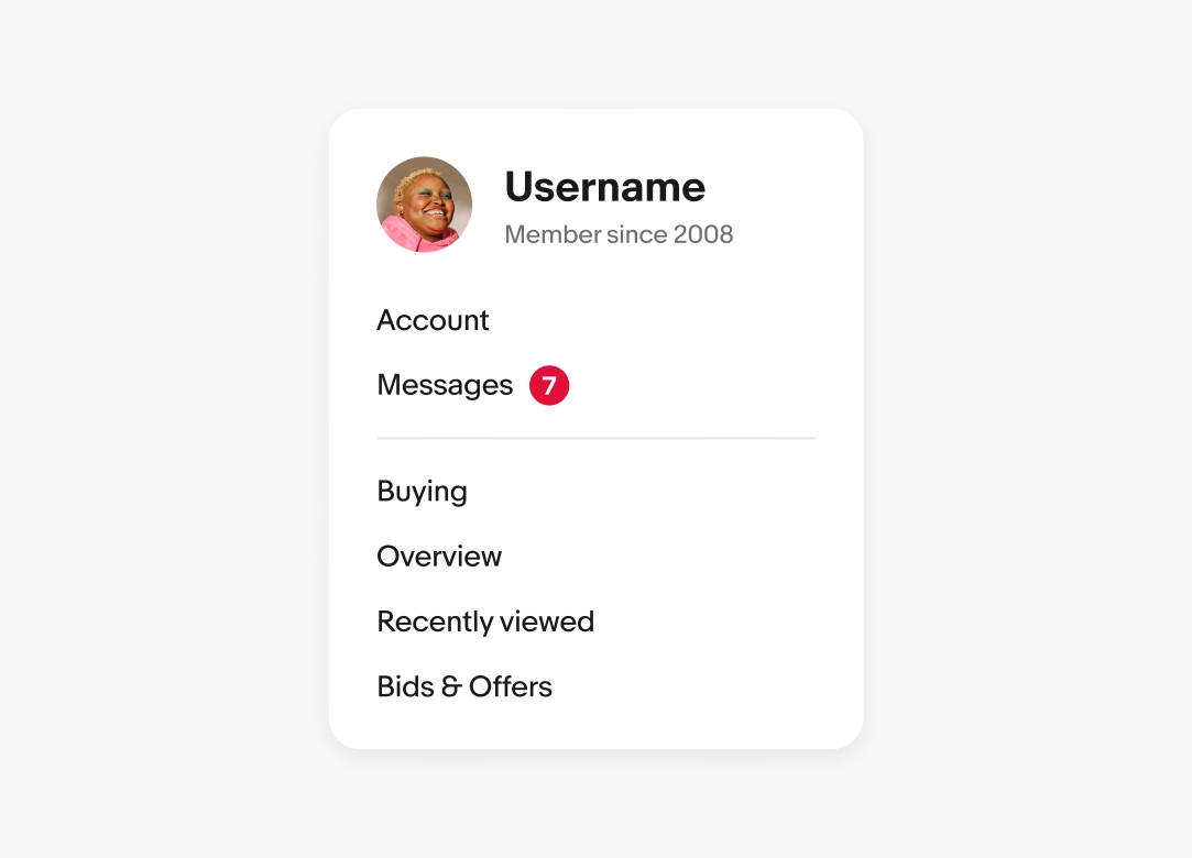
Inline
When used with text labels, badges are placed to the right and vertically aligned to the text cap height.
Maximum
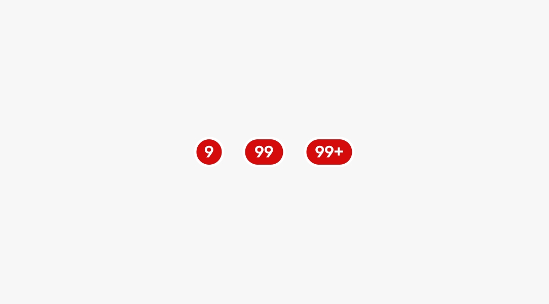
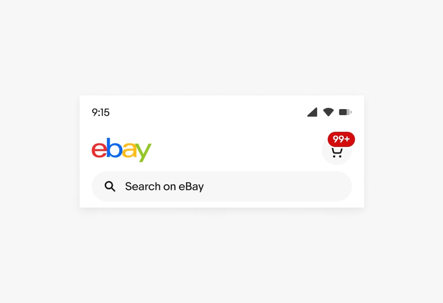
The maximum number shown is 99. When there are more than 99 notifications, a “+” will be appended to the label.
Small
Large
Placement
Do place badges in the top-right of icon buttons or inline to the right of a text label.
Don’t customize the placement of badges.
Maximum
Do adhere to our maximum values.
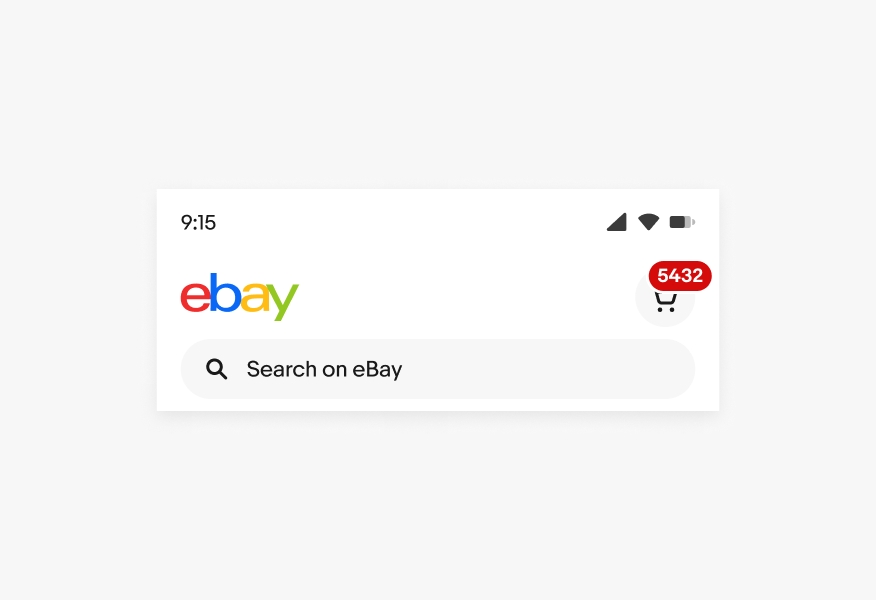
Don’t customize the badge to allow for numbers larger than 99.