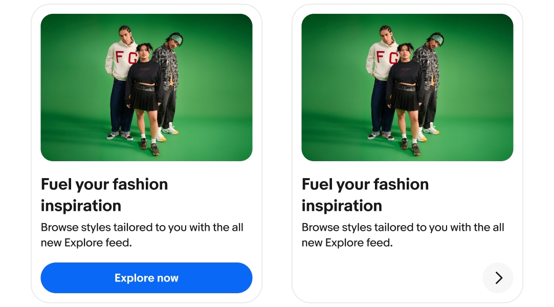
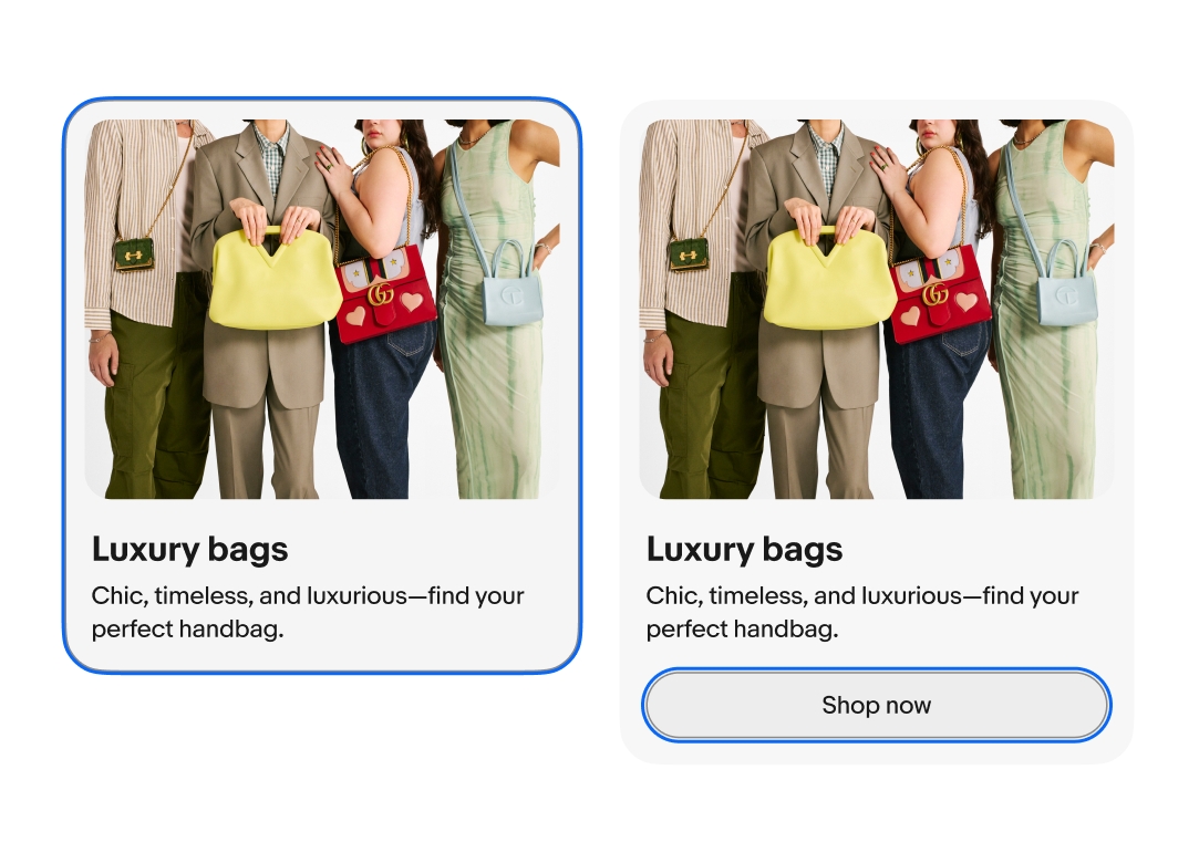
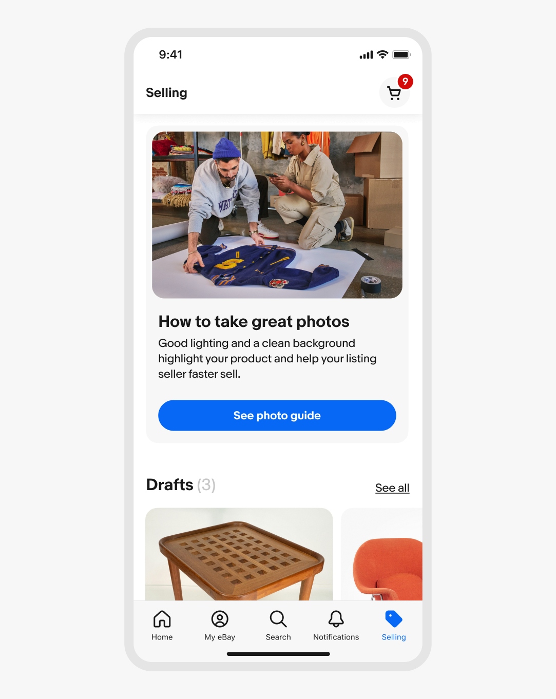
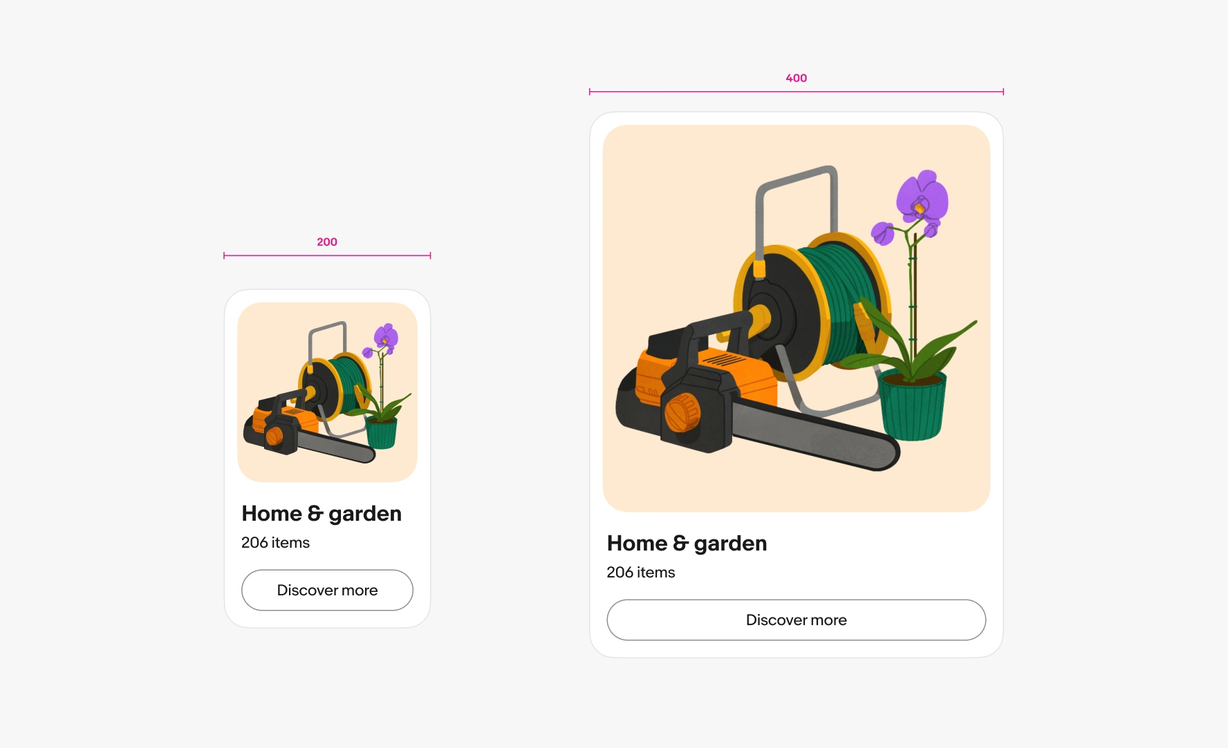
Card
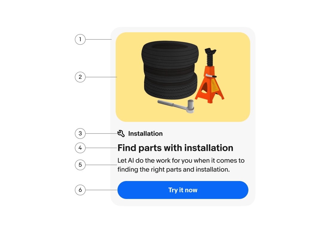
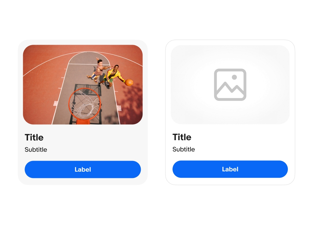
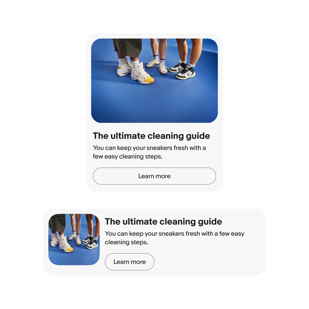
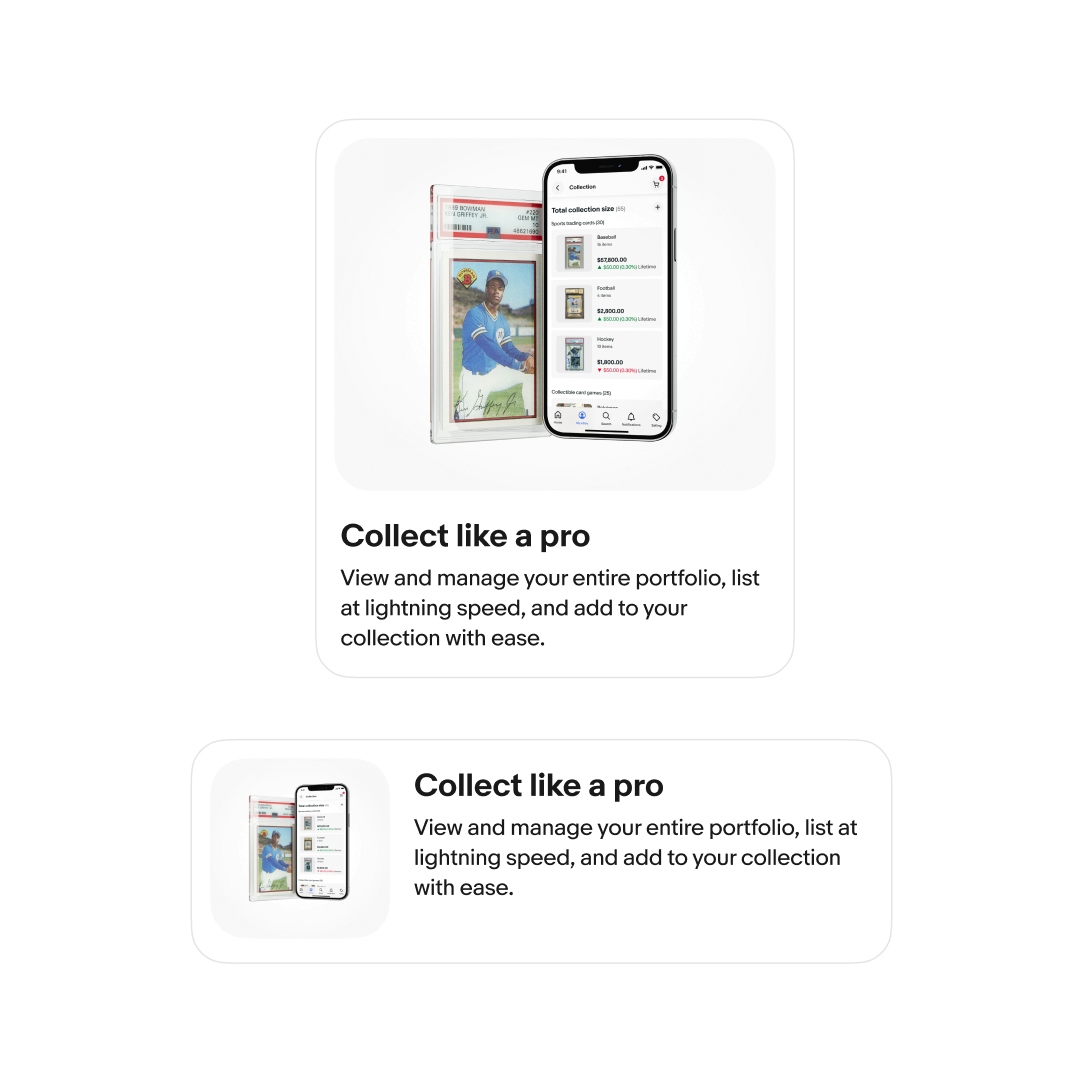
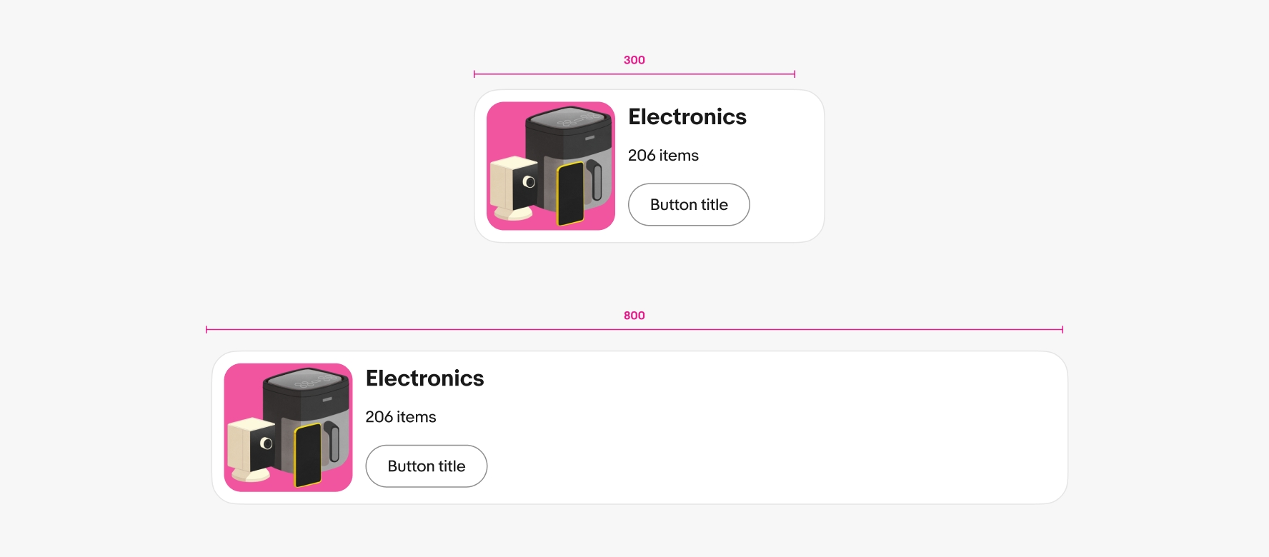
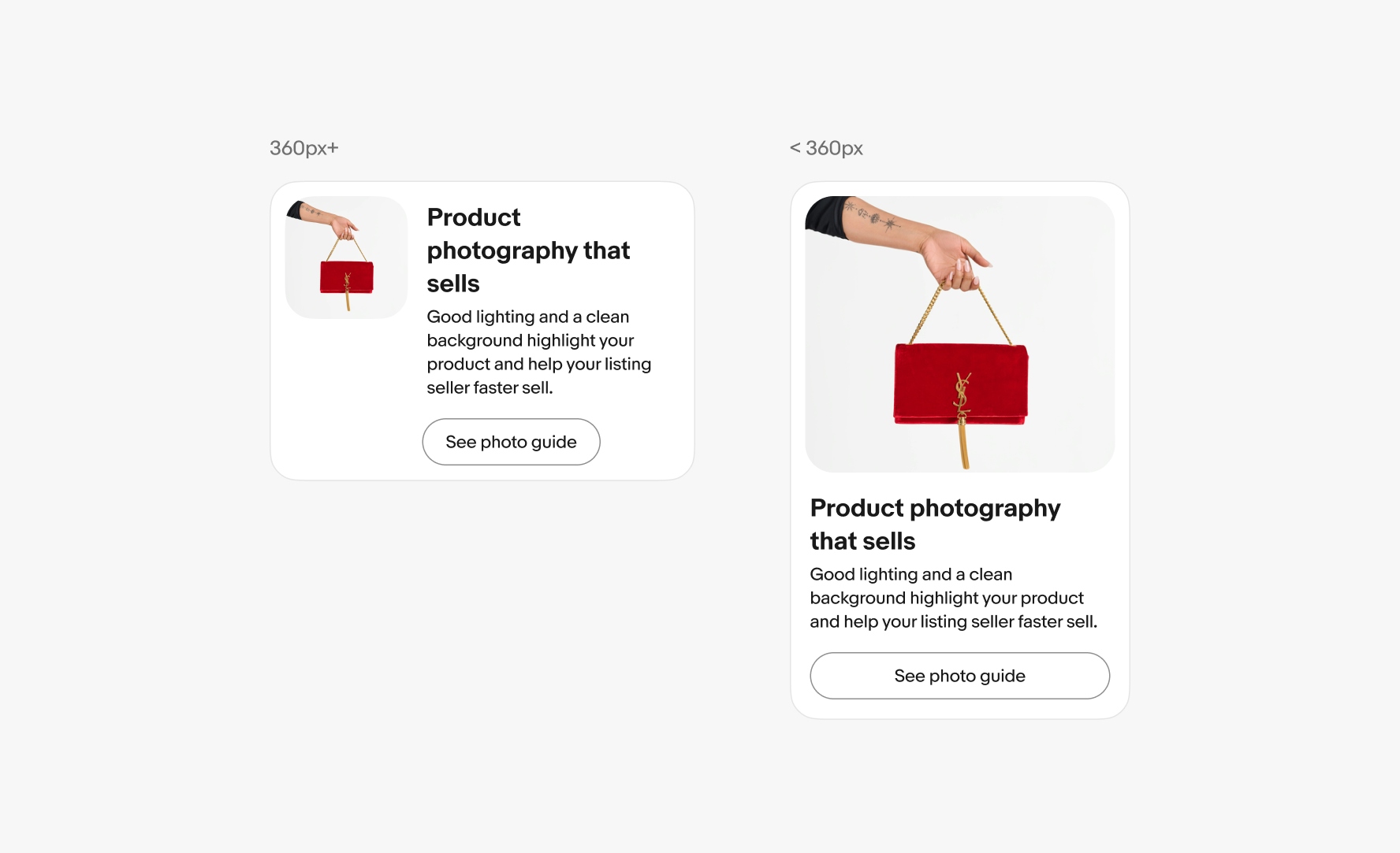
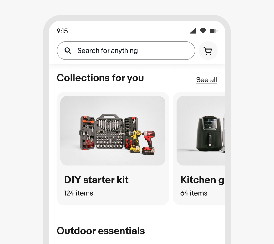
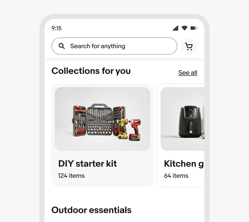
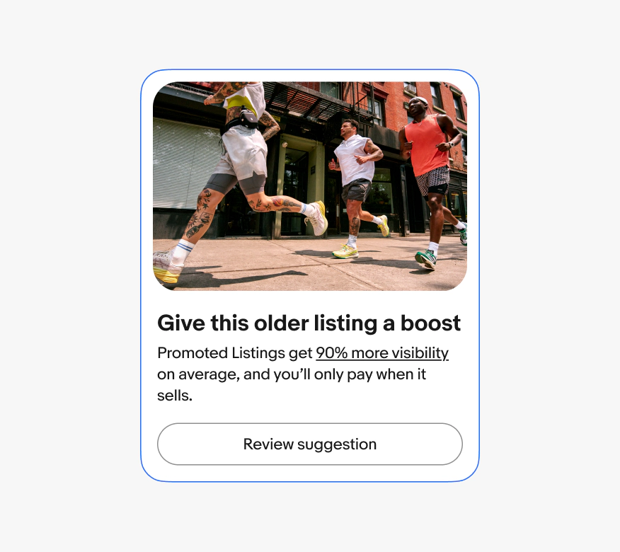
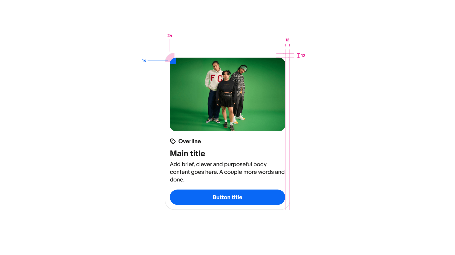
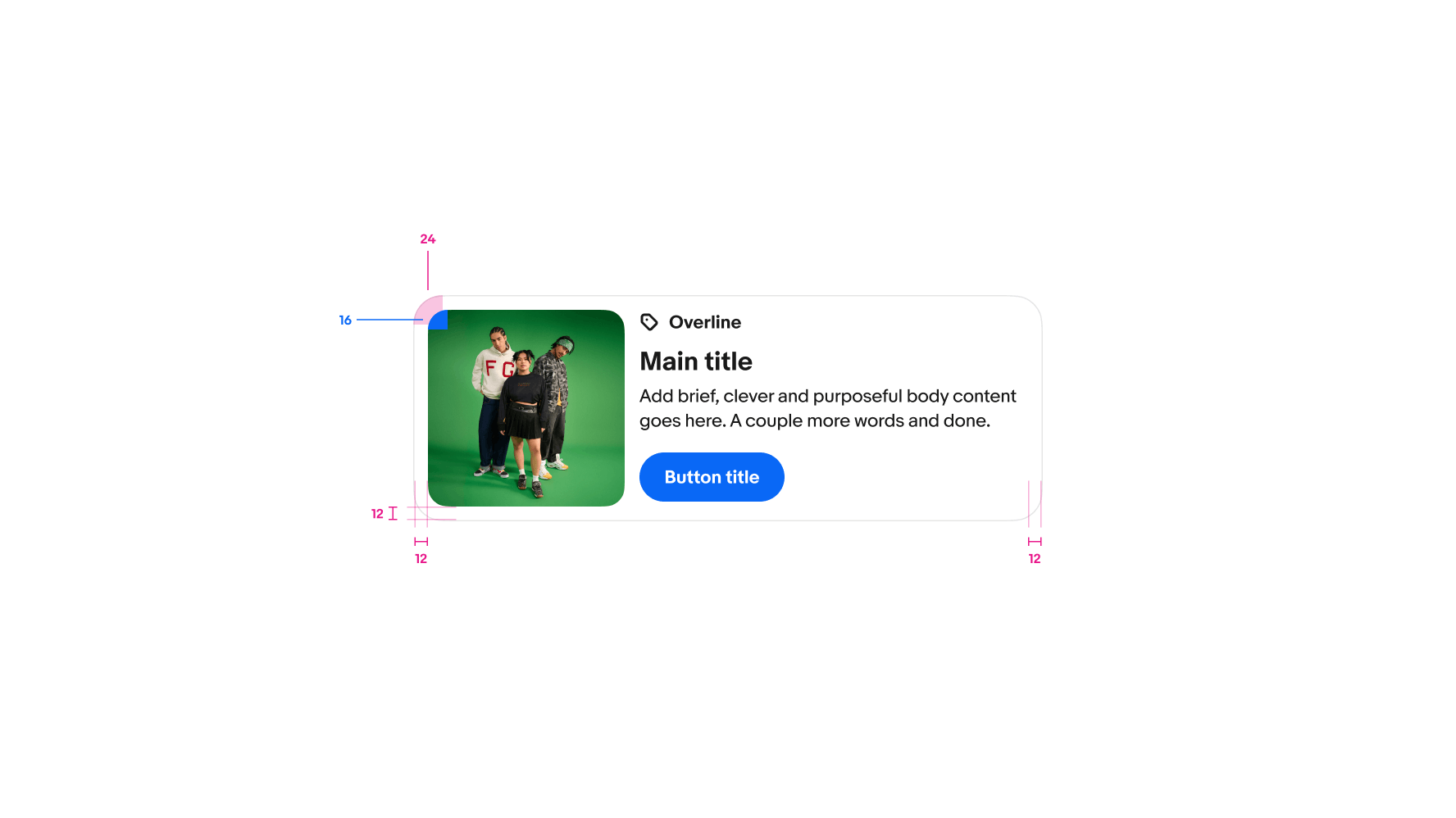
Cards display a distinct collection of content and actions in a flexible container.

Contained
Each card is a standalone object, even within a card group. The actions and information within one card is distinct from others.
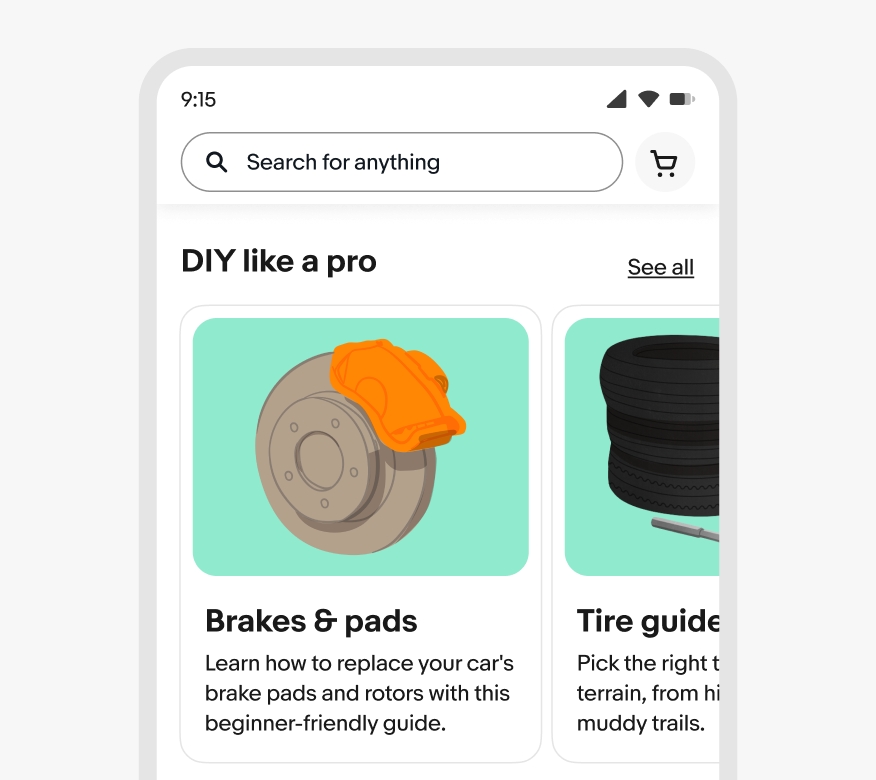
Summarized
A card focuses on high-level details to inform users of the card’s purpose and aid in deciding whether to interact with more content.
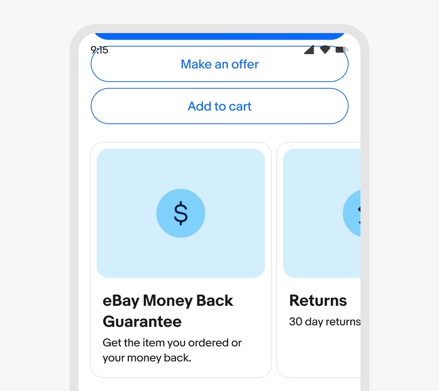
Interactive
Cards are implicitly interactive by nature whether they have nested buttons or not. They are never static or decorative.

- Container
- Media
- Overline
- Title
- Body
- Actions
Container
The card container bounds all of the card’s content and manages its state. It can flex according to the amount of content inside the card and the space available in the surrounding UI.
The card container is the only required element of a card. However, follow the standard placement of preview images, content areas, and actions.

Style
Cards are available as either filled or outlined. Choose a style that fits best in the page hierarchy. Outlined cards are generally more pronounced while filled cards are subtler.
Filled cards use a light gray background to denote the card’s boundary. They generally work best on primary page backgrounds and in more relaxed page layouts.
Outlined cards have a distinct border and white background. They generally work across various page backgrounds and in denser page layouts.

Orientation
Card contents can be oriented vertically or horizontally.
For vertical cards, the preview image, content area, and footer all flex to fill the available space. The preview media can be square, 16:9, or 5:4. The default ratio is 5:4.
For horizontal cards, the content area flexes to fill the available space, while the preview image maintains a fixed square ratio.

Preview image
Cards can have a preview image to enhance the visual impact of the card. Previews are aligned at the top of vertical cards and can be square, 16:9, or 5:4. The default ratio is 5:4
Preview images in horizontal cards are square and aligned to the leading edge of the card.

Content area
The card content area contains the primary details and purpose of the card. This includes a title, subtitle, description, or overline. The content area can also include leading and trailing accessories, like avatars and buttons.

Footer
Cards can have a footer that holds buttons and other metadata related to the card content.

Interactivity
Cards are directly interactive or not. The entire card is interactive if no additional buttons are present. Otherwise, only the nested buttons are interactive.

States
Directly interactive cards use a state layer to indicate hovered, pressed, and focused states.
Content overflow
Cards with fixed heights will truncate the description at 3 lines and the title at 1 line by default. This is common in uniform grid or carousel layouts.
Cards with a flexible height will wrap titles and descriptions to fit all characters by default. This is common in masonry or mosaic layouts.

Width
Vertical cards have a minimum width of 200px and a maximum width of 400px.
Horizontal cards have a min width of 300px and max with of 800px.


Responsiveness
To allow for a more readable experience on smaller screens, an inline card will shift to a stacked layout on screens below 360px wide.

Small screens
Cards on small screens can be standalone and extend the width of the grid. Cards within a carousel include one visible card and a peek of the second card.

Medium & large screens
Cards fill their container up to their maximum width. Cards in a grid will expand in width between their minimum and maximum width, wrapping to a new row as space allows.

Consistency
Do keep card heights and styles consistent when grouped in a carousel or grid.

Don’t mix card styles when grouped in a carousel or grid.

Cards vs cells
Do use cards to display grouped content about a specific subject or theme.

Don’t force content into cards when a simple list or whitespace and typography would create better hierarchy.


