Skip to main contenteBay Playbook
  • Get started
  • Foundations
  • Design system
  • Expressions
  • Resources
  • Articles

Design system

  • Overview
    • Overview
    • Color
    • Dimension
    • Spacing
    • Typography
    • Breakpoints
    • Shadow
    • Shape
    • Opacity
    • Motion
    • Overview
    • Status
    • Accordion
    • Action bar
      • Overview
      • Inline notice
      • Page notice
      • Section notice
    • Avatar
    • Badge
    • Banner
    • Breadcrumb
      • Overview
      • Branded button
      • CTA button
      • Icon button
      • Link button
    • Card
    • Carousel
    • CCD
      • Filter chip
      • Input chip
      • Graphs
      • Metrics
    • Date picker
    • Dialog
    • Divider
    • Education notice
    • EEK rating and range
    • Expansion
      • Checkbox
      • Combobox
      • Dropdown
      • Numeric stepper
      • Password
      • Phone number
      • Radio button
      • Select list
      • Switch
      • Text area
      • Text field
    • Item tile
    • List row
      • Overview
      • Expressive loader
      • Skeleton loader
    • Media container
      • Top navigation bar
    • Pagination
    • Popover
    • Progress stepper
    • Search field
    • Section header
    • Segmented button
      • Bottom sheet
      • Panel
    • Signal
    • Snackbar
    • Tab
    • Table
      • Tooltip
      • Tourtip
    • Toggle button group
    • Video player
    • Overview
    • Bulk editing
    • File uploading
      • Text link

Divider

v2.0

Dividers break up and group content on the page.

  • CSS
  • Marko
  • React
Dividerv2.0

On this page

  • Considerations
  • Types
  • Behavior
  • Best practices
  • Specs

Types

Behavior

Best practices

Specs

PreviousDialog
Things.People.Love.
  • Get started
  • Foundations
  • Design system
  • Expressions
  • Resources
  • Articles
  • Careers
  • Press
  • Privacy policy
© 2025 eBay. All rights reserved.

eBay Evo, the eBay trademark, and the eBay logo are the intellectual property of eBay Inc.

    Inset

    Inset dividers divide groups of related content. They can also be used to provide structure to tappable cells. They should match the inset level of content.

    Full-width

    Use full-width dividers to separate distinct sections of content. They can also be used instead of drop shadows to imply elevation for fixed elements.

    Separating list content

    Dividers are used to separate list groups and not individual list items. This is especially helpful when content in adjacent lists are similar.

    Elevated elements

    Elements that overlay on top of other content, like fixed navigation or fixed actions, use a full-width divider to provide a stronger sense of separation.

    Inset divider

    Full-width divider

    Order checkout screen with inset dividers organizing content into sections for payment details, shipping address, and shipping method.
    Full-width divider line separating two item cards from a sticky bottom button titled “go to checkout”
    Product listing page, featuring a 'Listing' section with three watches at different prices and a 'Trending videos' section, separated by light grey divider lines for clear section distinction.
    Full-width divider line separating a grid of four sneaker images on top from a sticky action button on the bottom of the page to continue that is floating above the image content.
    A detailed spec for an inset divider. The divider line is 1px thick. The spacing on the left and right of the divider matches the margin of the page. In this case, there is 16px on the left and right, resulting in the divider’s width plus the left and right margins totaling 100%.
    A detailed spec for a full-width divider. The divider line is 1px thick. The divider spans the full width of it’s content and totals 100% with no space on the left or right.

    Considerations

    Supportive

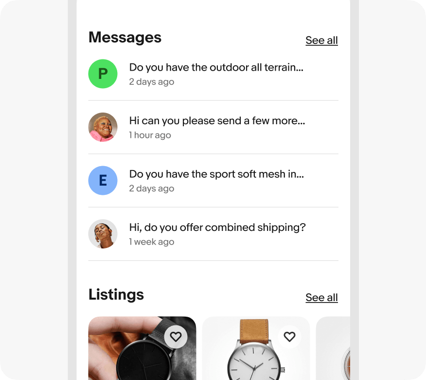
    Dividers separate groups of content when white space isn’t clear enough.

    Subtle

    Dividers are just noticeable enough to be effective and not interruptive.

    Seldom

    Dividers are used sparingly to group content, not separate multiple list items.

    Frequency

    Do use dividers to separate groups of similar content.

    App interface with two main sections, 'Messages' and 'Listings.' Divider line correctly separates the two sections.

    Don’t use dividers to separate individual items within a list.

    App interface with two main sections, 'Messages' and 'Listings.' Divider lines incorrectly separate the conversation threads in the 'Messages' section rather than delineate only between ‘Messages’ and ‘Listings’

    Elevated content

    Do use full-width dividers for elevated UI elements.

    Interactive price range filter interface with a histogram showing distribution of prices, with a 'See 120 results' button below that is sticky to the bottom of the screen with a correct divider line full width between content above.

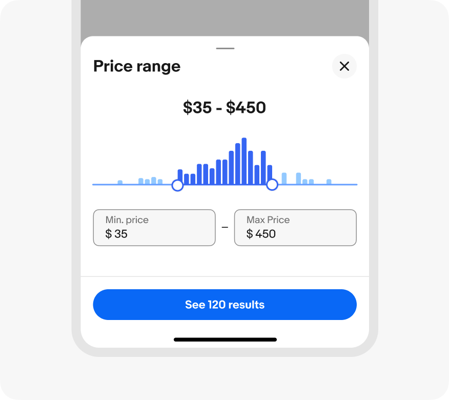
    Don’t use inset dividers for content that overlaps other content.

    Interactive price range filter interface with a histogram showing distribution of prices, with a 'See 120 results' button below that is sticky to the bottom of the screen with an incorrect inset divider line between content above.