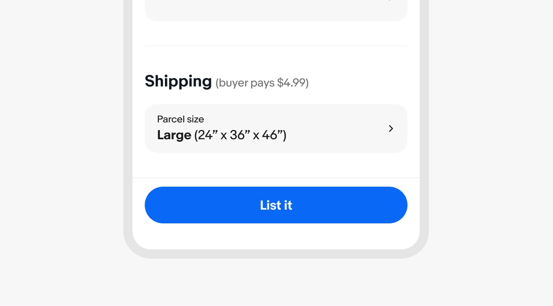
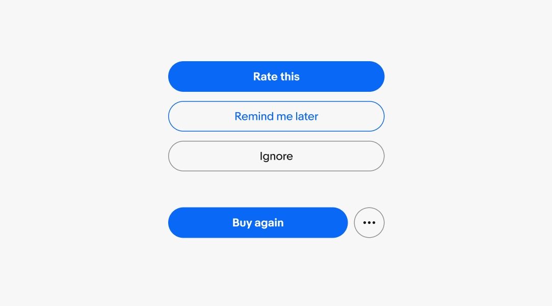
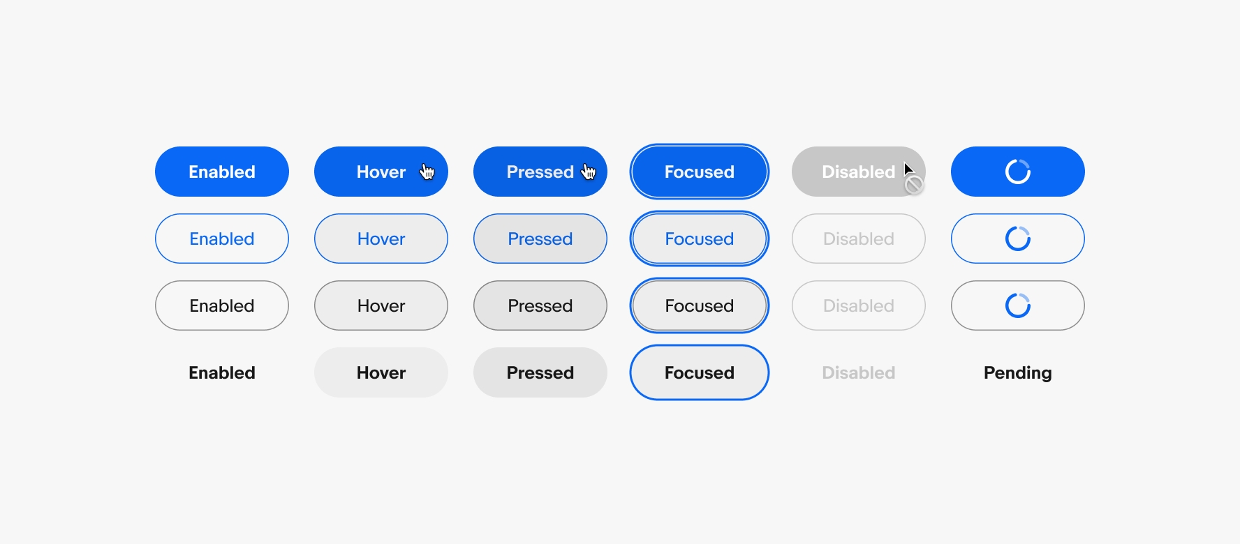
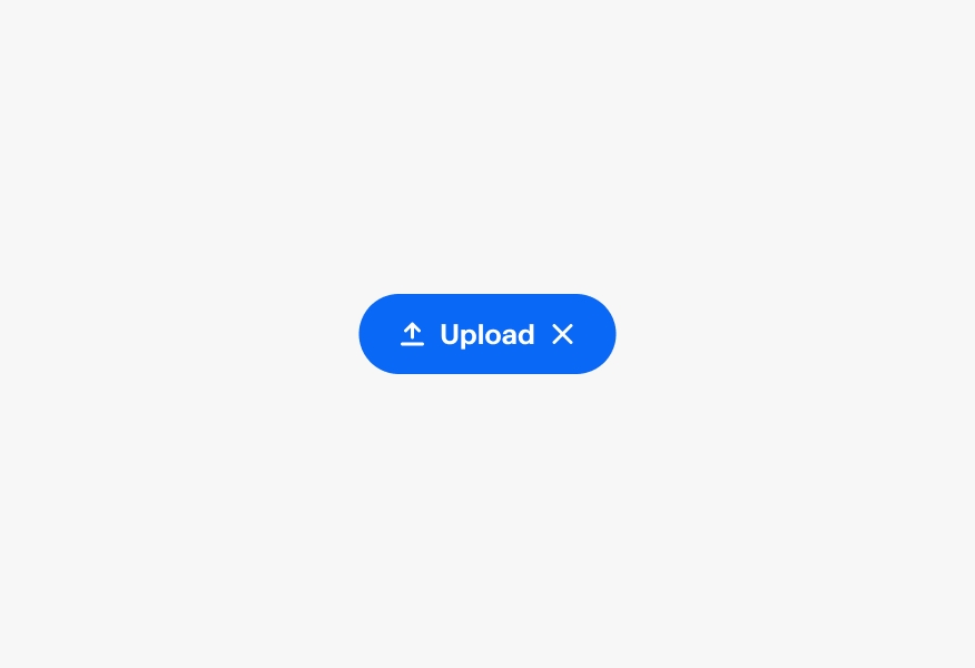
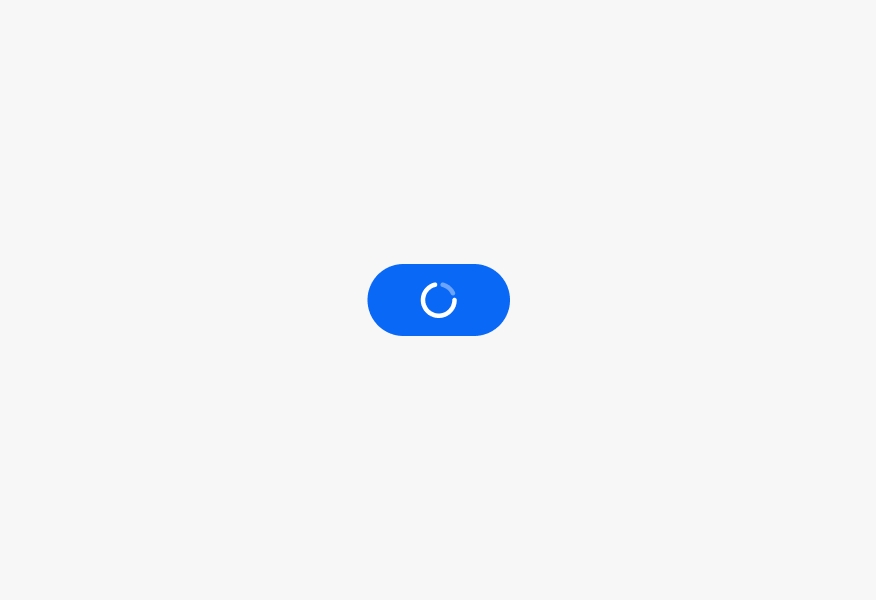
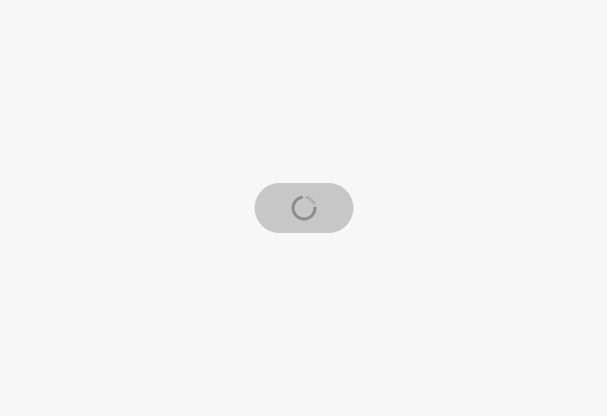
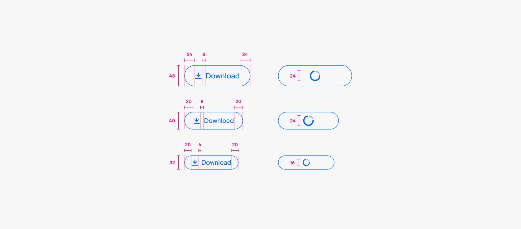
CTA button
v3.1
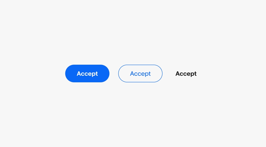
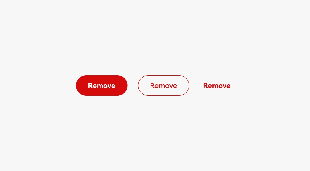
CTA buttons trigger the primary action in a flow.
- CSS
- Marko
- React
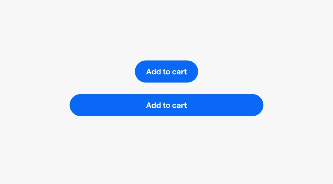
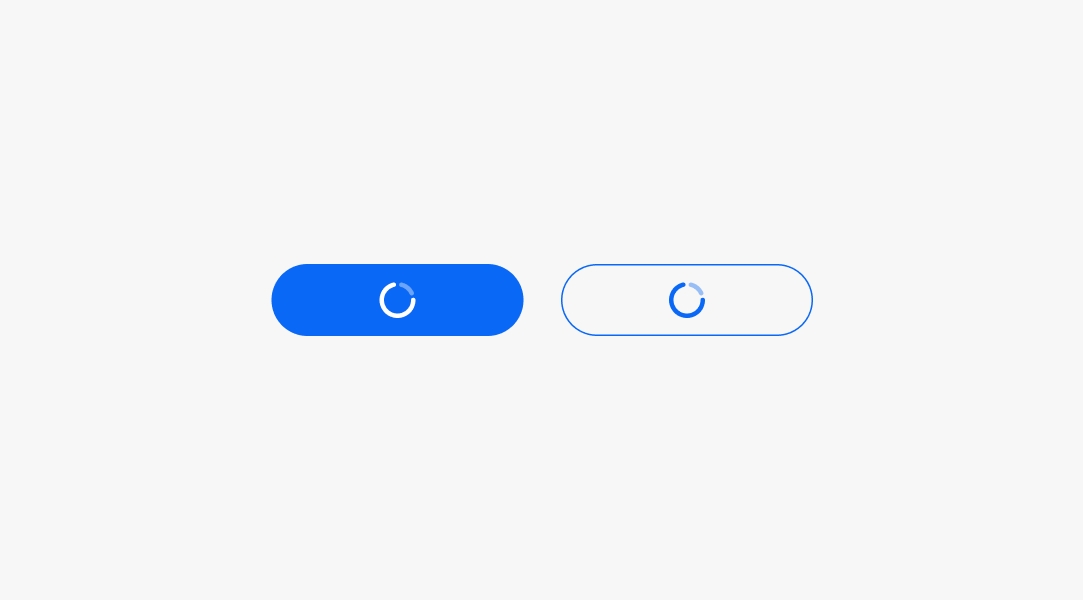
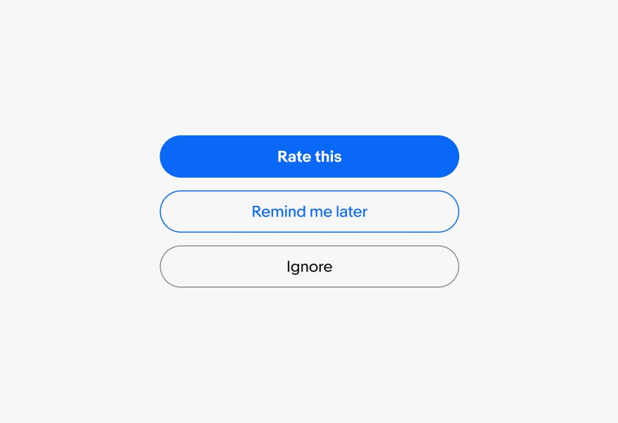
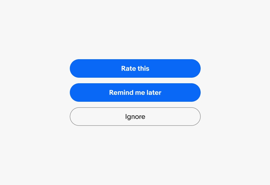
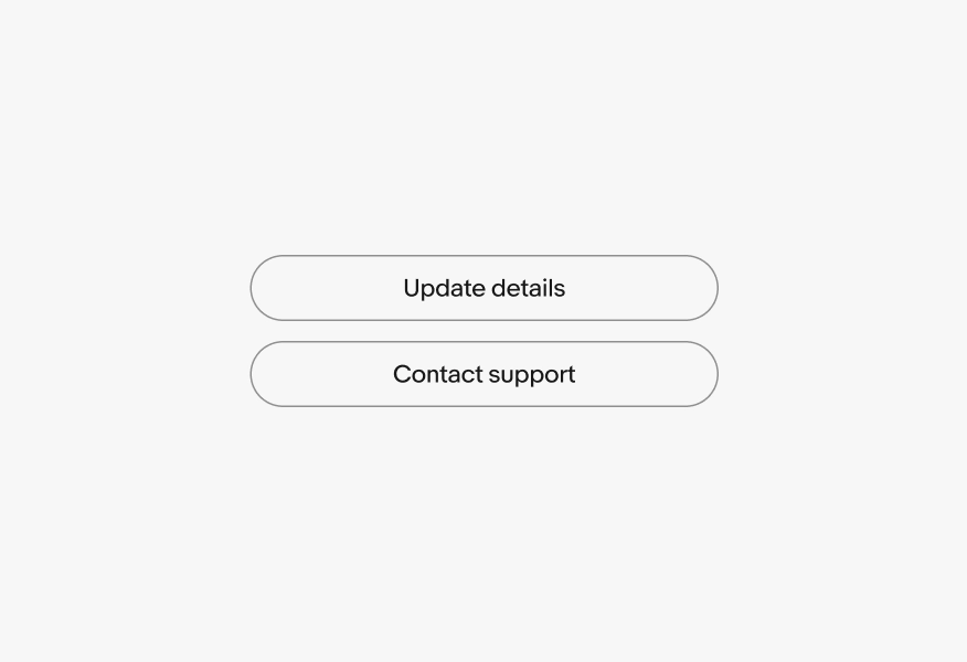
Actionable
Buttons guide users toward the primary actions on a screen, helping them understand what to do next.
Consistent
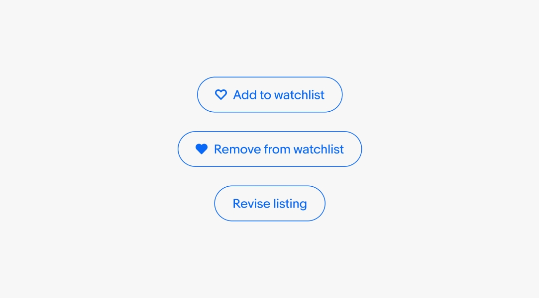
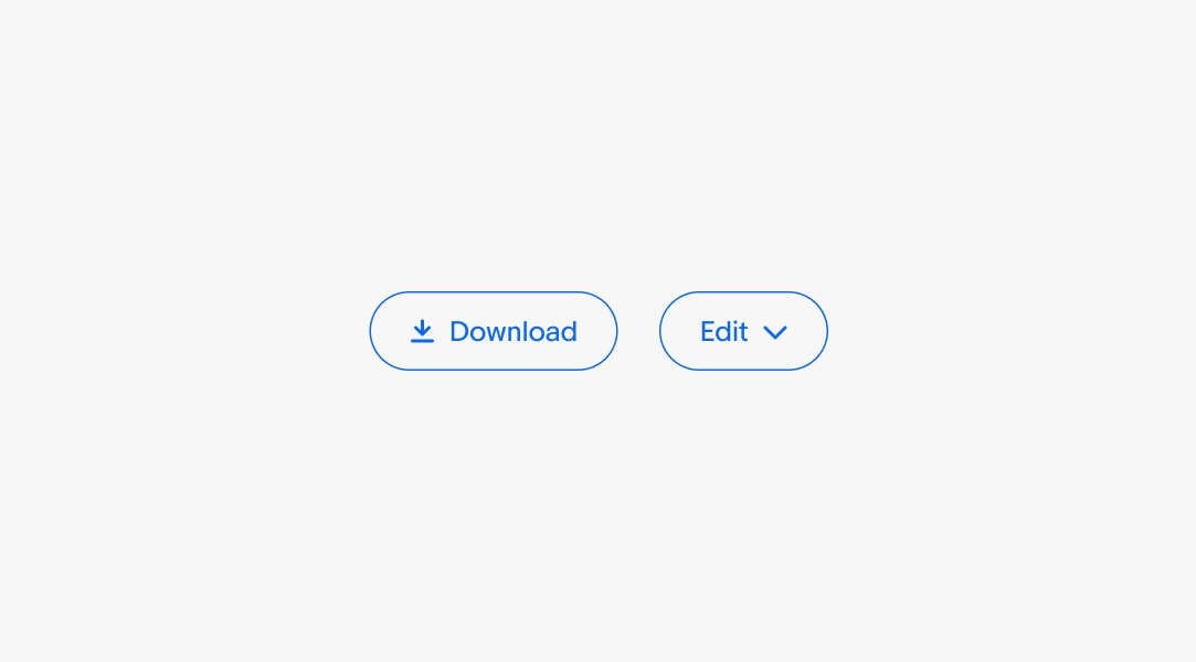
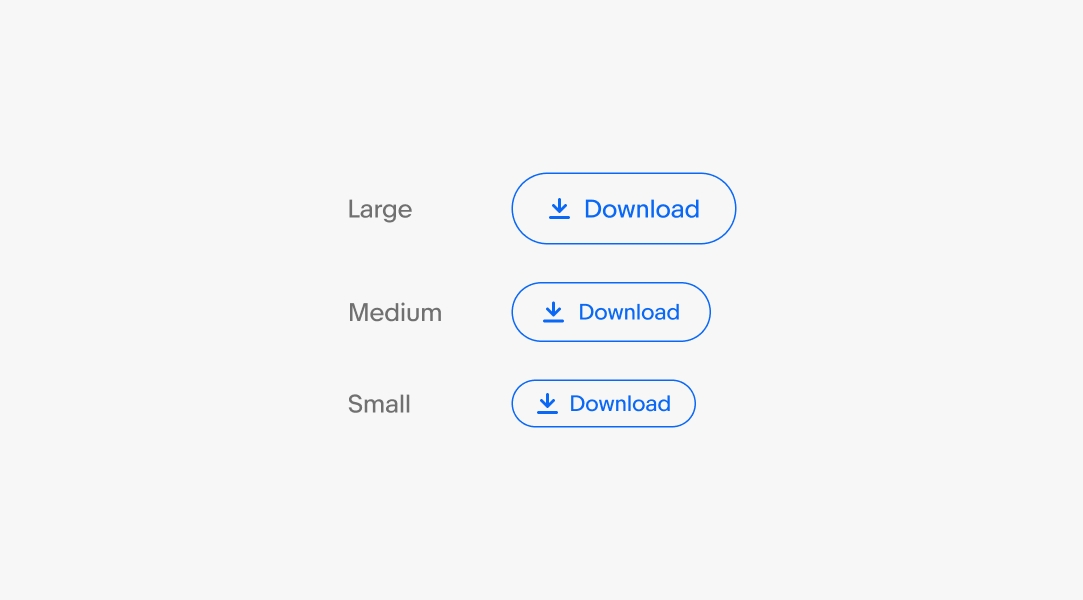
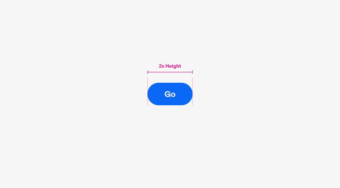
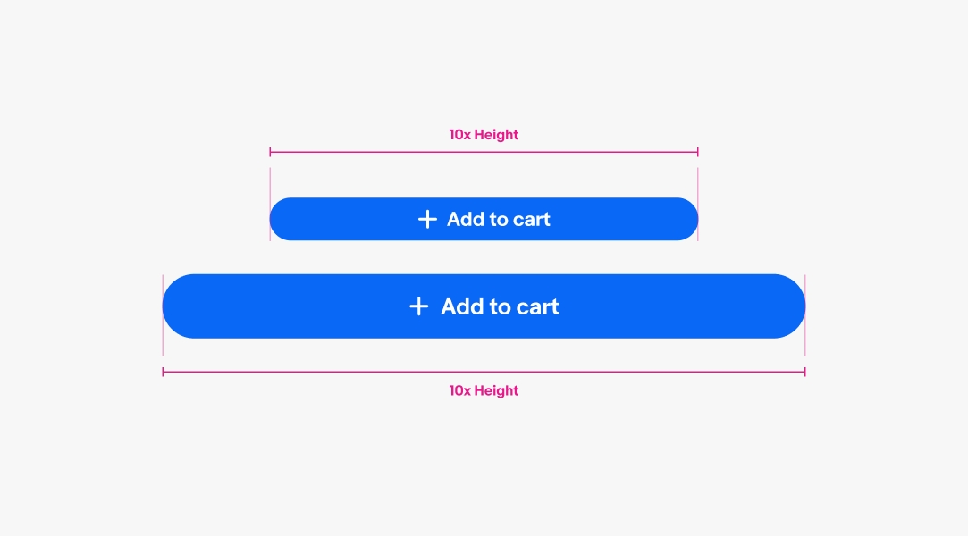
Buttons appear in consistent places throughout the experience.
Clear
Labels are short and express the action that will occur when pressed.