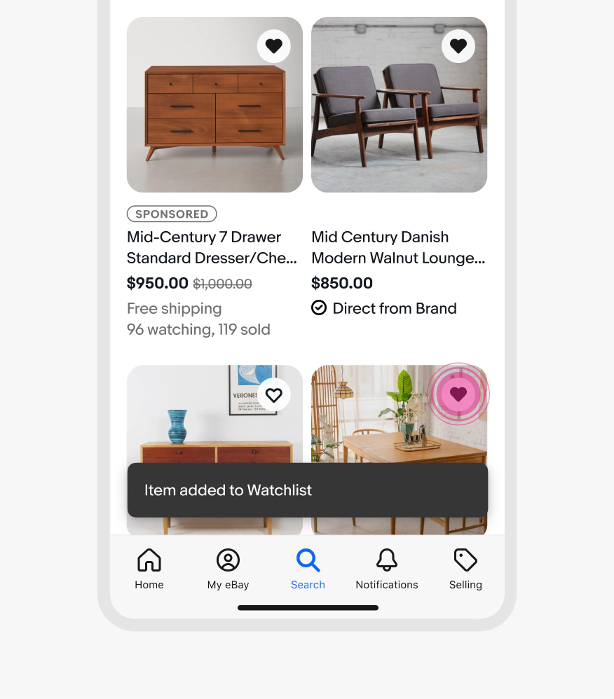
Snackbar
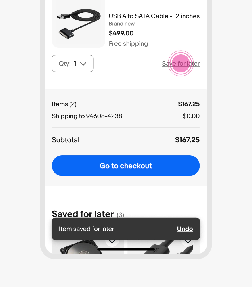
Snackbars are temporary messages that provide immediate feedback about a user action. They communicate the success or failure of an action, with an optional button to revert a decision, correct a failure, or dismiss.

Temporary
Snackbars appear and disappear after a set amount of time.
Brief
Snackbars are short and concise.
Responsive
Snackbars provide feedback about the processing of a user action.

- Container
- Body
- Action
Body
Required. Inform the user what just happened in concise, plain language. Use past tense and passive voice to focus on the outcome, not who caused it.
- Use sentence case
- No ending punctuation
- Max 2 lines

Action
Optional. The label should relate directly to the action that was taken.
For confirmation messages, common actions include “Undo,” links to relevant pages, or “Dismiss.” For error messages, use actions that let users resubmit data or navigate to where they can resolve the issue.
- Use sentence case
- No punctuation
- Use a [verb] or [verb] [noun] pattern
- Max 2 words

Attention
Snackbars use an attention icon to the left of the message when an issue occurs.
Because snackbars are transient, we recommend that you use a different pattern like dialog for high-priority issues.

Text overflow
Snackbars with longer messages will wrap and the action will move below the text. This layout is also preferred if the action label is longer. Aim for no more than two lines of text for the body.

Width
Snackbars have a maximum width of 448px. They can span full width minus insets on small screens up to the maximum width.

Placement
Snackbars appear bottom center on all screen sizes. They can span full width minus insets on small screens but adhere to a maximum width at larger screen sizes.
Snackbars animate upward from the bottom of the screen and downward off screen when dismissing.

Offset
Snackbars are offset 16px above persistent elements pinned to the bottom of the screen. If there are no persistent elements then the snackbar should be offset to clear any navigation hardware. They are inset 16px when fullwidth on smaller screens.

FAB interaction
While some platforms default to the snackbar above the floating action button (FAB), the preferred placement is below.

Dismiss
Snackbars can be dismissed by the action button, timing out, or via a downward swipe gesture.

Timeout
Snackbars appear from the bottom of the screen with a default timeout of 6 seconds (6000ms). The timing begins when the component loads into view and the message will dismiss automatically after the timeout if the user continues interacting with screen content.
Users can dismiss a message anytime via a downward swipe gesture.

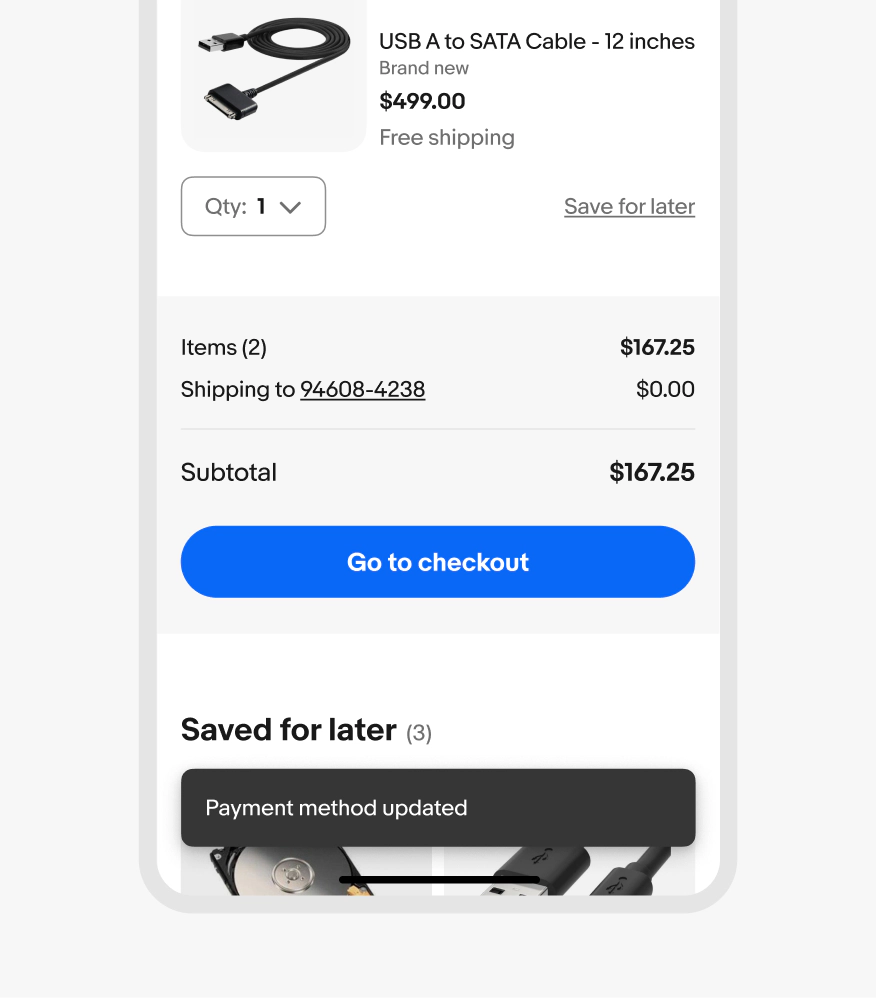
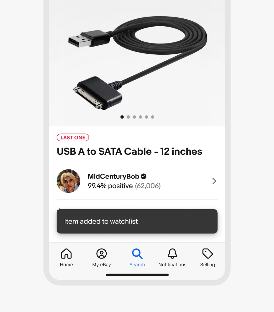
Small
Snackbars appear at the bottom center of the screen on small screens.
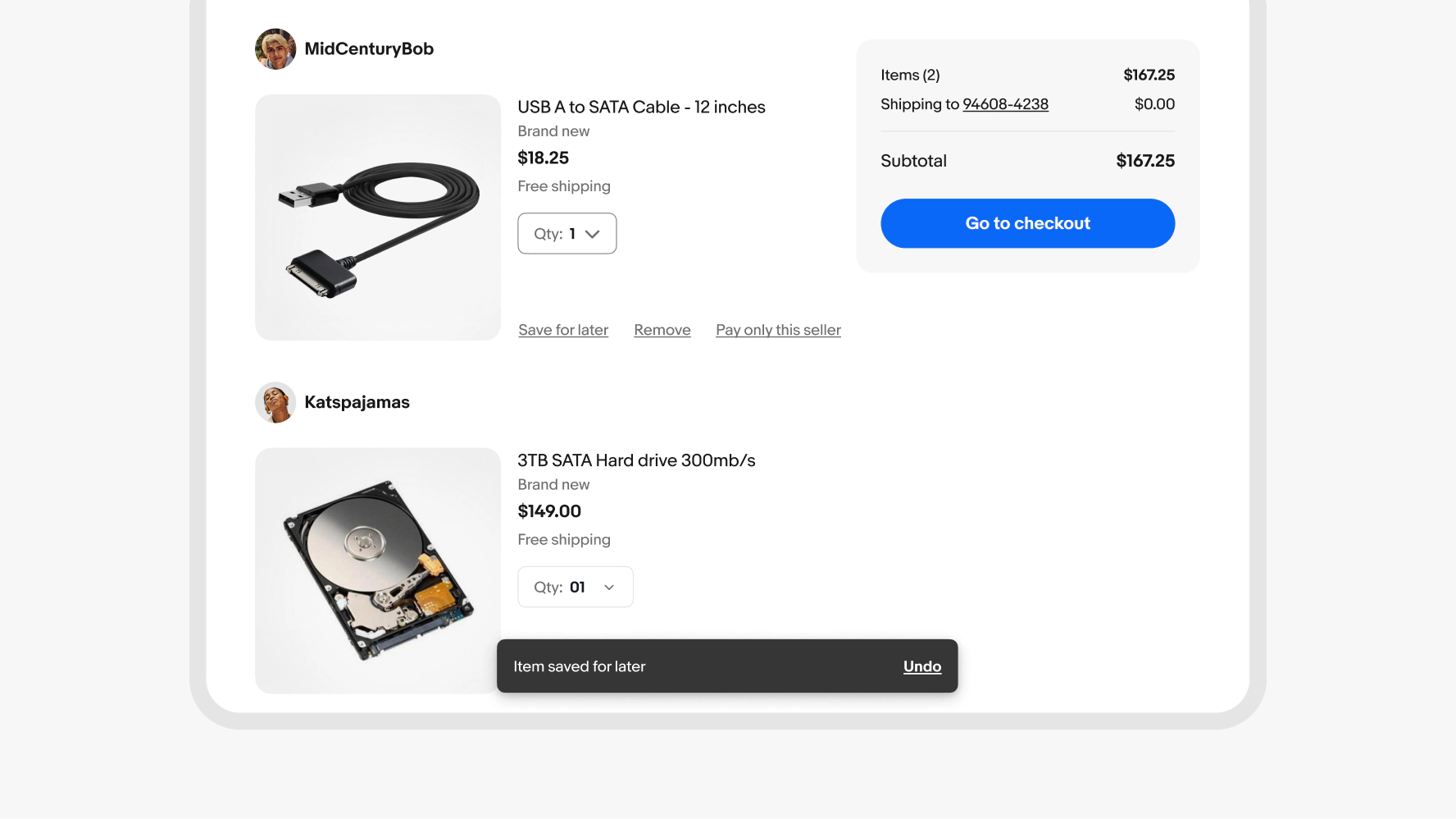
Medium and large
Snackbars are aligned bottom-center on larger screens.
Consecutive messages
Do replace existing snackbar messages with newer ones.

Don’t allow multiple snackbars to appear at once. Snackbars do not stack.

Placement
Do keep snackbars centered along the bottom of the screen.

Don’t customize the placement of snackbars.

Content
Do keep snackbar messages as short as possible, with no more than two lines in English, and use generic language for items.

Avoid being overly verbose within snackbar messages. Being overly-specific can negatively affect localization and scalability.

Snackbar vs. dialog
Do use snackbars for messages or alerts that don’t need to completely interrupt an experience.

Don’t use snackbars for high-impact decisions that require user attention or a response.

Frequency
Do use snackbars for targeted actions such as updating payment options, making changes to the cart, and reporting an item.
Don’t use snackbars for quick, repetitive actions such as watching multiple items in a grid of options. Too many snackbars after each other are disruptive to the experience.