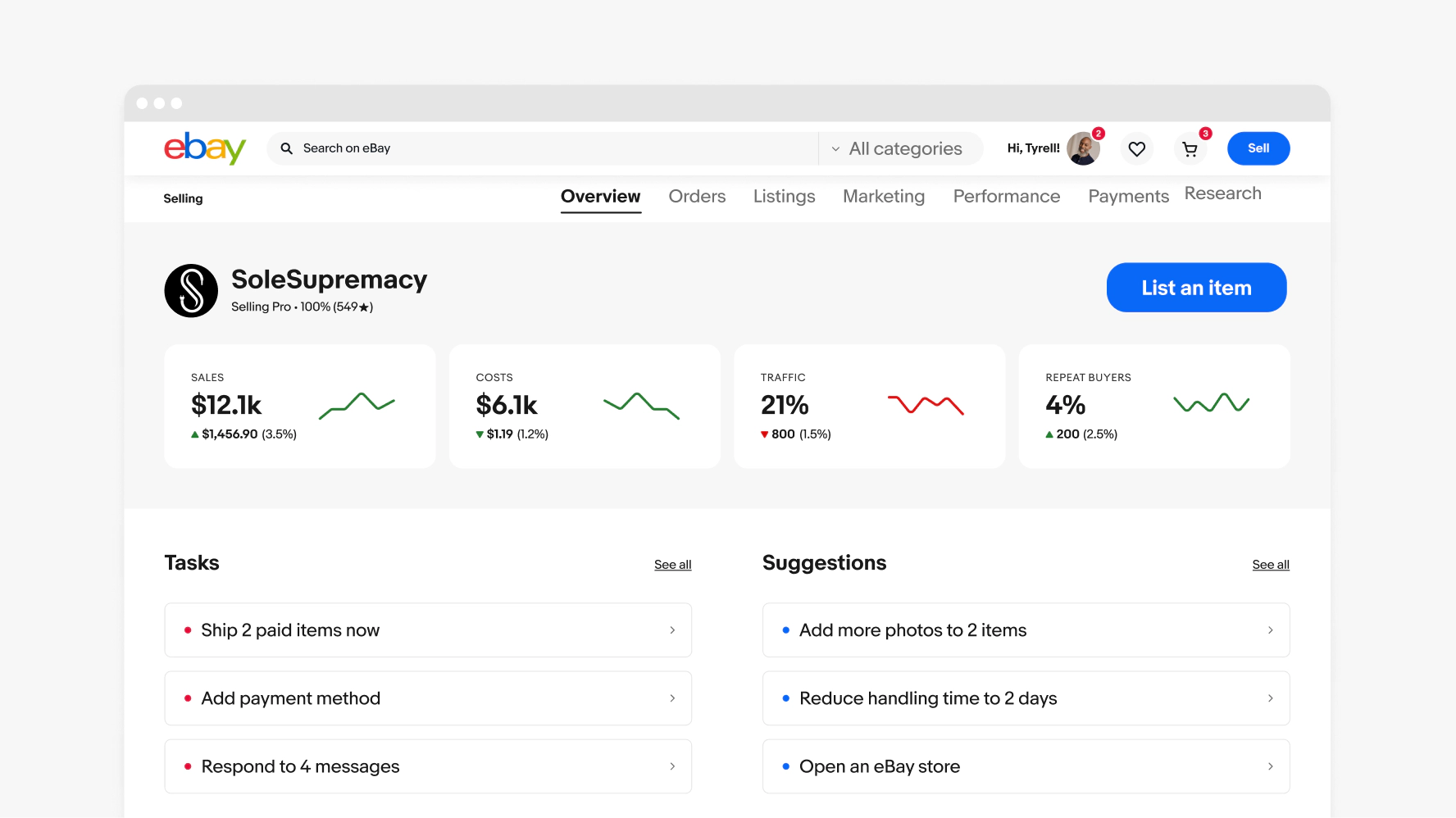
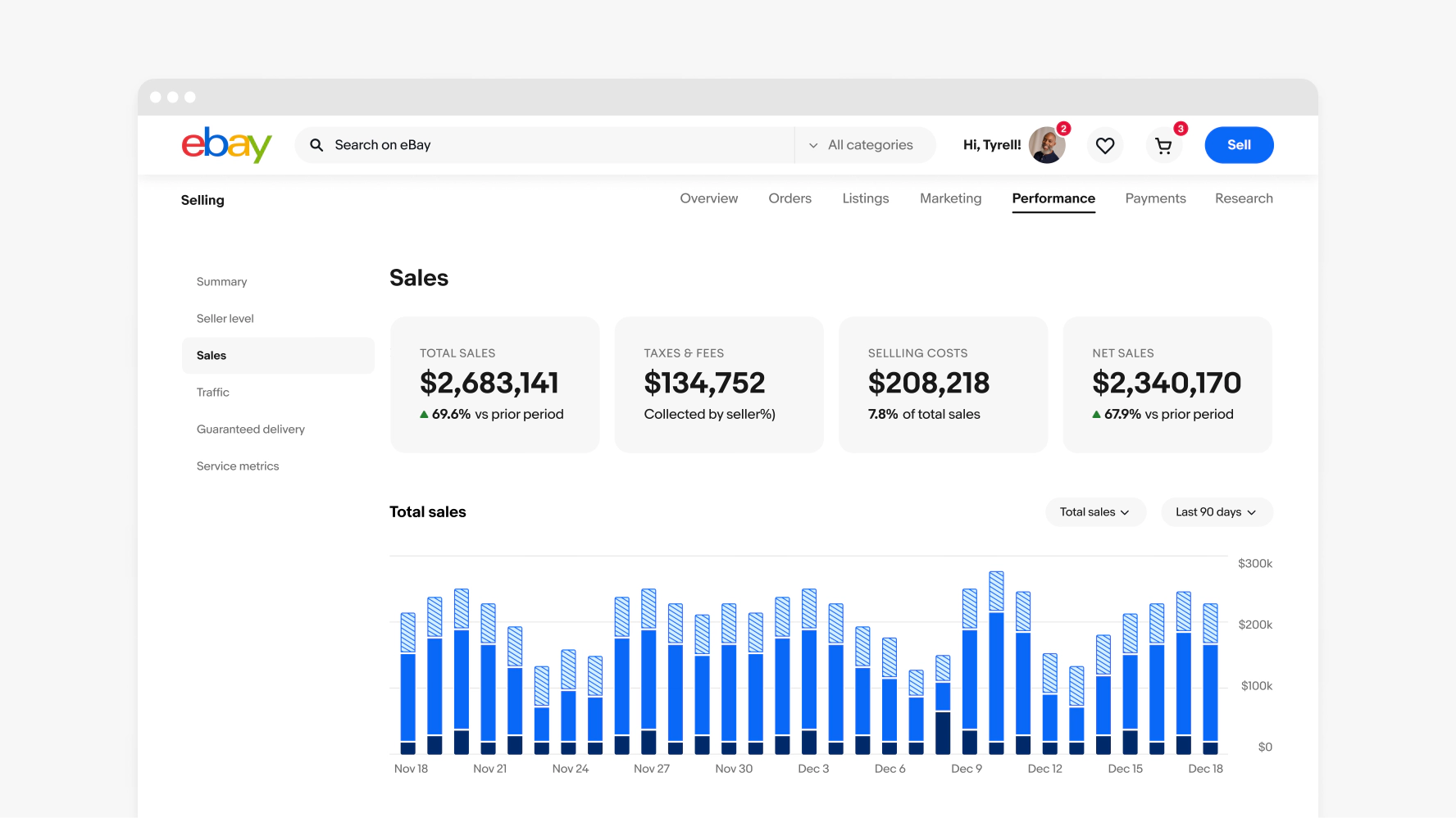
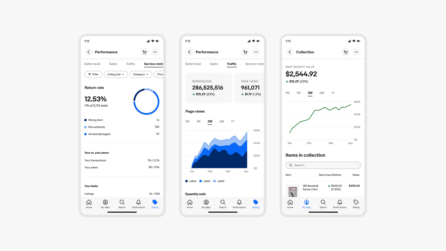
Metrics
Our metrics create simple and accessible at-a-glance summaries of data sets.

Keep it simple
Progressive disclosure is key—ensure you are using metrics as a tool to aid in the quick glance understanding of a data set. Long strings and overly complex filters don’t support this goal.
Tell a story
Focus on what you want to communicate and who you’re communicating to. Understanding data is much easier when there is a human narrative. Think about how you would tell the story in a sentence and start there.
Scale thoughtfully
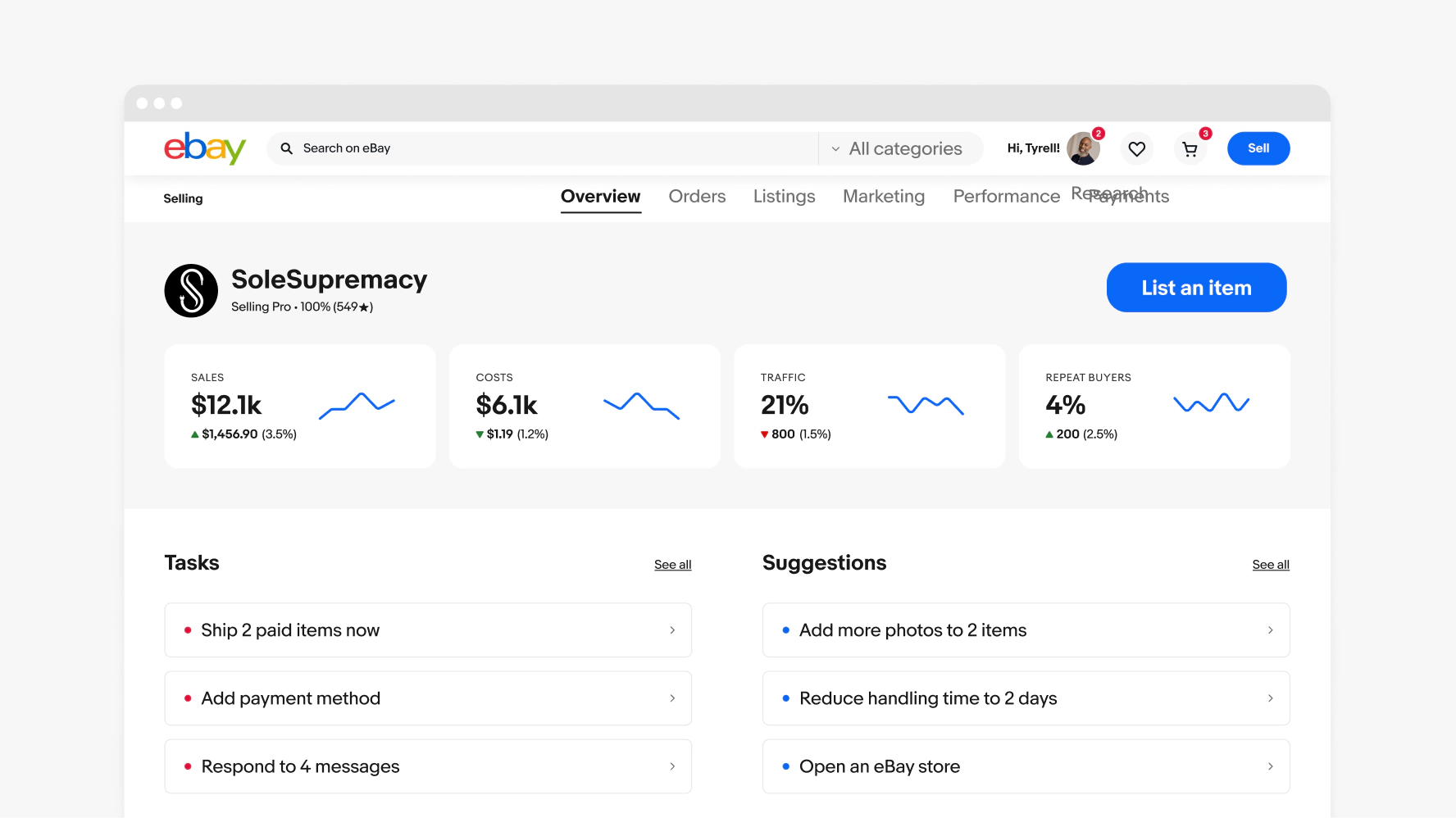
Our metrics components scale to accommodate one or many data sets—both with and without cards. They also scale seamlessly for all screen sizes and users. Use designated colors and scaling behaviors to ensure they are simple and accessible in all contexts.

- Summary bar container
- Label
- Trend arrow
- Summary metric container
- Metric
- Descriptor

Static metrics
Shows the current value of a single data set using text only.

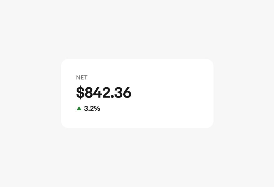
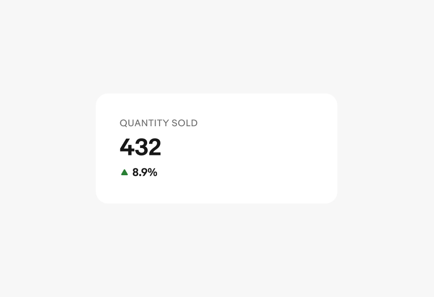
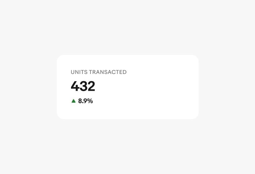
Trend metrics
Shows how a single data set changes over a specific time period or in comparison to a previous time period.

Trend lines
A trend metric used in tandem with a sparkline to visually show the trend of a single data set at a glance. Sparklines have 6 points max.
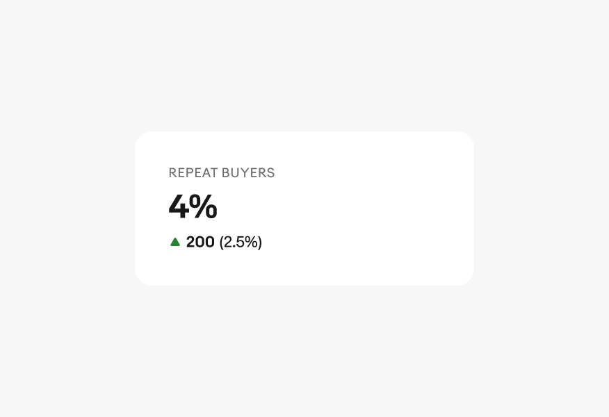
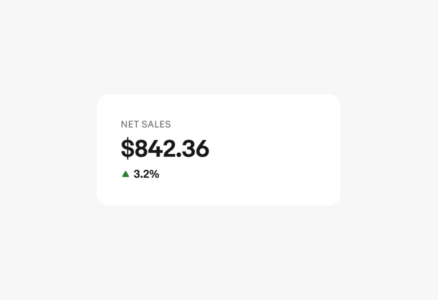
Label
The label names what the metric measures. Use short and distinct labels that identify the data clearly at a glance.
- Use all caps for the visual treatment
- Write in sentence case for screen readers
- No ending punctuation
- Use a noun or noun phrase
- Aim for 1-2 words
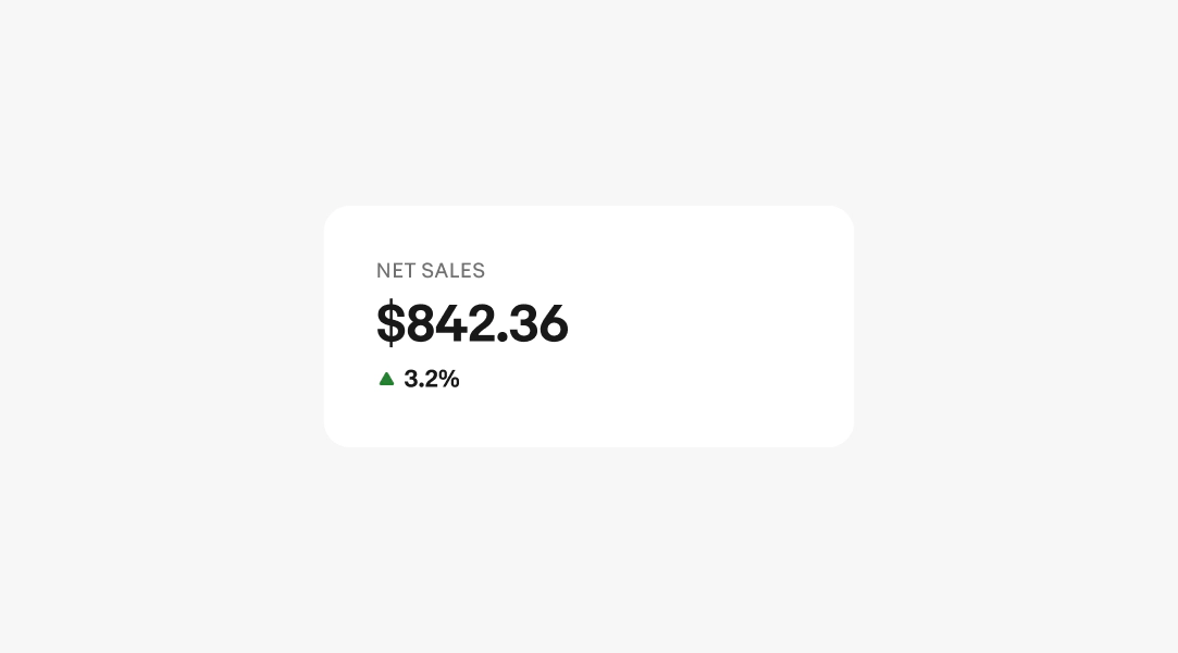
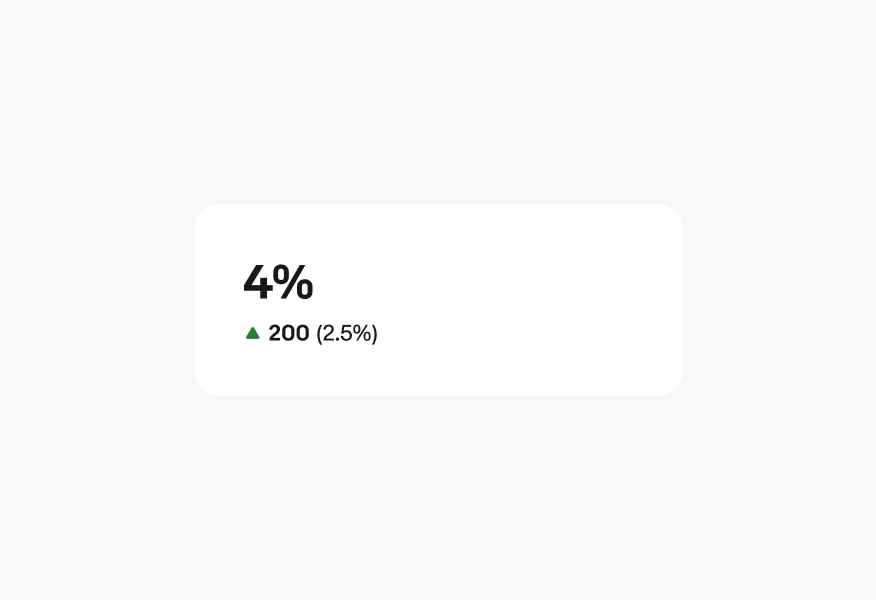
Metric
The metric displays the current value of the data. Abbreviate large numbers to keep the display compact and scannable.
- Use “K” for thousands ($12K)
- Use “M” for millions ($1.2M)
- Use “B” for billions ($5.2B)
- Default to two significant digits; don’t round up
- Avoid trailing zeros ($12K, not $12.0K)
- Include the appropriate unit symbol ($, %) or omit for plain counts
Learn more about formatting numerals.

Descriptor
The descriptor shows how the metric has changed from the comparison period.
Format as [trend arrow] [change value] [(percentage)].
- Trend arrow indicates direction
- Change value is the numeric difference from the comparison period; use the same unit as the metric value
- Percentage is the change expressed as a proportion of the comparison period value
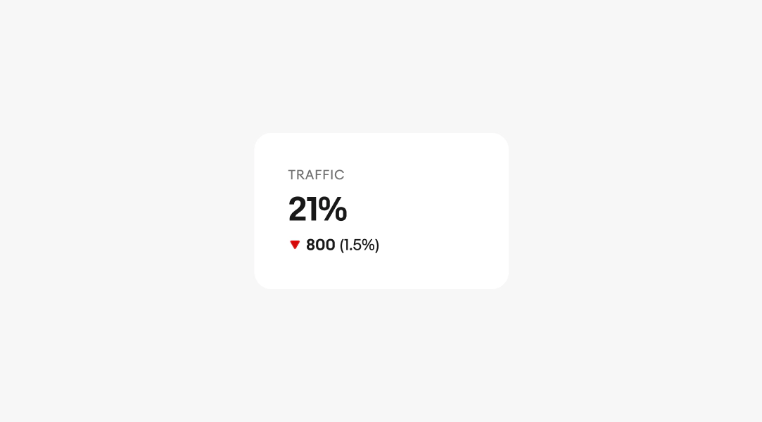
Use green to indicate a positive trend, such as increasing sales or decreasing costs, and red for a negative trend, like declining sales or rising costs. Blue is used for neutral trends or when displaying multiple trends in sequence. Always pair the color with an up or down arrow to show the trend direction. This approach ensures high contrast for all metrics and maintains clarity for users with low vision or color blindness.

Positive
When a single data set is showing a positive trend and it is the primary metric on the page, the line and arrow in a trend line graph can be green to emphasize the goal of the graph.

Negative
Similarly, when a single data set is showing a negative trend and it is the primary metric on the page, the line and arrow can both be red.

Neutral or multiple trends
If the graph isn't showing a trend, if the trend is neutral, or if there are multiple trend metrics in a row then only the arrows should use color to indicate the trend and sparklines should remain blue.
Small
On small screens, the behavior is the same as medium screens but less cards are seen by default. Make sure there is always a peek of the next card to ensure users know to scroll left and right.

Medium
On medium screens, summary metrics in cards should scroll horizontally and always maintain a peek of the next card so users know the area is scrollable.

Large
On large screens, summary metrics in a summary bar align horizontally across the page and can either be contained in a single summary bar, embedded within the page background, or each have their own card.

Labels
Do always include a label that clarifies what the metric represents.
Don’t remove labels. Users need context to understand metrics.
Do keep labels concise (2–4 words), but prioritize clarity over brevity.
Don’t shorten labels to the point where they become unclear.
Do use plain, unambiguous language. Leverage familiar, widely understood terms over jargon and internal terminology.
Don’t use overly technical terms that are difficult to parse.
Metric color
Do use semantic colors only in the trend arrow icon.

Don’t use color on the metric itself. We use colored text very sparingly because color alone is not accessible to all users.

Sparkline color
Do make sparklines blue when multiple summary metrics are shown in view at a time.
Don’t make sparklines red or green when multiple summary metrics are shown in view at a time.