Skip to main contenteBay Playbook
  • Get started
  • Foundations
  • Design system
  • Expressions
  • Resources
  • Articles

Design system

  • Overview
    • Overview
    • Color
    • Dimension
    • Spacing
    • Typography
    • Breakpoints
    • Shadow
    • Shape
    • Opacity
    • Motion
    • Overview
    • Status
    • Accordion
    • Action bar
      • Overview
      • Inline notice
      • Page notice
      • Section notice
    • Avatar
    • Badge
    • Banner
    • Breadcrumb
      • Overview
      • Branded button
      • CTA button
      • Icon button
      • Link button
    • Card
    • Carousel
    • CCD
      • Filter chip
      • Input chip
      • Graphs
      • Metrics
    • Date picker
    • Dialog
    • Divider
    • Education notice
    • EEK rating and range
    • Expansion
      • Checkbox
      • Combobox
      • Dropdown
      • Numeric stepper
      • Password
      • Phone number
      • Radio button
      • Select list
      • Switch
      • Text area
      • Text field
    • Item tile
    • List row
      • Overview
      • Expressive loader
      • Skeleton loader
    • Media container
      • Top navigation bar
    • Pagination
    • Popover
    • Progress stepper
    • Search field
    • Section header
    • Segmented button
      • Bottom sheet
      • Panel
    • Signal
    • Snackbar
    • Tab
    • Table
      • Tooltip
      • Tourtip
    • Toggle button group
    • Video player
    • Overview
    • Bulk editing
    • File uploading
      • Text link

Link button

v3.1

Link buttons are primarily used for actions and triggers, using an underline as affordance.

  • Skin
  • Marko
  • React
Link buttonv3.1

On this page

  • Considerations
  • Usage guidelines
  • Anatomy
  • Properties
  • Behavior
  • Best practices
  • Specs
PreviousIcon button
Things.People.Love.
  • Get started
  • Foundations
  • Design system
  • Expressions
  • Resources
  • Articles
  • Careers
  • Press
  • Privacy policy
© 2025 eBay. All rights reserved.

eBay Evo, the eBay trademark, and the eBay logo are the intellectual property of eBay Inc.

    When to use

    • Actions that do not navigate to new pages
    • Actions that follow a short description of contents

    When not to use

    • Actions that manipulate data or how its displayed
    • Actions that change state
    • Navigating between pages

    Link buttons vs text links

    If an action results in a URL change or new browser tab use a Text link. Everything else is a Button.

    Semantics

    HTML text links and buttons have important differences in behaviors, interactions, and expectations. For example, a text link will perform its interaction when clicked and when the enter key is pressed. A button will perform its interaction when clicked or when the enter and spacebar keys are pressed. When holding the control or command key a text link will open a new browser tab, a button will not.

    Buttons take action, links navigate

    • Use a link when you’re navigating to another place, such as: an item page, a seller profile, or a page "skip link".
    • Use a button when you are performing an action, such as: "bid," "add," "search".

    Large

    Large standalone links are Subtitle 2 (16/24) type size in regular weight.

    Medium

    Medium standalone links are Body (14/20) type size in regular weight.

    Small

    Small standalone links are Caption (12/16) type size in regular weight.

    A large link button with specs detailing the type is 16px and the line-height is 24px.
    A medium link button with specs detailing the type is 14px and the line-height is 20px.
    A small link button with specs detailing the type is 12px and the line-height is 16px.

    Considerations

    Clear

    The text makes it clear where this action will take the user.

    Identifiable

    Link buttons are familiar and easily identifiable amongst other content.

    Concise

    Link button labels should be short. It’s best to aim for fewer than 5 words.

    Usage guidelines

    Anatomy

    Properties

    Behavior

    Best practices

    Specs

    A link button’s anatomy. Number 1 is pointing to the title. Number 2 is pointing to the underline.
    1. Title
    2. Underline

    Strong

    Strong link buttons are the default treatment, used for tertiary/lower actions in an experience.

    Large, medium, and small link buttons in the foreground primary color (black).

    Subtle

    Subtle link buttons are used for tertiary/lower actions and use secondary color to align with secondary text areas.

    Large, medium, and small link buttons in the foreground secondary color (gray).

    White

    White is used within components that utilize a colored background like alert notices. This particular example uses the foreground onSuccess color token. Learn more about these token values in Color tokens.

    A green success alert notice with white text.

    Size

    Link buttons are available in small, medium, and large sizes. Large is the default size and is preferred on smaller screens.
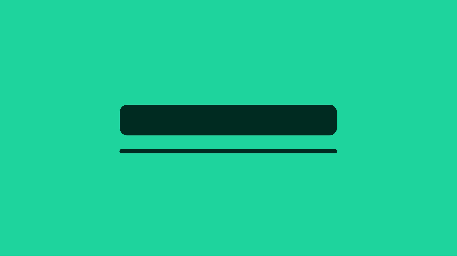
    Large, medium, and small link buttons with pink specs calling out there size as 24, 20, and 16px respectively.

    Underline

    Standalone link buttons are placed on their own line close to the relevant content and contain an underline by default.

    A carousel with a “See all” link button in the upper right. It has an underline.

    States

    States are used to indicate levels of interaction when hovering a link button. The available states are enabled, hover, focused, and disabled. They follow the same patterns as Text Links. Learn more about the state layer color values in Color tokens.

    Large, medium, and small link buttons all in the enabled, hover, focused, and disabled states.

    Content

    Do use words that describe where the link leads and what content is expected.

    A carousel with a concise “See all” link button in the upper right corner.

    Don’t use lengthy words that create longer strings. They add unnecessary detail.

    A carousel with a wordy “See all watchlist items” link button in the upper right corner.

    Link button or Text link

    Do use link buttons for actions that don't navigate the user to another page.

    A heading for Shipping and returns followed by a Link button correctly labeled for its action, “Calculate”.

    A heading for Shipping and returns followed by an Link button incorrectly labeled as a link, “View policy details”.