Skip to main contenteBay Playbook
  • Get started
  • Foundations
  • Design system
  • Expressions
  • Resources
  • Articles

Design system

  • Overview
    • Overview
    • Color
    • Dimension
    • Spacing
    • Typography
    • Breakpoints
    • Shadow
    • Shape
    • Opacity
    • Motion
    • Overview
    • Status
    • Accordion
    • Action bar
      • Overview
      • Inline notice
      • Page notice
      • Section notice
    • Avatar
    • Badge
    • Banner
    • Breadcrumb
      • Overview
      • Branded button
      • CTA button
      • Icon button
      • Link button
    • Card
    • Carousel
    • CCD
      • Filter chip
      • Input chip
      • Graphs
      • Metrics
    • Date picker
    • Dialog
    • Divider
    • Education notice
    • EEK rating and range
    • Expansion
      • Checkbox
      • Combobox
      • Dropdown
      • Numeric stepper
      • Password
      • Phone number
      • Radio button
      • Select list
      • Switch
      • Text area
      • Text field
    • Item tile
    • List row
      • Overview
      • Expressive loader
      • Skeleton loader
    • Media container
      • Top navigation bar
    • Pagination
    • Popover
    • Progress stepper
    • Search field
    • Section header
    • Segmented button
      • Bottom sheet
      • Panel
    • Signal
    • Snackbar
    • Tab
    • Table
      • Tooltip
      • Tourtip
    • Toggle button group
    • Video player
    • Overview
    • Bulk editing
    • File uploading
      • Text link

Video player

v2.0

The video player is used for displaying and controlling video content.

Stylized artwork of a video player.
Video playerv2.0

On this page

  • Considerations
  • Anatomy
  • Properties
  • Behavior
  • Platforms
  • Best practices
  • Specs
PreviousToggle button group
Things.People.Love.
  • Get started
  • Foundations
  • Design system
  • Expressions
  • Resources
  • Articles
  • Careers
  • Press
  • Privacy policy
© 2026 eBay. All rights reserved.

eBay Evo, the eBay trademark, and the eBay logo are the intellectual property of eBay Inc.

    A video player with specs highlighted. The padding on the top, bottom, left, and right of the video player is 12px. The height of the playhead is 44px. The height of the play button placed in the middle of the video player is 64px. The height of the close button is 32px. the padding between the playhead and the volume slider is 4px.
    A playhead, a smaller playhead, and a volume slider is shown with specs highlighted. The height of the playhead is 44px. The padding on the left and right of the playhead is 12px. The padding between the play/pause button and the time elapsed is 12px. The padding between the time elapsed and the progress indicator is 8px. The padding between the progress indicator and the duration is 8px. The padding between the duration and the closed captions icon is 16px. The padding between the closed captions icon, the volume icon, the report icon, the expand/collapse icon, and the overflow icon is 12px. The height of the progress indicator is 4px. The padding between the playhead and the closed caption tooltip is 4px. The closed caption tooltip has a height of 24px, with 8px of padding to the left and right of the tooltip. The width of the volume slider is 32px. The padding at the bottom of the volume slider is 12px. The width of the volume slider rail is 4px.

    Considerations

    Familiar

    The video player works as expected across all platforms.

    Performant

    The video player optimizes playback to run smoothly.

    Connection

    Video enables people to express themselves and their content on a deeper level.

    Anatomy

    Properties

    Behavior

    Platforms

    Best practices

    Specs

    A video player diagram with 14 elements numbered: 1. Play trigger, 2. Scrim, 3. Playhead, 4. Play/pause, 5. Time elapsed, 6. Progress indicator, 7. Duration, 8. Closed captions, 9. Volume, 10. Report, 11. Expand/collapse, 12. Overflow, 13. Volume slider, 14. Close button.
    1. Play trigger
    2. Scrim
    3. Playhead
    4. Play/pause
    5. Time elapsed
    6. Progress indicator
    7. Duration
    8. Closed captions
    9. Volume
    10. Report
    11. Expand/collapse
    12. Overflow
    13. Volume slider
    14. Close button

    Media ratio

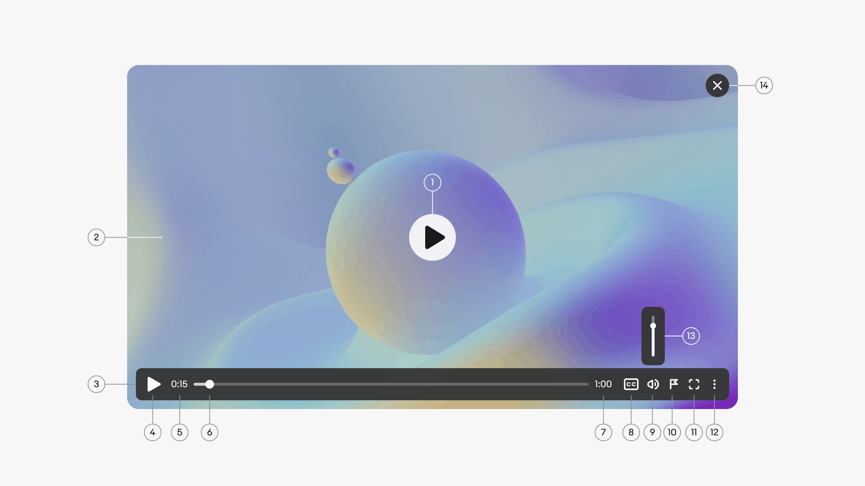
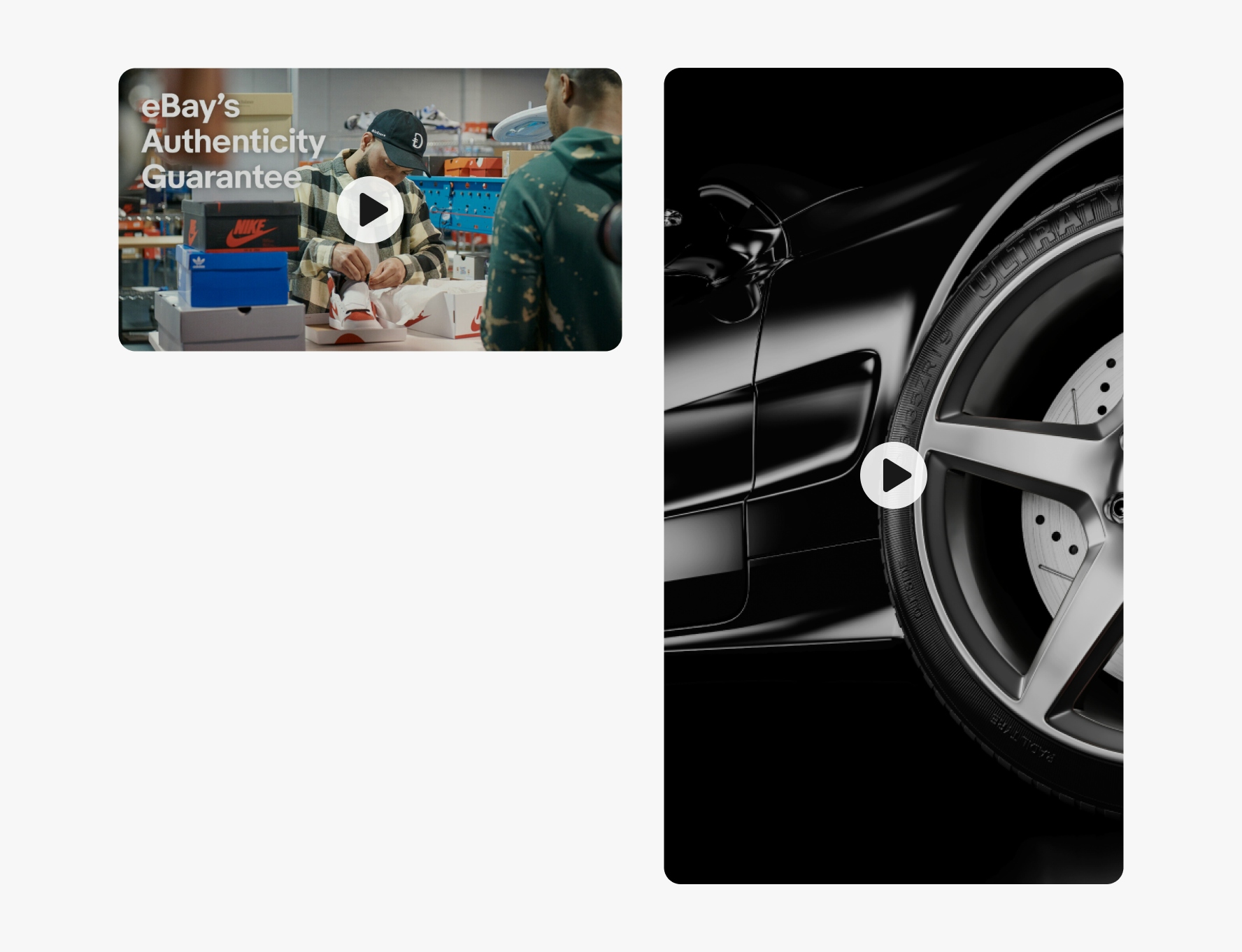
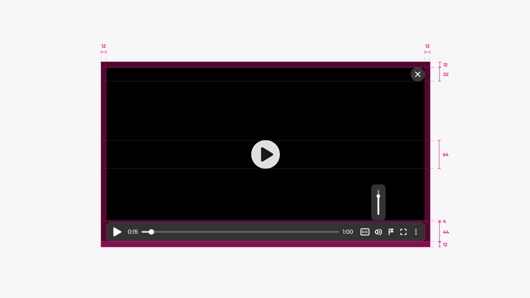
    The video player container has a ratio of 16:9. Media uploaded in other ratios is centered within the player. The supported media ratios are 16:9, 5:4, and 1:1.

    Three video players, the first with a ratio of 16:9, the second with a ratio of 5:4, and the third with a ratio of 1:1.

    Orientation

    The orientation of the player can be landscape 16:9 or portrait 9:16. Landscape is the default.

    A landscape 16:9 video player sits to the left of a portrait 9:16 video player.

    Autoplay

    A video can be set to autoplay on page load or when scrolled into view. When set to autoplay, the video is muted until the user chooses to unmute. Users can set their browser to block this behavior by default, so don’t rely solely on audio for important information. Leverage closed captions whenever possible.

    A video player with a play button over the video.

    Inline

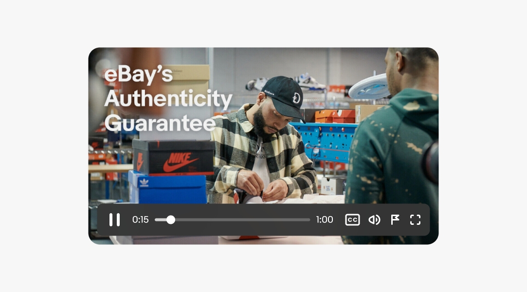
    For inline videos, a play button is always present over the video thumbnail when the video isn’t playing. The thumbnail updates to the last frame viewed when a user pauses the video.

    A video player with a play button over the video.

    Lightbox

    The lightbox presentation is a modal view available on web. The lightbox launches from a trigger element and loads a video in the center of the screen above a scrim layer. Interaction with the content below is blocked until the video is closed.

    The lightbox can include carousel functionality to allow users to navigate to other media content without having to close the lightbox and open each element individually.

    A video player in lightbox presentation mode. There is a scrim behind it, and left and right chevron buttons on each side to indicate carousel behavior.

    Tooltips

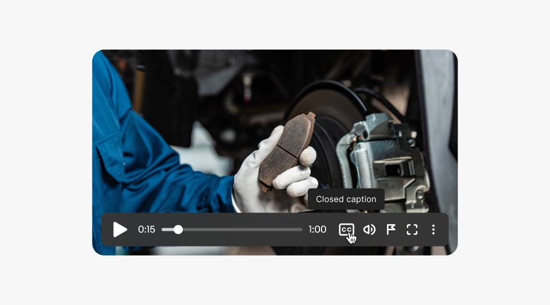
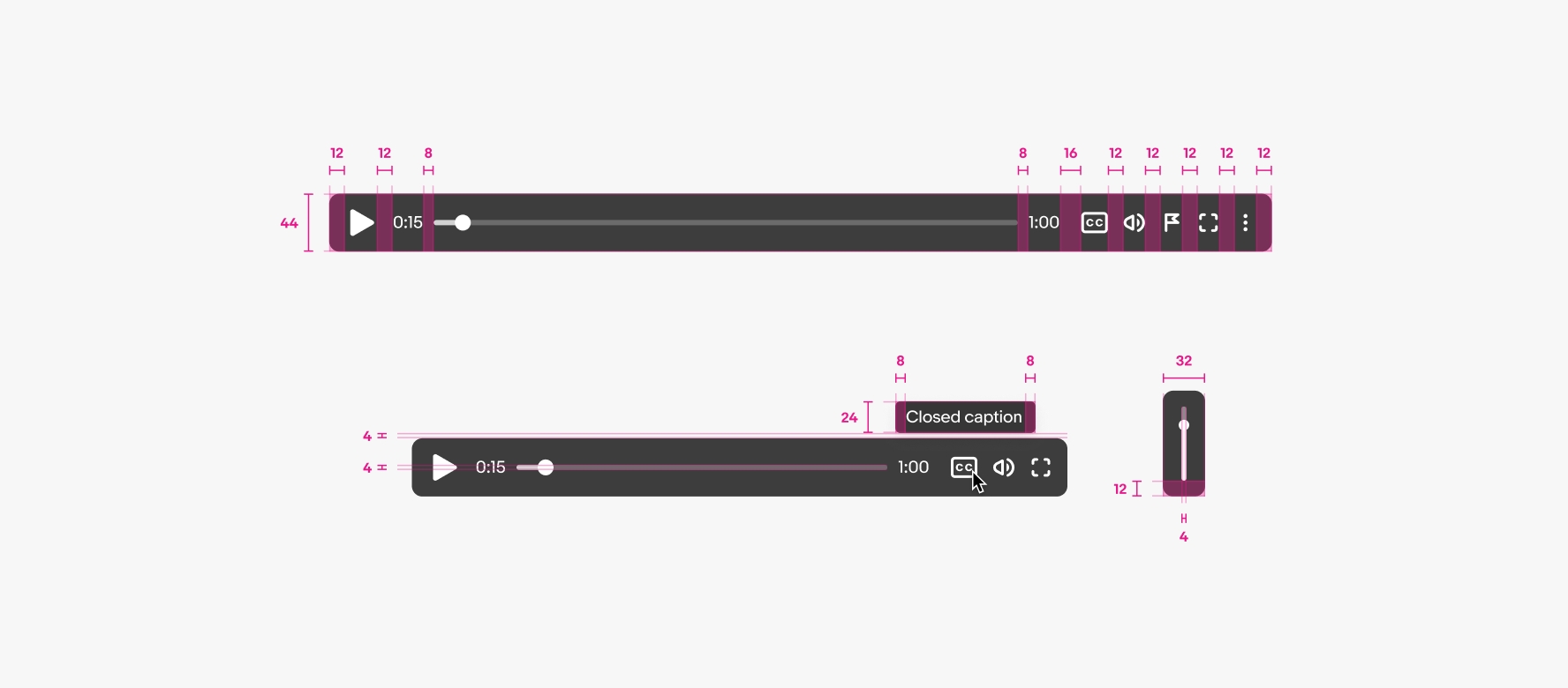
    Hovering or focusing on an icon reveals a tooltip with the button label.

    A cursor hovers over the closed caption icon with ‘Closed caption’ tooltip appearing above it.

    Changing volume

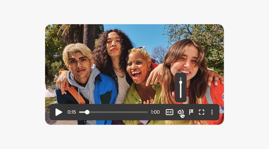
    A volume slider appears when hovering or focusing on the volume icon. The icon’s appearance adjusts according to the volume level and has a slash when muted. Clicking or tapping the icon toggles between mute and the previous volume level.

    A cursor hovers over the volume icon with a volume slider appearing above it.

    Native

    Native apps use the native video capabilities. iOS devices launch videos in full screen automatically when the video is played. Android devices play videos inline with an option to go full screen.

    A video is fullscreen on an iOS mobile device, and a video is full screen on an Android mobile device.

    Web

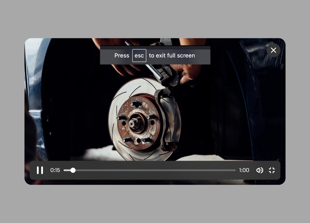
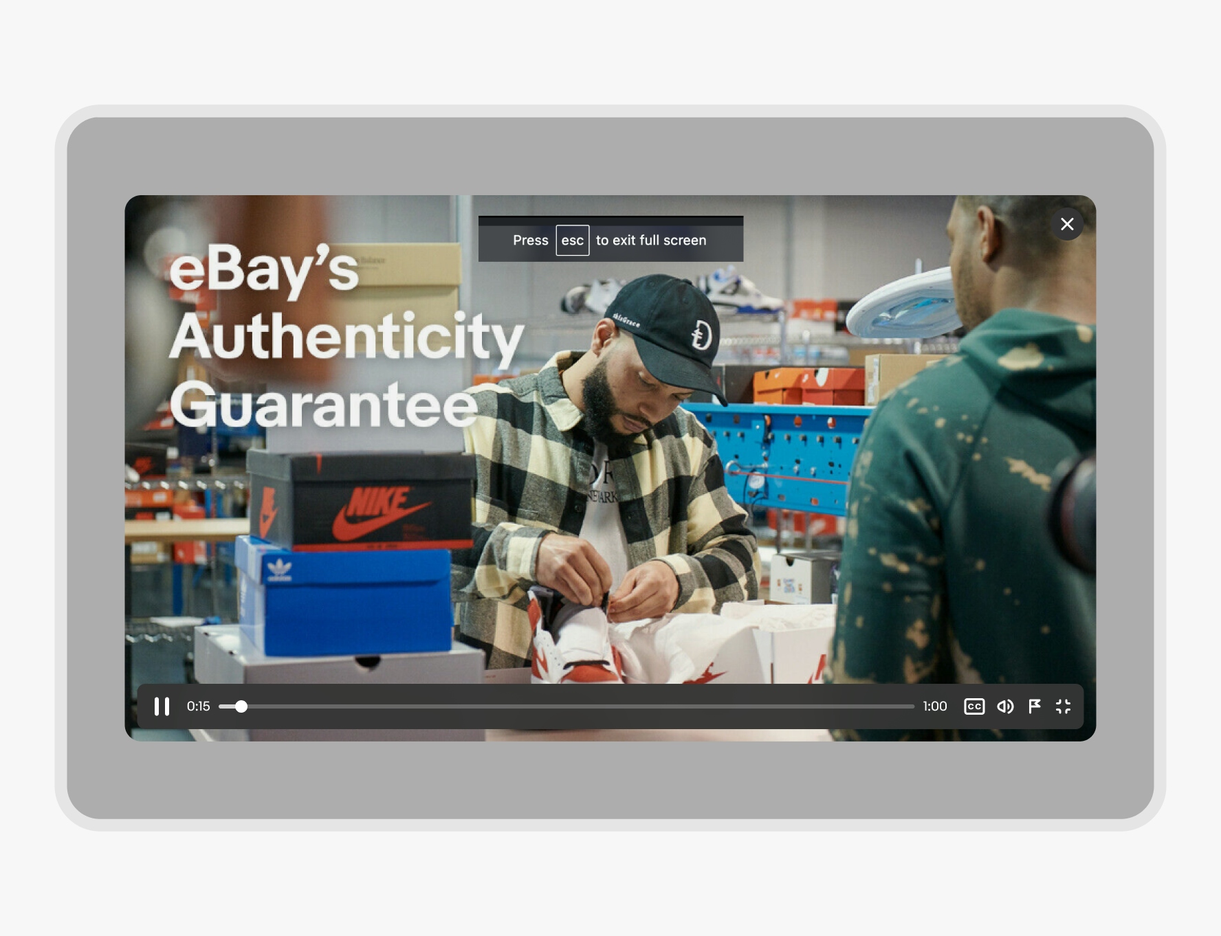
    Web videos can play inline or in a lightbox with an option to go full screen.

    A video player is on web overlaid on a scrim. A close icon button is situated on the top right of the screen.

    Autoplay

    Videos must be muted with controls available if the autoplay property is used. Use surrounding content to reinforce the value of the video content.

    A video player is shown with the volume off.

    Never autoplay a video with audio, and don’t rely on autoplay to work. Most modern browsers automatically block autoplay if a video isn’t muted, and users can adjust settings to block autoplay properties completely.

    A video player is shown with the volume on.
    • CSS
    • Marko
    • React