Toggle button group
A toggle button group is a single and multi selection pattern that provides increased visual emphasis for the available choices.
- CSS
- Marko
- React
Quick
They should be lightweight and short enough to scan instantly.
Informative
Each option should be self-explanatory, with clear content that make decisions easy.

- Image
- Title
- Subtitle
- Border
- Container
Toggle buttons work best when options stand on their own, helping create a strong visual hierarchy that guides users. For situations where the selection option is isolated, toggle buttons make the experience clear and focused.
- Use toggle buttons when selection options exist in isolation, meaning they are not part of a multiple selection groups.
- Avoid toggle buttons when multiple selection sections appear on the same page or layout. In these cases, use radio buttons for single-choice selections or checkboxes for multiple-choice selections.
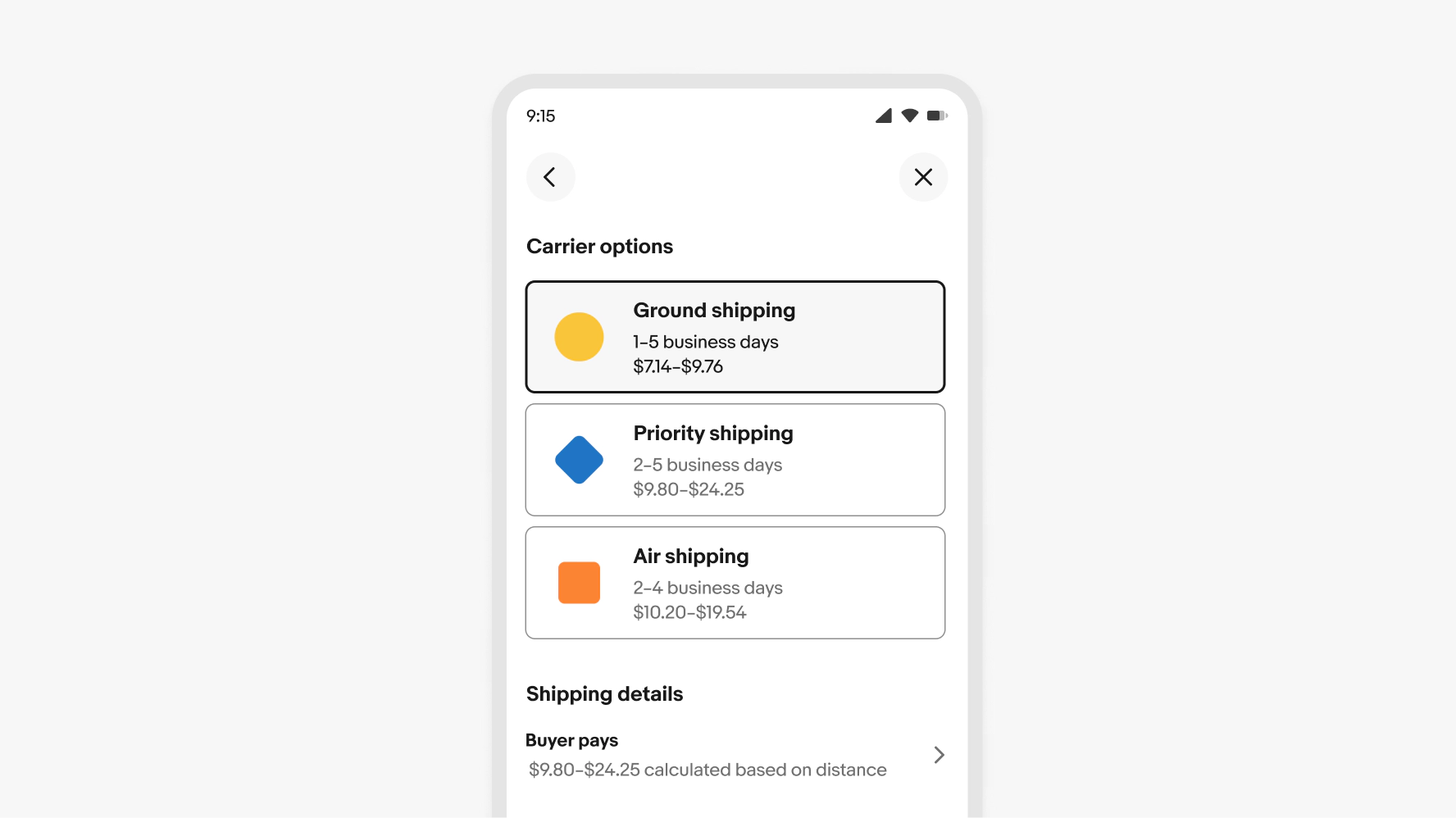
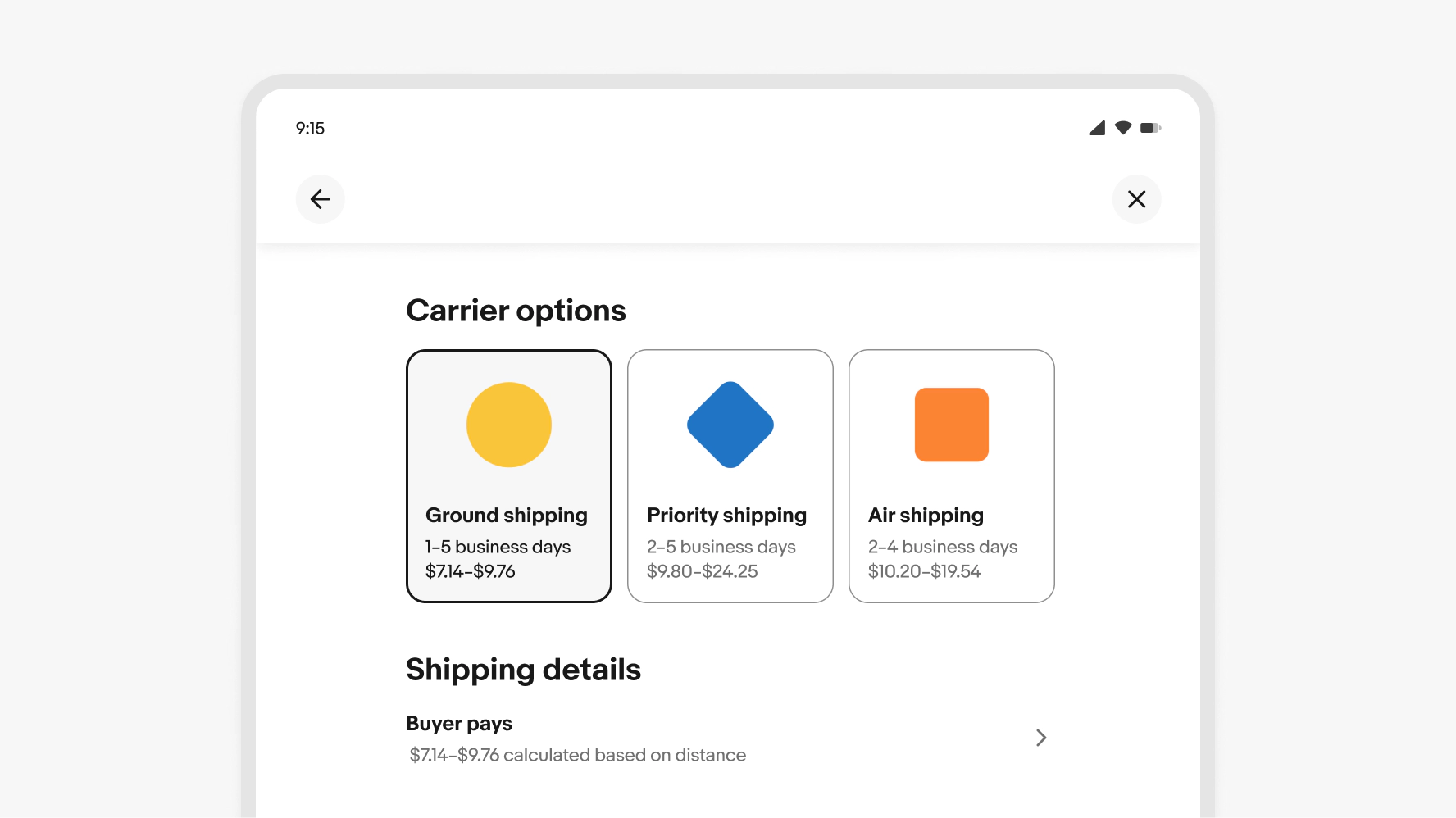
Single select
Single select allows the user to select one option from a set. Only one can be selected at a time.

Multi-select
Multi-select allows the user to select multiple options from a list.

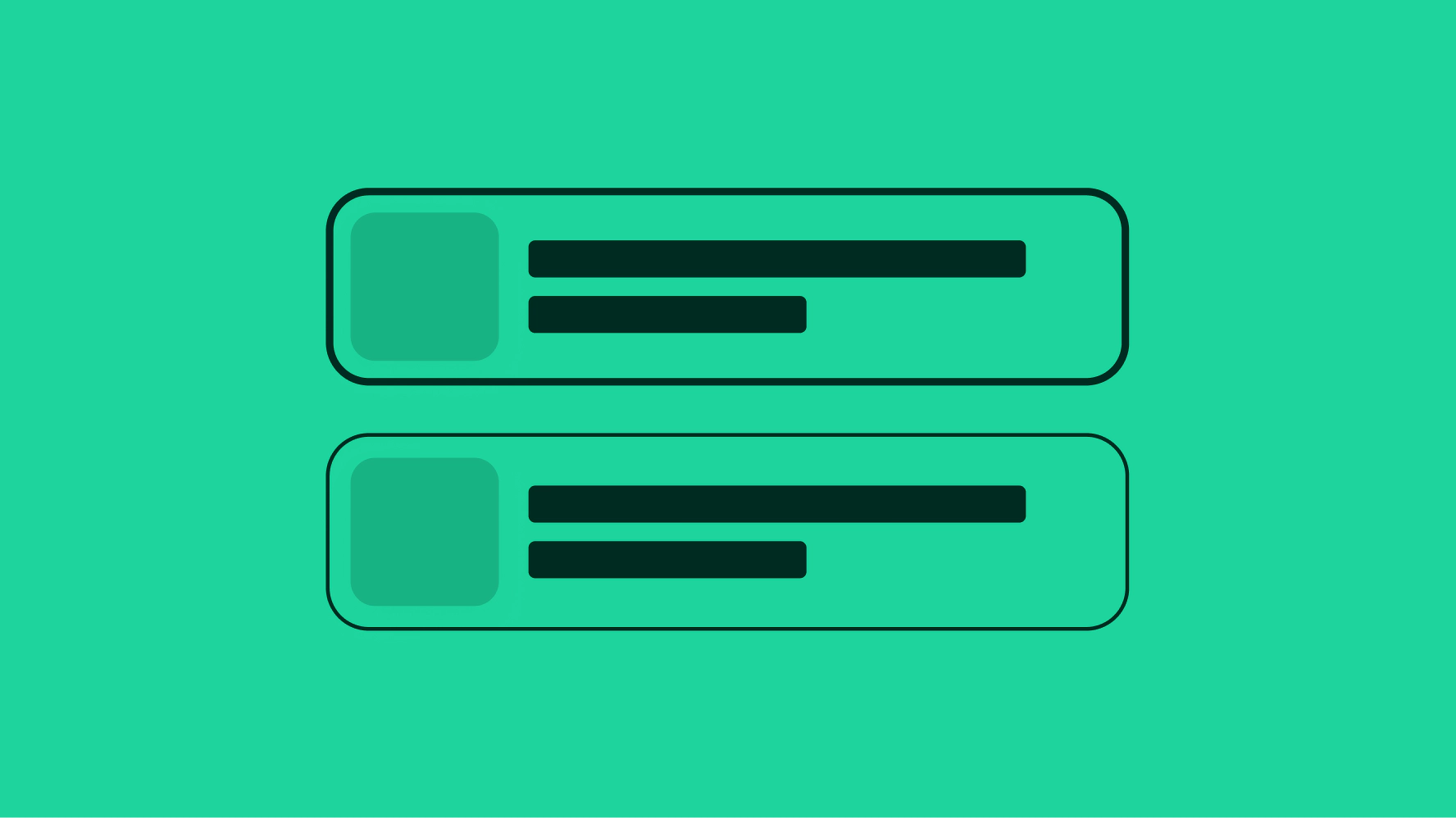
Content area
The content area helps users identify and distinguish between options at a glance.
Title
Titles name each option with clear, specific language so users can choose without needing a subtitle. Keep parallel structure across options.
- Use sentence case
- No ending punctuation
- Max character count: 20
Subtitle
Optional. Subtitles provide additional context, such as specifications or benefits, without restating the title.
- Use sentence case
- Use ending punctuation for complete sentences
- Max 2 lines
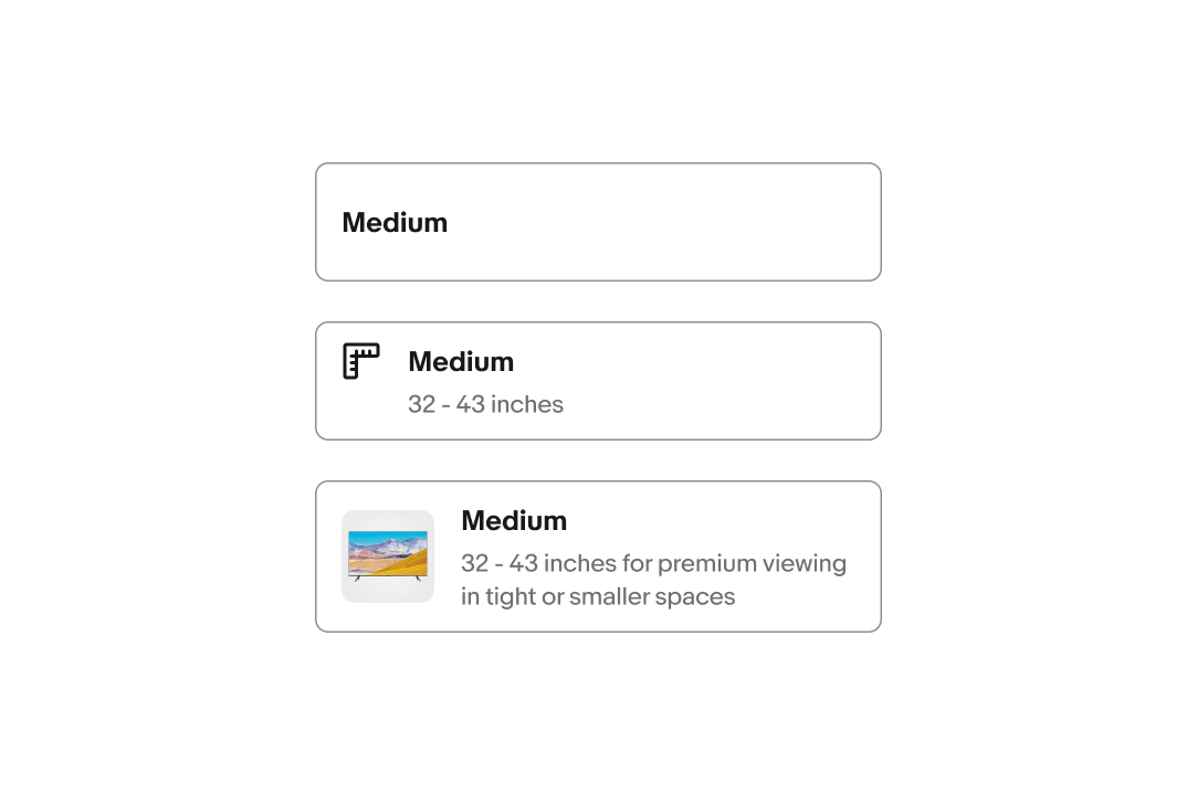
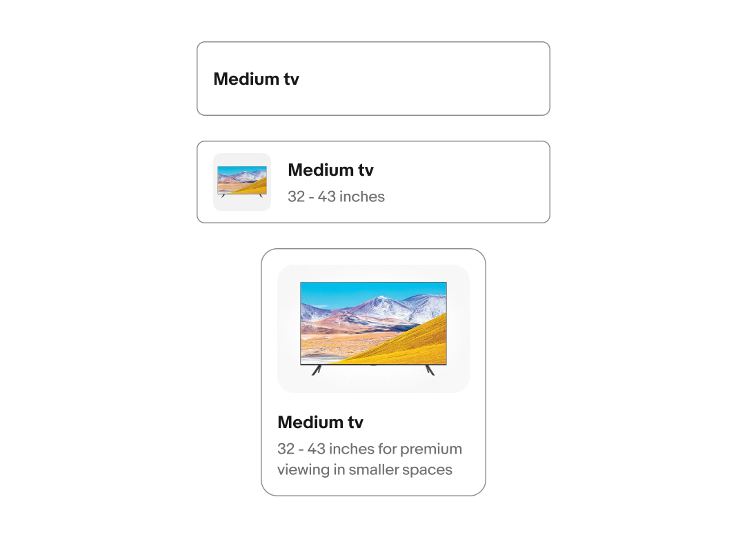
Lead element
The lead element is optional. It provides visual support for the available options. There are 2 options for lead elements: Icon and Image.

Layout
Toggle buttons can be presented in 3 variants: Minimal, List view, and Gallery view.
Overflow
Titles and subtitles wrap to another line when wider than the container. Keep them short to avoid overly tall buttons.

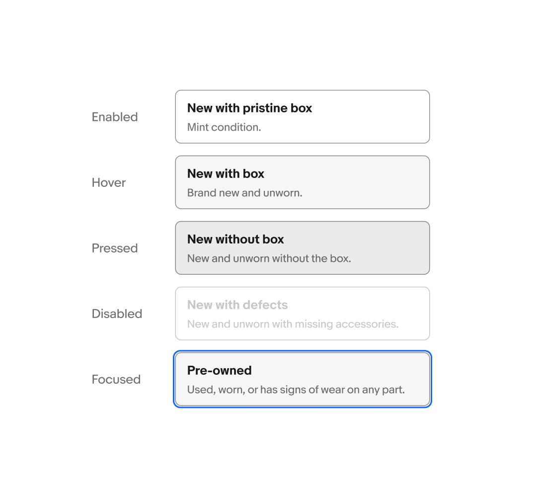
Selection
The selection state toggles on and off for both multi and single select option list styles.
On selection the border color changes to “border.strong”, the border width increases, and the background color changes to “background.secondary”.

State
Toggle buttons use state layers for interaction states. The available states are enabled, hover, disabled, and focused. Learn more about the state layer color values in Color tokens.
Size
It is important to ensure you follow the sizing guide for each toggle button variant. The various styles and layouts adhere to different minimum and maximum sizing rules.
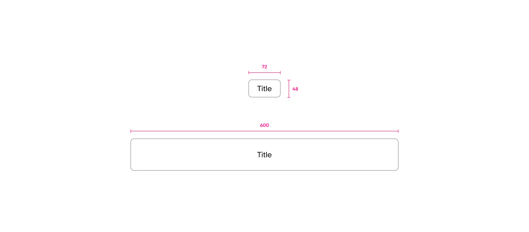
Minimal
The minimal layout has a minimum width of 72px and a minimal height of 40px. The minimal layout has a maximum width of 600px.
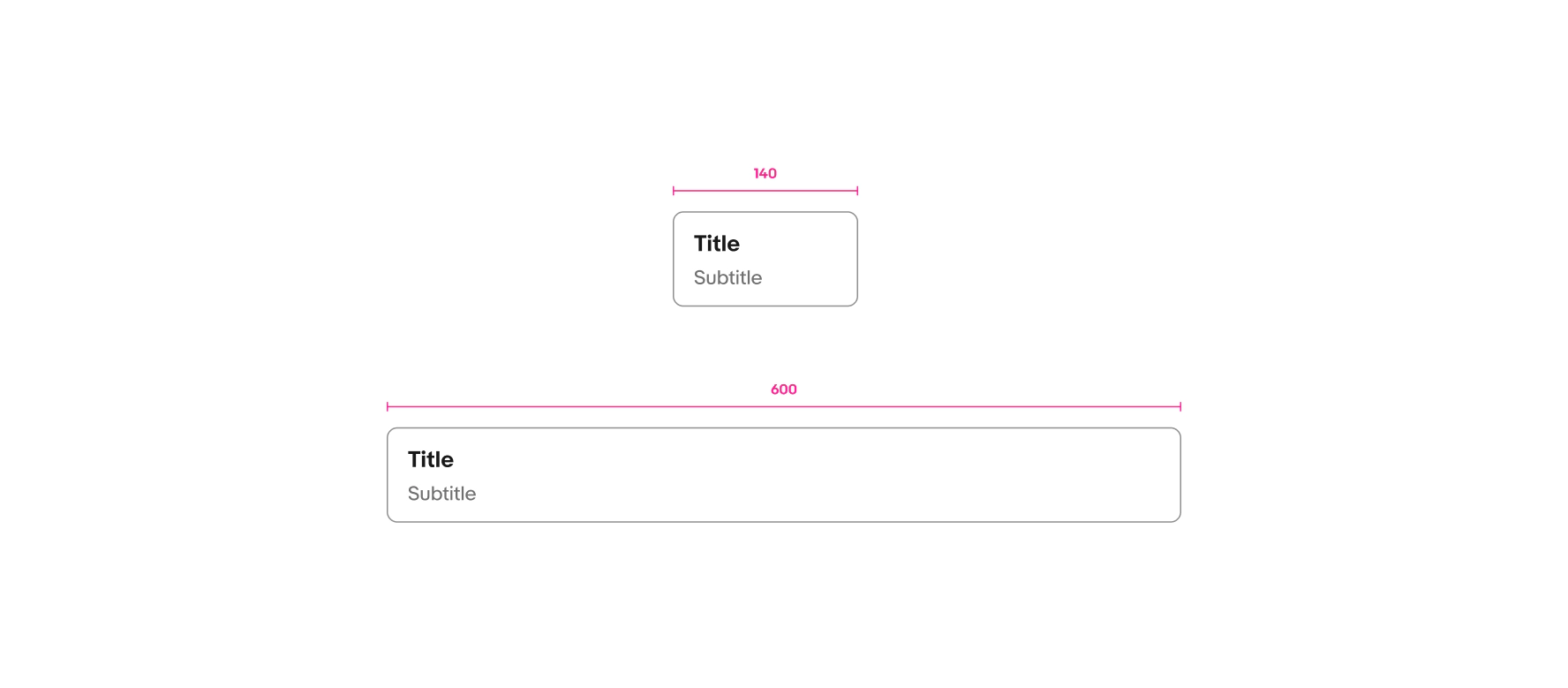
List view
List view layouts have a minimum width of 140px and a maximum width of 600px.
Gallery view
Gallery layouts have a a minimum width of 140pc and maximum width of 140px.

Small
Medium and large
CTA buttons
Do use the variant options provided within the component.

Don’t add CTAs or additional buttons to the option list.

Additional controls
Keep content minimal and straight forward.

Don’t add additional controls or selection indicators, such as checkbox, radio button, or checkmark.

Content length
Keep titles and subtitles short and concise.

Don’t let the subtitle go over 3 lines.

Binary choices
Do use the radio component for short, binary options.

Don’t use the Toggle Button Group component for short, binary options.

Overflow
The title can wrap to 2 lines for the title-only option. In general, keep your content brief and to the point.

Don’t write overly detailed titles. If more room is needed consider using a different layout variant.

Size consistency
Do keep all buttons the same height and width when grouped.

Don’t create buttons with differing heights and widths in the same group.

Filtering
Do use the filer chip component for selecting filters.

Don't use the Toggle Button Group for filtering.

Navigation
Do use tab to navigate between pages

Do not use toggle buttons to navigate between pages or views.

Progressive disclosure
Do use progressive disclosure to present the next section within a flow base on a user’s selection, keeping the interface clean and focused.

Do not place progressive disclosure within a toggle button itself, as this could hide critical information needed to make an informed choice. Key details should always be visible before a selection is made.


