Dialog

v4.0

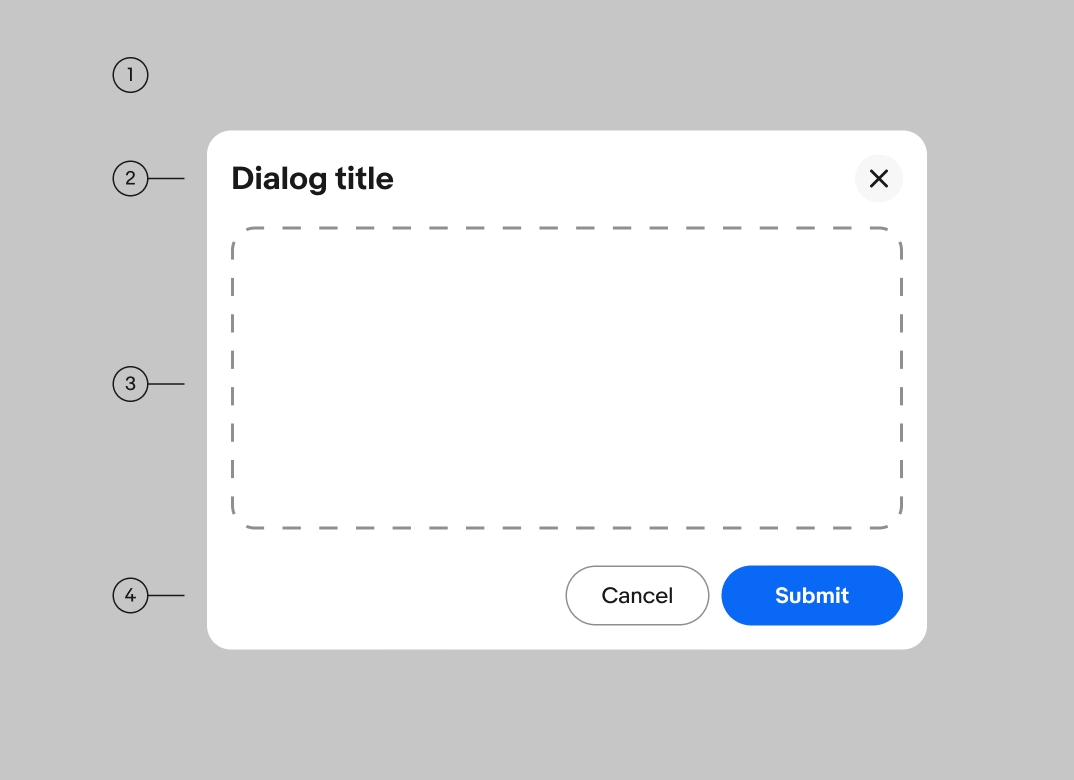
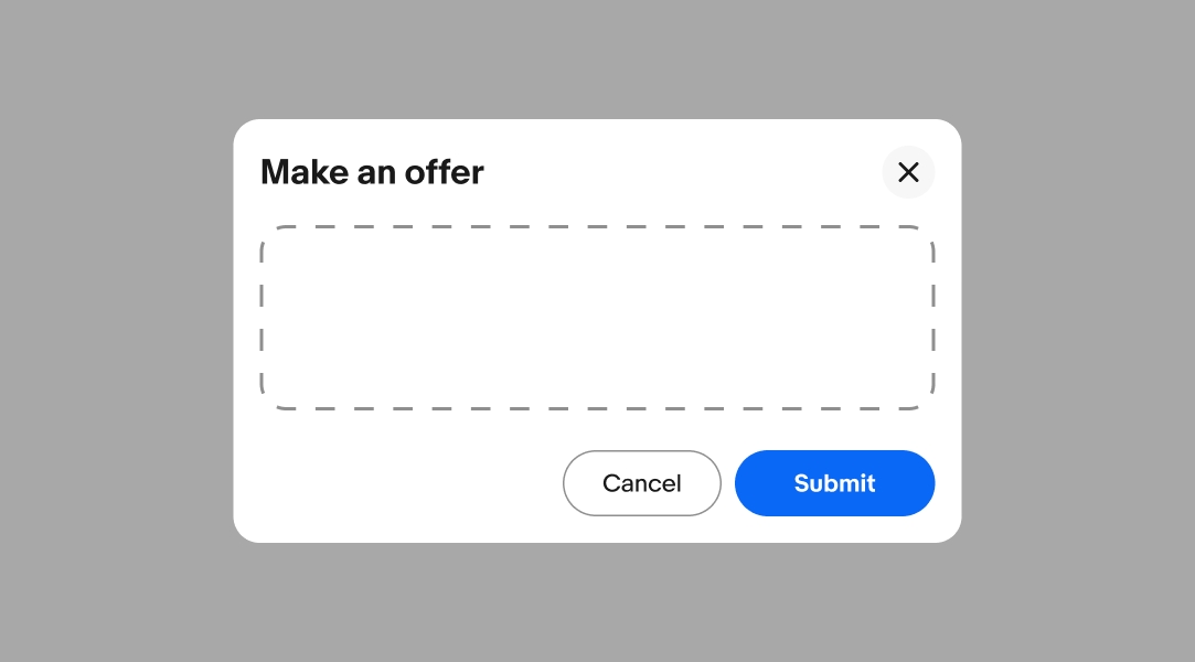
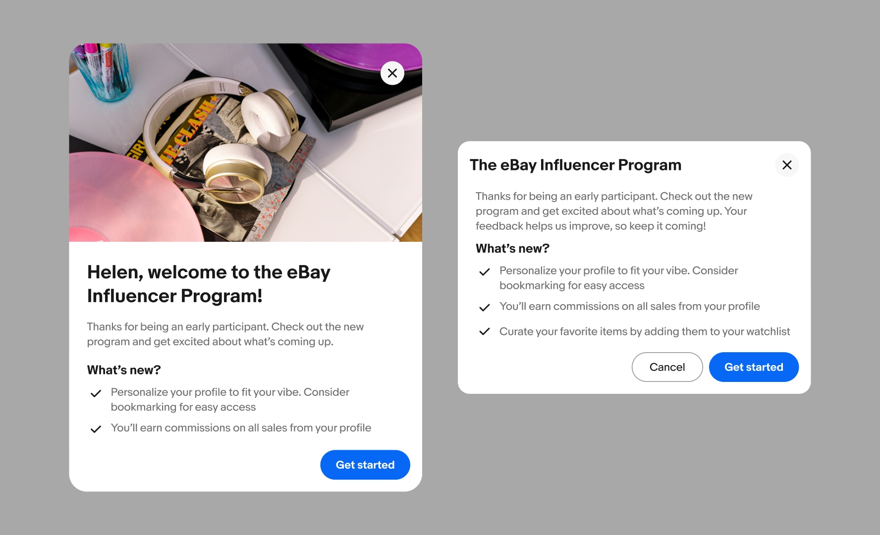
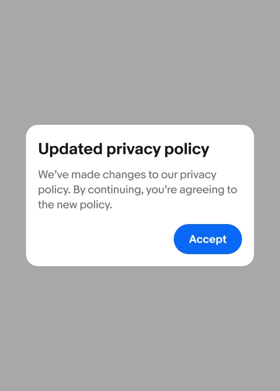
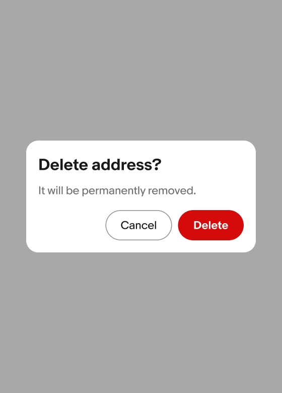
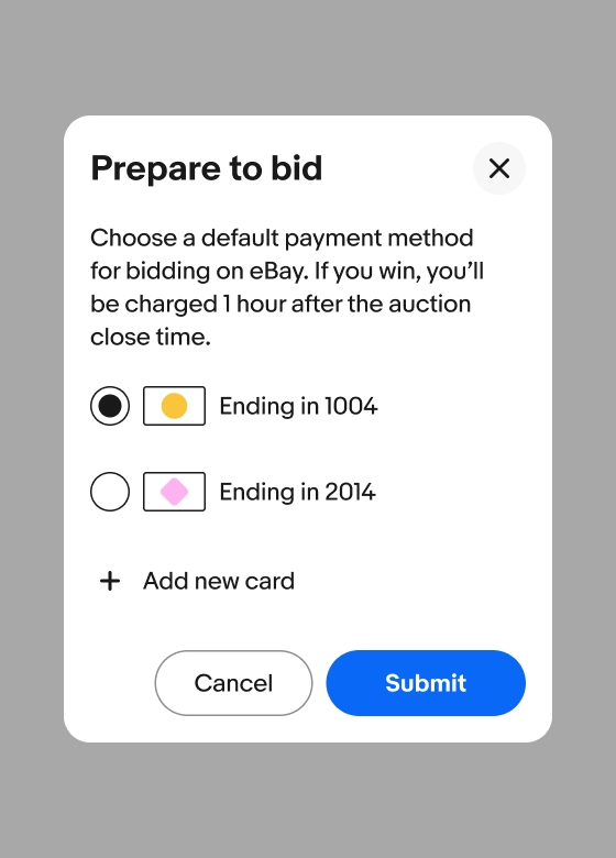
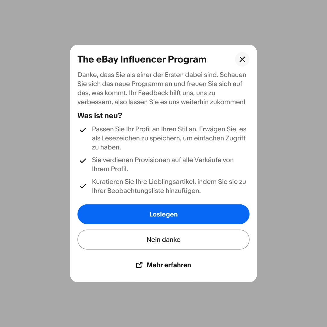
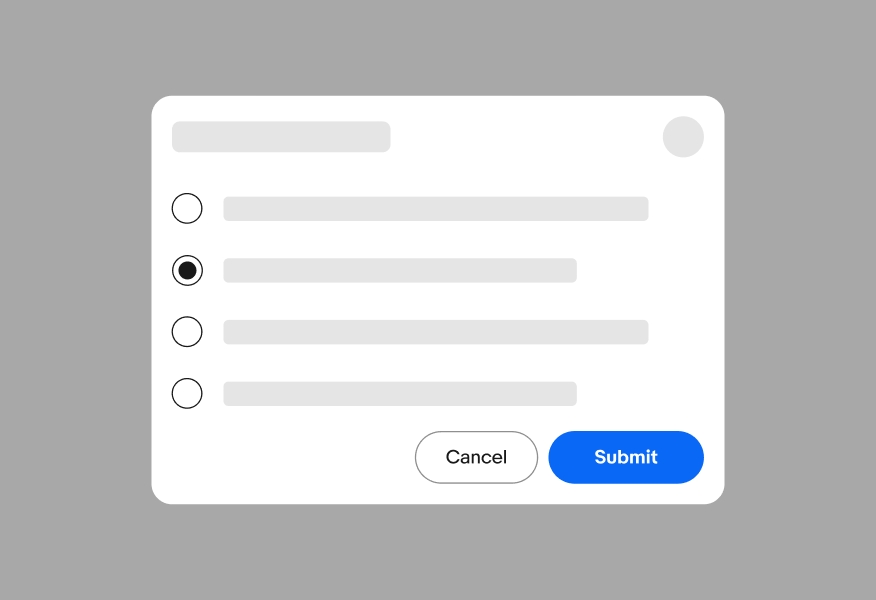
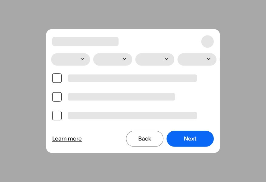
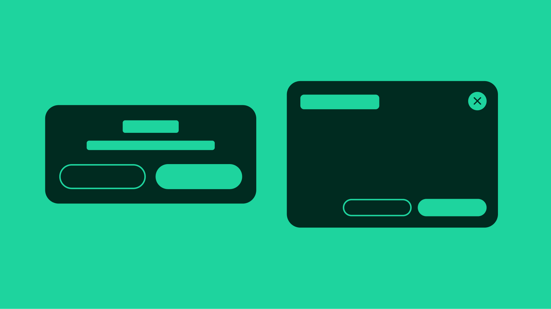
Dialogs appear in front of other content to ask for a decision or inform users of important information.

  • CSS
  • Marko
  • React
Stylized graphic of a set of dialogs.

Considerations

Focused

Dialogs focus the user on a single task or piece of critical information.

Responsive

Dialogs are initiated by the user either explicitly or implicitly. They are not system-generated.

Intentional

Dialog content is necessary and helpful for the user to complete a larger goal.
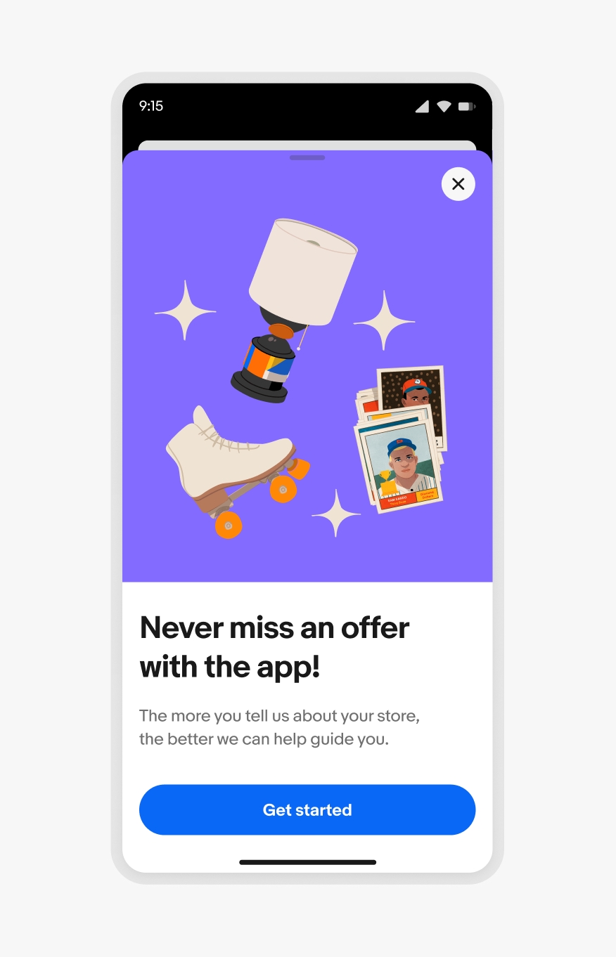
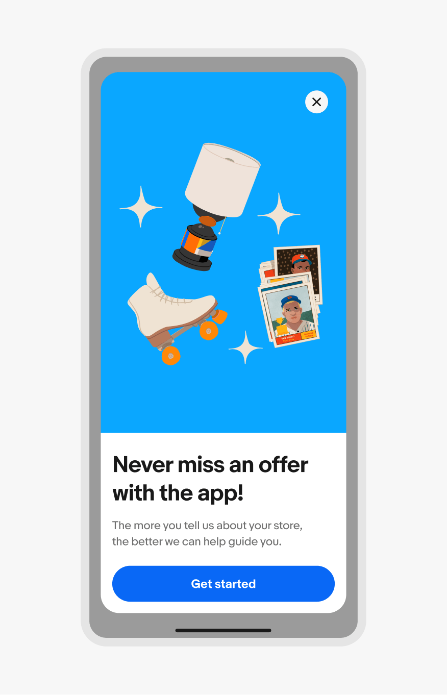
Anatomy

Properties

Type

There are three types of dialogs available depending on the type of decision and number of actions present.

Alert dialog with a single buttons.

Alert

Alert dialogs require the user’s attention. They are usually presented by the system, not an explicit user action, so they are highly disruptive. Alerts have a single action and can only be dismissed through the action.

Confirm dialog with two buttons.

Confirm

Confirm dialogs inform users of a decision’s impact. These dialogs present two actions and are dismissed by interacting with one of them.

Task dialog with two buttons in the footer container and a radio button group to select a payment method in the content container.

Task

Task dialogs request users to complete a focused task or provide more information related to an element on the main page. The content can vary depending on use case, like form fields to update an item in a table or additional information about a program. Task dialogs have a close button in the header to allow users to dismiss the dialog at any time without a decision.

Behavior

Screen sizes

Small screen native

Native applications use the bottom sheet for dialogs.
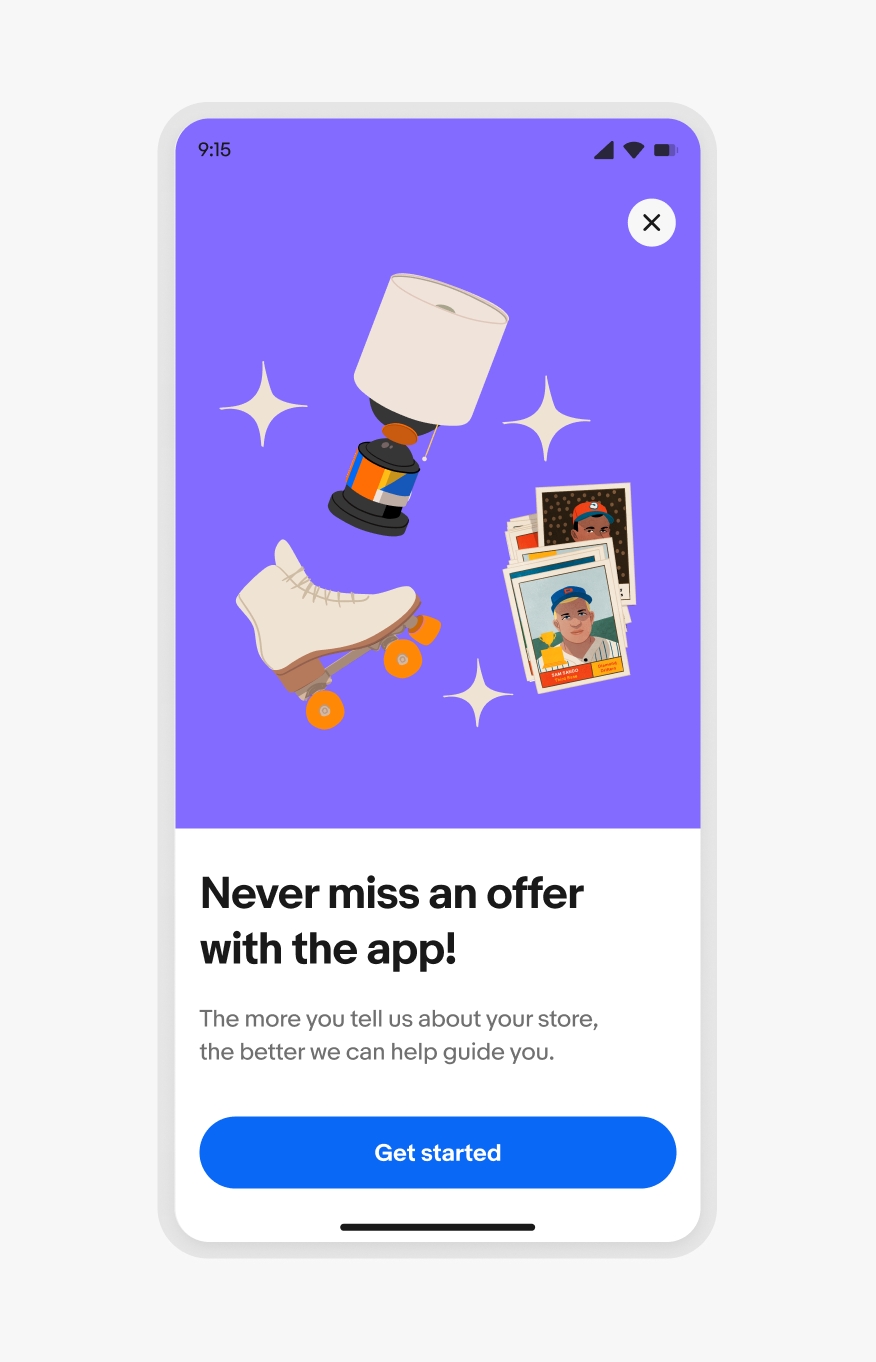
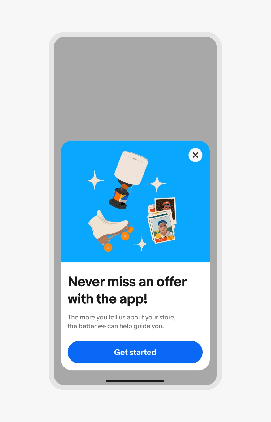
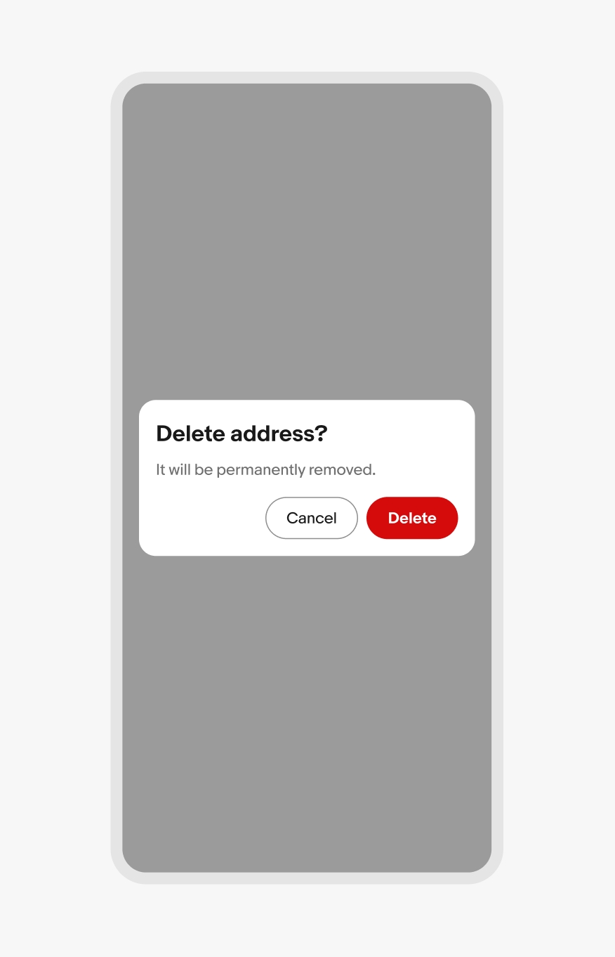
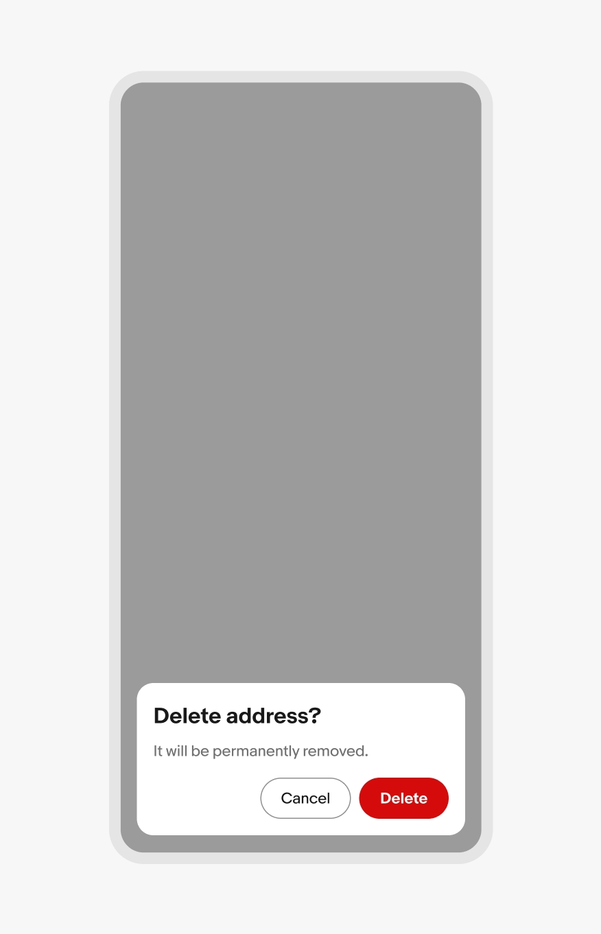
Full screen overlay on a compact iOS device with an illustration image, title, description, and button.

iOS form sheet

Full screen overlay on a compact Android device with an illustration image, title, description, and button.

Android full screen overlay

Small screen web

Dialogs on web are inset and bottom-aligned.
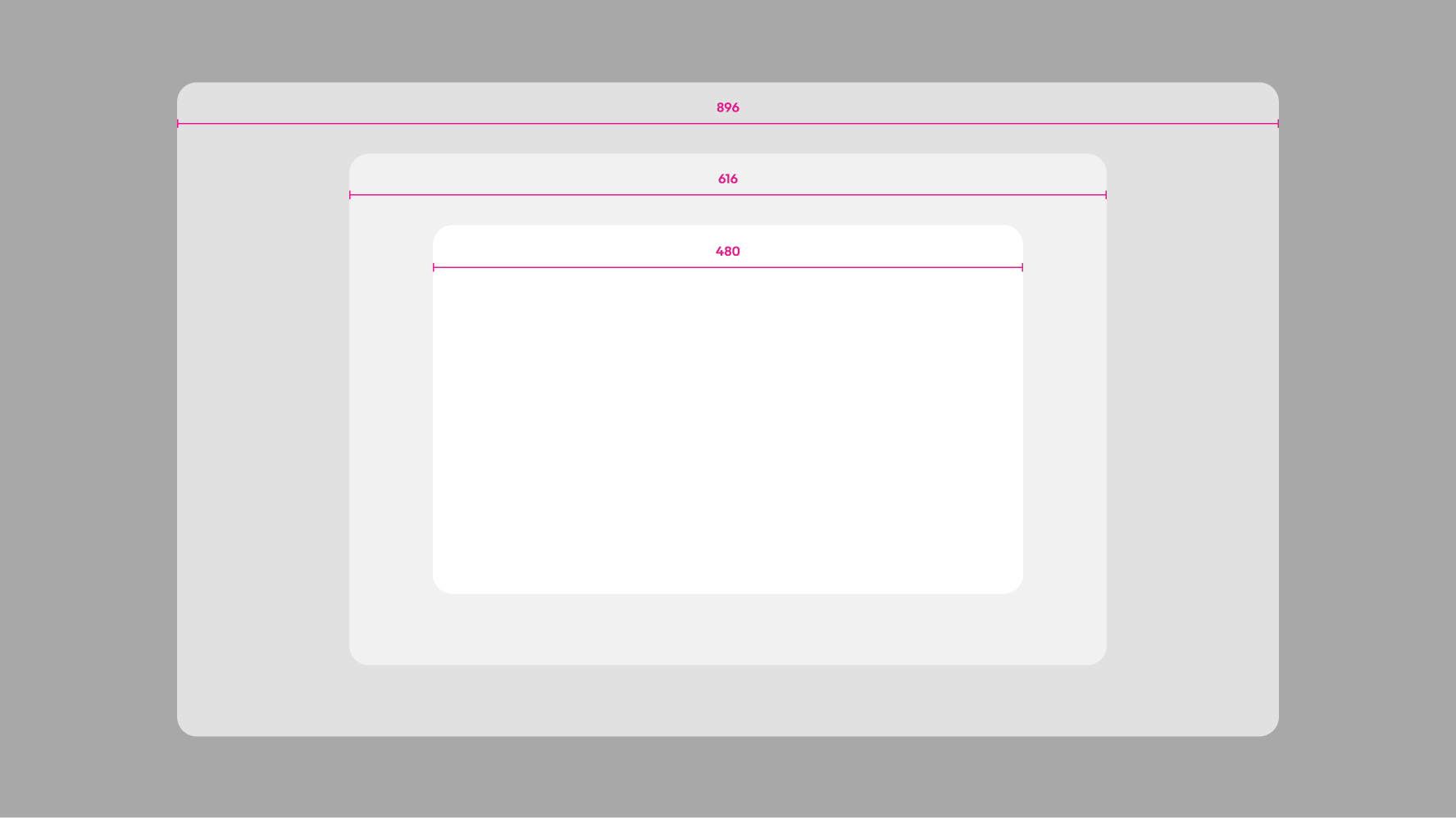
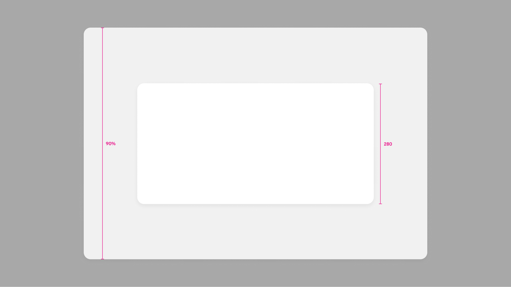
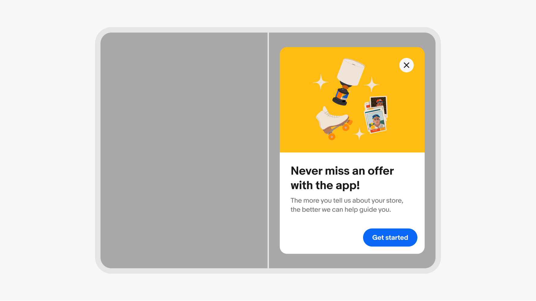
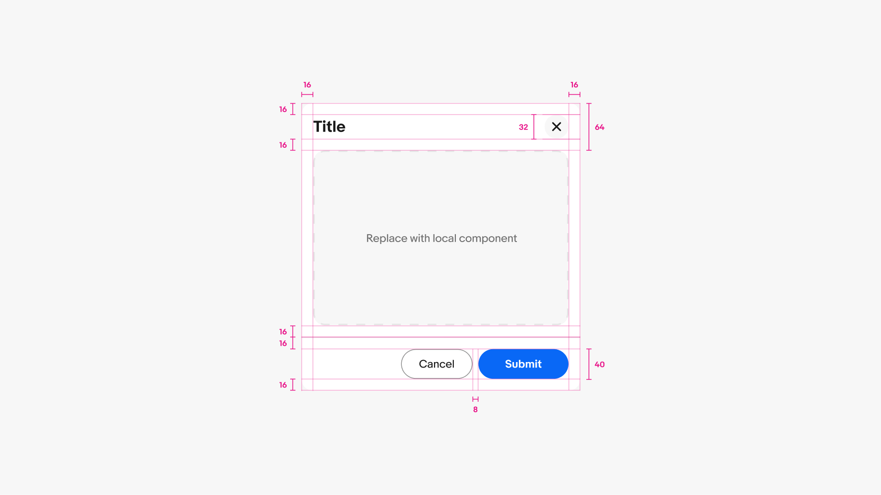
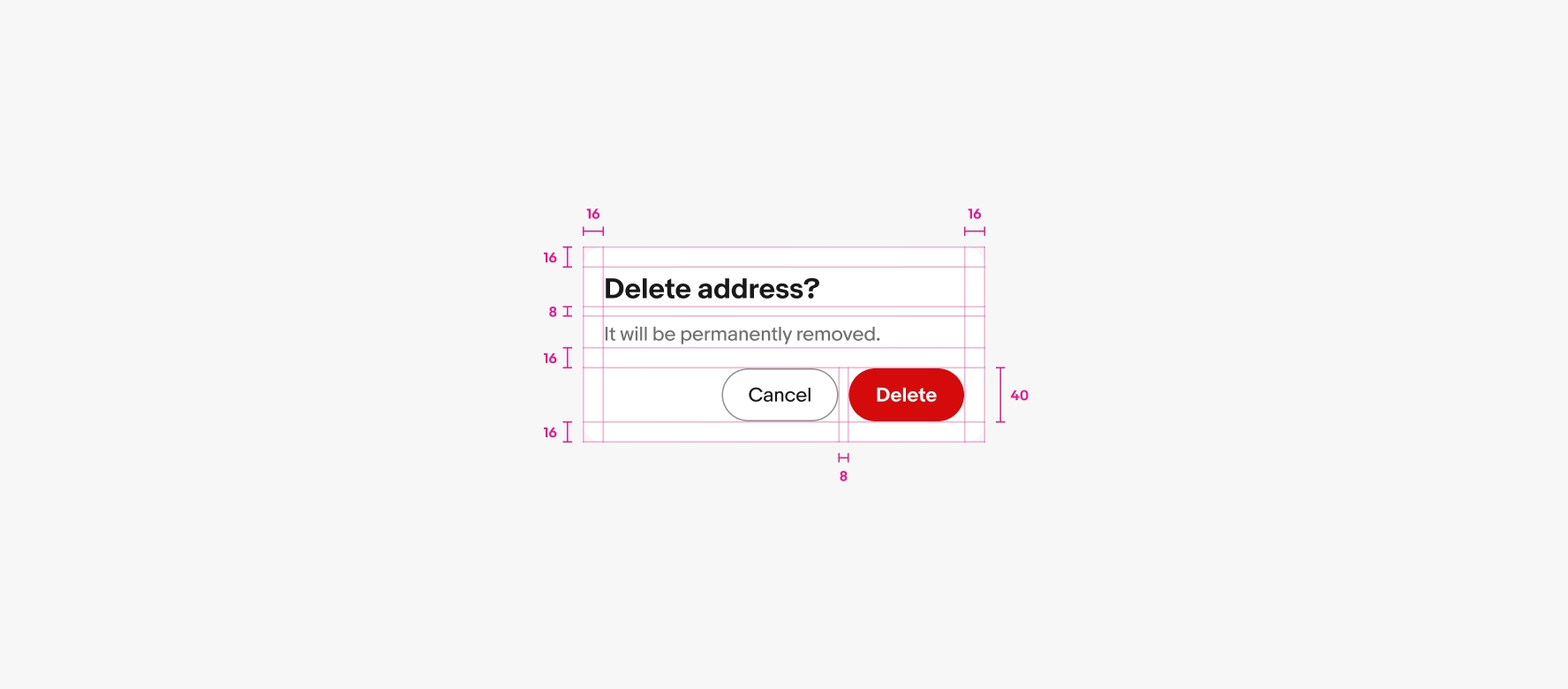
Lightbox dialog in a web browser on a small screen. The dialog is anchored towards the bottom and inset from the sides and bottom of the screen.

Web bottom inset sheet

Full screen overlay in a browser on a small screen with an illustration image, title, description, and button.

Web full screen overlay

Large screen

Dialogs are centered on larger screens across platforms. Dialogs can be offset to the left or right on large-format foldable devices.

A centered dialog on a large screen device.

Centered sheet dialog

An offset dialog on an open foldable device.

Offset sheet dialog on foldable device

Best practices

Specs

A spec for a dialog container. The container has 16px of padding on all sides. The header area contains a title and a 32px close icon button with 16px of padding between it and the content area. A full-width divider line with 16px of padding above and below it sits below the content area, followed by a pair of CTA buttons that are anchored to the bottom right.

Task dialog

A spec for a confirm dialog container. The container has 16px of padding on all sides. 8px of padding is between the title and body copy. 16px of padding is between body copy and button group. 8px of padding is between the buttons.

Confirm dialog