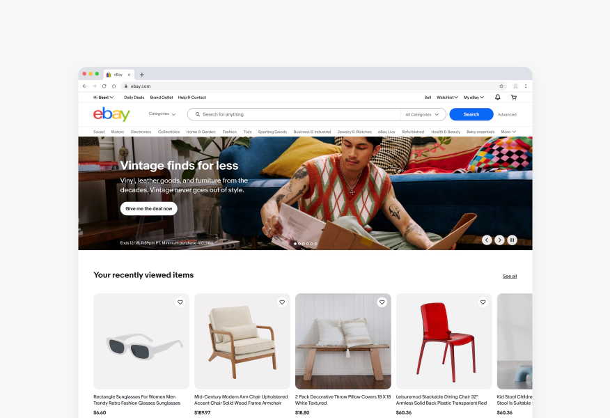
Banner
Banners give users visibility to curations, promotions, events, and programs with a CTA that drives them to explore more.
- CSS
- Marko
- React
Expressive
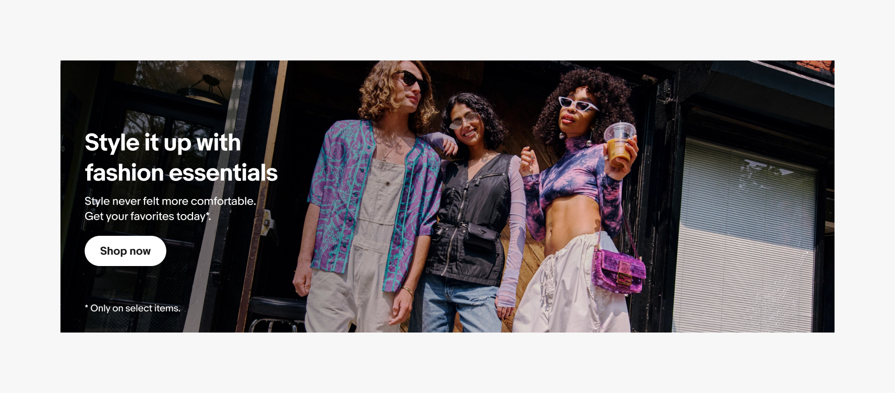
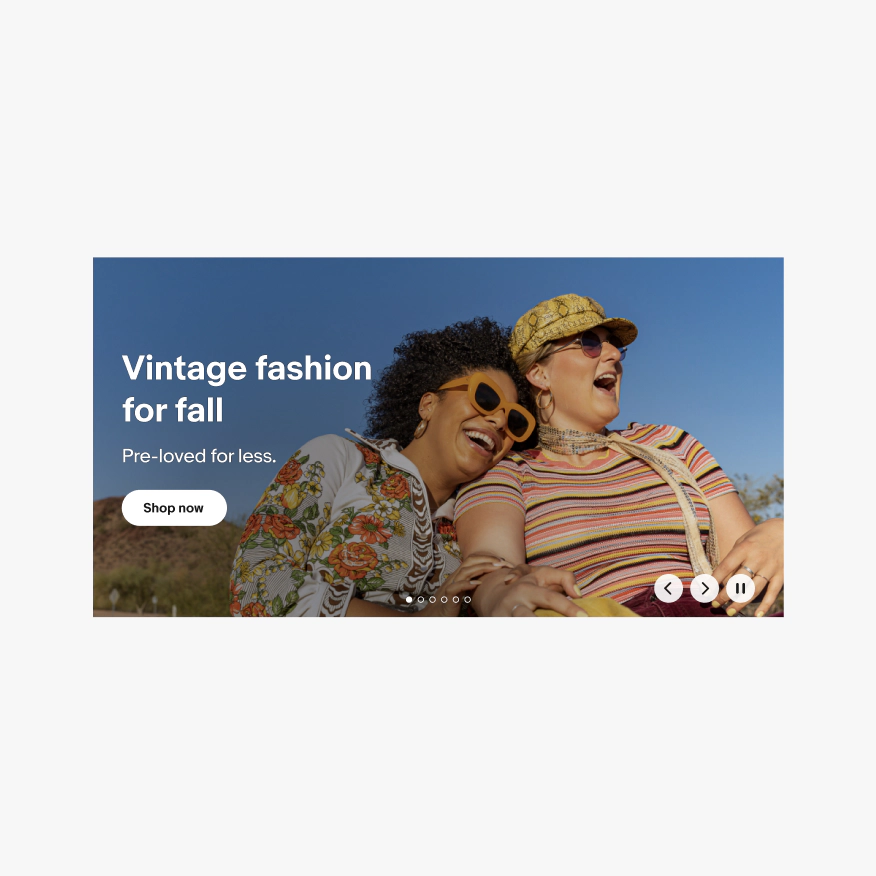
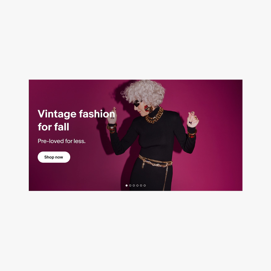
Banners use full-bleed color and photography to immerse users in a mood, season, or story.
Resonate
Personalize banners for each user by using what we know about them to show content that resonates.
Relevant
Banners appear at the moments they are most relevant to the user and always consider context and situation.
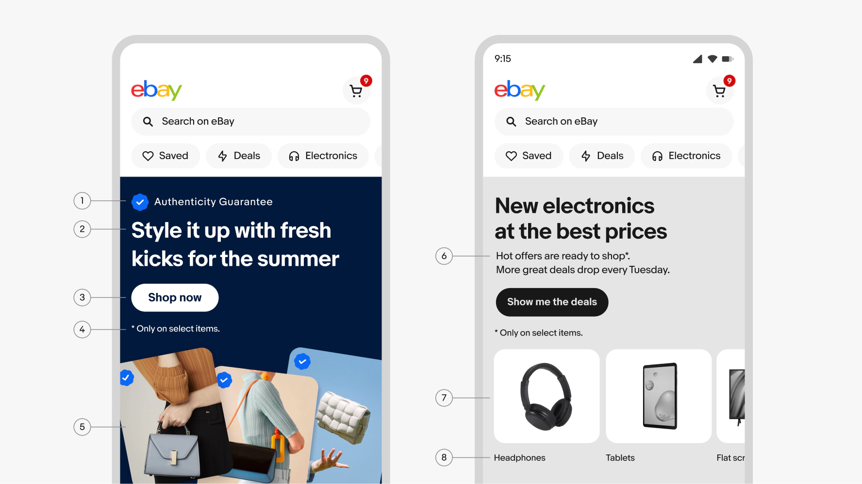
- Overline
- Headline
- Action
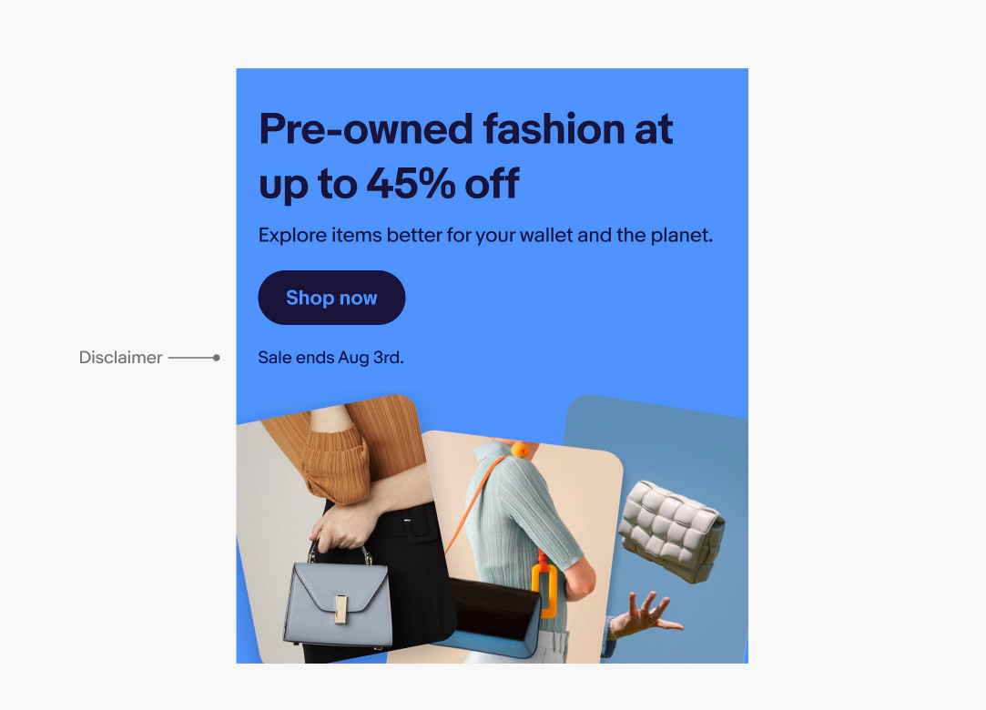
- Disclaimer
- Image
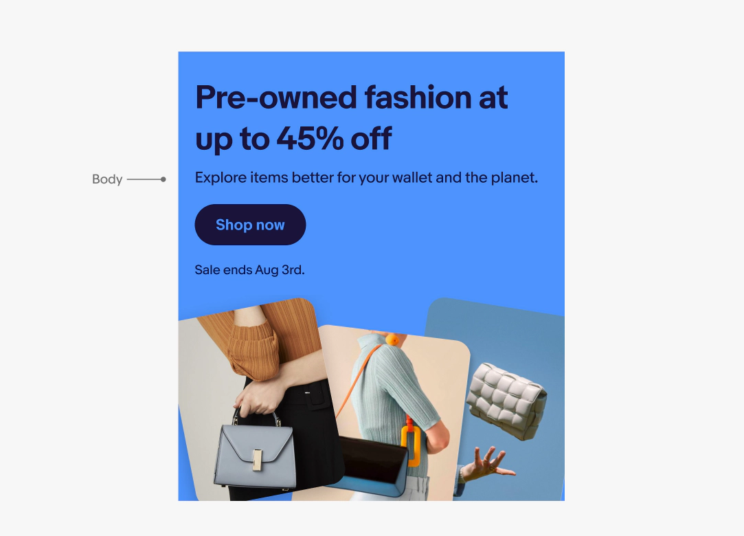
- Body
- Destination card
- Destination link
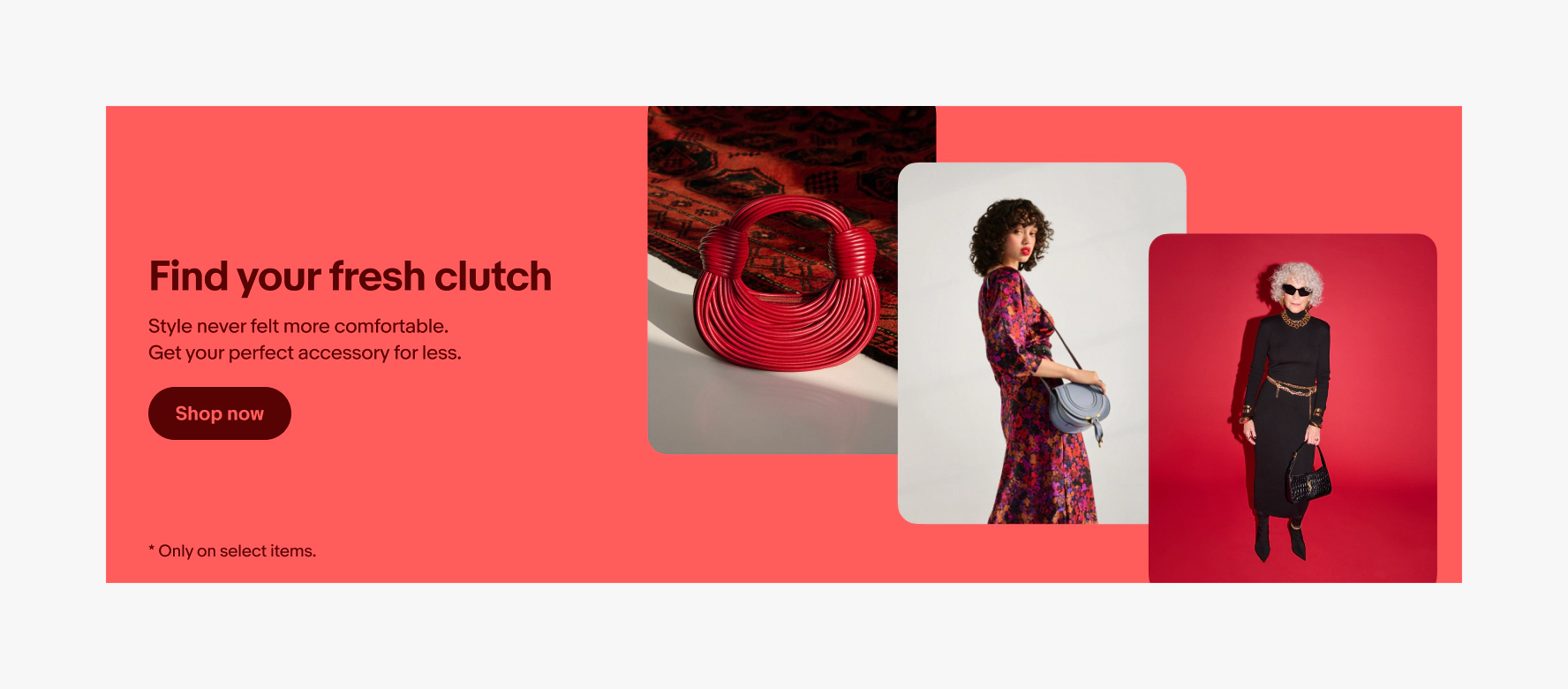
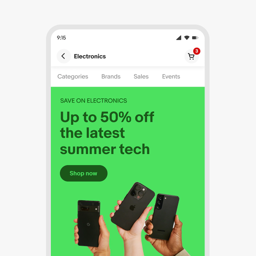
Image background
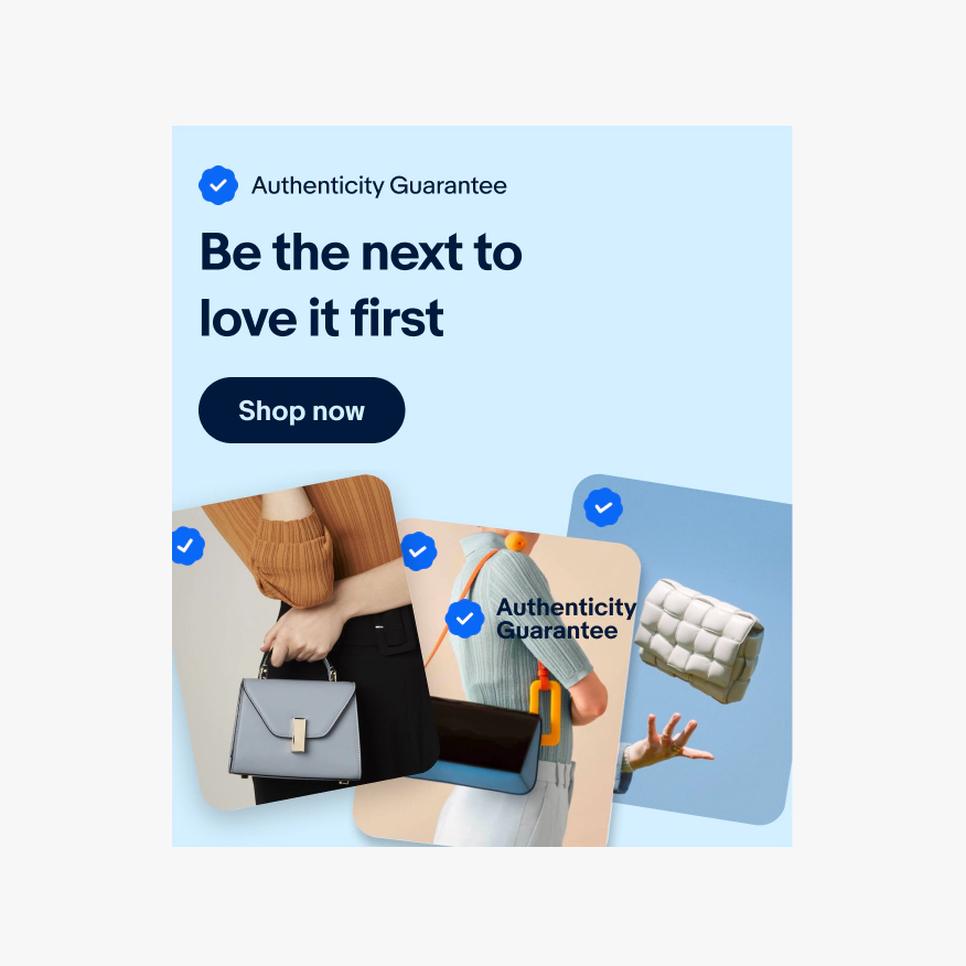
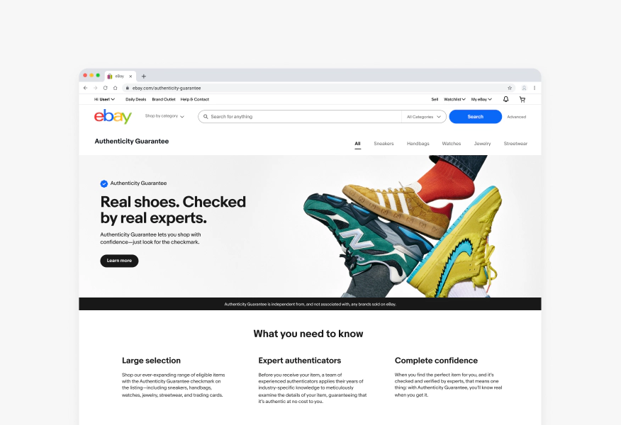
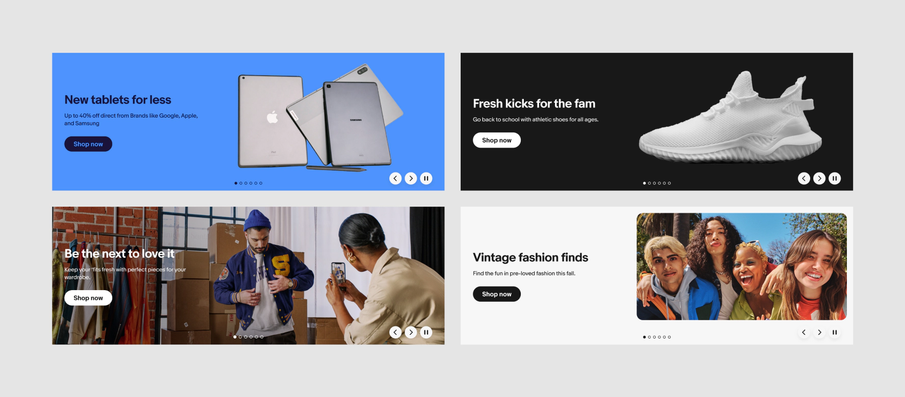
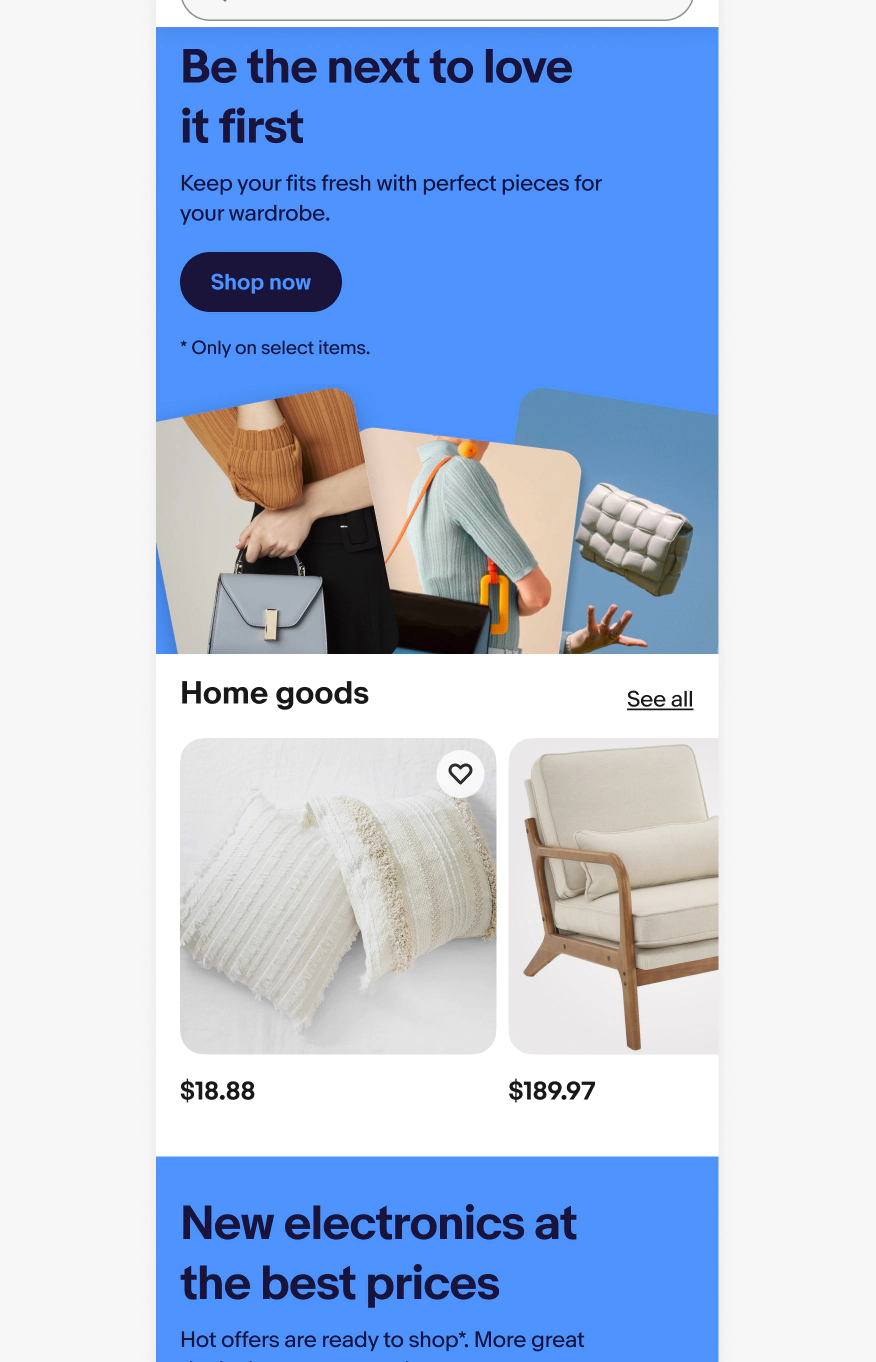
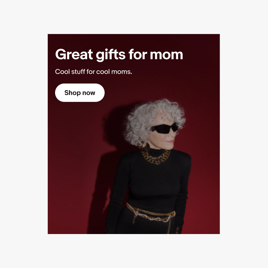
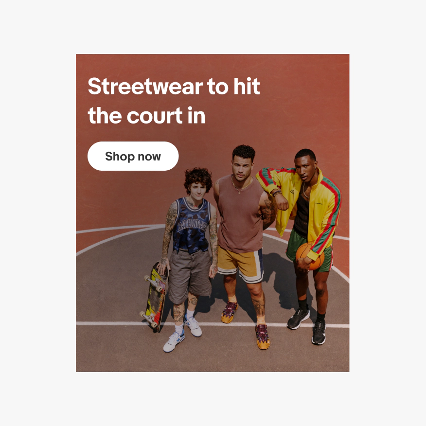
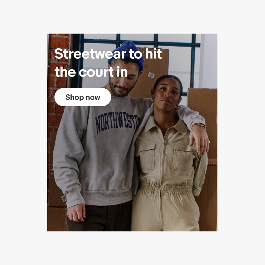
Image background banners have a single action button and a full-bleed image that extends edge to edge as the background. A drop shadow on the text and a radial gradient will automatically be applied behind the text area to ensure that all content is legible. Specs for the gradient and drop shadow can be found in the Making it legible section. Specs for asset size and safe zones of full-bleed images can be found in the Assets and scaling section.
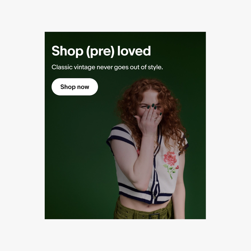
Color background
Color background banners have a single action button and a single color background chosen based on a theme. Our color themes have pre-defined background and foreground colors for the text and button. You can find all of our brand-approved color combinations on our Using color page. Images used in this banner type utilize transparent PNG’s that sit on top of the background color. You can find specs for asset size and safe zones in the Assets and scaling section.
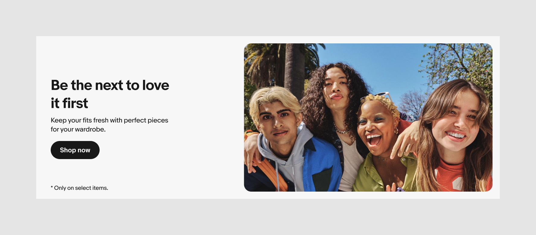
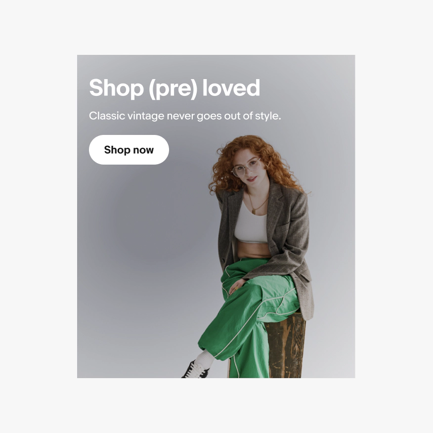
Inset image
Inset banners also have a single action button and images used in this banner type utilize lifestyle or studio PNG’s. The only available color for this template is our lightest gray background (N200) with black text. You can find specs for asset size and safe zones in the Assets and scaling section.
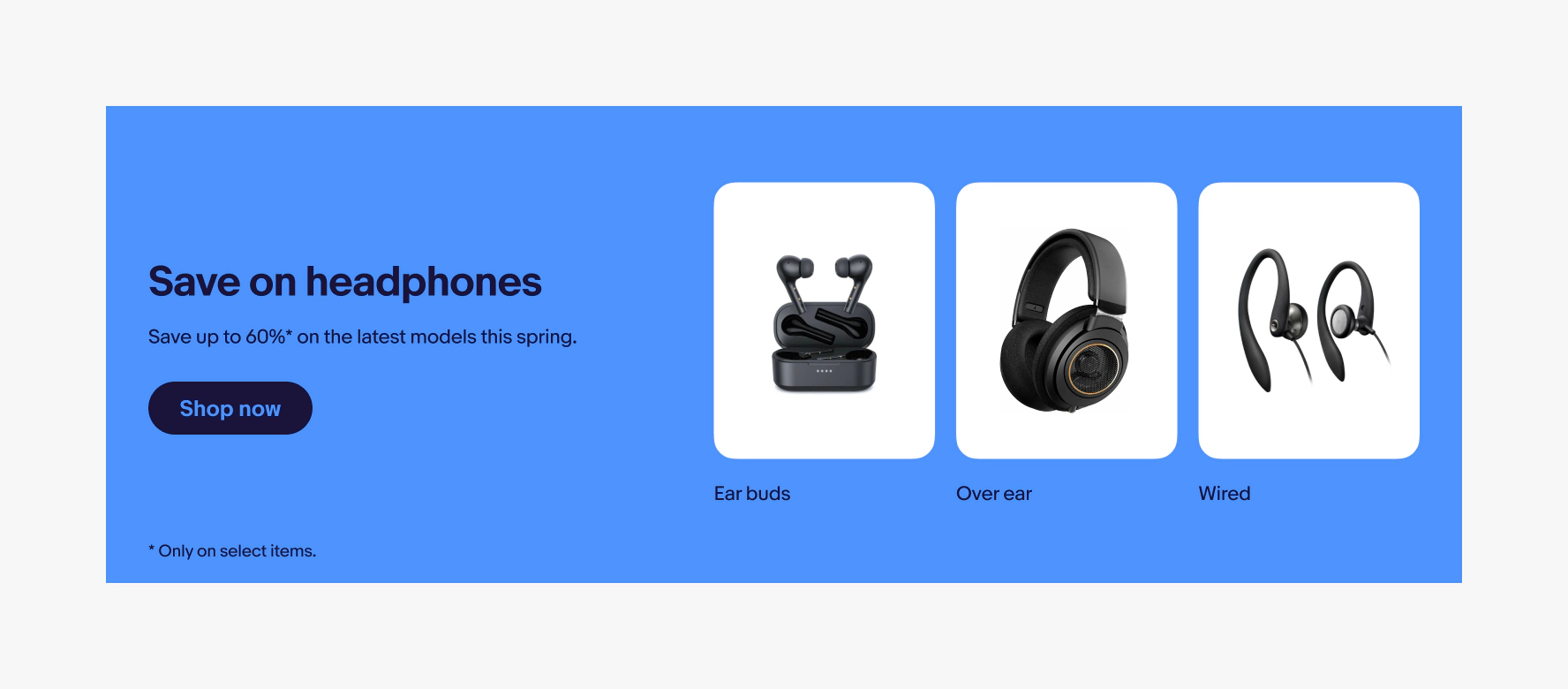
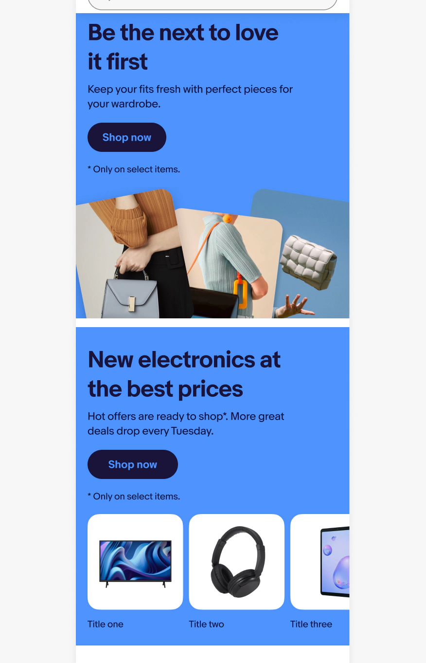
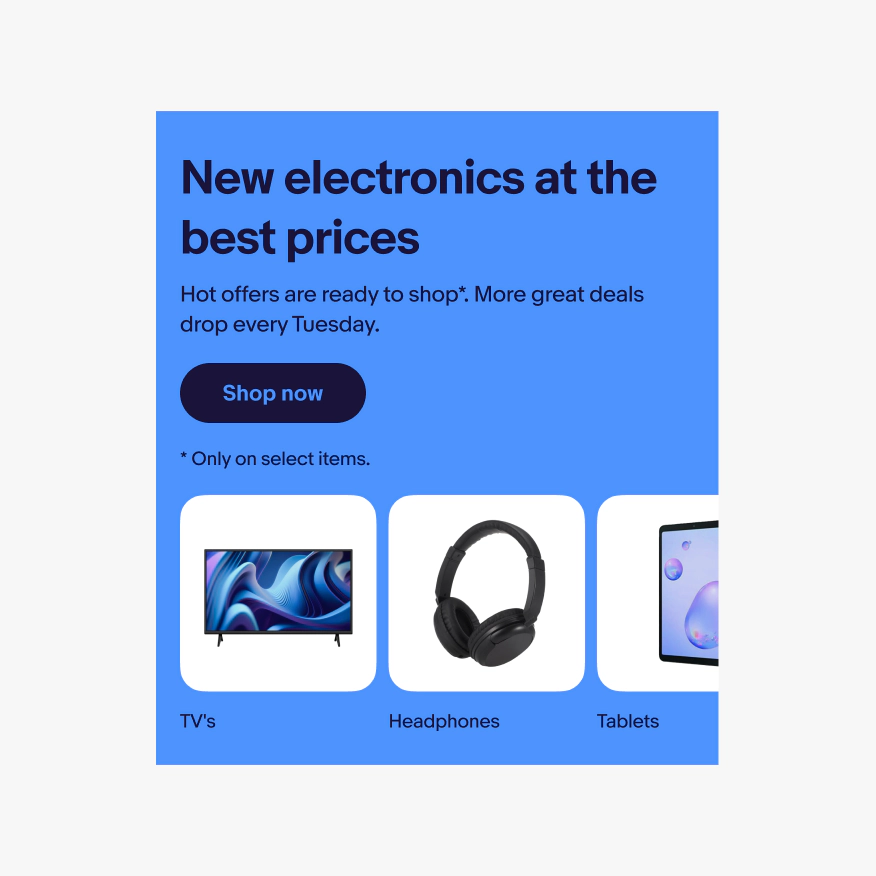
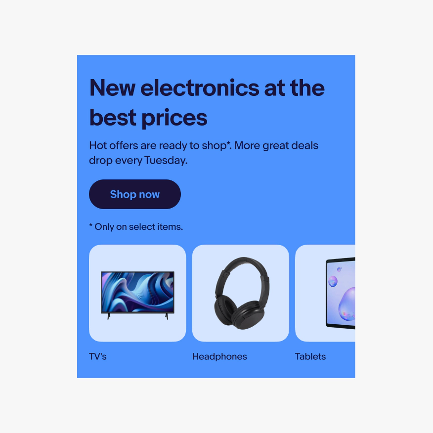
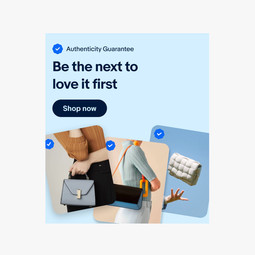
Multi-destination
Multi-destination banners promote sales or events that link to multiple different destinations. Destinations should feature specific categories, brands, or price points and utilize a PNG with transparent background to represent it. These banners always use a single color background from our pre-defined color themes which can be found on our Using color page.
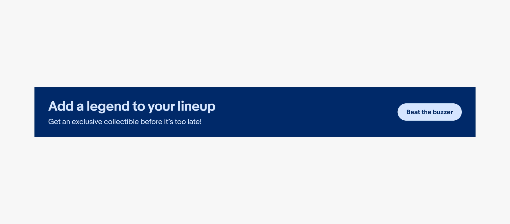
Loyalty
Loyalty banners promote sales or events that link to a single destination. They are used on dense, performance-focused shopping pages where height is a concern and/or there is no relevant image associated with the content. These banners always use a single color background from our pre-defined color themes which can be found on Using color.
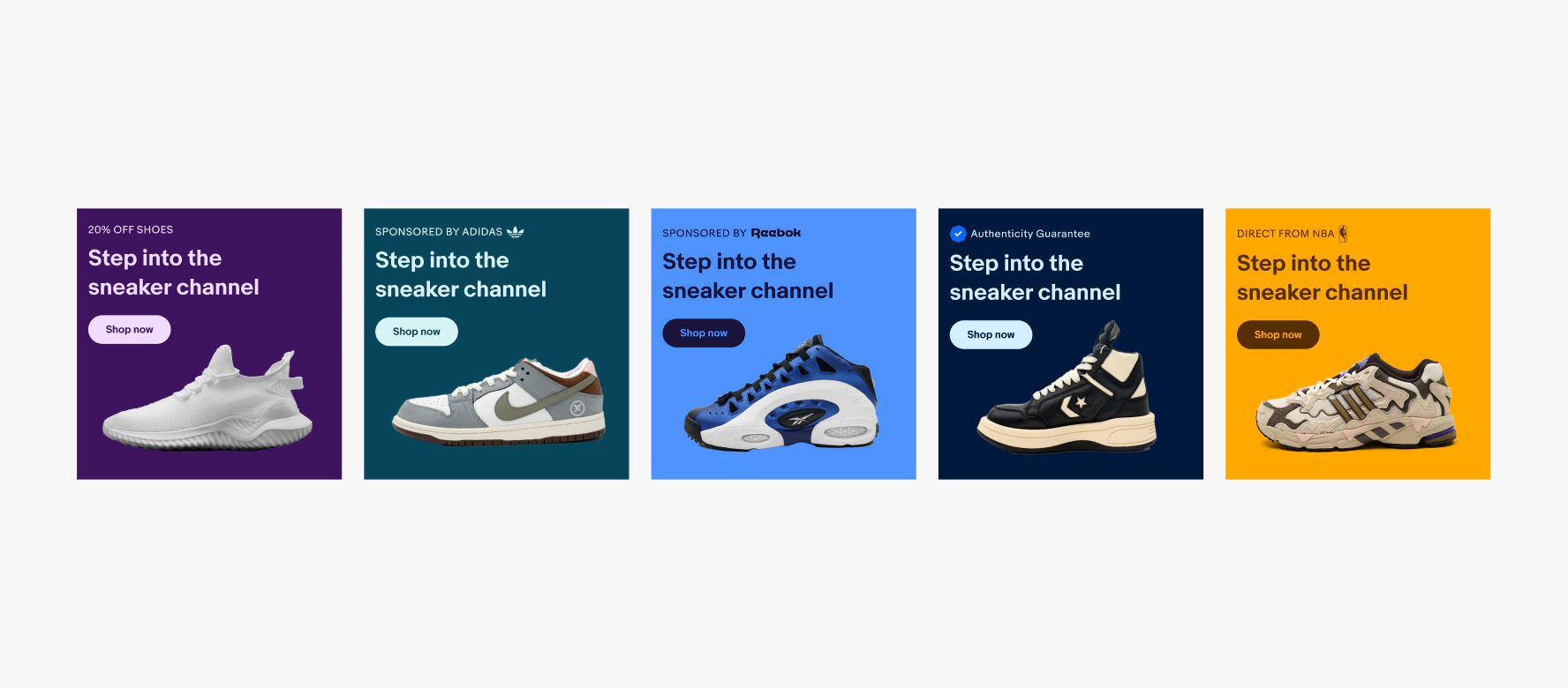
Overline
The overline provides secondary context—a category, promotion, or program name—that frames the headline. On mobile, including an overline hides the body copy, so use it only when the context is essential. It can also support a custom SVG.
- Use all caps
- No ending punctuation
- Max character count: 33
- Max height for SVGs: 24px
Headline
The headline leads with user benefit using bold, active language. Make the value clear without requiring the body copy to complete the thought.
- Use sentence case
- No ending punctuation
- Max character count: 33
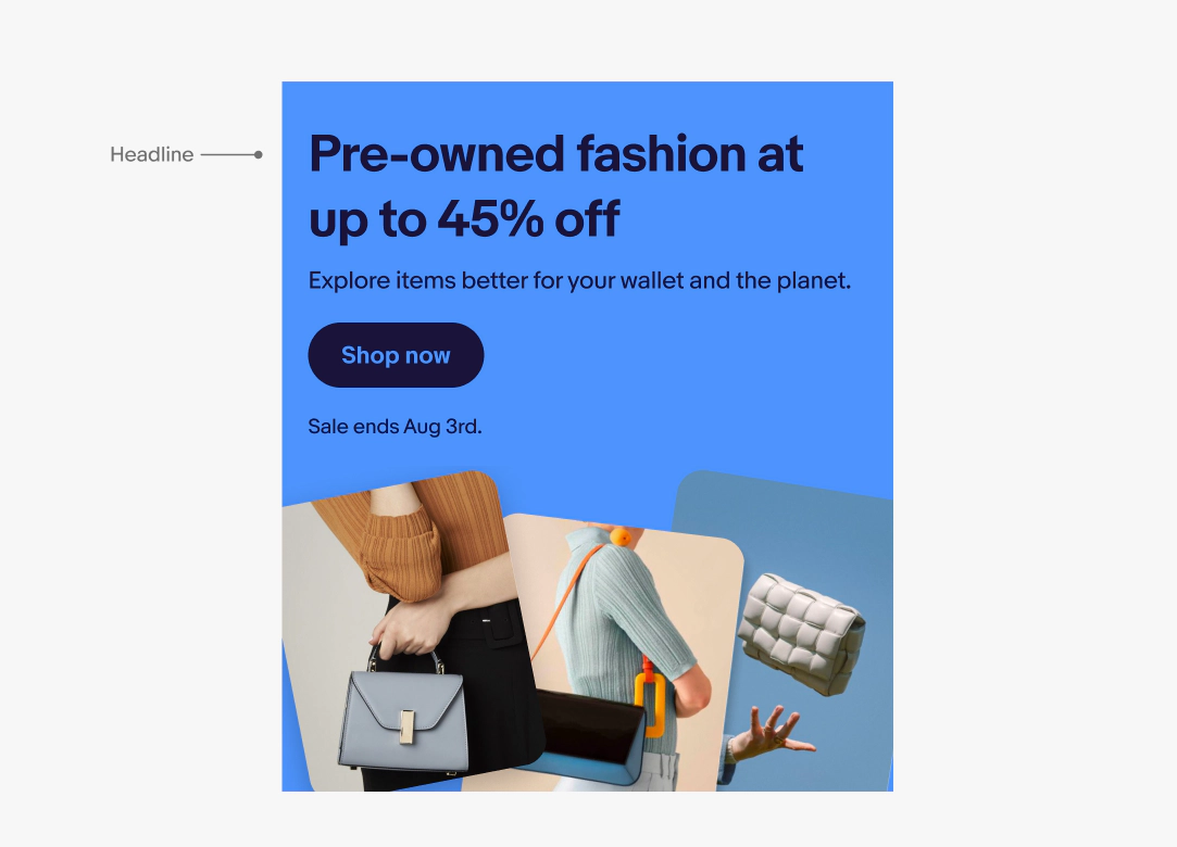
Body
Body copy expands on the headline with specific, user-focused value. Keep it conversational and concrete—what will the user gain or be able to do? Body copy will not show on mobile.
- Use sentence case
- Use conversational language
- Max character count: 65
Action (Button label)
The button label or CTA makes the next step and outcome immediately clear. Use verbs that describe what happens.
- Use sentence case
- No ending punctuation
- Use [verb] [noun] or [verb] [article] [noun] pattern
- Use 1 - 4 words

Disclaimer
Disclaimers surface legally required or time-sensitive details users need to understand the offer. Include only what's essential like dates, key terms, or restrictions.
- Use sentence case
- Use periods to separate discrete items (e.g., Ends Aug 3. Exclusions apply.)
- Max character count: 65
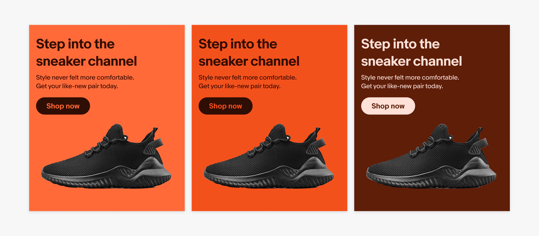
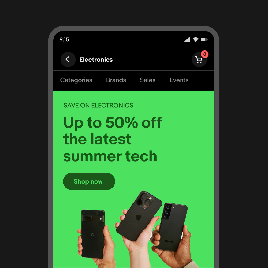
Theme
A theme changes the color of the background and foreground elements. Generally, the color theme should be derived from the associated image used within the banner. Color banners have 17 color themes.
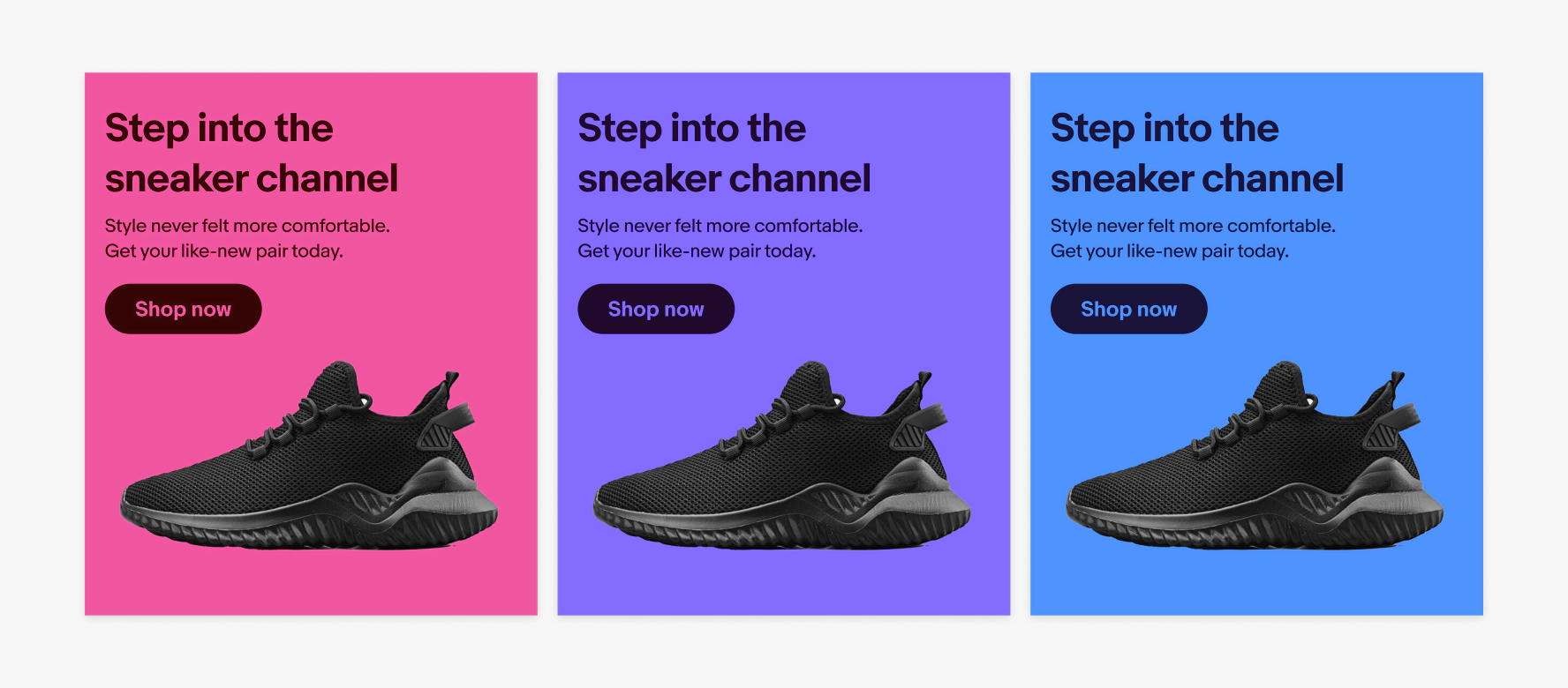
Level
Each color theme has 3 levels that increase the prominence of the banner. They are Light, Medium, and Dark.
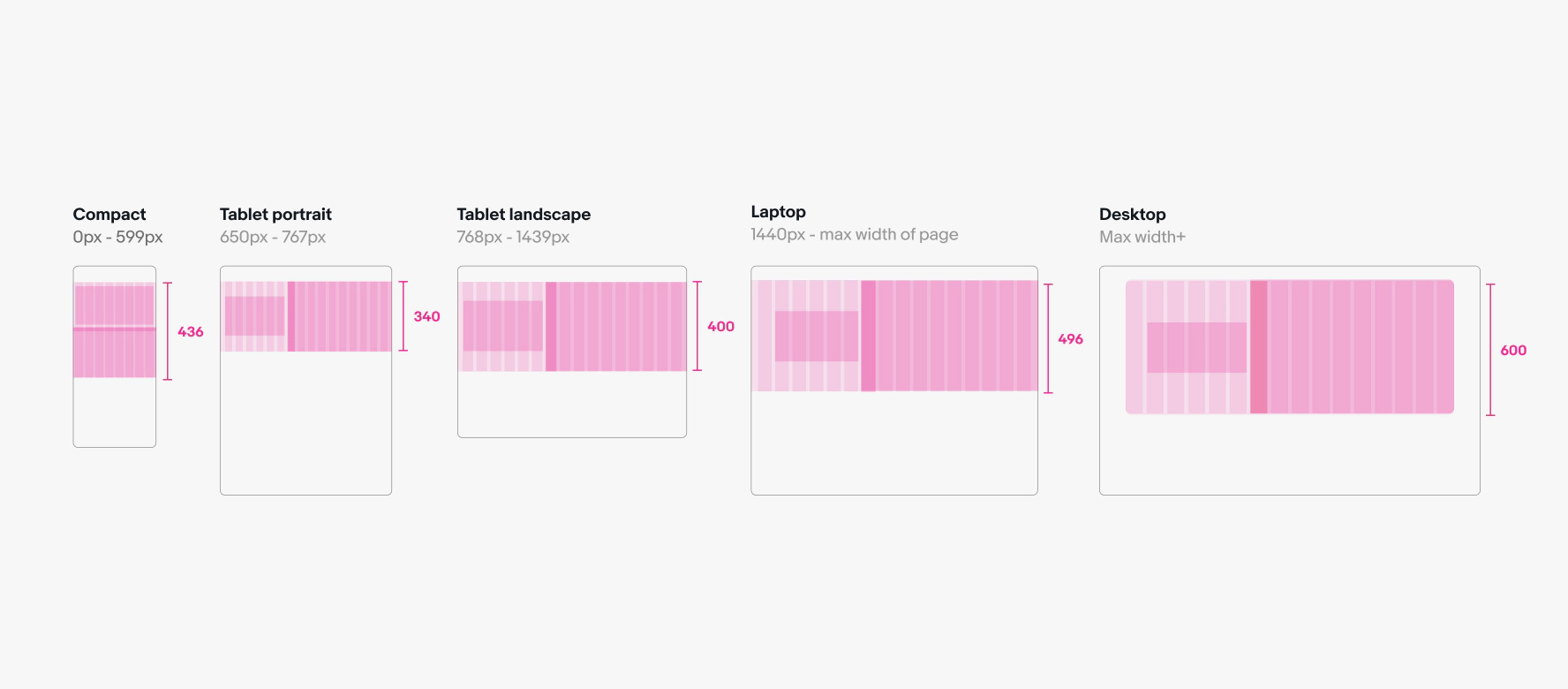
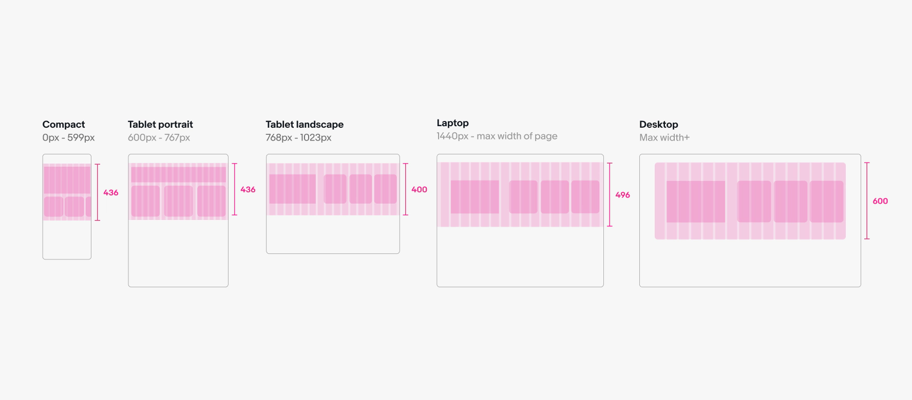
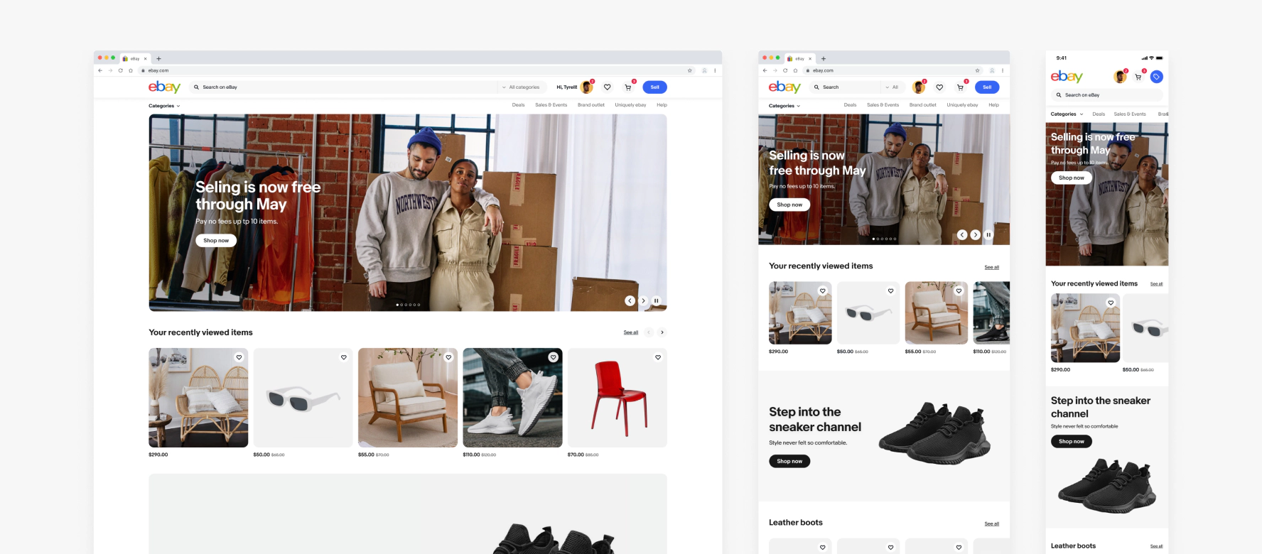
All banners are designed to be responsive at any screen size. The banner height, image size, and text size is relative to the width of the viewport and aligns to the grid. All banners extend to the left and right edges of the viewport until it reaches the page’s max width. When the viewport extends past the page’s max content area, the banner stops scaling and remains the max width of the page grid, inset with margins and a 16px corner radius. Check the breakpoints below to see how the image and text areas scale based on the page grid.
Image background banners
Banner scaling
Single destination banners with image backgrounds utilize a larger full-bleed image that sits behind the text. Safe zones below mark the areas that will be safe from cropping or text overlapping at various sizes.

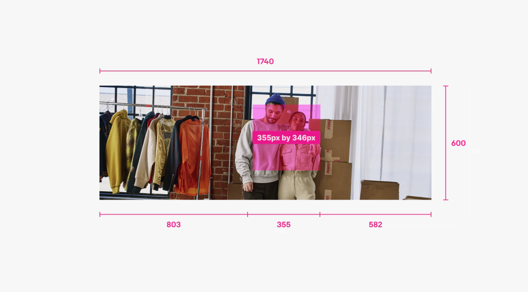
Image background asset
Assets should be 1740px by 600px and primary content should stay within the 355px by 346px safe zone. Anything outside of the safe zone is at risk of getting cut off or covered with text at smaller sizes. Use the figma banner components from the Design system as a template and turn on the toggle titled “Image safe zone” to see where it will land on your photo.
Color background banners
Banner scaling
Single destination banners with color backgrounds use one PNG with a transparent background that sits on top of the background color and is separated from the text box so they will never overlap. On small screens, the image sits beneath the button and text. On larger screens, the image sits to the right of where the text is. Check the component to see how it scales in short banners and other variants.
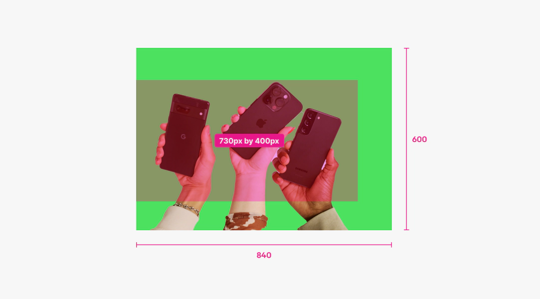
Color background asset
Asset is 840px by 600px with a 730px by 400px safe zone vertically centered & anchored to left. No part of the image should bleed off the top edge. If it does, it will look awkwardly cropped on small screens when the text stacks above the asset. Or, you can create a separate mobile override asset that will be used on screens 600px and smaller with the product arranged differently inside it. Mobile override assets are the same dimensions with the same safe zone. Use the banner components from the Design system as a template and turn on the toggle named “Image safe zone” to see where it will land on your photo.
Inset image banners
Banner scaling
Inset image banners utilize a single PNG asset that includes the background color and gets scaled inside a shape that’s inset from the background color. On small screens the image sits beneath the button and text. On larger screen sizes the image sits to the right of the text zone. The image area scales down when controls are present. Check the component to see how it scales inside short banners and other variants.

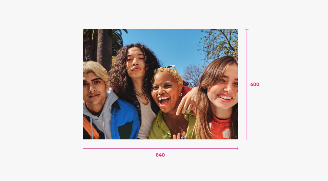
Inset image asset
Asset is 840px by 600px and will get centered inside the shape. Use the banner components from the Design system as a template.
Multi-destination banners
Banner scaling
Multi-destination banners utilize 3 separate and transparent square PNG’s that get centered inside 3 card shapes with padding around each. Safe zones below show how each card is scaled in tall banners at various screen sizes. Check the component to see how they scale in short banners and other variants.
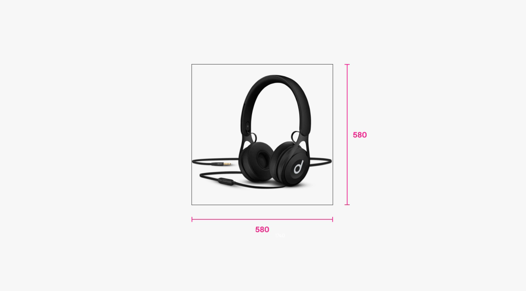
Multi-destination color background asset
Each asset should be 580px by 580px with a transparent background. No part of the image should get cut off inside the asset. Use the banner components from the Design system as a template and turn on the toggle named “Image safe zone” to see where it will land on your photo.
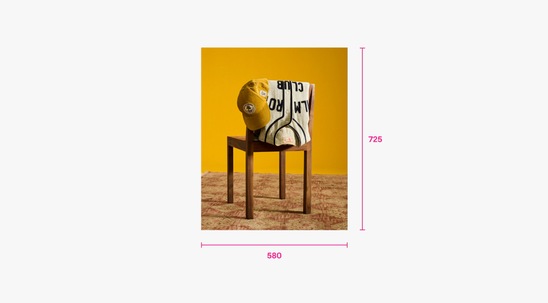
Multi-destination lifestyle image asset
Each asset should be 580px by 725px and utilize imagery that has a lifestyle or studio background. Use the banner components from the Design system as a template and turn on the toggle named “Image safe zone” to see where it will land on your photo.
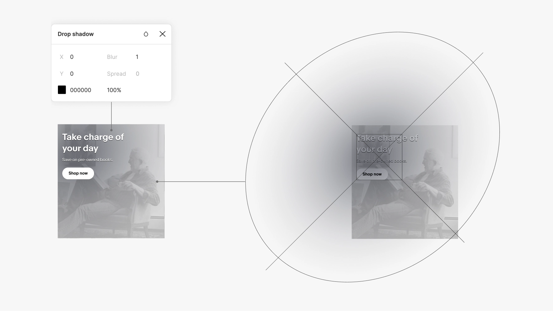
To ensure legibility of any text that is layered over photography, we apply our standard black scrim in #000000 at 5% opacity over the entire photo, plus an additional radial gradient in #030819 at 70% opacity centered behind the text. The shape of the radial gradient is a tilted oval that stretches over the bounds of the image and scales with the size of it. This helps the text stand out without looking like there’s a shape behind it. Lastly, we also apply a 100% opacity drop shadow in #000000 on any text that sits on top of photography to ensure legibility.
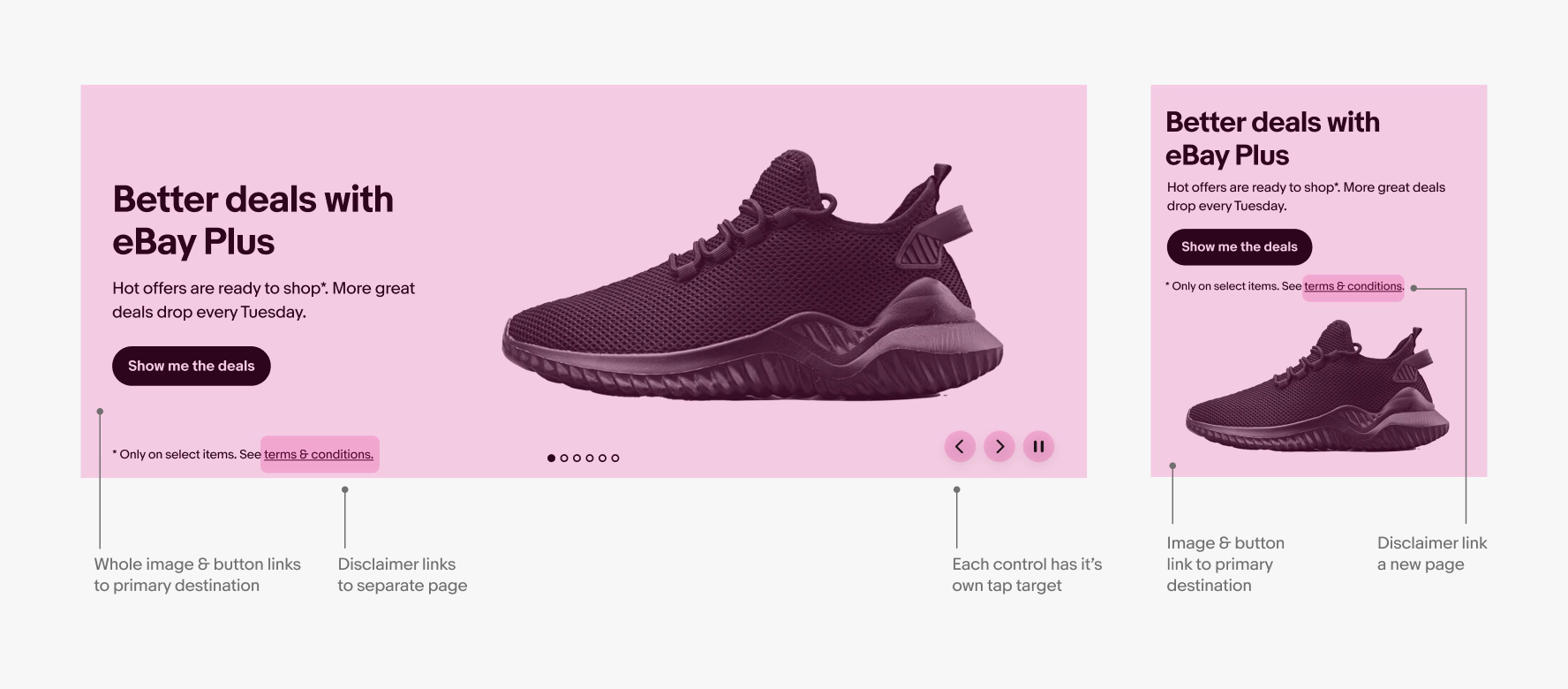
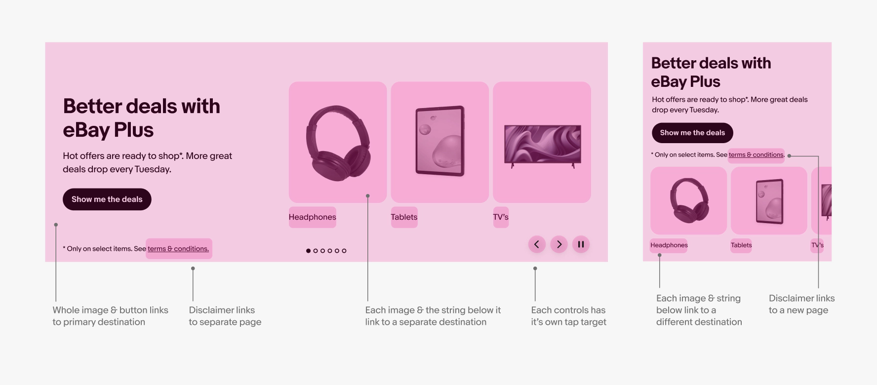
Banners can have multiple interactive areas depending on the type of banner it is, if it has a disclaimer link, and if there are multiple banners in a carousel or not. Generally, the entire image will link to the primary button destination. However, disclaimer links and carousel controls have their own tap targets within the banner area and go to separate destinations.
Single destination
Multi destination
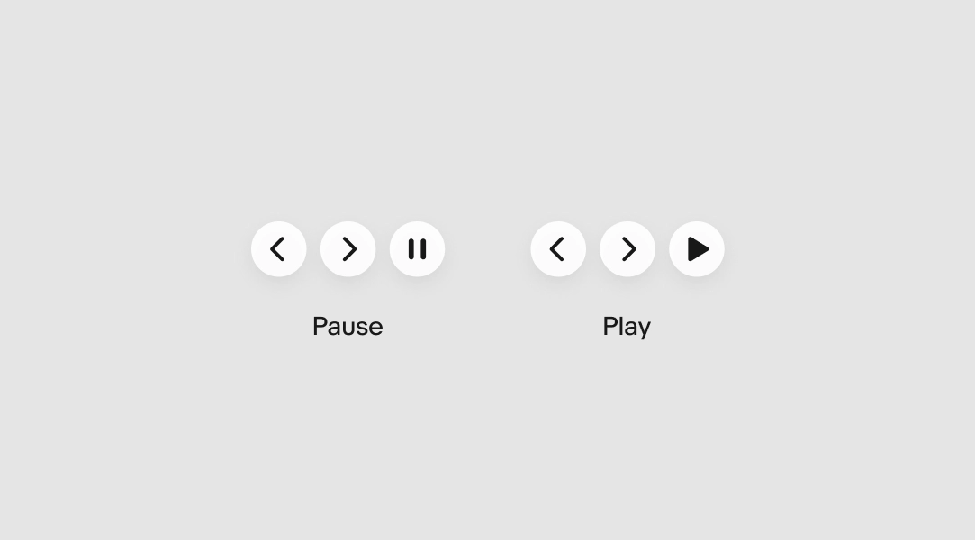
Carousel controls
When multiple banners appear in a carousel, dot indicators appear at the bottom to show how many there are. On HTML screens larger than 599px wide, carousels auto-scroll and controls are available in the bottom right corner. Controls allow the user to go back, forward, or pause. When user taps pause, the pause icon becomes a play icon. On native and HTML screens smaller than 599px wide, we do not use carousels and therefore have no controls
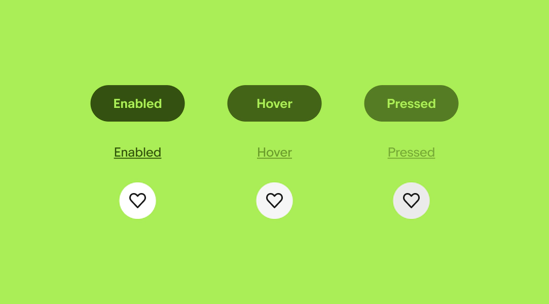
Interactive feedback
Buttons, links, and controls in banners use the same hover and pressed states as they do elsewhere in product. Banners use Branded buttons for CTA’s, Link buttons for disclaimer links and multi-destination links, and Icon buttons for controls. Check out the respective pages for more detail on state layers and interactivity.
Controls on various backgrounds
Dot indicators are always the color of the text and control buttons have a 90% white background with a “subtle” drop shadow.
Do disperse banners throughout the page.
Don’t stack banners directly on top of each other.
Photography
Do choose photos that aren’t too busy behind the text.
Don’t choose photos with too much detail on the left. It will make the text harder to read.
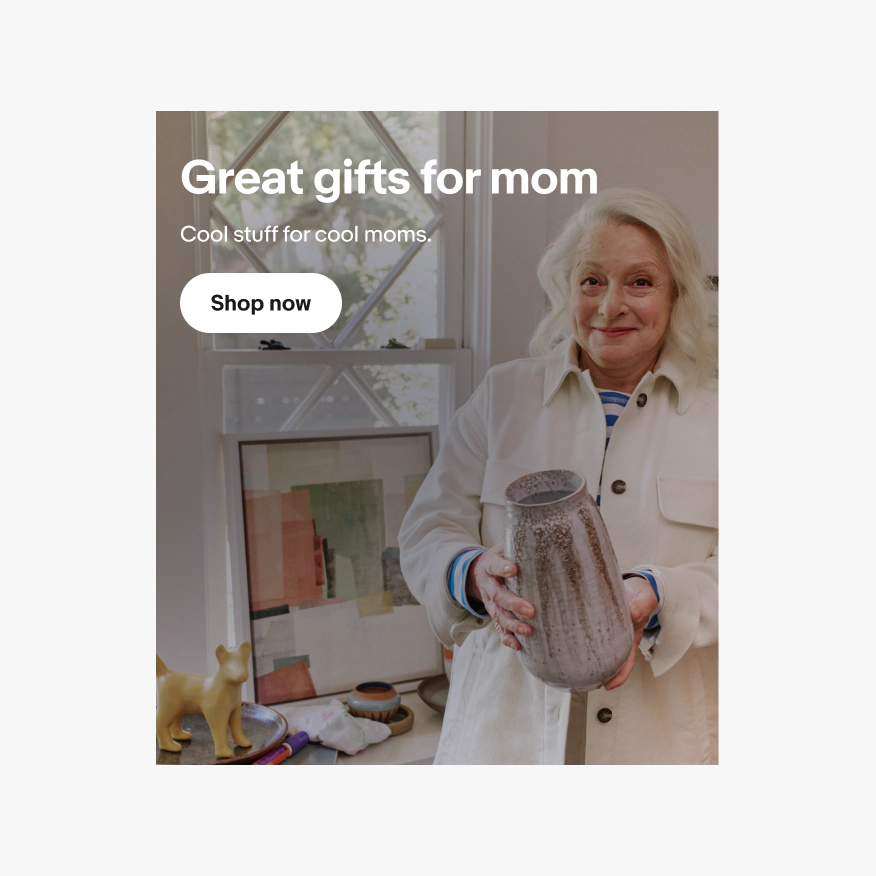
Do make sure important features like faces are kept within the safe zone.
Don’t let important features in the photo extend outside the safe zone if it’s critical to the message. They will get covered by text.
Do choose photography with a dark enough background on the left side to ensure legibility of white text. A dark gradient will be applied over your photo to ensure legibility and it should be unnoticeable.
Don’t choose photography with a very light, plain background. It will make the text hard to read and the gradient stand out unnaturally.
Color
Do use a single color family and make sure cards on multi-destination banners are always neutral 100.
Don’t mix multiple color families or pick custom colors for destination cards, even if it matches the photos inside.
Controls
Do make sure controls are always visible when multiple banners are shown in a carousel and auto-scrolled.
Don’t remove controls when banners auto-scroll. Pause must always be present when banners auto-scroll.
Badges & logos
Do use the overline area to display program badges and partner logos.
Don’t include program badges or partner logos in the image. They will scale text incorrectly and may get cropped or violate accessibility contrast guidelines.