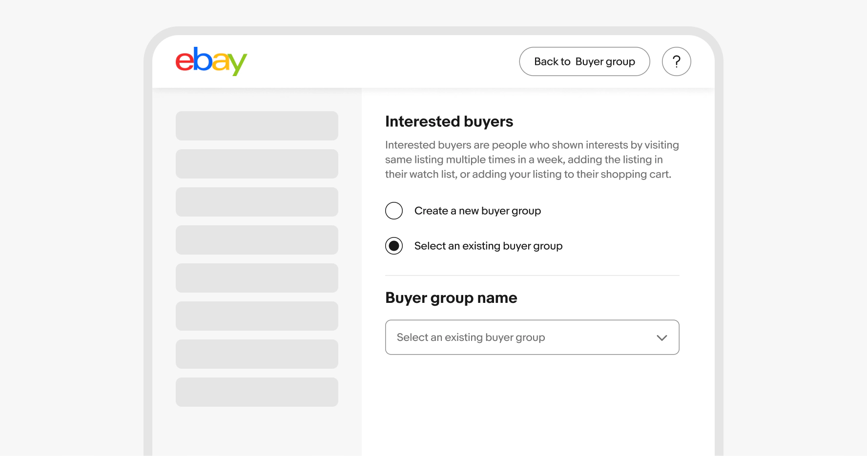
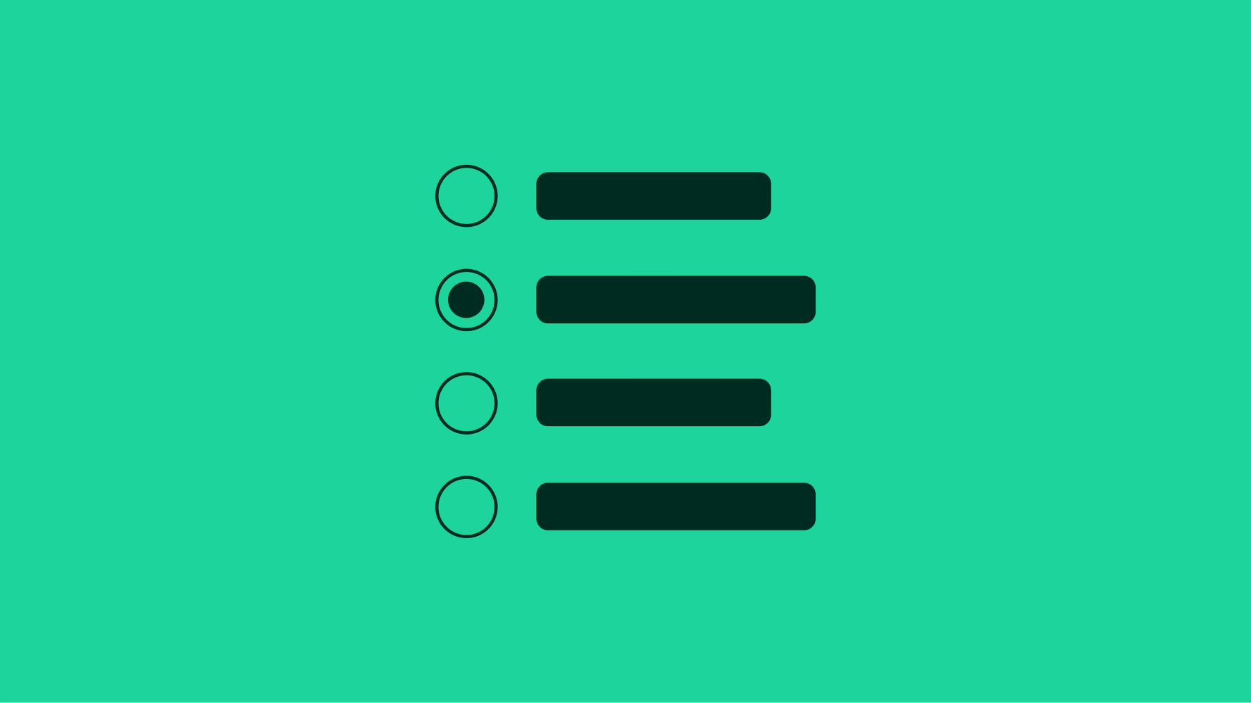
Radio button
v2.2
Radio buttons allow the user to select one option from a set.
- CSS
- Marko
- React
Required. The label names a single selectable option. Each option in a group should be distinct and parallel so users can quickly scan and compare.
There are two sizes available. Large is the default and is preferred on smaller screens. The smaller radio button can be used for dense layouts, but are less tap-friendly.
A radio button can be either selected or unselected. There are no indeterminate states for radio buttons.
A radio button can be disabled if there is a prerequisite to activate.
Labels will wrap if they are wider than the parent container. The radio button remains aligned to the top of the text box.
Radio buttons are contained within a set of at least two items. The group label names the category or decision the user is making to give context for the options beneath it. If users need more context before selecting, use a short introductory paragraph above the group instead of trying to fit it in the label.
Android uses the native Material radio buttons for improved support and accessibility.
iOS devices use the large Evo radio button.
Web uses the large and small Evo radio buttons depending on screen size and content density.
Radio buttons should only be used when a single element can be selected.
Don’t use radio buttons when multiple options can be applied simultaneously.