Expansion
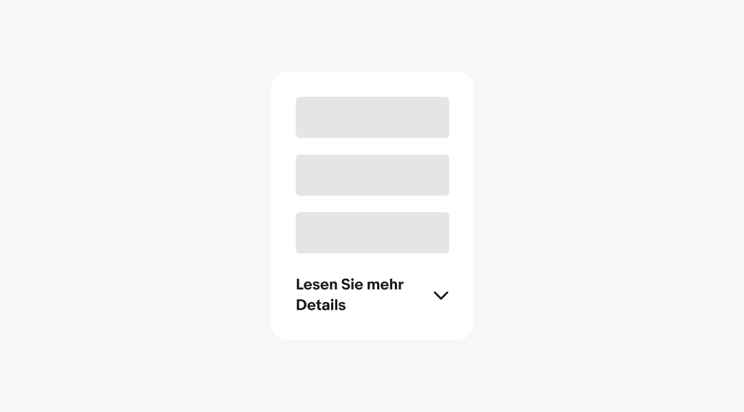
Expansion is a lightweight container that can function independently or be integrated into a larger surface. Tapping the expansion controls will either expand the content into a larger section or collapse it back to its original size.
- CSS
- Marko
- React

Progressive
Expansions reduce visual complexity and information density.
Empower
Users decide what information they want to see and when.
On-demand
Revealing and hiding information is a single tap away.

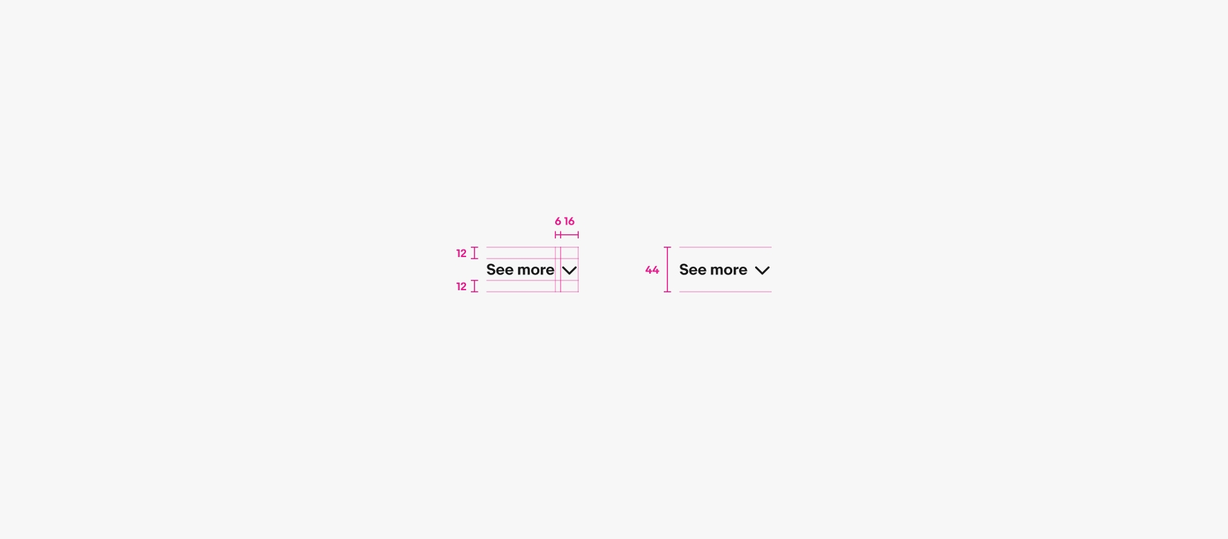
- Title
- Trailing icon
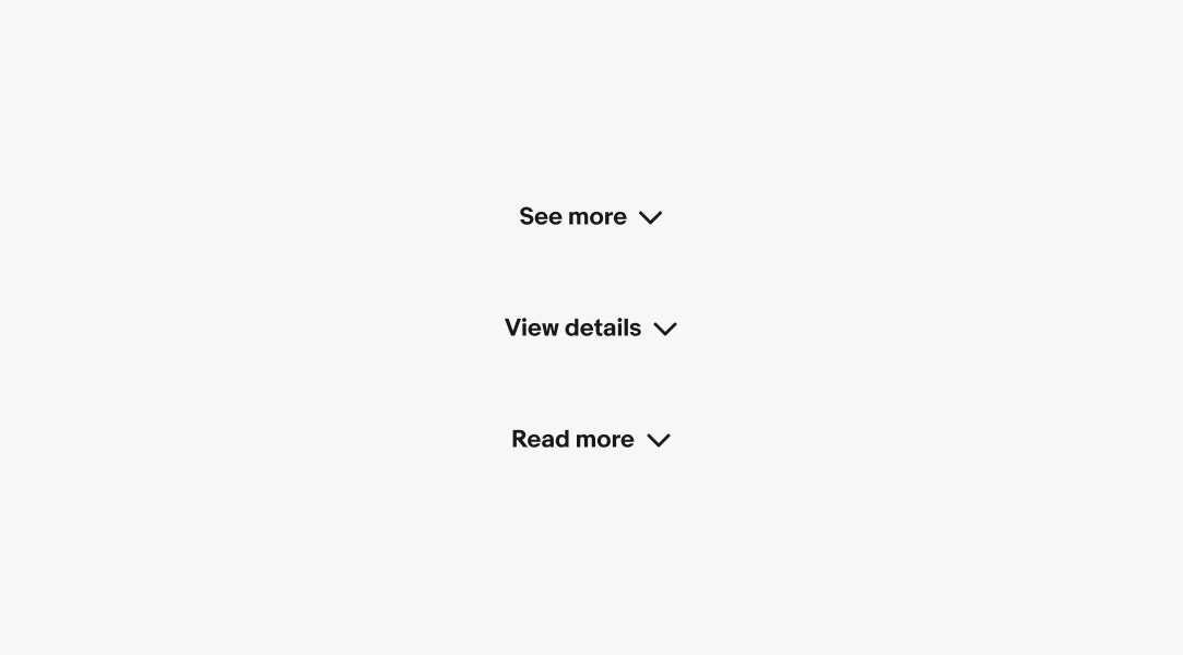
Title
The title describes what occurs when the button is selected. The title can be adjusted according to the context.
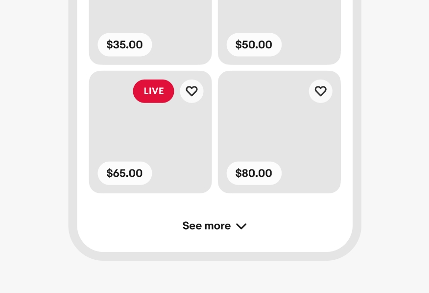
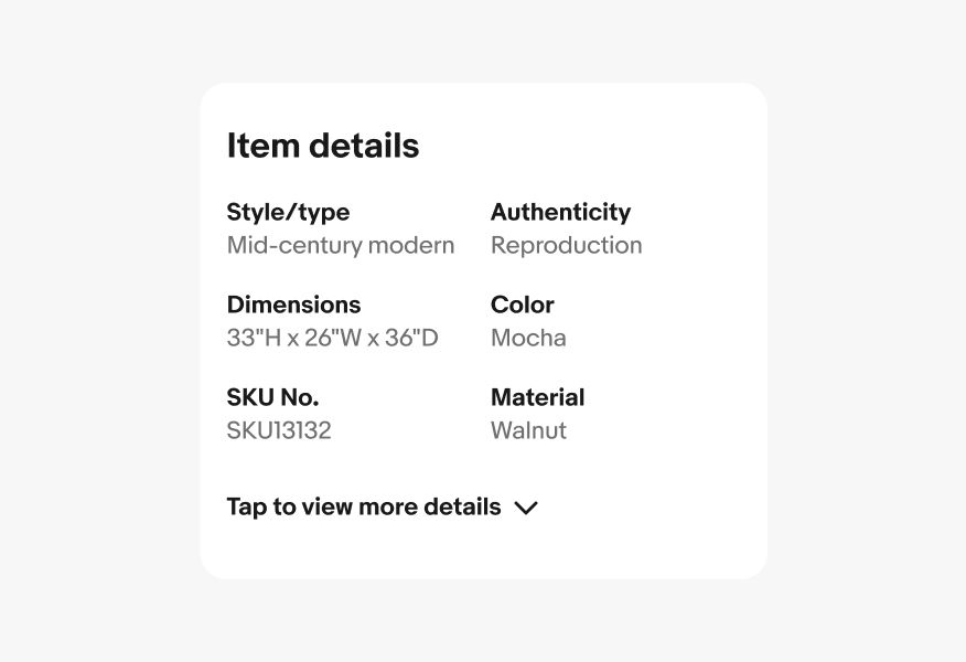
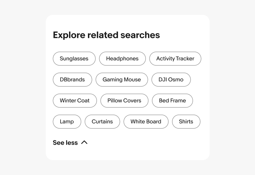
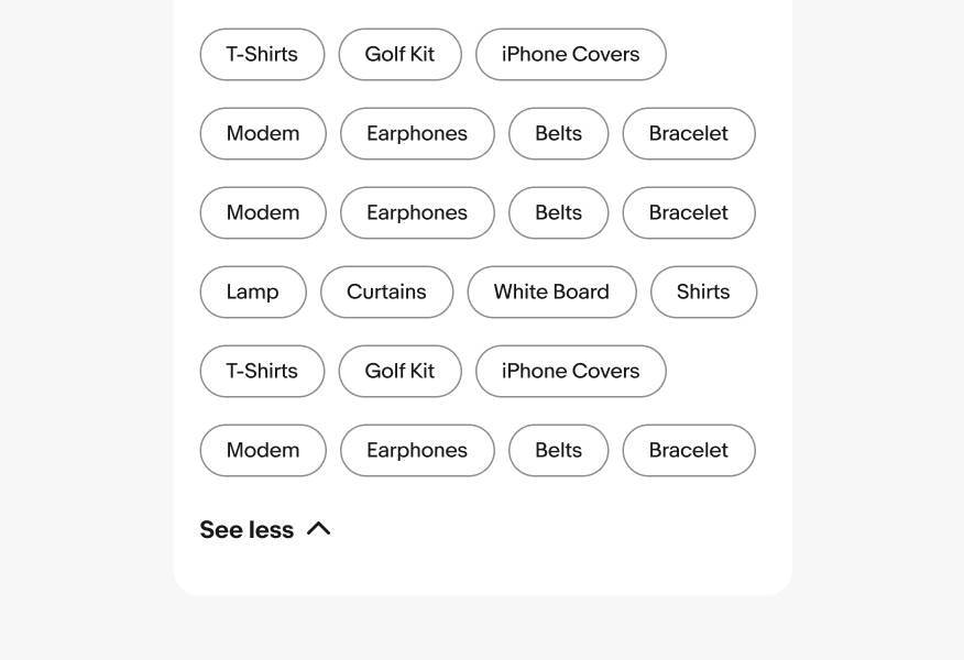
Expanding
The expansion button title adjusts according to its state to indicate what occurs when pressed. The title says “more” when collapsed and “less” when expanded. The expand button remains below the revealed content.
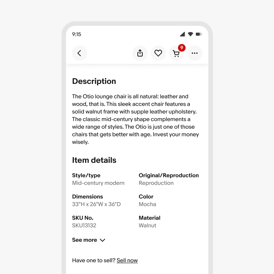
Overflow
The title wraps to another line when extending beyond the parent container.
Small
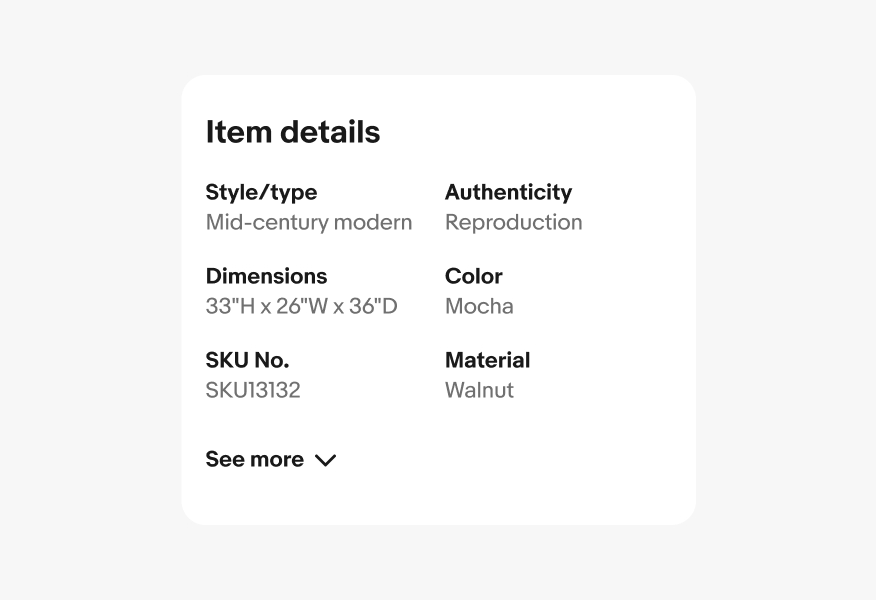
Expansion buttons appear directly beneath the content they expand on small screens.
Large
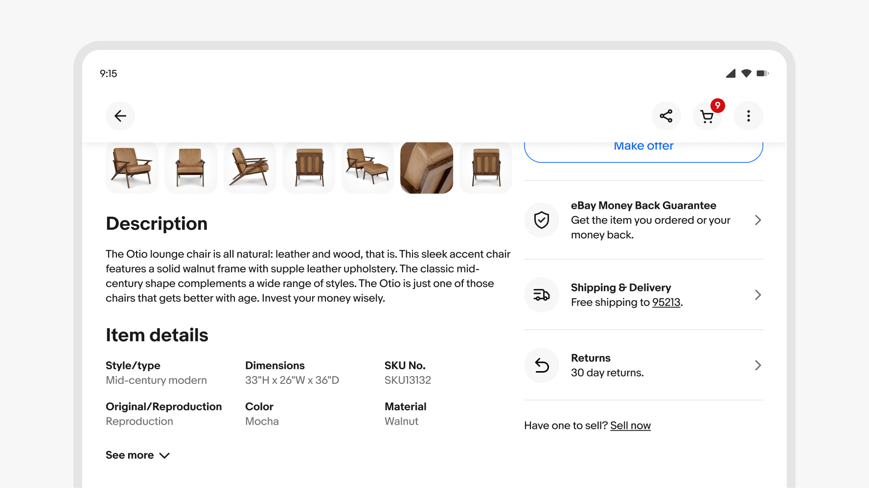
Expansion buttons appear directly below the content they expand on large screens.
Button title
Keep the title short and concise. Only add additional qualifiers if it’s necessary to clarify the expected behavior.
Don’t use long or wordy titles. Extra long titles can negatively affect the overall hierarchy.
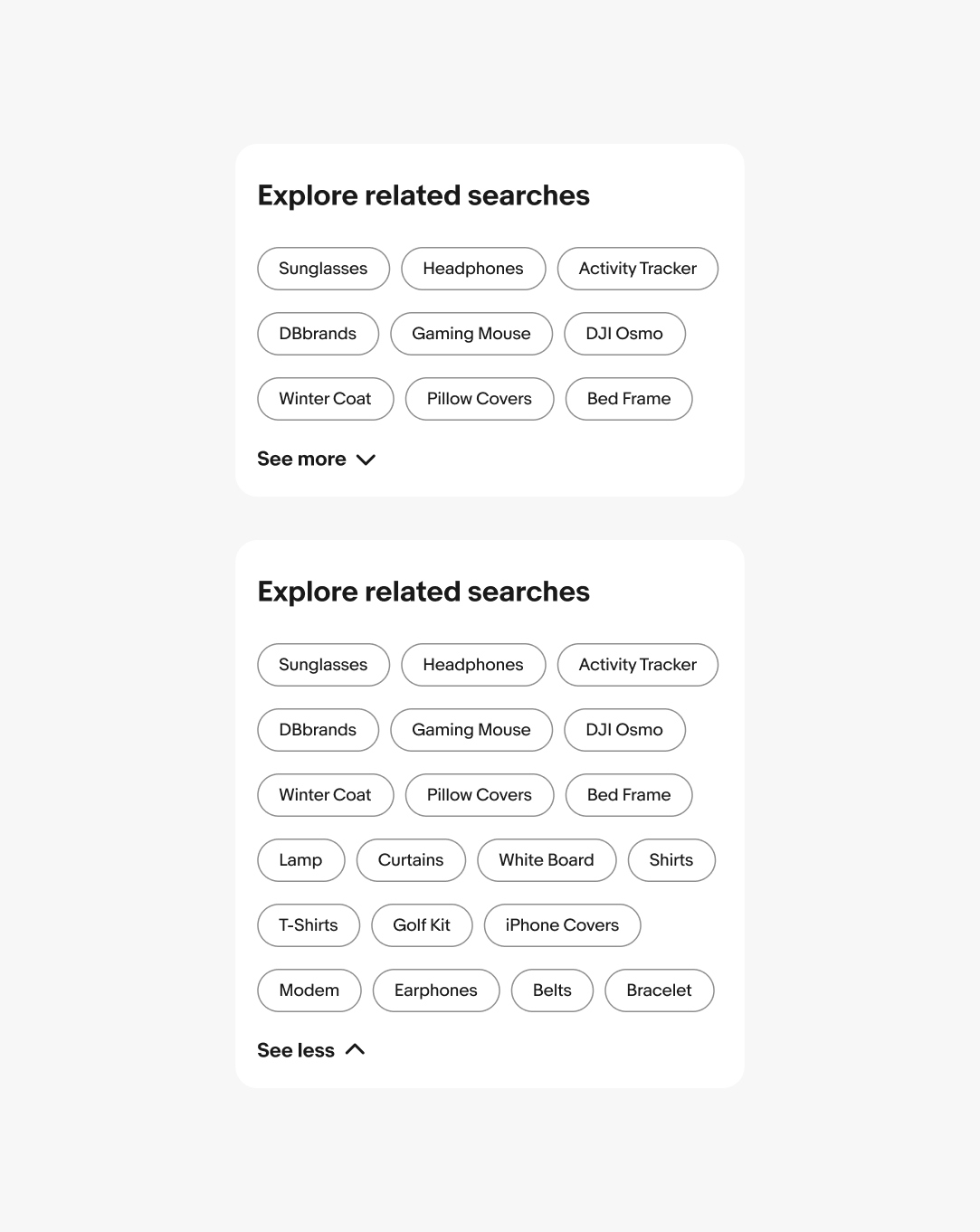
Amount of content
Use expansion buttons to expand a reasonable amount of content within view.
Be careful expanding a large amount of content. If it expands off screen, the connection to the content can get lost and become difficult to navigate.
Density
Use a tertiary button when paging content that cannot be collapsed.
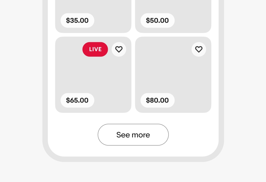
Don’t use expansion buttons for paging content.