Tooltip
Tooltips provide a brief, helpful explanation when users hover over or tap a label.
- CSS
- Marko
- React
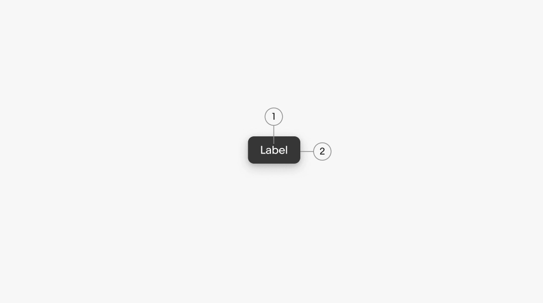
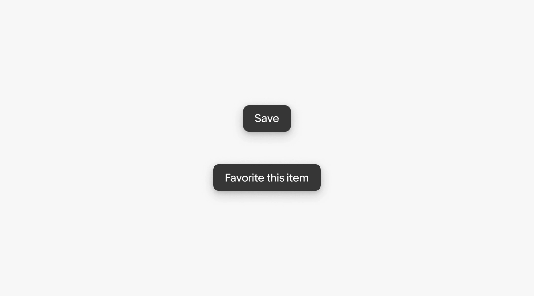
- Label
- Container
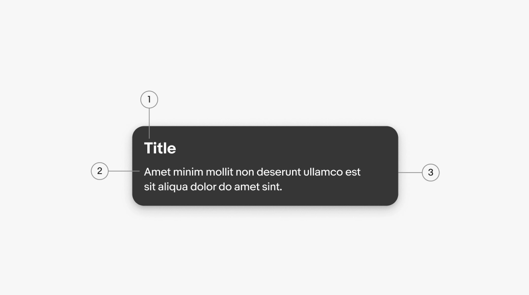
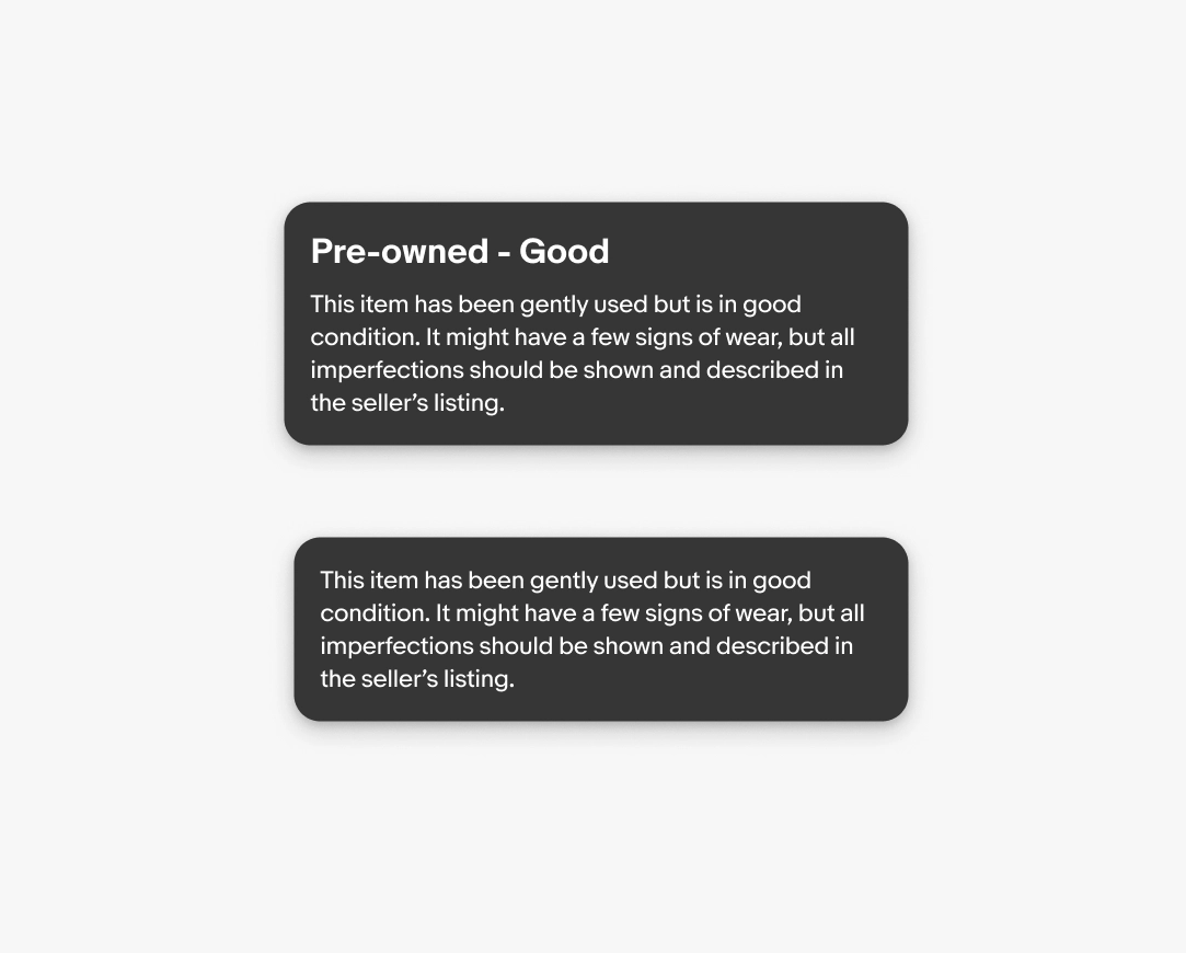
- Title (optional)
- Body
- Container
Tooltips reveal a label or additional information when a user interacts with a UI element. They are explicitly triggered and persist until dismissed.
Tooltips follow two semantic messaging structures:
- Descriptive
- Info
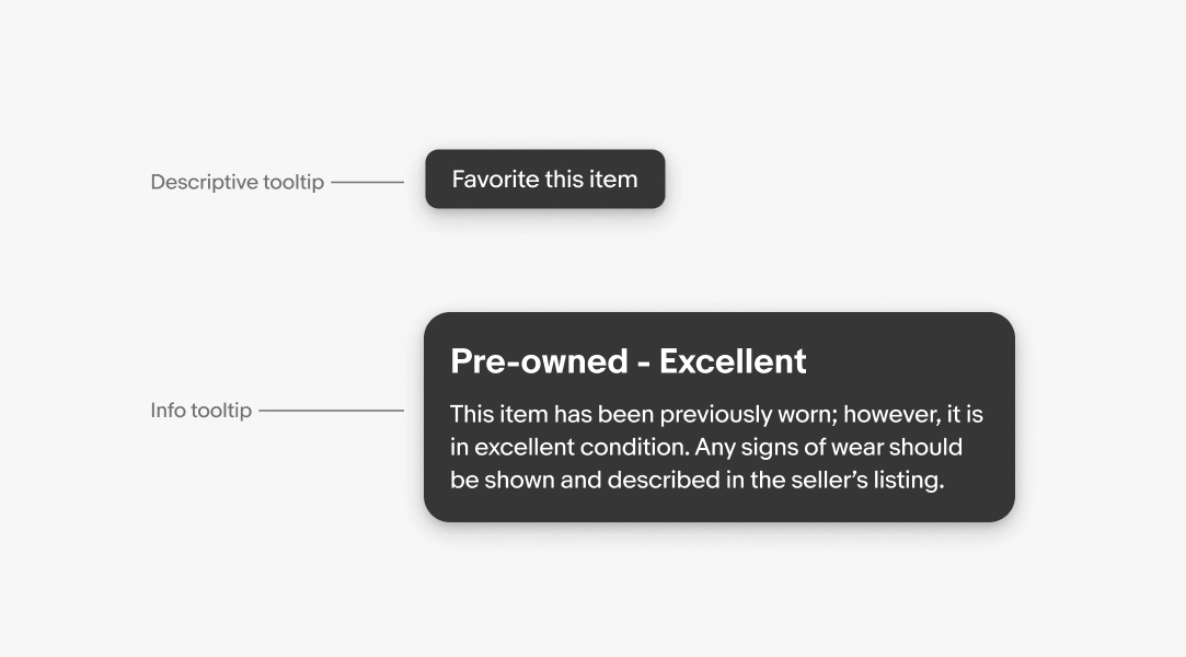
Descriptive tooltip
A descriptive tooltip clarifies a UI element that lacks a visible label.
Label
The label is pulled directly from the anchor element's accessible label and should simply state the element or action.
- Use sentence case
- No ending punctuation
- Aim for 1-3 words
Info tooltip
An info tooltip defines terms or provides secondary details users might need without requiring them to navigate away.
Title
Optional. Use a title only when the tooltip needs an introduction. It should succinctly summarize the rest of the content. Most tooltips don't need a title.
- Use sentence case
- No ending punctuation
- Aim for 3-6 words
Body
Required. Use the body to define jargon and technical terms, or to provide additional context. Don't repeat content already on the page or include interactive elements like buttons or links.
- Use ending punctuation
- Max 3 lines
Presentation
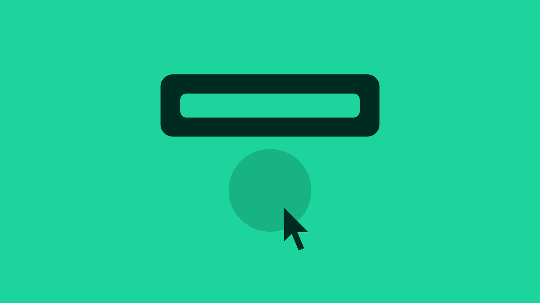
Tooltips appear after a 2 second delay while hovering or focusing on an anchor element. They fade out 1 second after the anchor element loses hover or focus.

Dismissing
Tooltips automatically disappear 1 second after the element loses hover or focus, or when another element receives hover or focus that reveals a tooltip.

Text overflow
Tooltip labels should avoid wrapping where possible. When required, the label wraps to a new line when extending beyond the width of the container.

Placement
Tooltips appear to the side of the anchor element that has open space. The default position is below the anchor element.

Small
Tooltips appear on hover or focus on smaller screens or browser windows. They’re uncommon on native platforms.

Medium
On medium screens, tooltips appear on hover or focus.

Large
On large screens, tooltips appear on hover or focus.

Multiple tips
Do only show a single tip at a time.

Don’t override tip behavior to show multiple at once.

