Tokens overview
Tokens are representations of design decisions. They abstract raw values into scalable, meaningful, and readable labels spanning across teams and platforms.
Tokens are representations of design decisions. They abstract raw values into scalable, meaningful, and readable labels spanning across teams and platforms.
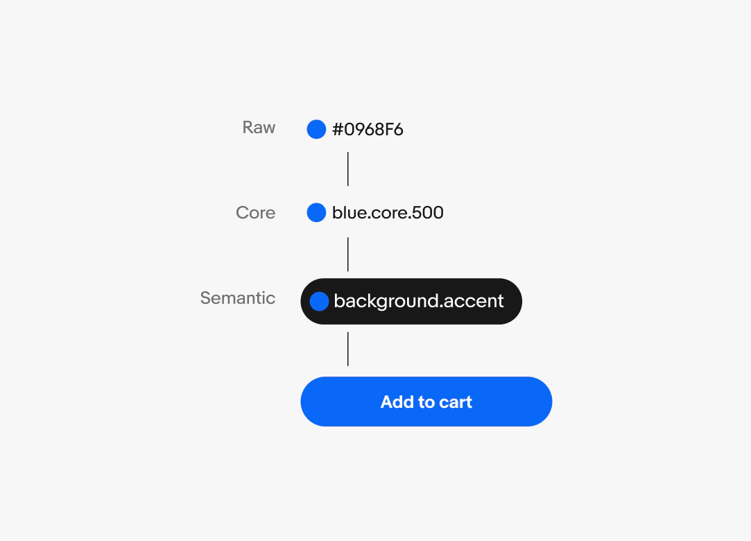
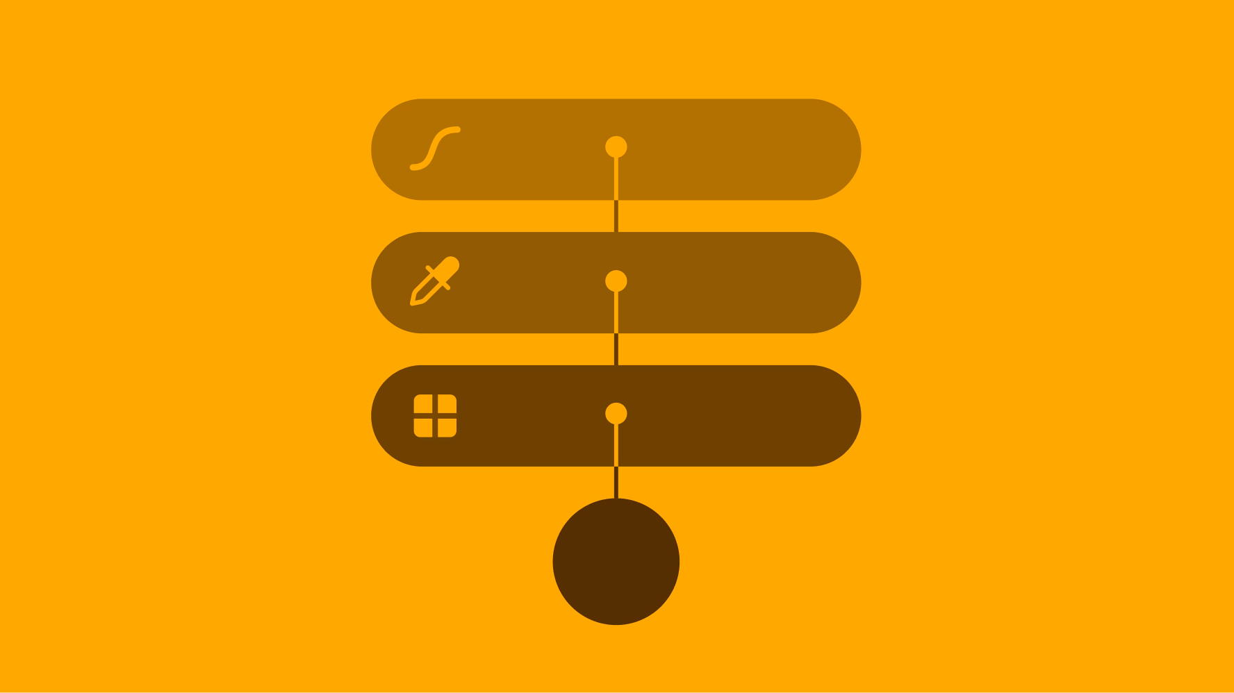
Tokens progress in specificity from raw values to core tokens, semantic tokens, and component tokens.
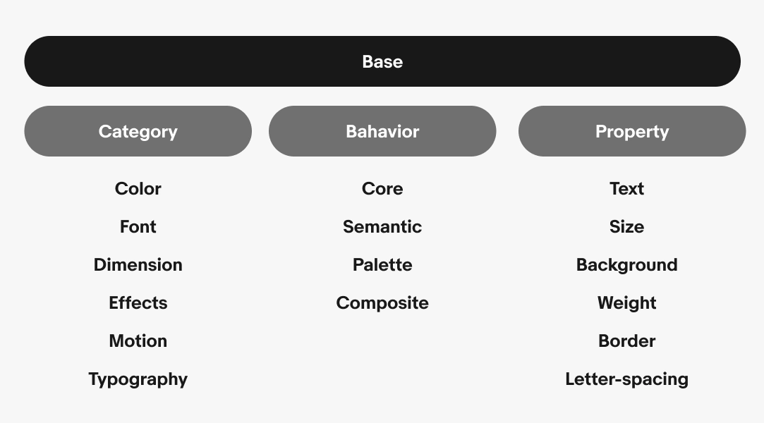
A graphic explaining the “base” token structure. Base is split into 3 groups...category, behavior and property. Category is broken out into color, font, dimension, effects, motion and typography. Bahavior is broken out into core, semantic, palette and composite. Property is broken out into text, size, background, weight, border and letter-spacing.
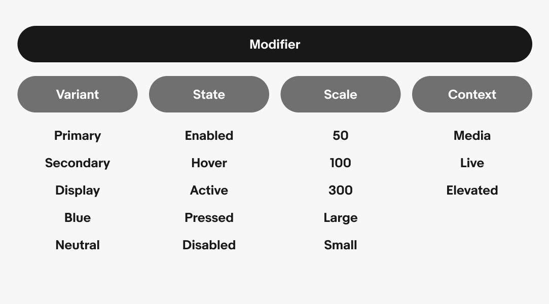
A graphic explaining the “modifier” token structure. Modifier is split into 4 groups...variant, state, scale and context. Variant is broken out into primary, secondary, display, blue and neutral. State is broken out into enabled, hover, active, pressed and disabled. Scale is broken out into 50, 100, 300, large and small. Context is broken out into media, live and elevated.
The majority of tokens used are semantic tokens for background and foreground elements. Semantic colors like attention and success have corresponding foreground tokens like on-attention and on-success. This ensures color combinations are used appropriately and remain accessible.
Tokens are platform agnostic. The names remain similar despite slight alterations to the naming structure. The design library uses dots as separators with all letters lowercase, but can be converted to a preferred platform convention like dashes or camelCase.
Tokens simplify documentation of design decisions and make sharing across teams easier. They establish a common language for styles and intention across all users of the system.
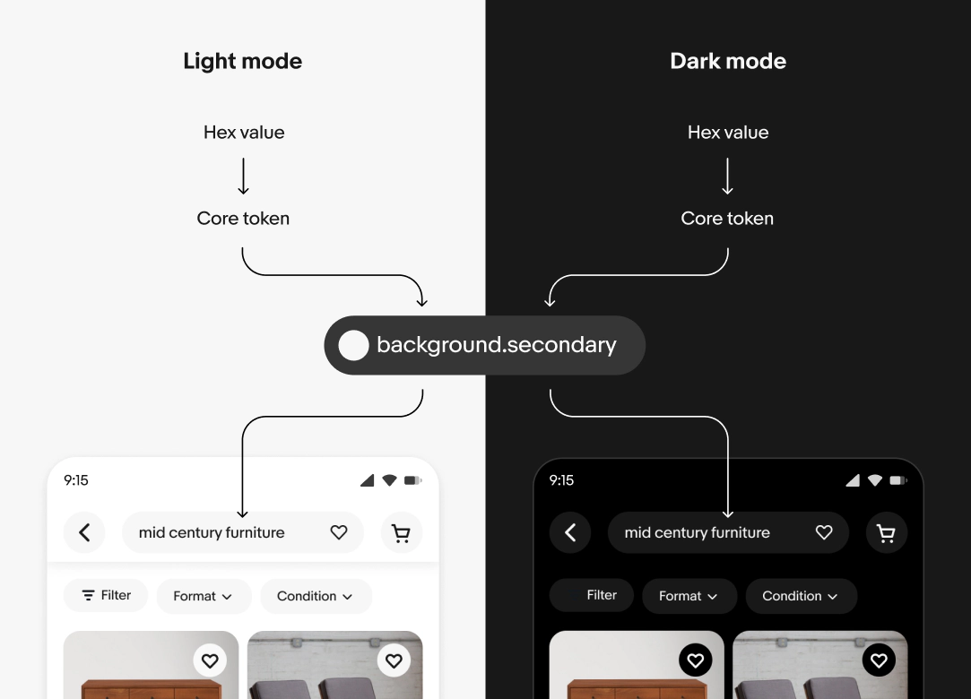
Modes are a collection of semantic token mappings. Semantic tokens are named references that define the intended use of a color. They help maintain consistency and clarity across different contexts and themes, such as light and dark modes.
A single token can point to different values depending on the context. The context can be a change in device theme, form factor, or accessibility settings. Semantic tokens map a meaningful name to a core token. A theme is a mapping of semantic tokens.
When context changes, the reference values are updated automatically and the changes cascade throughout the system.
Here’s an example of how tokens are used throughout a page. Background elements like containers and frames can stack on top of each other. Foreground elements, like text and icons, sit on top of backgrounds. Lastly, border elements include container strokes and dividers.