Action bar
v1.0
An action bar is a collection of components that provide controls to give users more agency over their content or data sets.
- CSS
- Marko
- React
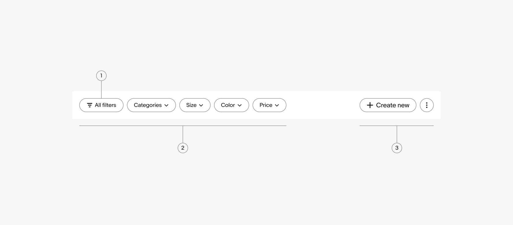
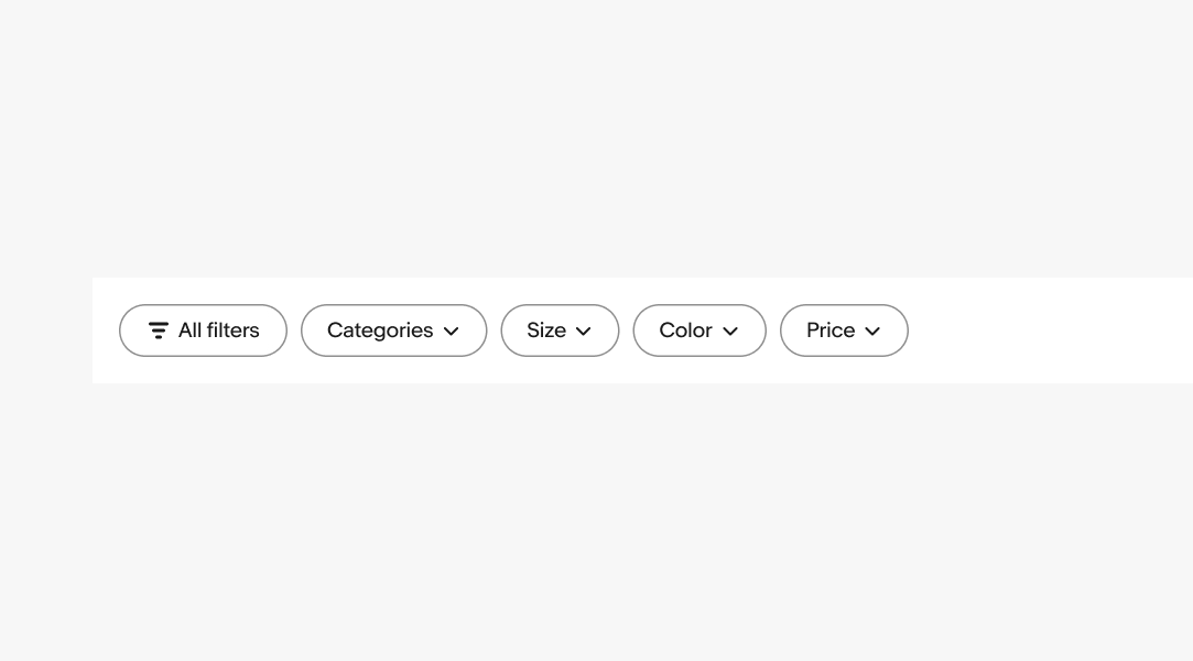
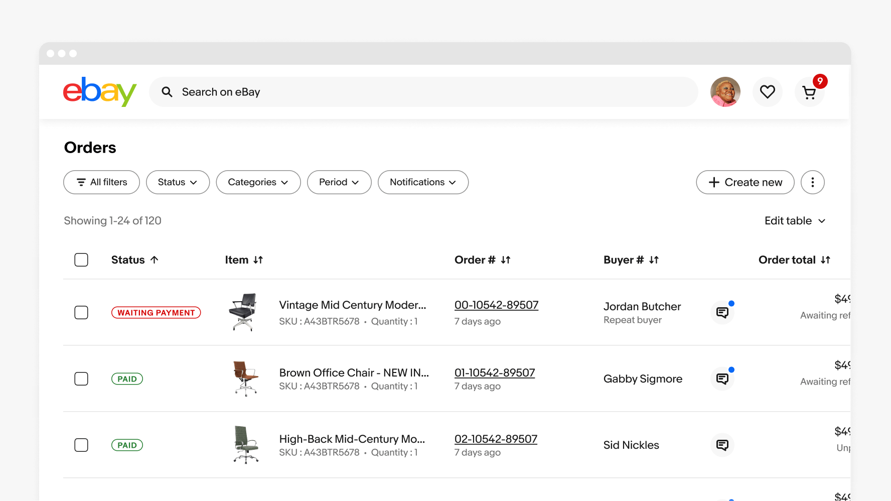
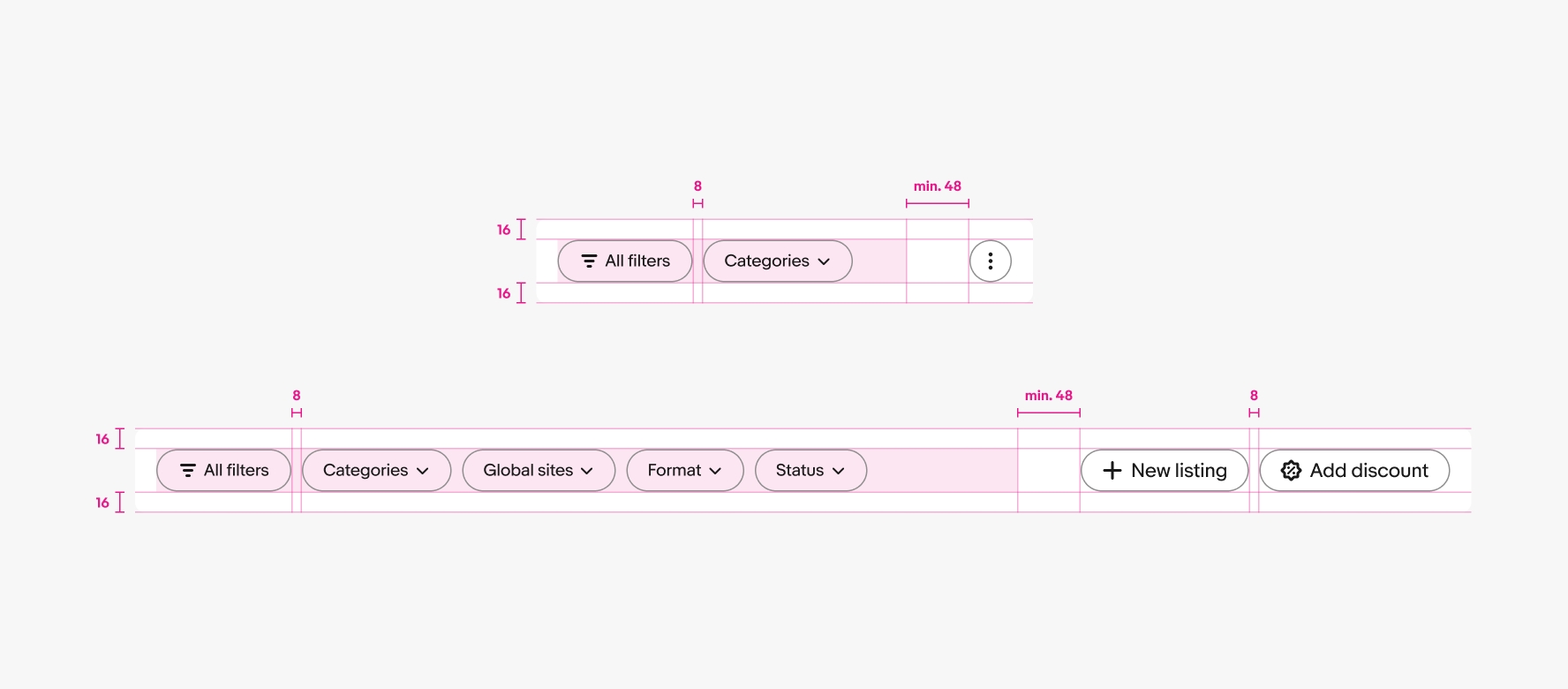
The filter group contains all filter-related buttons. The lead filter button includes a generic “All filters” button that launches a sheet with all available filters.
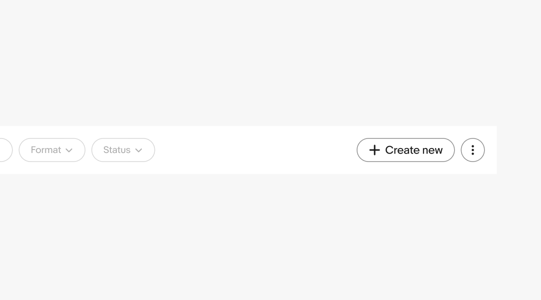
The action group is optional and contains up to 3 non-filter actions. Additional actions can be collapsed into an overflow icon button in the first position.
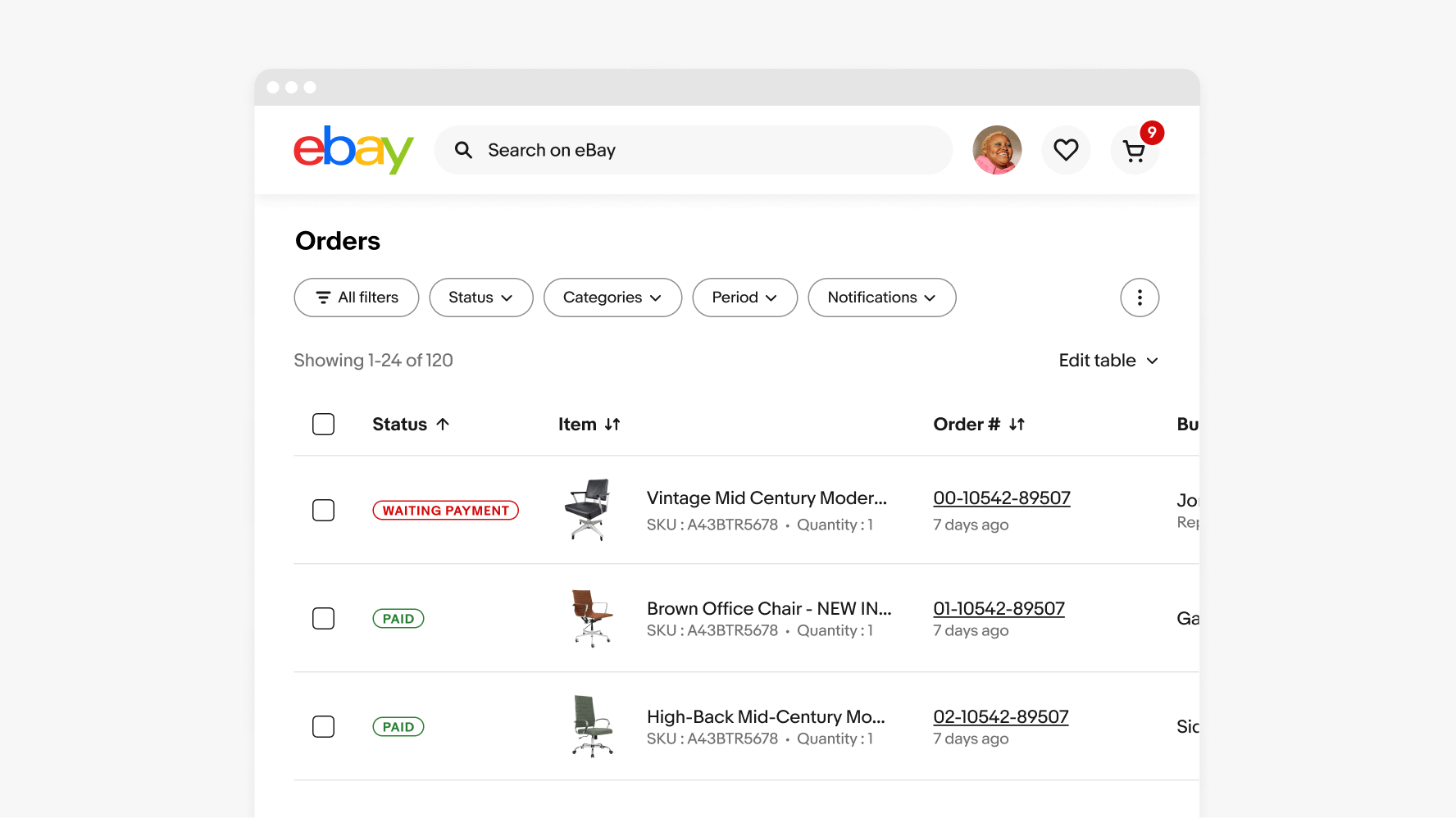
Buttons are collapsed into an overflow button and filter menu as the overall width is reduced. The filter buttons collapse first before all action buttons are collapsed into an overflow.
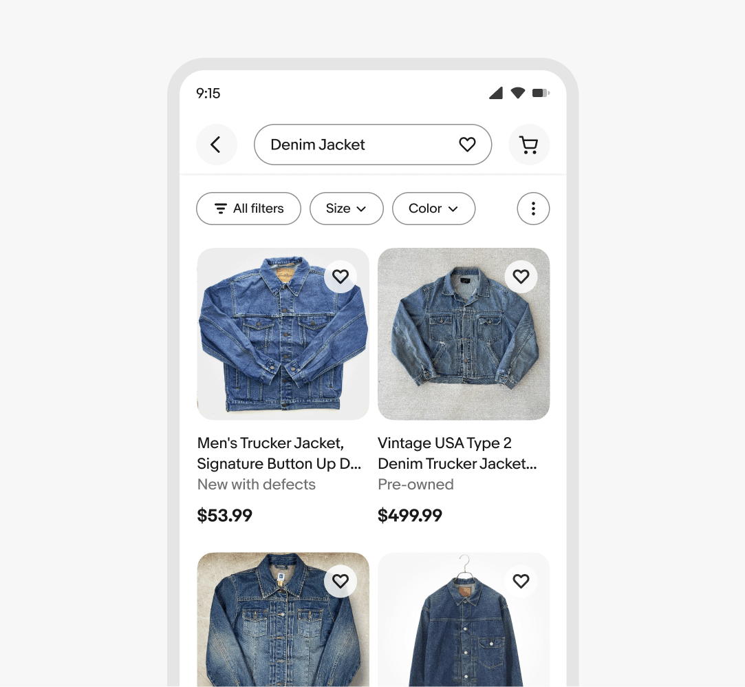
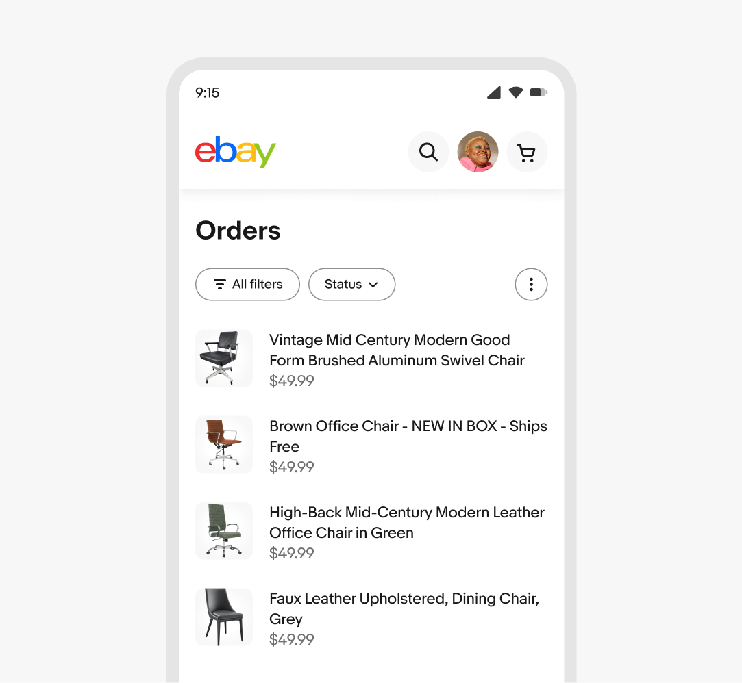
On smaller screens, trailing buttons are collapsed into an overflow button and filter buttons are hidden.
The trailing buttons collapse into an overflow first, followed by the filter buttons.
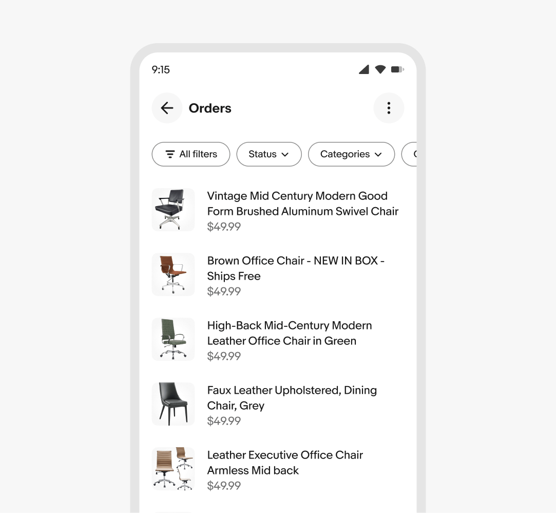
If the trailing actions are present, the actions are collapsed into an overflow and the filter buttons are hidden on smaller screens, similar to the web behavior.
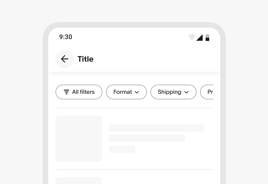
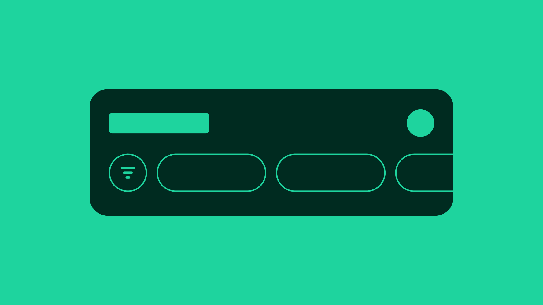
If the trailing actions aren’t present, the filter buttons extend beyond the screen and the container becomes horizontally scrollable.
Filter and action group content remain visible as space permits. The action group will collapse into an overflow first, followed by the trailing filter buttons.
Large screens surface up to the maximum number of content in each group as space permits.
Content within the action bar remains on a single line.
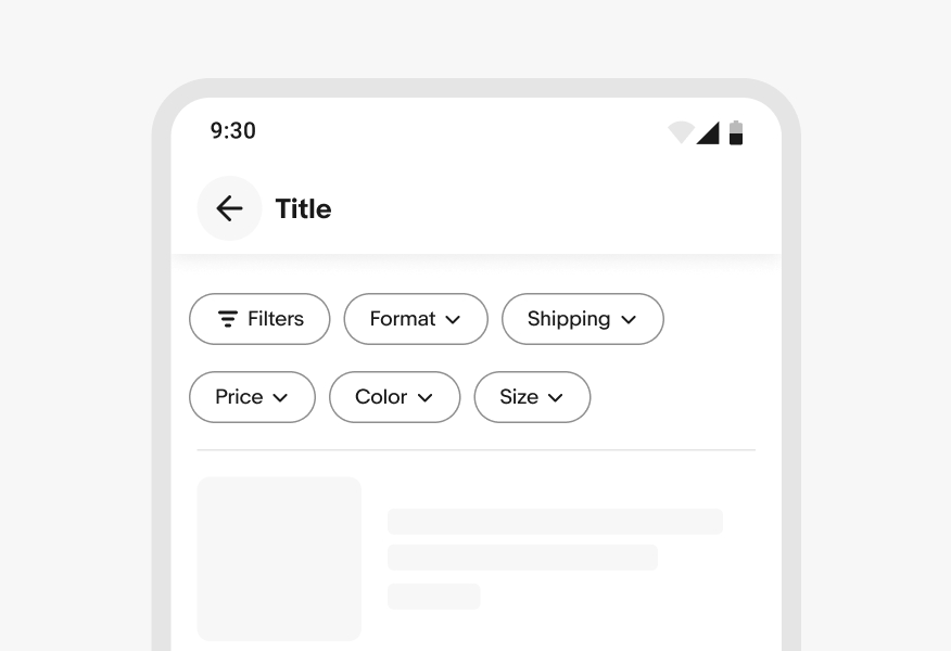
Don’t wrap content within the action bar.
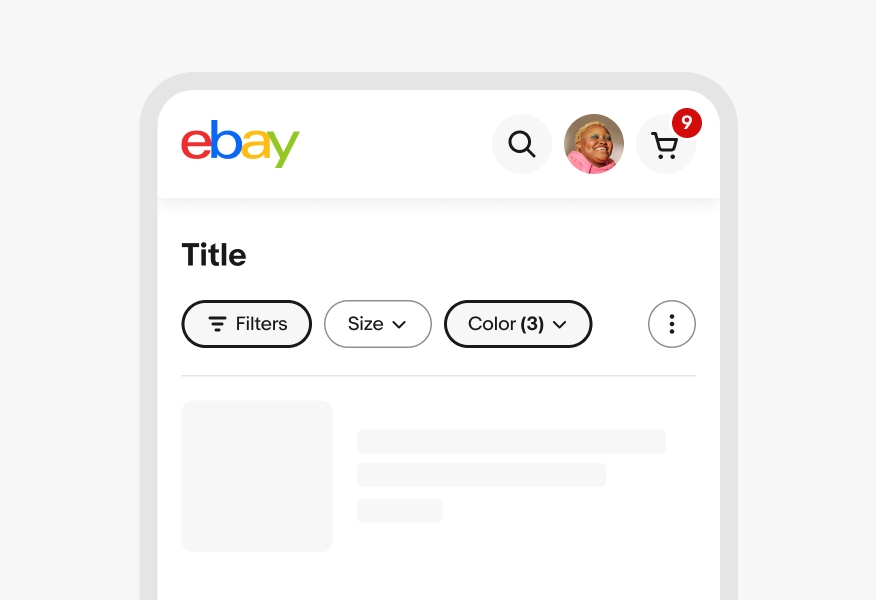
Do maintain each filter button’s original position as selections are made. For more details, see Quick filter.
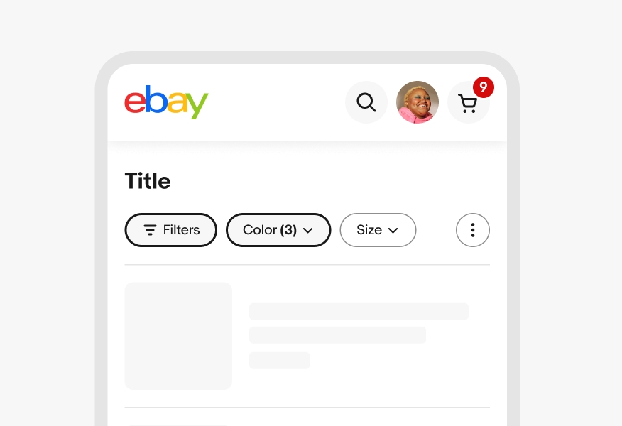
Don’t change the position of filters as selections are made.