State layer

v1.0

Tabs organize and manage content within an interface, allowing users to navigate between different sections or views without leaving the current page.

Stylized graphic of state layers.

Considerations

Subtle

State changes are lightweight and distinct.

Additives

If multiple states occur simultaneously, like selected and hover, each will be clear and obvious.

Consistent

State changes are similar across components throughout the system.

Anatomy

  1. Label
  2. State layer
  3. Content

Properties

Color fill

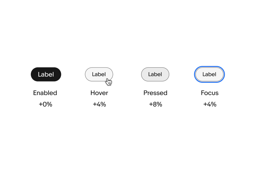
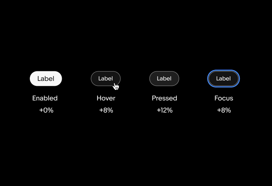
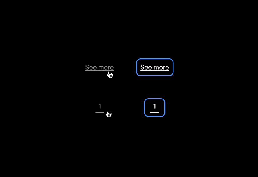
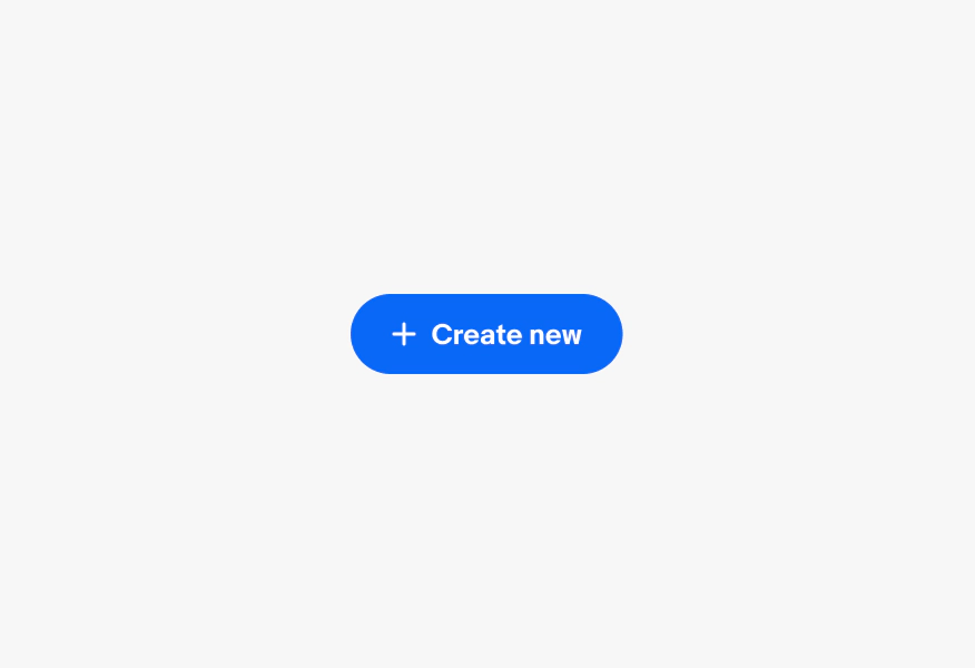
For elements with a container, a state-layer is added above the content. Each state increases the opacity by 4%. Dark mode uses white (#FFF) for the interaction layer instead of black.

Four image buttons stacked in a row in light mode. The image is of a watch. The first button is enabled with a state later of black 100%. The second button is hovered by a hand pointer cursor with a state layer of black 12%. The third button is pressed with  a state layer of black 8%. The fourth button is focused with a blue outline and a state layer of black 12%.
Four text buttons stacked in a row in dark mode. The first button is hovered by a hand pointer cursor with a state layer of white 8%. The second button is focused with a blue outline and a state layer of white 8%. The third button is pressed with a state layer of white 12%. The fourth button is being dragged with a closed hand icon and a state layer of white 16%.

Graphics

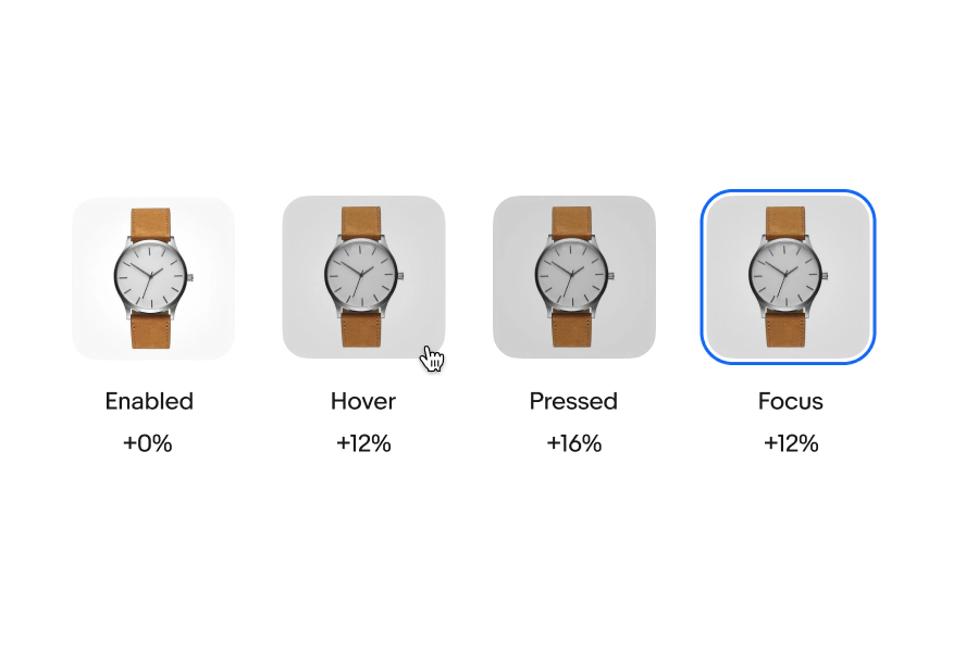
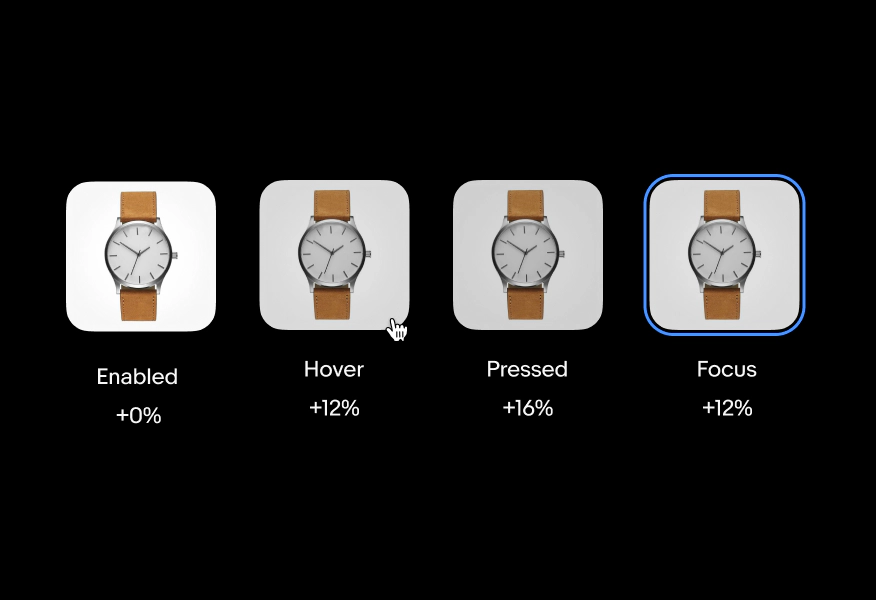
Graphic elements use a heavier scrim to account for the variation in contrast and detail. Light and dark mode use black (#000).
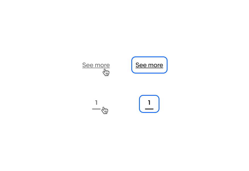
Four image buttons stacked in a row in light mode. The first row is a “See more” text link. The left example is enabled. The second is hovered with a pointer hand icon and an opacity applied. The third example is a pressed state. The right example is a focused state with the blue stroke without the opacity applied.
Four image buttons stacked in a row in dark mode. The first row is a “See more” text link. The left example is enabled. The second is hovered with a pointer hand icon and an opacity applied. The third example is a pressed state. The right example is a focused state with the blue stroke without the opacity applied.

No container

Elements that do not have a container, like links or pagination, use opacity to indicate a change in state. Light and dark mode use 60% opacity for hover states. The focused state does not receive the opacity shift.

Two rows of text links in light mode. The first row is a “See more” text link. The left example is hovered with a pointer hand icon and an opacity applied. The right example is a focused state with the blue stroke without the opacity applied. The second row is a page indicator with “1” in the same treatments.
Two rows of text links in dark mode. The first row is a “See more” text link. The left example is hovered with a pointer hand icon and an opacity applied. The right example is a focused state with the blue stroke without the opacity applied. The second row is a page indicator with “1” in the same treatments.

Behavior

A blue enabled cta button with a plus icon next to “Create now”.

Enabled

The enabled state indicates an interactive component.

Video description: A 2-second video shows a gray disabled button that reads “+ Create new”. When the cursor hovers over it an icon with a circle with a line diagonally through it appears indicating the button is not able to be interacted with.

Hover

The hover state indicates that a cursor is actively hovering over a component. Hover states can be combined with focused, activated, selected, or pressed states.

Video description: A 2-second video shows three cta buttons. The primary cta in blue reads “Buy It Now” while the secondary buttons are in white and read “Make an offer” and “Add to cart” with a blue outline and text. The pointing hand cursor moves over each button and a hover state layer appears on each button upon hover.

Press

The press state state indicates a tap or click is occurring.

Video description: A 3-second video shows a tab icon animates in a tapping motion in the bottom left corner as the focus blue outline state moves between a form field, cta button, and check box in the center.

Focus

The focus state indicates that a keyboard has tabbed to a component.