Progressive disclosure
Progressive disclosures gradually reveal complexity, allowing users to focus on primary content and information directly relevant to their goal.

When to use
- Secondary content that supports but isn't required for the primary task
- Advanced or optional settings used by a subset of users
- Long-form referential content where users typically scan and drill into specifics
- Sequential tasks with discrete steps that benefit from being revealed one at a time
- Conditional content that only applies based on a prior selection
- Dense interfaces where reducing initial visual load improves scanning
When not to use
- Information required to complete the current task
- Content users need to compare or scan side by side
- Validation, errors, or feedback tied to user input
- Content most users will access on every visit, where every click adds friction
- Short content that fits inline without crowding the layout
- A way to mask underlying IA problems. If hiding content makes a page feel cleaner, the structure likely needs work, not concealment.
In-place
Content expands or reveals within the existing layout, keeping surrounding context visible so users stay oriented.
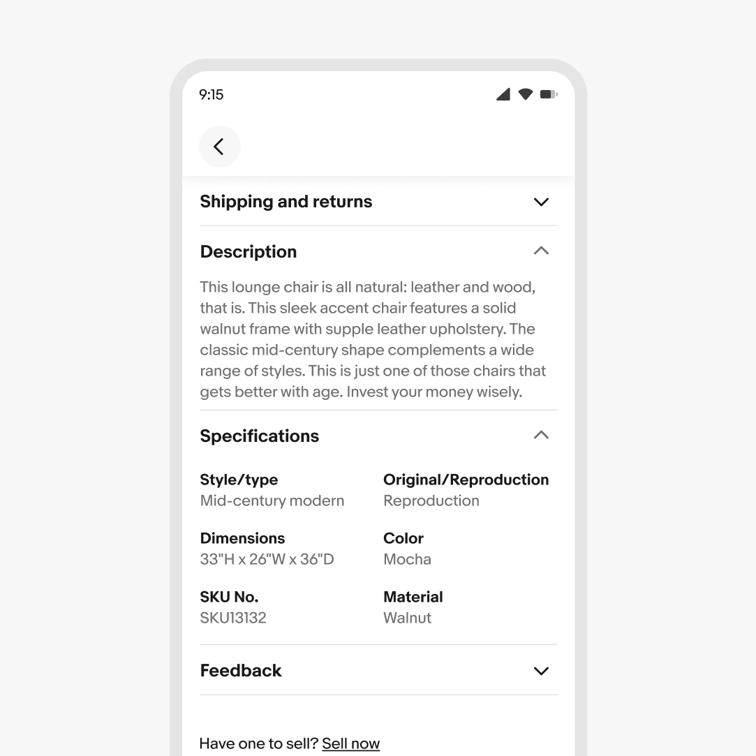
Accordion
Vertically stacked sections, each with a header that toggles content open or closed.
This is best for FAQs, settings groups, or sectioned reference content where users scan headings and drill into a few.
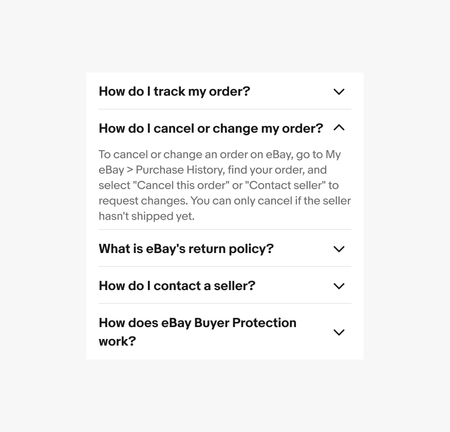
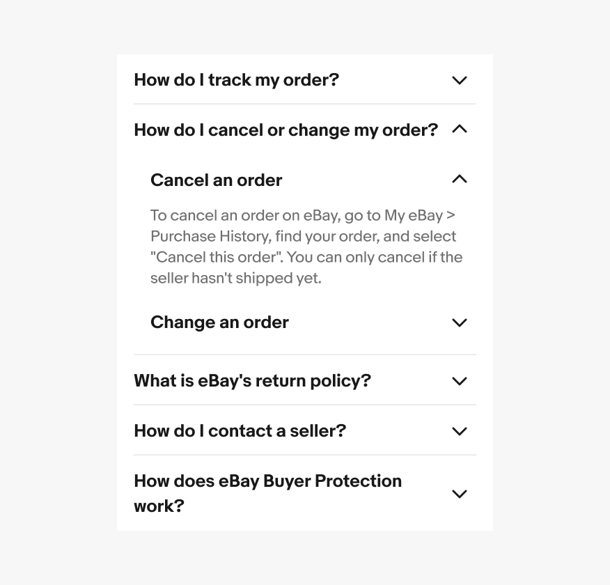
Avoid nesting accordions inside accordions.
Expansion button
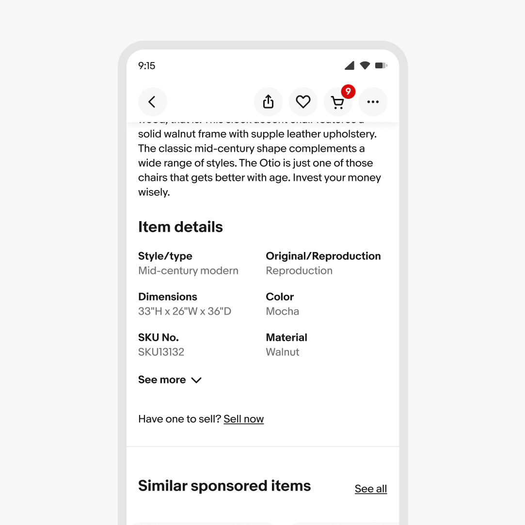
Truncates long content with an action to expand.
Best for secondary content where the full text isn't critical to the current task—descriptions, comments, or supplementary details.
Avoid using it on content users regularly need in full, like the most common item details.
Overlay
Content appears in a layered surface above the current view. The underlying context remains visible or partially visible, but focus shifts to the new layer.
Modal sheets and dialogs
A focused surface that interrupts the current task and requires action before continuing.
Best for confirmations, focused workflows, or quick edits that need user attention.
Avoid using modals for non-critical content as they are disruptive.
Side sheet (Panel)
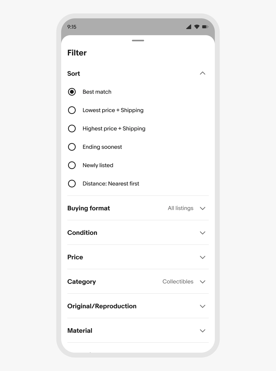
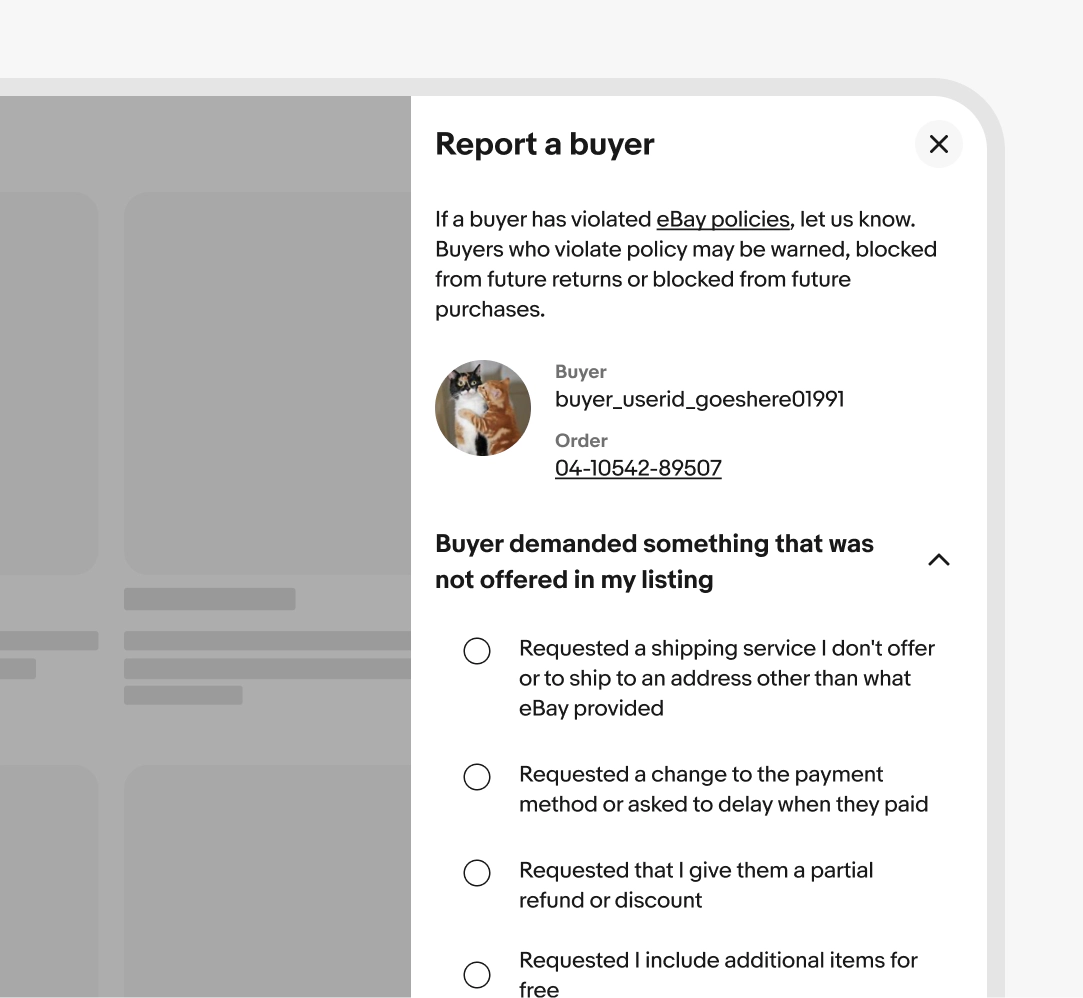
A panel that slides in from an edge without fully blocking the underlying view.
Best for secondary tasks that benefit from staying close to the main context—filters, details, settings.
Avoid using it for workflows that belong on a dedicated page.
Popover
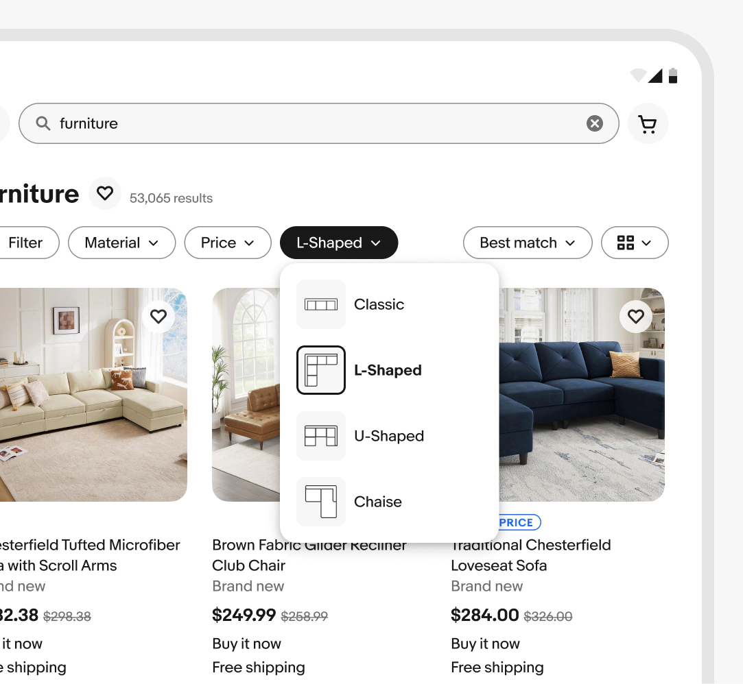
A small surface anchored to a trigger element, dismissed by clicking outside or selecting an action. Unlike tooltips, popovers can hold interactive content.
Best for contextual menus, secondary actions, or short forms tied to a specific element.
Sequential
Stepped flow
Breaks a long or complex task into ordered steps, showing one at a time.
Best for tasks with clear stages, dependencies between steps, or high cognitive load when shown all at once. For example, onboarding, multi-step checkout, account setup.
Avoid using a stepper for tasks without meaningful stages. If inputs are short, independent, or don't build on each other, use a single page instead to let users see everything at once and complete the task faster.
Video description: A "Select condition" step in an item-listing form; tapping Continue advances to a "Describe item" step, then tapping back returns to the condition step, showing disclosure and direction across sequential steps.
Triggers
Triggers should indicate that more content exists and reflect whether it's currently visible.
Icons that rotate or swap (chevron up/down, plus/minus) and labels that toggle ("Show more" / "Show less") help reinforce this.

Incomplete content
When revealed content loads asynchronously, design for loading, empty, and error states alongside the default. Skipping these turns a smooth disclosure into a confusing one the moment conditions change.
Match dismissal to disruption
Lighter patterns like tooltips and popovers should dismiss easily. Heavier patterns like modals require explicit dismissal and should confirm before discarding user work.
Focus moves with intent
When content opens, focus should land somewhere useful. When content closes, focus should return somewhere predictable. The right behavior varies by pattern type and is documented on each component page.
Decision tree
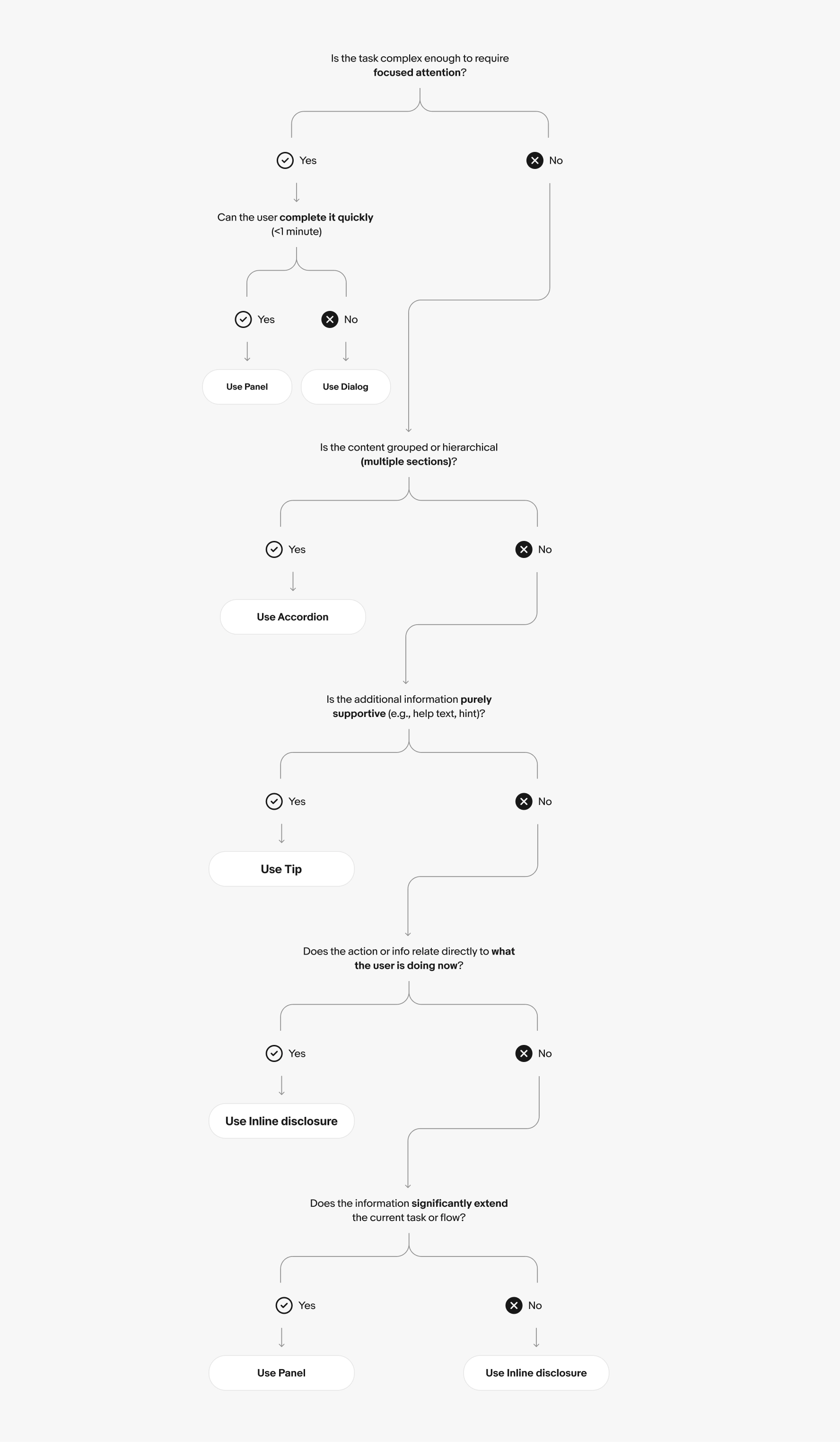
Choosing a component
| Component | Best for | Interruptive | Content length |
|---|---|---|---|
Accordion | Sectioned reference and settings | No | Medium to long |
Expandable row | Item-level detail in lists or tables | No | Short to medium |
Expansion button | Variable-length text content | No | Short to medium |
Modal | Focused tasks and confirmations | Yes | Short to medium |
Side sheet | Secondary tasks alongside main context | Partial | Medium to long |
Popover | Quick actions tied to a trigger element | No | Short |
Tooltip | Labels and short definitions | No | Very short |
Hint text | Form field guidance | No | Very short |
Stepper | Multi-step sequential tasks | Yes | Long |
Don’t nest disclosures
To cancel or change an order on eBay, go to My eBay > Purchase History, find your order, and select "Cancel this order" or "Contact seller" to request changes. You can only cancel if the seller hasn't shipped yet.
To cancel an order on eBay, go to My eBay > Purchase History, find your order, and select "Cancel this order". You can only cancel if the seller hasn't shipped yet.
Surfacing critical content
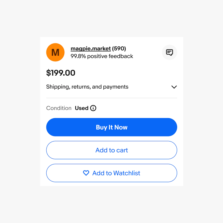
Do keep required information, primary actions, and validation feedback visible at the top level.
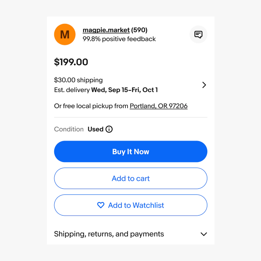
Don’t bury critical content behind a disclosure that requires effort to open.
Keep revealed content connected to its trigger
Do reveal new content from the element that triggered it.
Video description: Tapping the filter chip on a search results screen smoothly opens a popover of shape options anchored to the chip, then closes the same way.
Don’t reveal new content from a fixed point unrelated to its trigger.