Date field
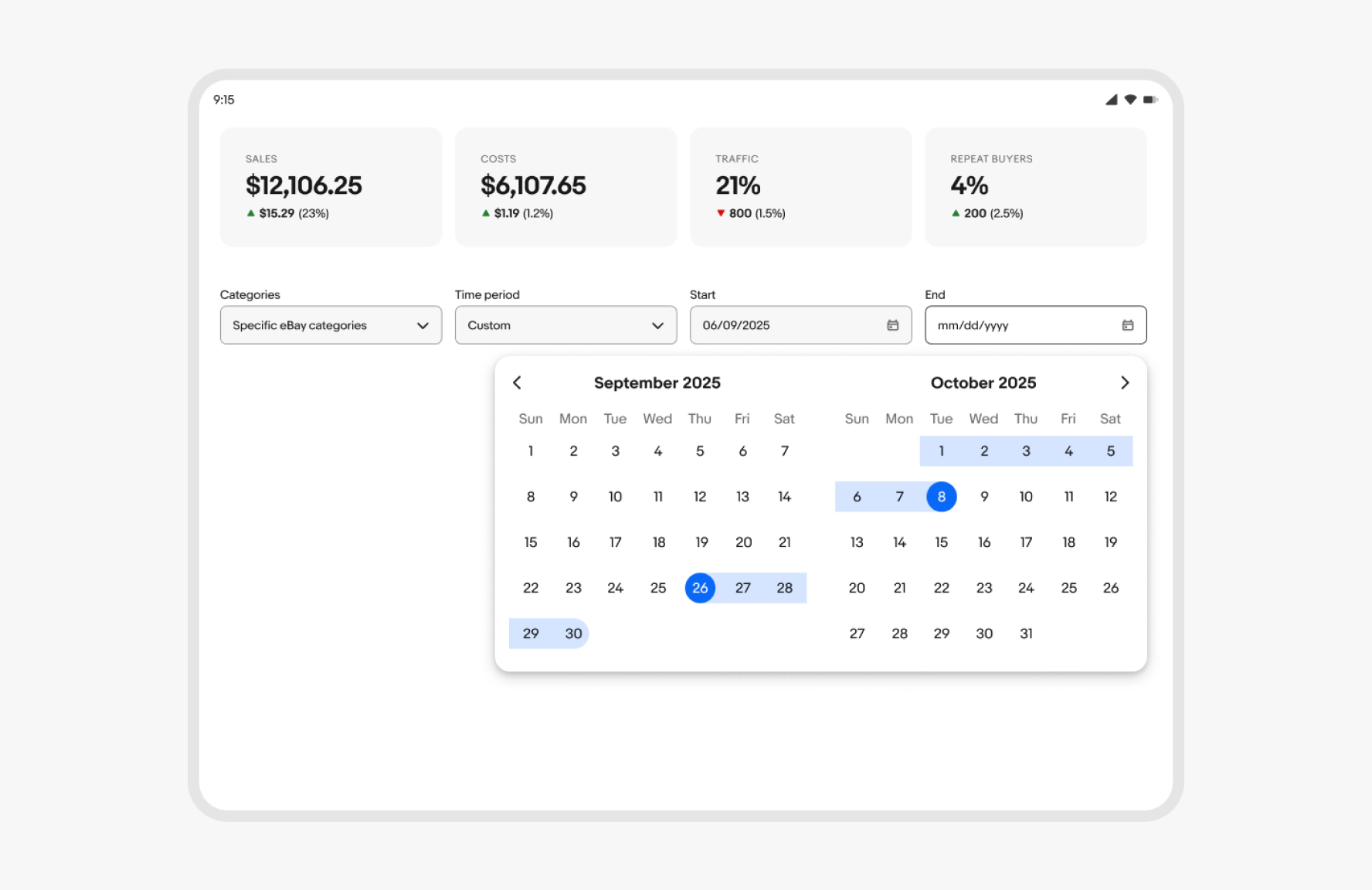
Date field allow users to open a calendar and select a singe date or a date range.

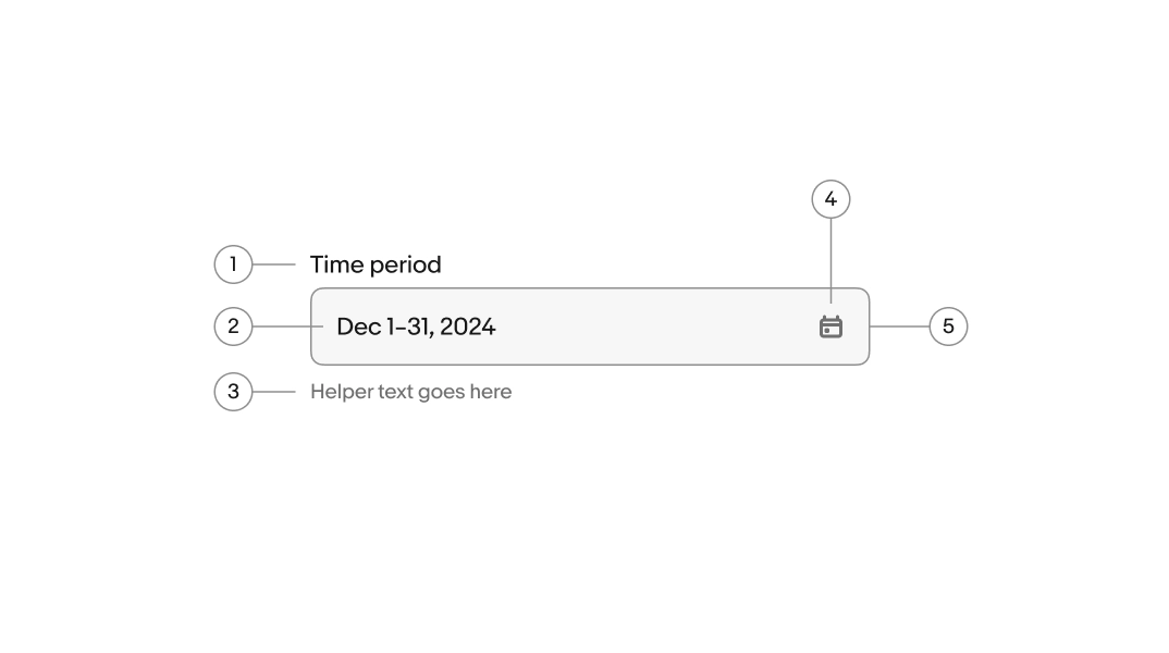
- Label
- Value
- Helper text
- Calendar icon
- Field container
Label
Required. The label names the date or date range the user is selecting.
- Use sentence case
- No ending punctuation
- Use a noun or noun phrase
- Aim for 1–3 words
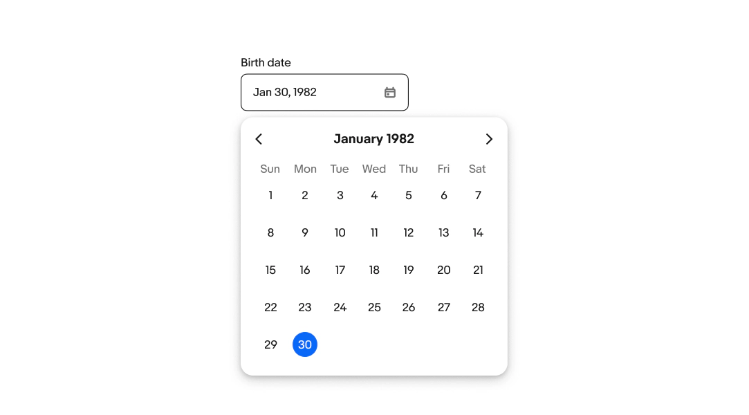
Calendar
The calendar is always paired with the date field. Clicking on the field displays a calendar picker. Users can select a single date or a date range. Learn more about formatting calendar.
Input value
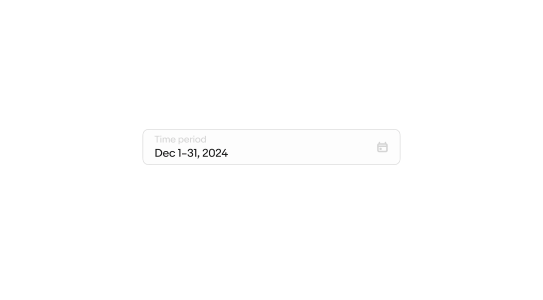
Required. The value reflects the date or date range the user selects.
- Abbreviate months to 3 characters with no periods
- Use four-digit years
- For date ranges, use an en dash with no spaces
- Repeat the year only when the range spans two calendar years (e.g., Dec 30, 2025–Jan 2, 2026)
Learn more about formatting dates.
Helper text
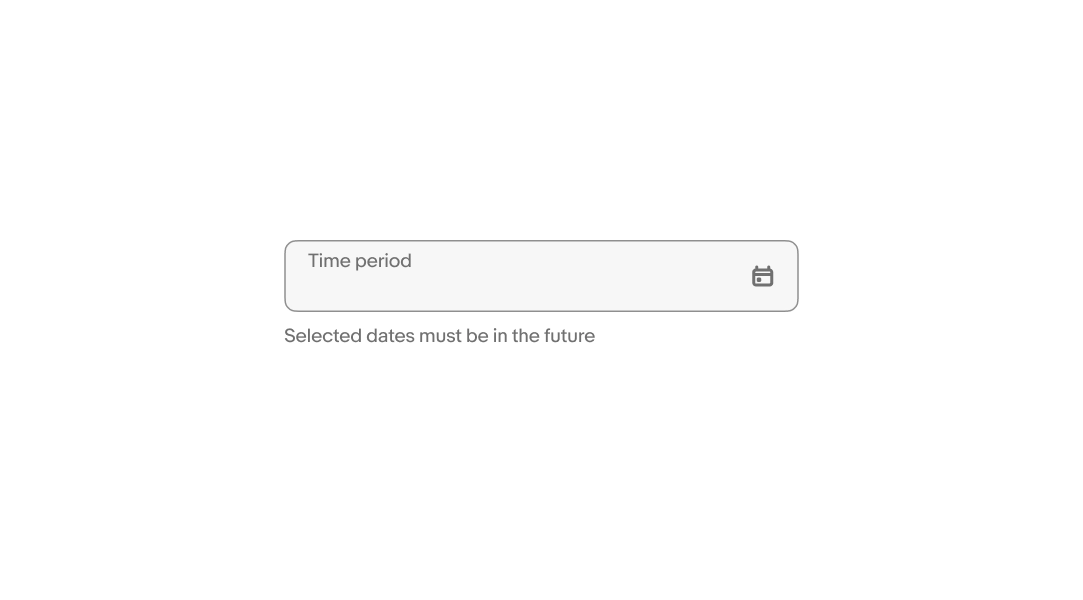
Optional. Helper text communicates specific formatting requirements for entering a phone number.
- Use sentence case
- No ending punctuation
- Max one line
Error messages
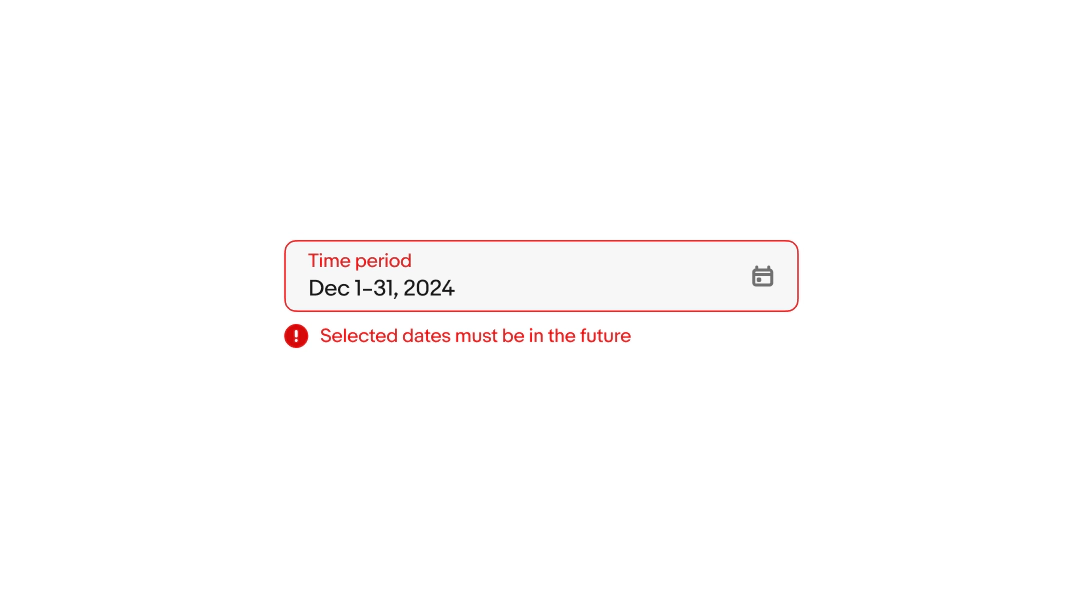
Error messages appear below the field when the input doesn't meet the required format or conditions. The error message replaces any existing helper text.
Keep the tone neutral, don’t blame or scare the user. Clearly inform users the requirements so they know how to fix it.
- Use sentence case
- No ending punctuation
- Avoid technical language or filler words like “please”, “sorry”, or “oops”
Size
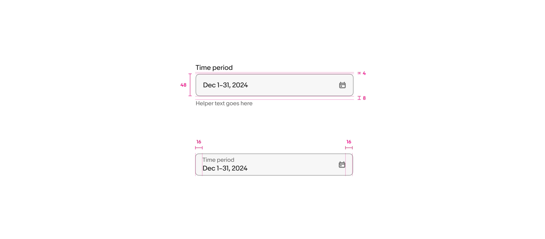
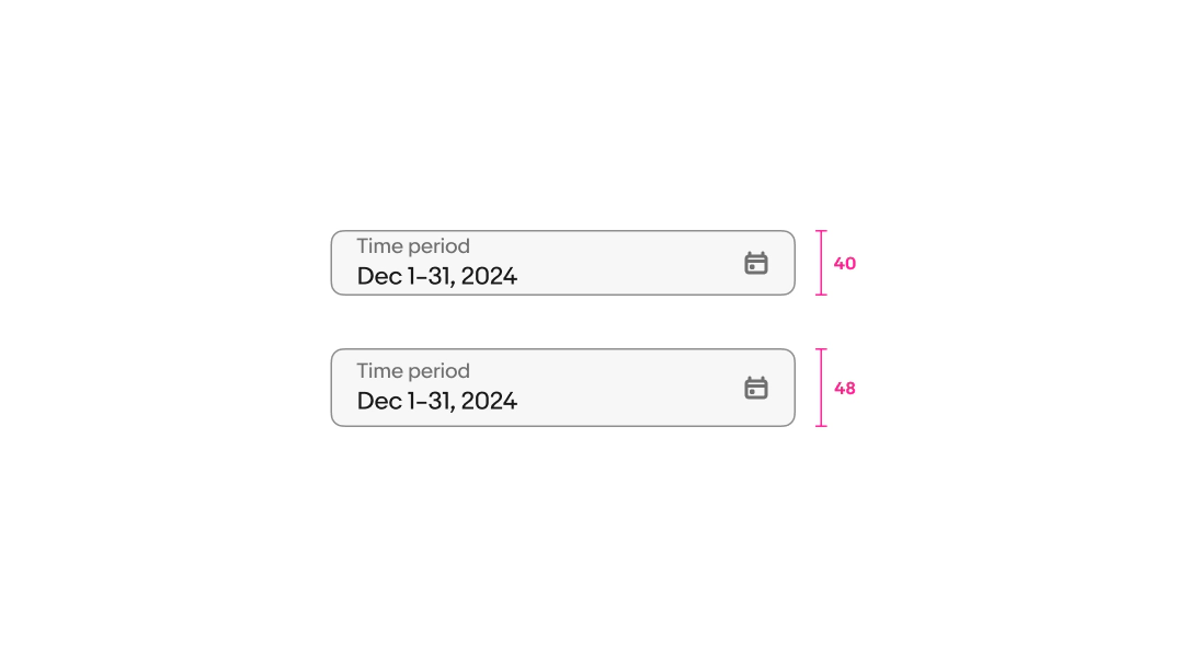
There are two sizes available: 48px and 40px. These sizes match available button sizes in case they’re inline together. Avoid mixing different sizes in a single form.
Small
Date picker fields on native launch the OS date pickers. HTML uses the popover or fullscreen dialog version.
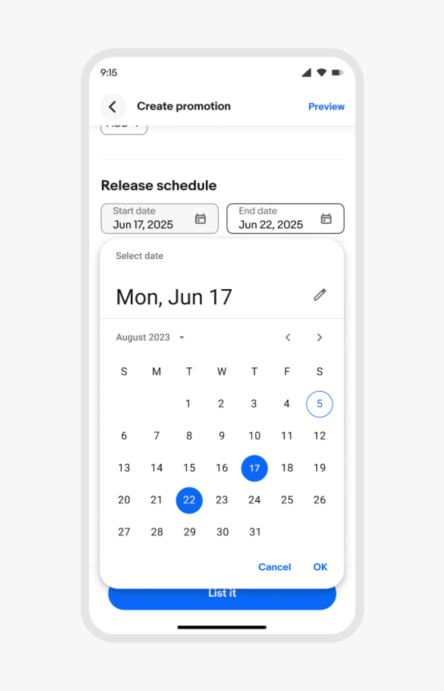
Native date picker
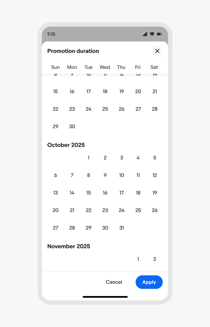
HTML full screen date picker
Medium
Date picker fields on native launch the relevant OS picker. HTML uses the popover.
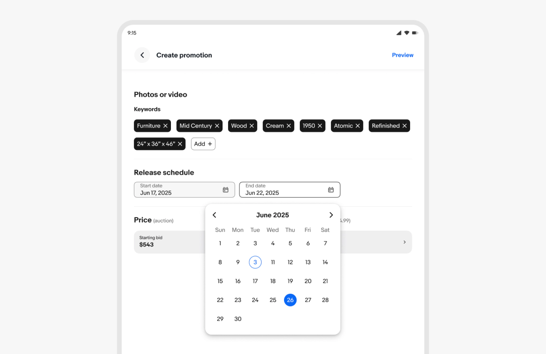
Large
Date picker fields on native launch the relevant OS picker. HTML uses the popover.