Standard dialog
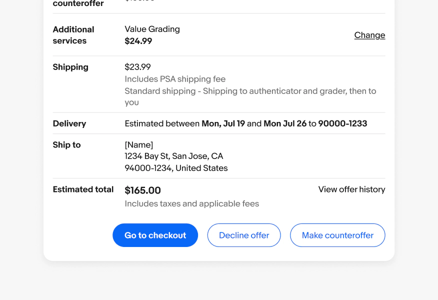
Standard dialogs focus the user’s attention on a specific piece of content or task.

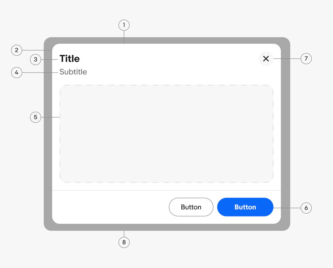
- Container
- Header
- Title
- Subtitle (optional)
- Content area
- Footer buttons
- Close button
- Scrim
Header
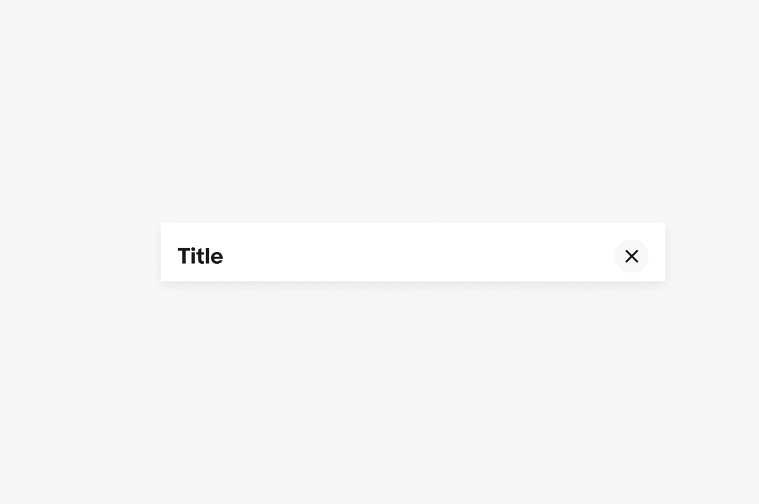
The header contains the dialog toolbar. In the default layout, the toolbar is opaque and displays the title. In the layouts with a hero image or multiple columns, the toolbar is transparent and the title and subtitle move into the content area instead.
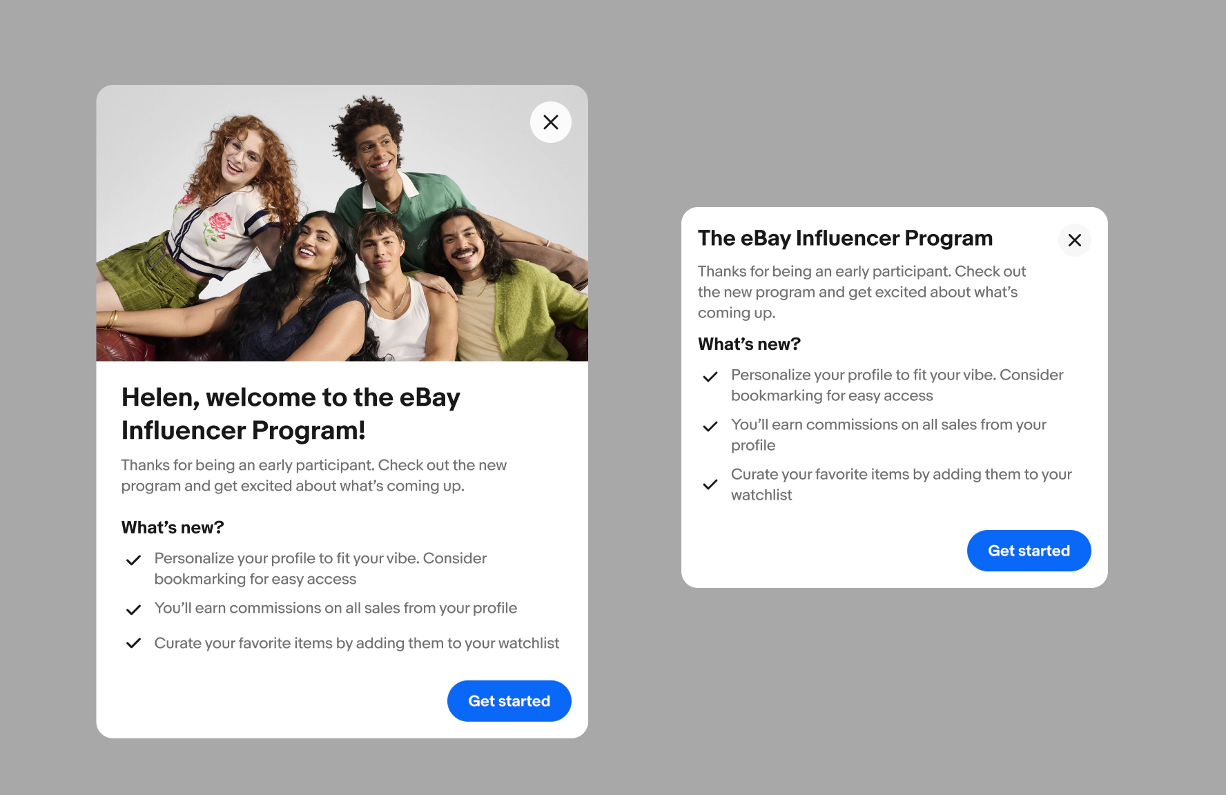
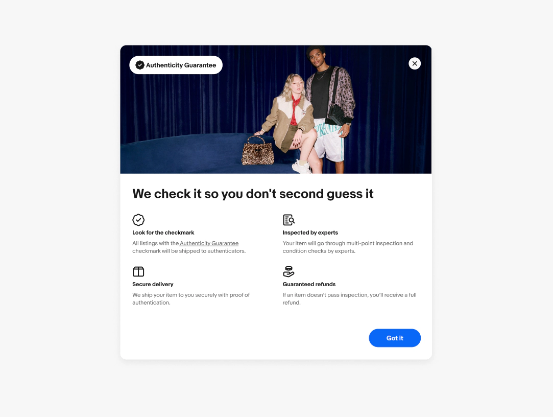
Hero image
Optional. Use a hero image to set visual context or reinforce the topic of the dialog. The hero image moves the title and subtitle below it, to the content area, and increases the overall padding of the dialog.
Title
Required. The title orients the user to the purpose of the dialog, such as what they need to decide, learn, or acknowledge.
- Use sentence case
- No ending punctuation
- Keep to 1 line
- End with a question mark when the title is phrased as a question
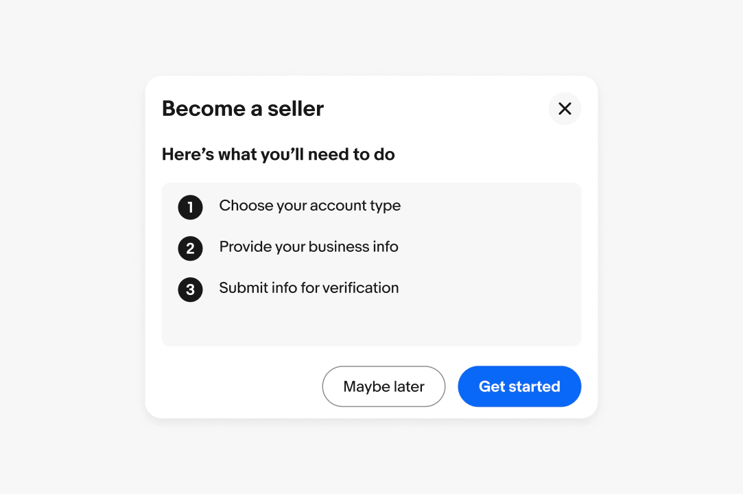
Subtitle
Optional. The subtitle adds context that helps users understand what's happening and what to do next. For educational and informational dialogs, focus on the key benefit or outcome instead of the mechanics.
- Use sentence case
- Use ending punctuation
- Keep to 1–3 sentences
- Don't repeat the title

Content area
The content area is a flexible layout that can contain any components, such as lists, forms, or notices. Follow the guidelines for any components placed inside it. Keep content focused on a single task or topic.
Footer
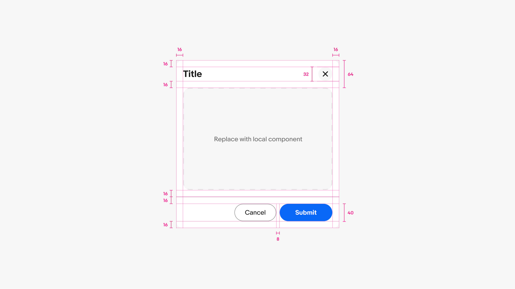
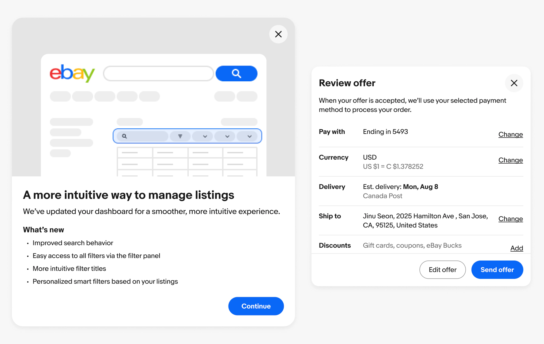
A consistent, fixed container for the dialog's actions. The primary action is aligned along the trailing edge of the container followed by any secondary or tertiary actions.
Button
The primary action completes the task or advances to the next step. The secondary action provides an alternative action or cancels it. The tertiary action provides an additional action. Strong button labels clearly indicate each action and outcome.
Note: Consider using a text link within the body copy before adding a third button.
- Use sentence case
- Keep to 1-3 words
- Start with an action verb
See Buttons for more details on visual hierarchy and writing guidance.

Container
The dialog container is an elevated, modal surface bounding all of its content and actions.
Scrim
The scrim is a semi-transparent overlay that blocks interactions with the primary surface and visually separates the dialog from the page content below.
All standard dialogs are modal, so the scrim is automatically applied. Learn more about scrim tokens.

Position
The dialog container can align to the center or trailing edge of the screen. The default position is centered.
Use the trailing position for a side panel look when referencing the primary page content is important.
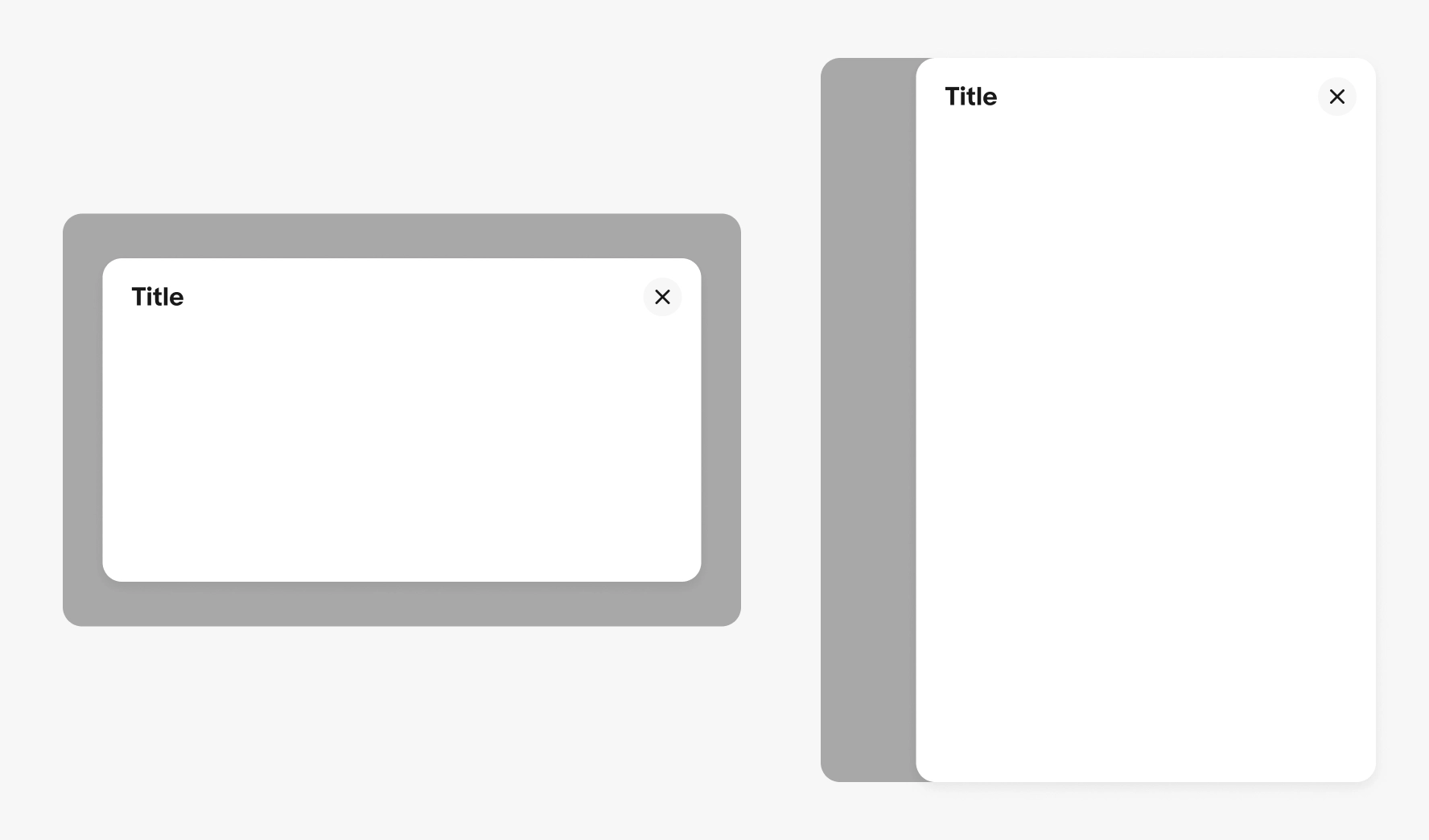
Presentation
Dialogs use a scale and fade transition when entering and exiting. The dialog rests in the center on large screens and along the bottom on smaller screens.
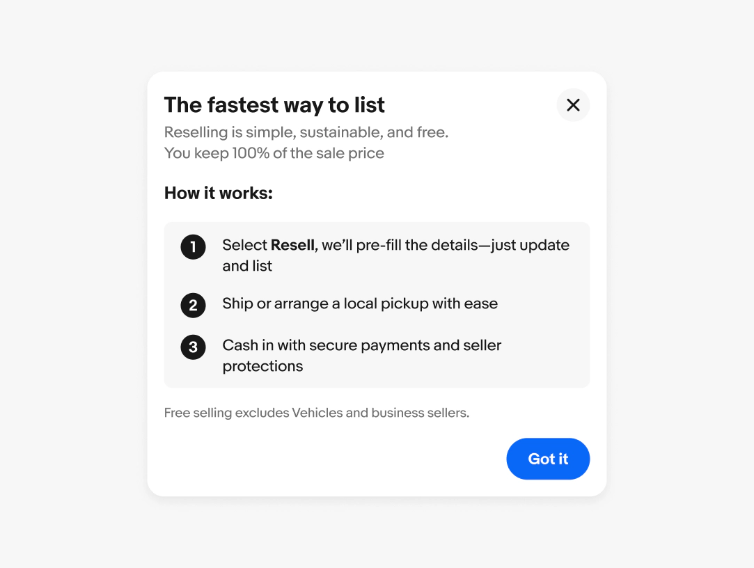
Scrolling
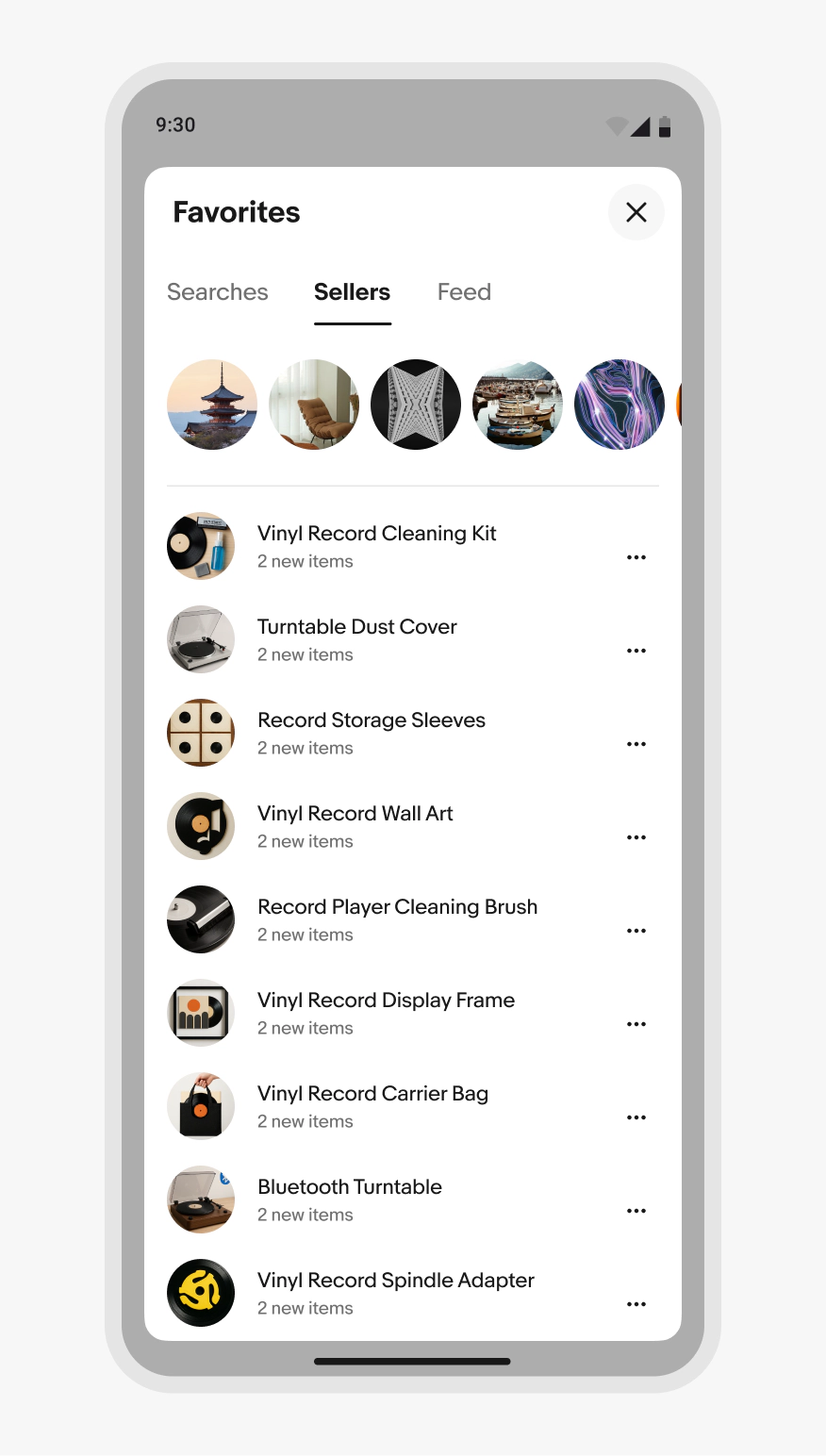
Content that flows beyond the container’s bounds will scroll within the content area. The header and footer are pinned above the content area and all content scrolls beneath.
Keep scrolling within dialogs to a minimum. Navigate to a new page if content extends far beyond the bounds of the dialog container.
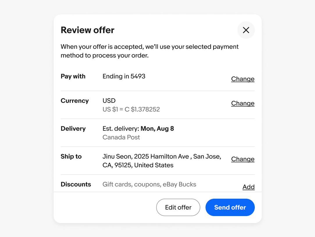
Dismissing
Dialogs are either completed, canceled, or closed. Pressing the escape key on a keyboard or interacting with the scrim registers as a cancel or close button.
Button overflow
Dialog footer buttons stack vertically when the footer is too narrow.
Keep button titles short and only show buttons that aid in completing the action or canceling the task. Don’t add links to the footer. Instead, add links to the body content or provide the links on the primary page surface.
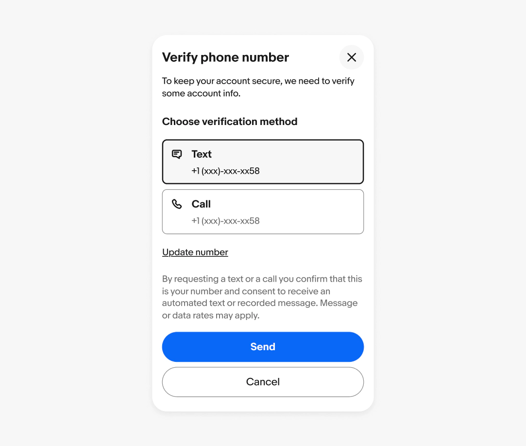
Title overflow
The title and subtitle wrap to a new line when wider than the available space. The width of the text box leaves room for the close button and text doesn’t extend below the button.
The close button aligns in the center to the top line of the title.

Navigating views
Because dialogs focus on a single task, navigating or loading additional views should be used sparingly. For cases that require additional steps, use the footer buttons to navigate forward and backward.
For multi-step tasks or tasks that include a variety of input types, use a new page instead.
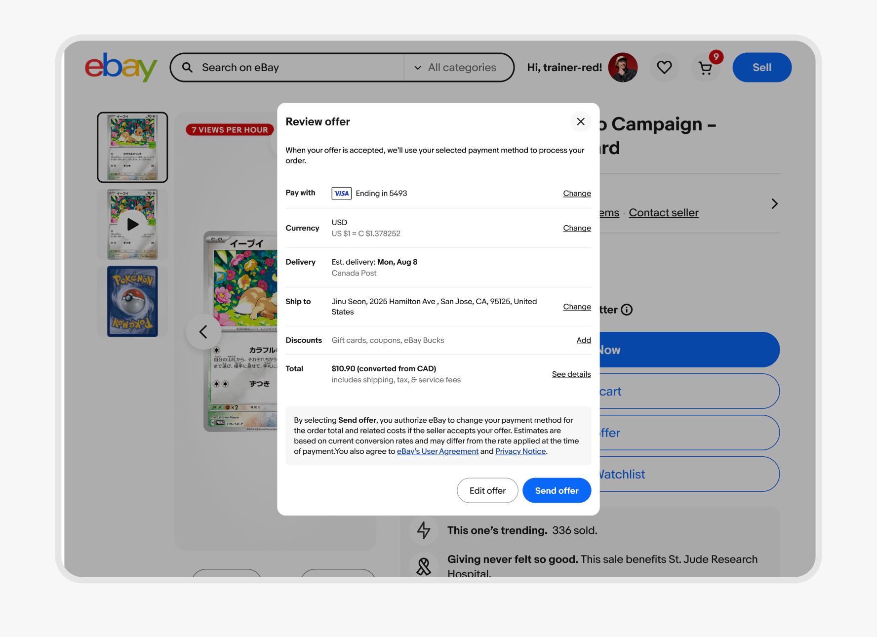
The content within the dialog is replaced when transitioning to a new view. This also applies when navigating back.
If additional content renders into a view, like an error message, the container can animate to adjust for the additional height up to its maximum relative height.
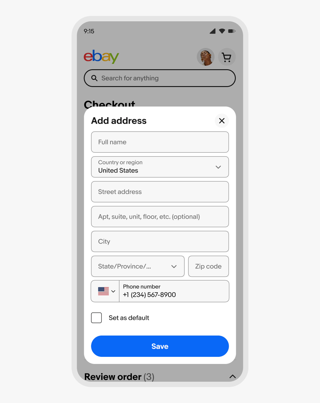
Native apps
The native Android and iOS apps use a Focus sheet instead of a dialog.
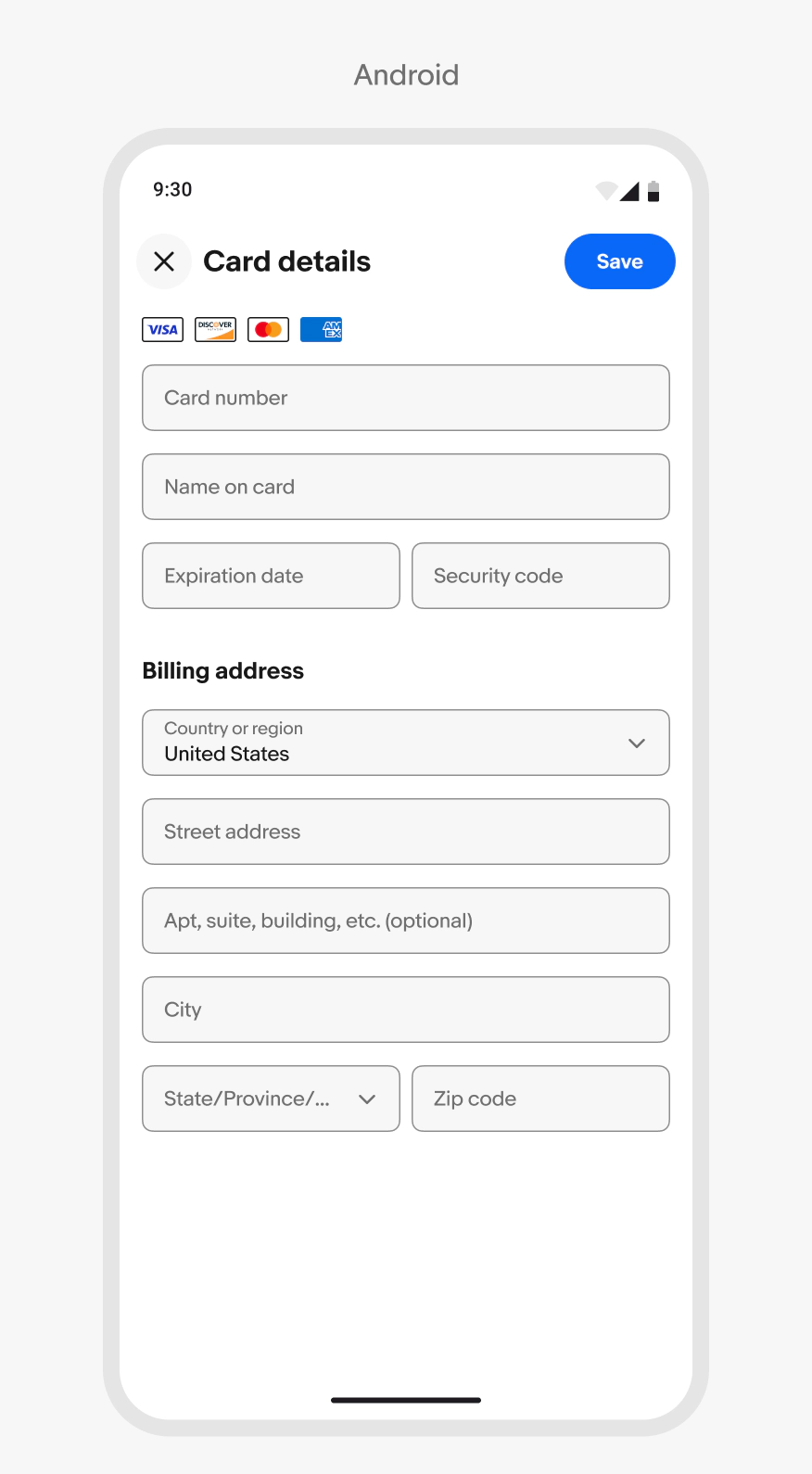
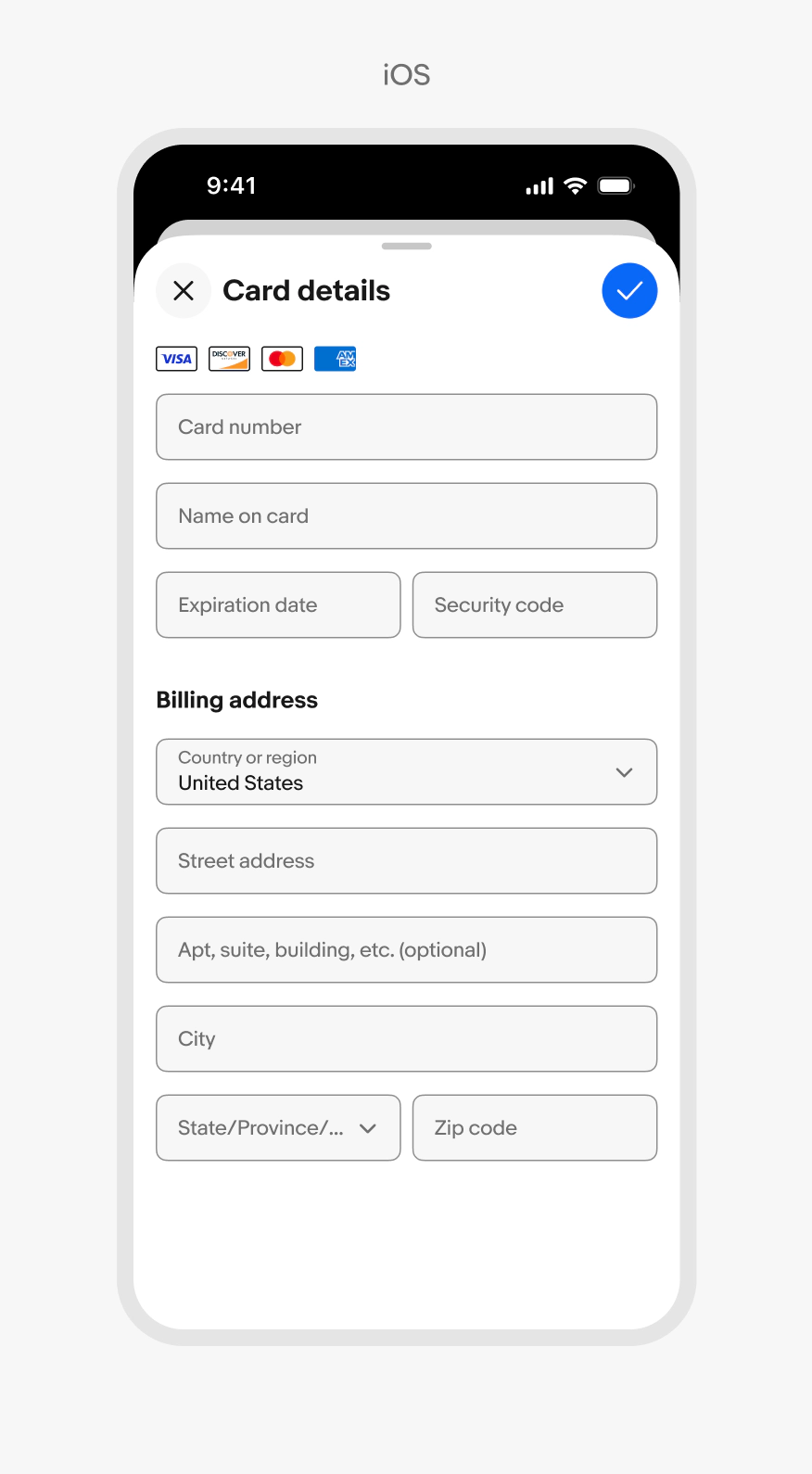
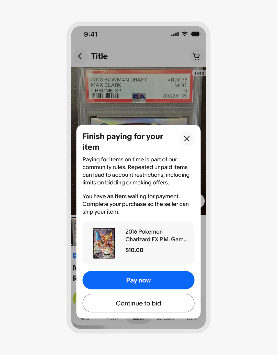
Small screen
Standard dialogs are aligned to the bottom on smaller screens to improve ergonomics of the footer buttons. They extend to the maximum screen height when the content requires it.
Large screen
Standard dialogs are centered on larger screens.

Stacking
Dialogs lie above all main page content.
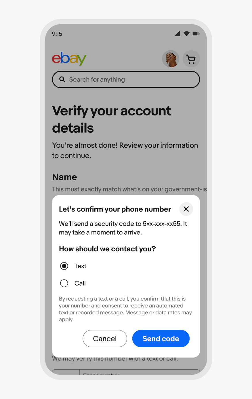
Dialogs should not trigger other dialogs. This quickly becomes inaccessible. Links within modals should open in a new tab or dismiss the modal before navigating.
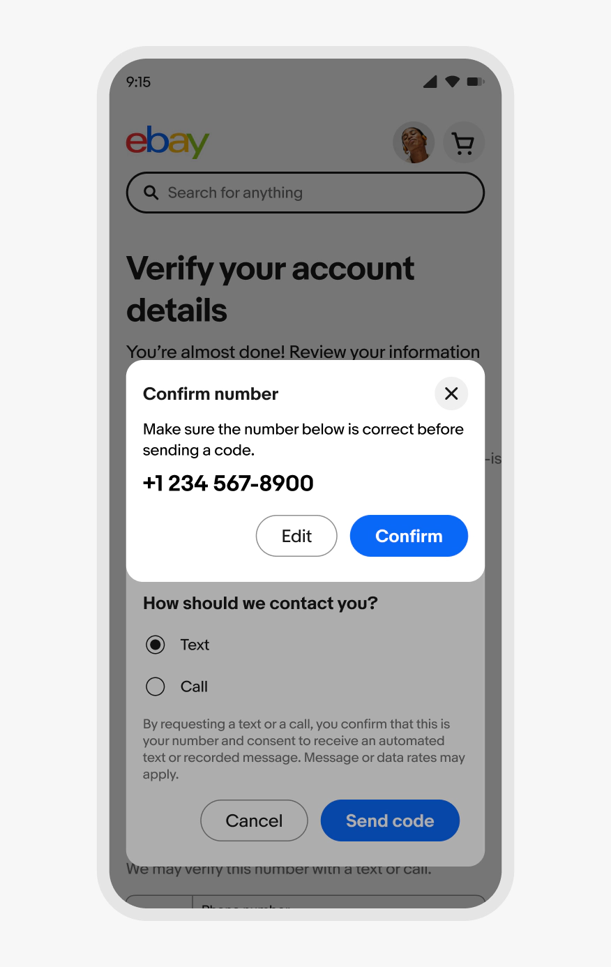
Scope
Focus the content on a single task with direct interactions and decisions. Use simple inputs like form fields and selection controls.
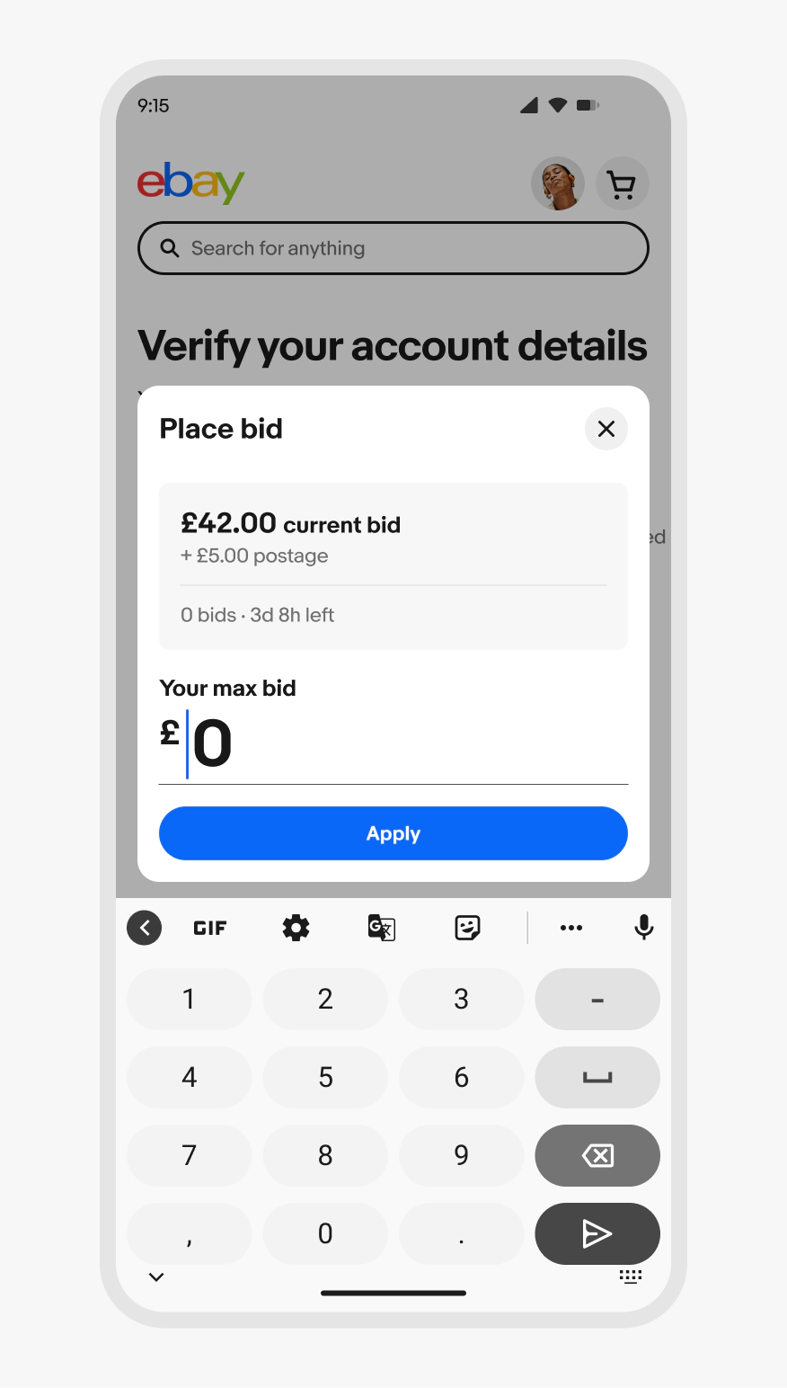
Don’t use a dialog when the content requires multiple complex decisions and input types. Navigate to a page instead.
Using 3 CTAs
All three buttons are aligned to the right side of the dialog. Only the outmost right button is allowed to be a primary button with the other two being secondary buttons.
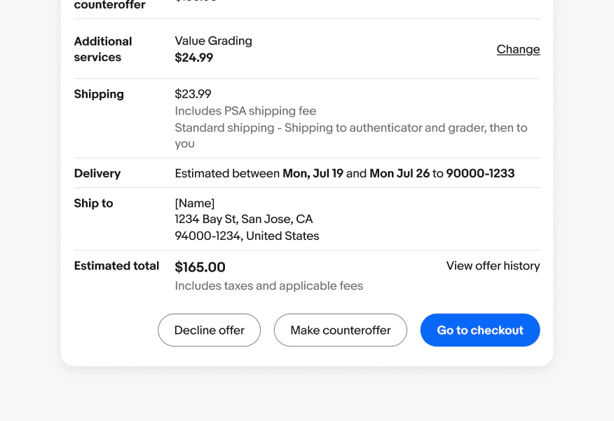
The primary button must be the outmost right button. The other buttons must be styled as “tertiary”, black outline.