Skip to main contenteBay Playbook
  • Get started
  • Foundations
  • Design system
  • Expressions
  • Resources
  • Articles

Design system

  • Overview
    • Design system definitions
    • Overview
    • Theming
    • Color
    • Dimension
    • Spacing
    • Typography
    • Breakpoints
    • Shadow
    • Shape
    • Opacity
    • Motion
    • Overview
    • Status
    • Accordion
    • Action bar
      • Overview
      • Inline notice
      • Page notice
      • Section notice
    • Avatar
    • Badge
    • Banner
    • Breadcrumb
      • Overview
      • CTA button
      • Icon button
      • Link button
    • Calendar
    • Card
    • Carousel
    • CCD
      • Overview
      • Filter chip
      • Input chip
      • Graphs
      • Metrics
      • Overview
      • Alert
      • Confirmation
    • Divider
    • Education notice
    • EEK rating and range
    • Expansion
      • Overview
      • Checkbox
      • Combobox
      • Date field
      • Dropdown
      • Numeric stepper
      • Password
      • Phone number
      • Radio button
      • Select list
      • Switch
      • Text area
      • Text field
    • Item tile
    • List row
      • Overview
      • Expressive loader
      • Skeleton loader
    • Media container
      • Top navigation bar
    • Pagination
    • Panel
    • Popover
    • Progress stepper
    • Search field
    • Section header
    • Segmented button
      • Overview
      • Context sheet
      • Focus sheet
    • Signal
    • Snackbar
    • State layer
    • Tab
    • Table
      • Overview
      • Tooltip
      • Tourtip
    • Toggle button group
    • Video player
    • Overview
    • Bulk editing
    • Empty states
    • Filtering
    • Uploading files
      • Overview
      • Text link

Confirmation dialog

v3.0

Confirmation dialogs ask users to confirm a potentially destructive action, a high-impact decision, or accept or reject terms.
Stylized graphic of a set of dialogs.
Confirmation dialogv3.0

On this page

  • Anatomy
  • Properties
  • Behavior
  • Considerations
  • Screen sizes
  • Best practices
  • Specs

Anatomy

Properties

Behavior

Screen sizes

Best practices

Specs

PreviousAlertNextDivider
Things.People.Love.
  • Get started
  • Foundations
  • Design system
  • Expressions
  • Resources
  • Articles
  • About eBay Design
  • Careers
  • Press
  • Privacy policy
© 2026 eBay. All rights reserved.

eBay Evo, the eBay trademark, and the eBay logo are the intellectual property of eBay Inc.

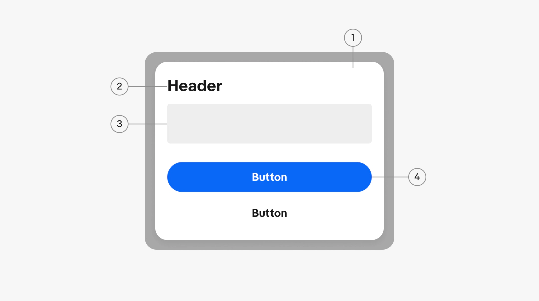
    1. Container
    2. Header
    3. Body
    4. Buttons

    Title

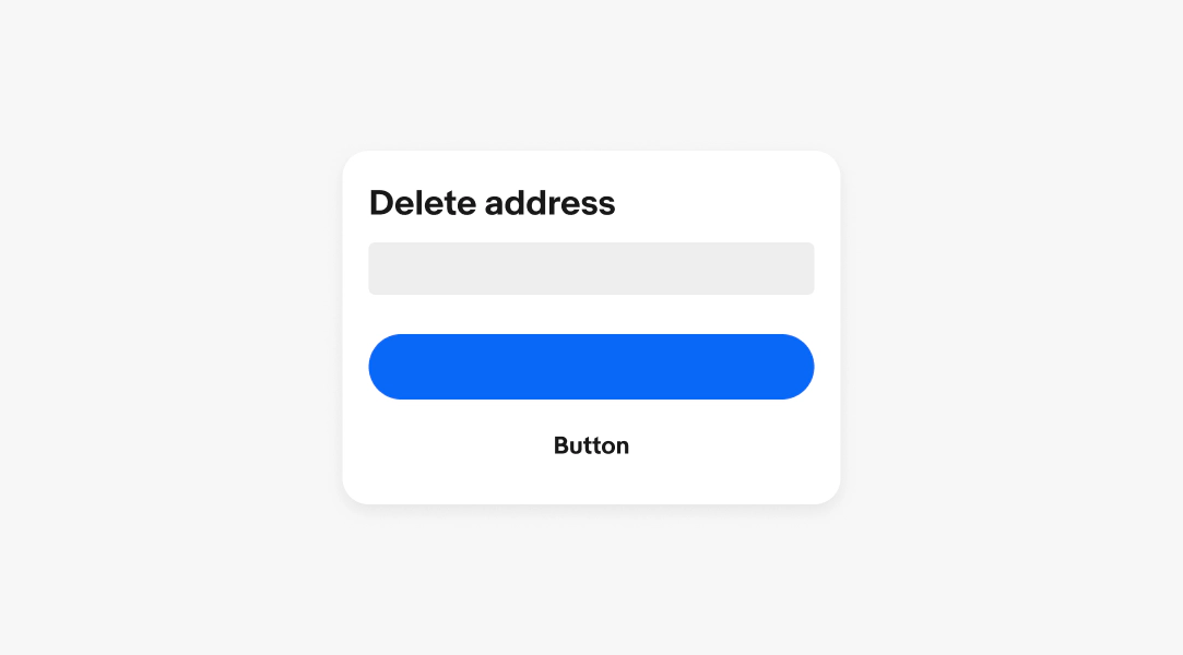
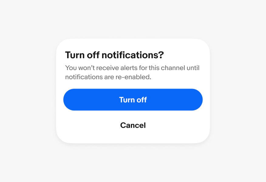
    The title is required and frames the decision the user needs to make. A strong title is specific about the action being confirmed and often posed as a question.

    • Use sentence case
    • Keep to 1 line
    • Frame as a question when possible
    • Don’t use ending punctuation, unless it’s a proper sentence like a question
    Body

    The body is required and explains what will happen if the user confirms or rejects. A strong body clearly states the consequences, especially for destructive or irreversible actions, and includes specific details.

    • Keep to 1-3 sentences
    • Avoid repeating the header

    Buttons

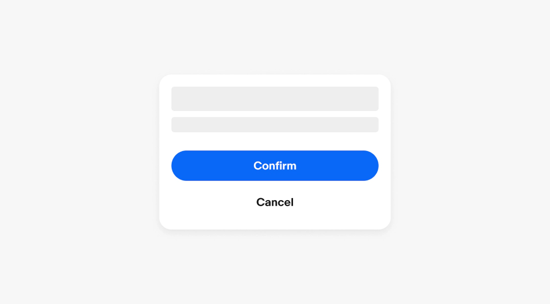
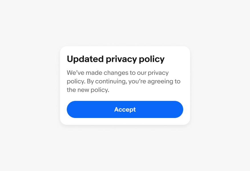
    Confirmation and cancel buttons are required. Selecting one of the two actions is the only way to dismiss the dialog.

    The primary action button confirms and executes the action, so the label should clearly describe user’s action.

    • Use sentence case
    • Keep to 1-3 words
    • Avoid generic labels like "Yes" or "OK"

    The cancel button dismisses the dialog without taking action. Common labels for cancel buttons are “Cancel” and “Go back”.

    • Use sentence case
    • Keep to 1-2 words
    • Avoid "No" unless the title is a clear yes/no question

    See Buttons for more details on visual hierarchy and writing guidance.
    Scrim

    The scrim is a semi-transparent overlay that focuses attention on the dialog. The scrim isn’t interactive and doesn’t dismiss the dialog.

    Dismissing

    Confirmation dialogs can be dismissed by clicking either the confirmation or cancellation action. Pressing the escape key on a keyboard will register as the cancellation action.
    Button placement

    The alert dialog button is positioned along the trailing edge of the dialog container below the body content.
    Width & height

    Confirmation dialogs are a fixed width to maintain readability and encourage short, simple messaging. They flex vertically to fit their content down to a maximum height of 400px.
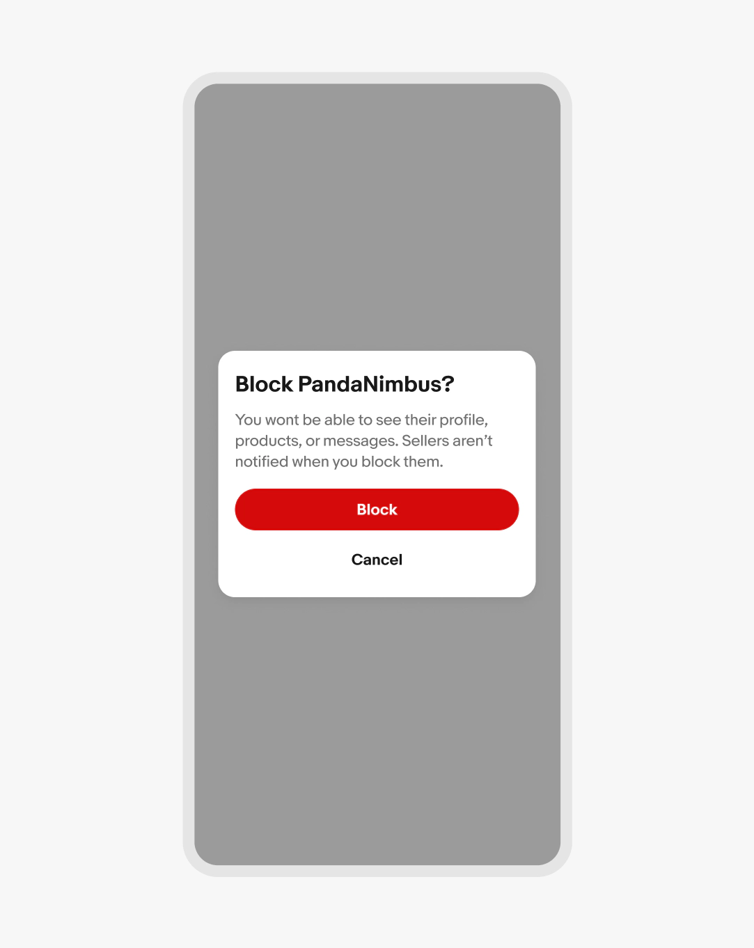
    Small screen

    Alert dialogs on small screens are centered.
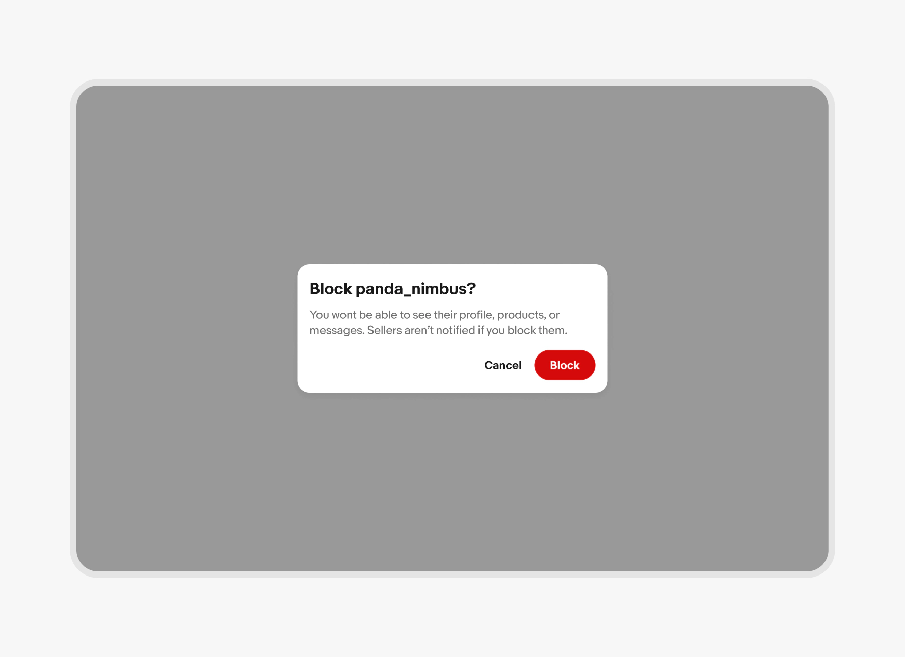
    Large screen

    Confirmation dialogs on large screens are centered and inset as well.
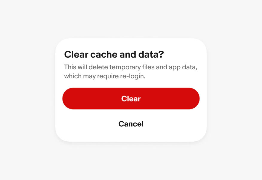
    Scrolling

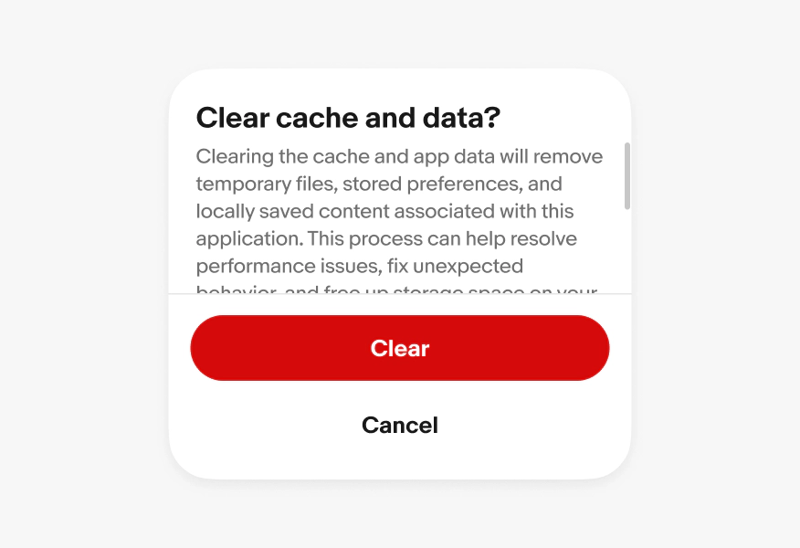
    Do ensure confirmation dialogs do not scroll.
    Don’t pack confirmation dialogs with content that would cause it to flex beyond the maximum height or scroll.
    Critical messaging

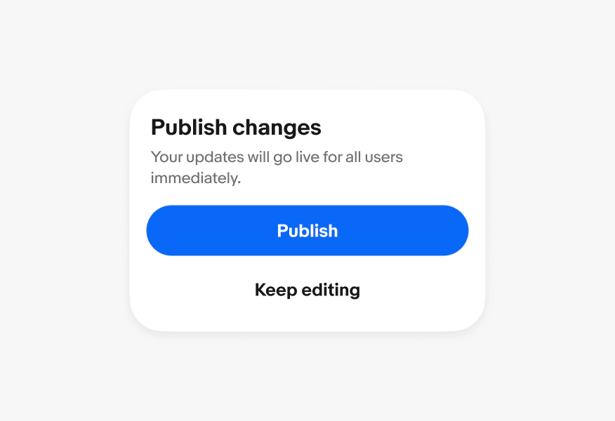
    Do use confirmation dialogs when informing a user of a decision’s impact. These dialogs present two actions and are dismissed by interacting with one of them.
    Don’t use a confirmation dialog when an alert is triggerd by the system.
    Actions

    Do utilize CTA buttons to direct user to interact before dialog is dismissed.
    Don’t show confirmation dialogs without CTA buttons.
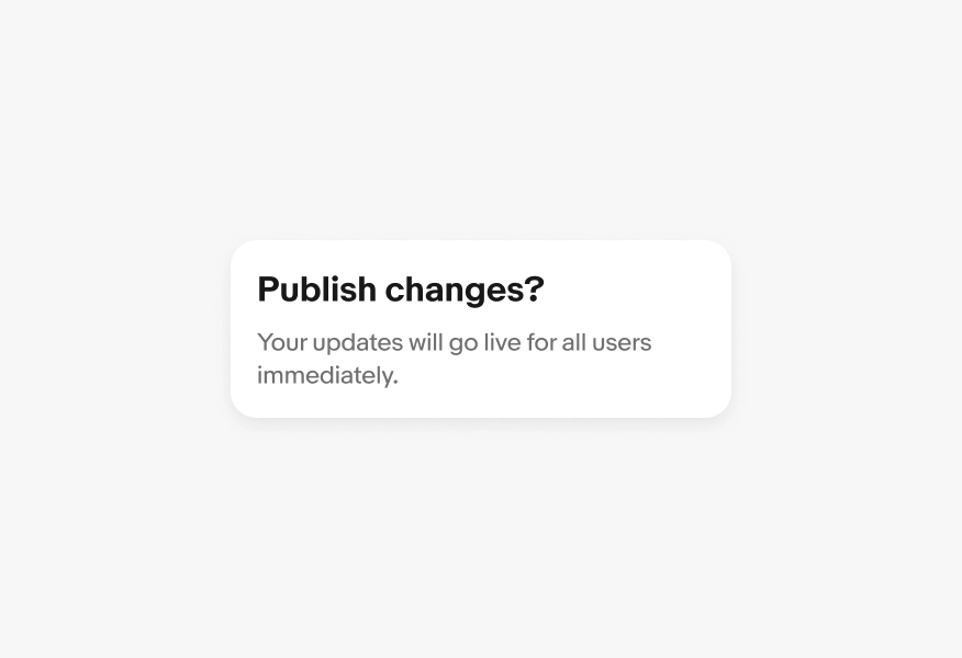
    Types of buttons

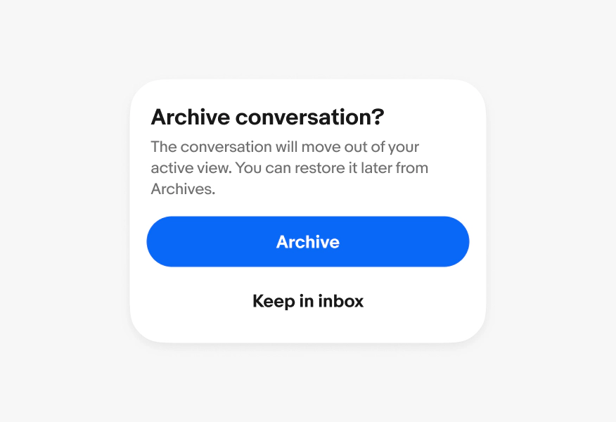
    Do always use a primary button with a borderless button
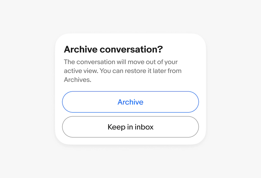
    Don’t use secondary or tertiary buttons.
    Alignment

    Do always center-align alert and confirm dialogs.
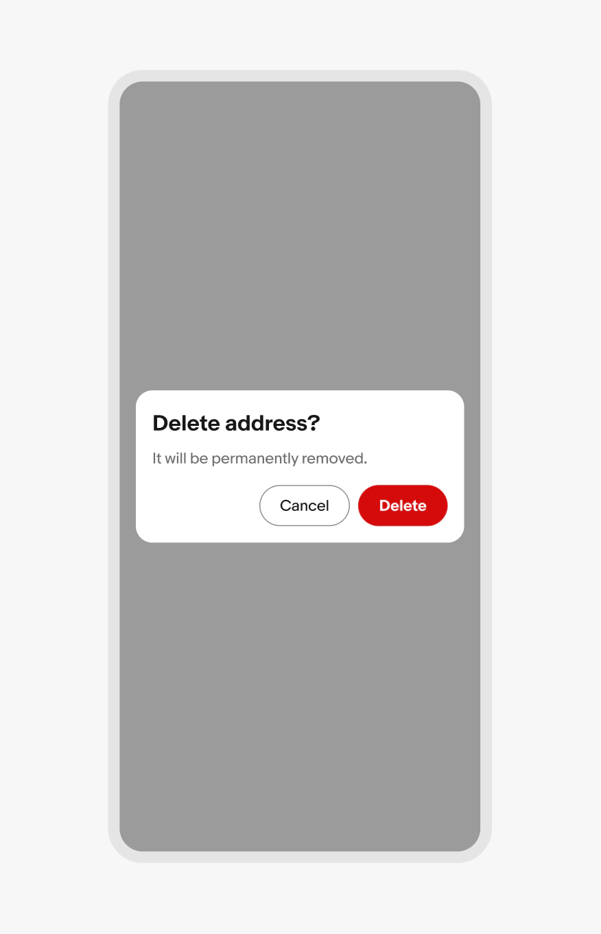
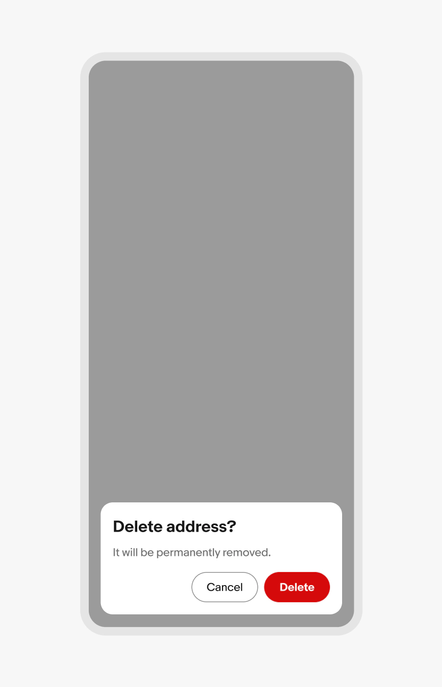
    Don’t bottom-align alert and confirm dialogs.
    Confirm dialog

    A confirmation dialog with 4 elements numbered: 1. Container, 2. Header, 3. Body, 4. Buttons
    A confirmation dialog with a title of “delete address”.
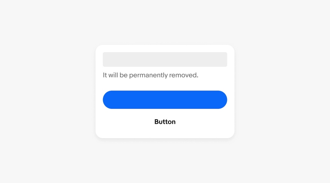
    A confirmation dialog with a body of “it will be permanently removed.”
    A confirmation dialog with a primary button of “confirm” and a borderless button of “cancel”.
    Dialog over a scrim that darkens and separates the dialog from the elements behind it.
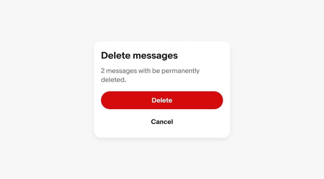
    A confirmation dialog with a title of “delete messages”, a body of “2 messages with be permanently deleted”, a primary button of “delete” and a borderless button of “cancel”.
    The alert dialog button is positioned along the trailing edge of the dialog container below the body content.
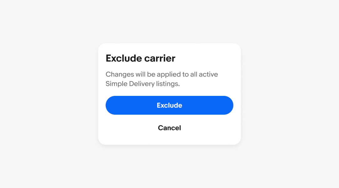
    A confirmation dialog with a title of “Exclude carrier”, a body of “Changes will be applied to all active Simple Delivery listings”, a primary button of “exclude” and a borderless button of “cancel”.
    A centered confirmation dialog on a small screen.
    A centered confirmation dialog on a large screen.
    A confirmation dialog not scrolling.
    A scrolling confirmation dialog.
    A confirmation dialog with a title of “Turn off notifications?”, a body of “You won’t receive alerts for this channel until notifications are re-enabled”, a primary button  of “Turn off” and a borderless button of “cancel”.
    A confirmation dialog with a title of “Updated privacy policy”, a body of “We’ve made changes to our privacy policy. By continuing, you’re agreeing to the new policy. ”, a primary button of “Accept”.
    A confirmation dialog with a primary and borderless button.
    A confirmation dialog with no buttons.
    A confirmation dialog showing a primary and borderless button.
    A confirmation dialog showing a secondary and tertiary button.
    A centered confirmation dialog on a small screen.
    A confirmation dialog bottom-aligned on a small screen.
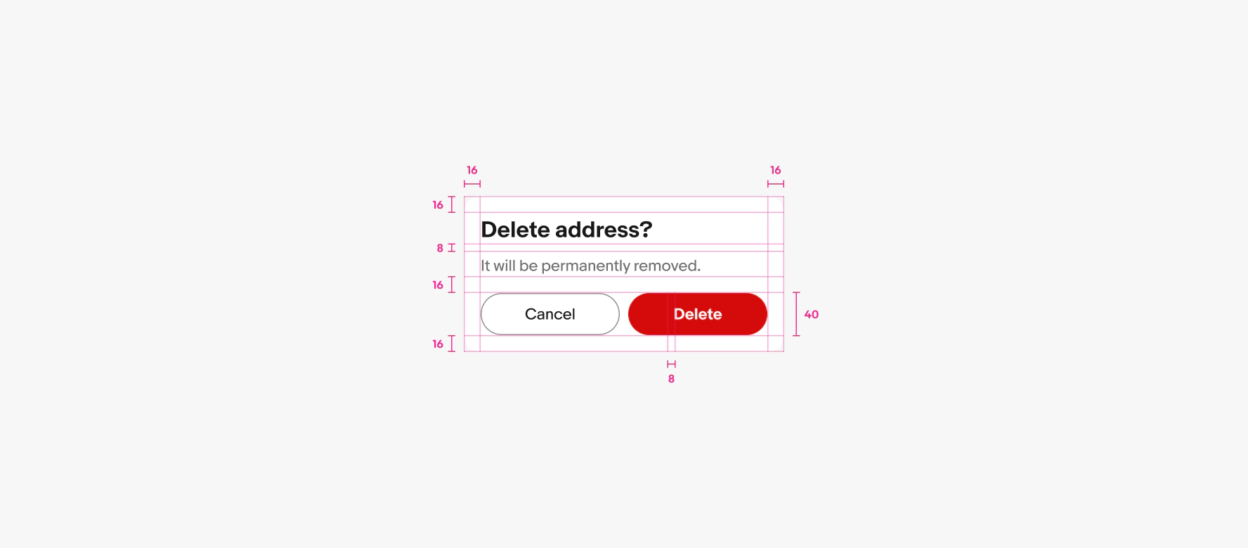
    A spec for a confirmation dialog container. The container has 16px of padding on all sides. 8px of padding is between the title and body copy. 16px of padding is between body copy and button group. 8px of padding is between the buttons.

    Considerations

    Presentation

    Confirmation dialogs fade in and out from the center of the screen.

    Confirmation dialogs are commonly triggered by a user action, like deleting a record. However, the application can trigger a confirmation dialog to appear to inform the user of an important update that requires their attention.