Input overview
Input fields allow users to enter and submit data. Choose the type that matches the shape and structure of what the user needs to provide.

Intentional
Every input should collect only the information needed for the task. Avoid asking for data you won’t use.
Guided
Use labels, helper text, and the right input type to set expectations before the user acts. Validation should confirm success as much as it flags failure.
Consistent
Maintain the same field size, label position, and spacing throughout a form. Mixed patterns create uncertainty and slow users down.
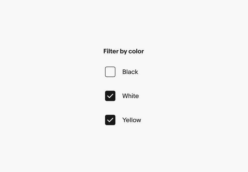
Checkbox
Checkboxes allow the user to select multiple options from a list or a single yes/no option. Learn more about using checkbox.
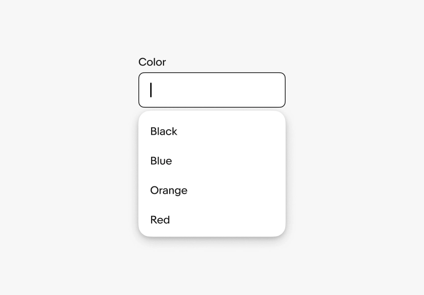
Combobox
The combobox combines a text field with a popover menu, allowing users to filter and choose an option from a list or enter their own value. Learn more about using combobox.
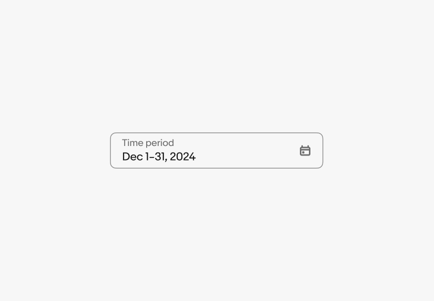
Date field
Date picker fields allow users to open a calendar and select a single date or a date range. Learn more about using date field.
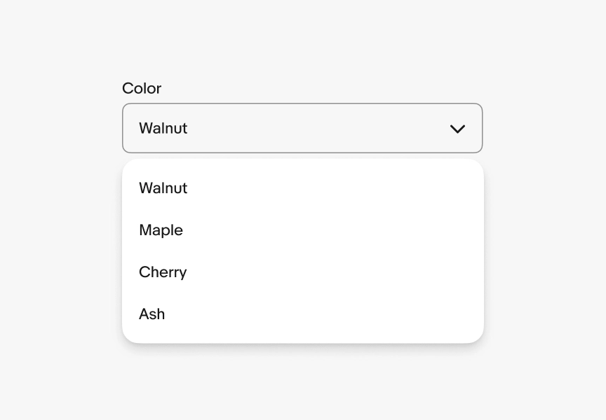
Dropdown
Dropdown fields allow for selection of a value within a predetermined dataset. Learn more about using dropdown.
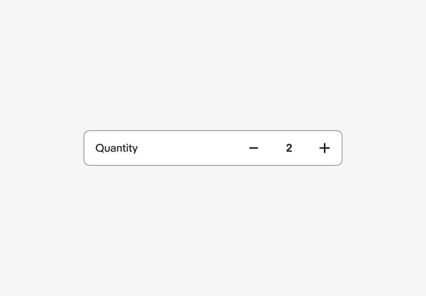
Numeric stepper
A numeric stepper is a control for editing a numeric value with buttons to decrease or increase the value. Learn more about using numeric stepper.
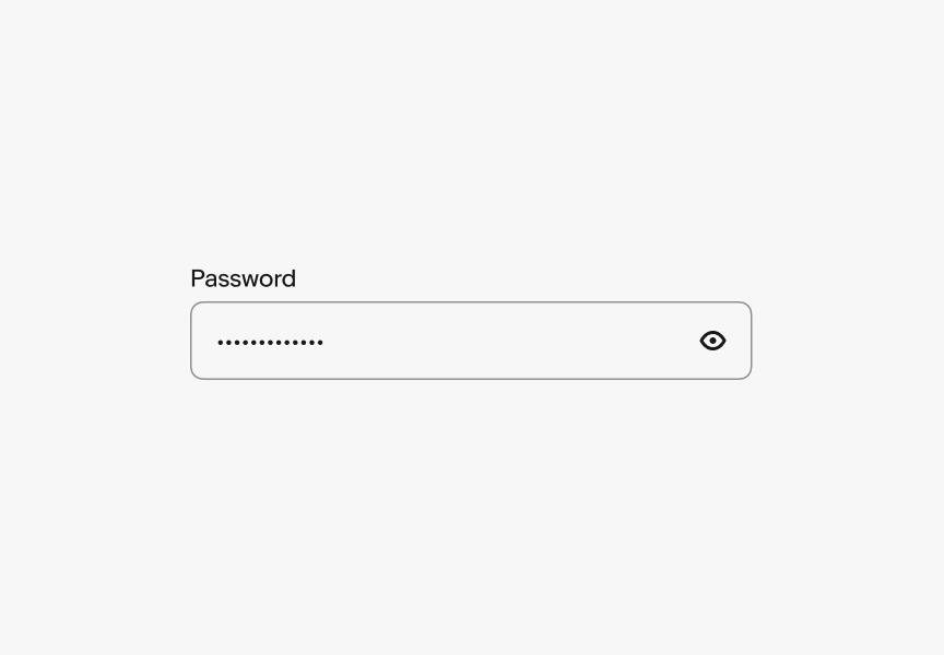
Password
The password field lets users enter a password with characters concealed and a toggle to reveal them. Learn more about using password.
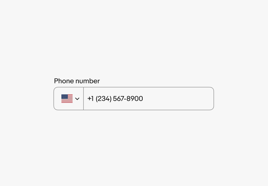
Phone number
The phone number field is a specialized text field enabling quick phone number entry. Learn more about using phone number.
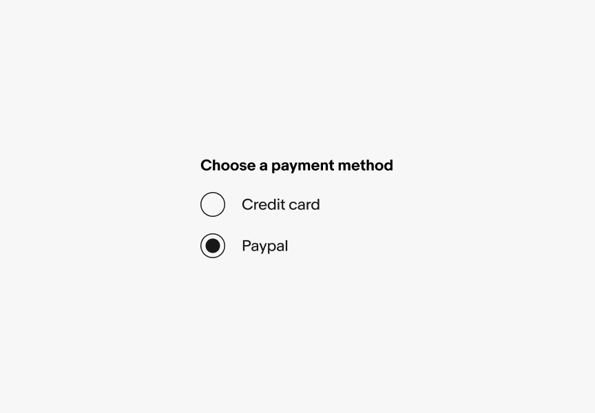
Radio button
Radio buttons allow the user to select one option from a set. Learn more about using radio button.
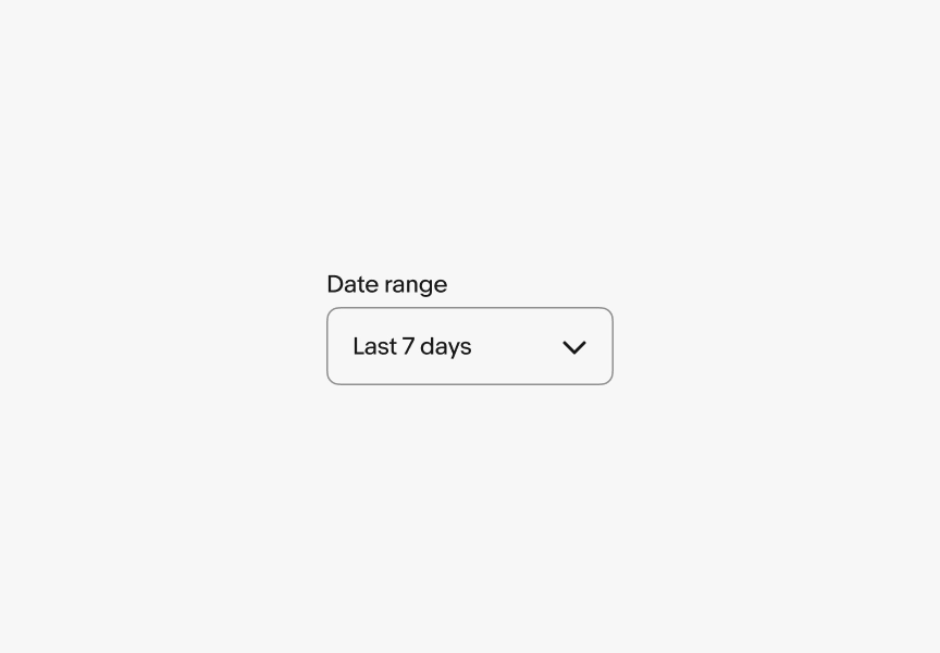
Select list
Select list allows users to choose a single option from a predefined list. It uses the browser's native dropdown and is available on web only. Learn more about select list.
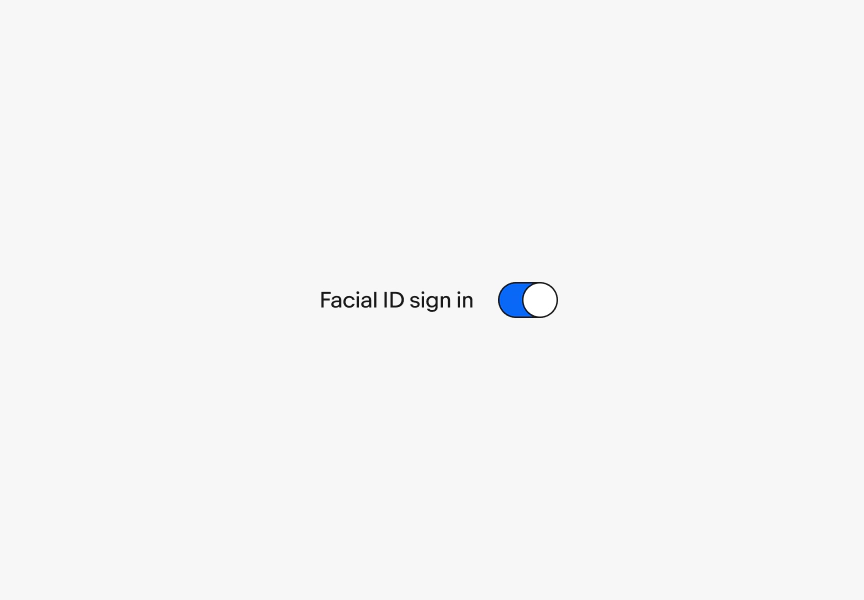
Switch
Switches allow users to toggle a setting on or off. Learn more about using switch.
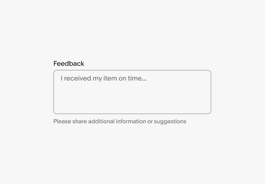
Text area
Text areas allow for input that extends across multiple lines. Learn more about using text area.
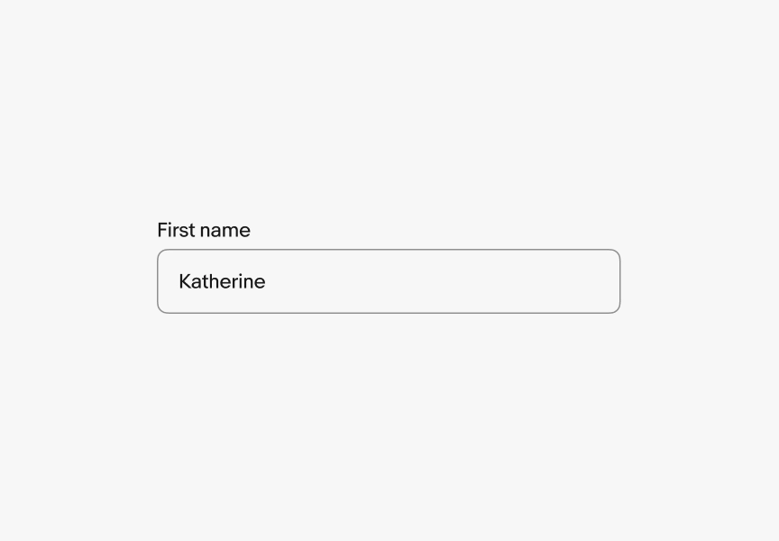
Text field
Text fields let users enter and submit text. Learn more about using text field.
Checkbox vs. radio button
Use a checkbox when:
- The user can select zero or more options
- A single yes/no choice needs to be confirmed
- Each option is independent of the others
Quick check: Can the user walk away without selecting anything?
Yes — checkbox. No — radio button.
Use a radio button when:
- Exactly one option must be selected
- Options are mutually exclusive
- A default can be pre-selected, but the user must actively choose
Text field vs. text area
Use a text field when:
- The response is a single line (name, email, search term)
- Character count is short and predictable
Use a text area when:
- The response is expected to span multiple lines
- The user needs space to compose (feedback, description, notes)
Dropdown vs. radio buttons
Use a dropdown when:
- There are more than 4-5 options
- Listing all options would clutter the layout
- Options do not need to be directly compared
Use a radio button when:
- There are 4 or fewer options
- Comparing options directly helps the user decide
- The form has enough vertical space to show them all