Skip to main contenteBay Playbook
  • Get started
  • Foundations
  • Design system
  • Expressions
  • Resources
  • Articles

Design system

  • Overview
    • Design system definitions
    • Overview
    • Theming
    • Color
    • Dimension
    • Spacing
    • Typography
    • Breakpoints
    • Shadow
    • Shape
    • Opacity
    • Motion
    • Overview
    • Status
    • Accordion
    • Action bar
      • Overview
      • Inline notice
      • Page notice
      • Section notice
    • Avatar
    • Badge
    • Banner
    • Breadcrumb
      • Overview
      • CTA button
      • Icon button
      • Link button
    • Calendar
    • Card
    • Carousel
    • CCD
      • Filter chip
      • Input chip
      • Graphs
      • Metrics
    • Dialog
    • Divider
    • Education notice
    • EEK rating and range
    • Expansion
      • Overview
      • Checkbox
      • Combobox
      • Date field
      • Dropdown
      • Numeric stepper
      • Password
      • Phone number
      • Radio button
      • Select list
      • Switch
      • Text area
      • Text field
    • Item tile
    • List row
      • Overview
      • Expressive loader
      • Skeleton loader
    • Media container
      • Top navigation bar
    • Pagination
    • Panel
    • Popover
    • Progress stepper
    • Search field
    • Section header
    • Segmented button
      • Overview
      • Context sheet
      • Focus sheet
    • Signal
    • Snackbar
    • State layer
    • Tab
    • Table
      • Overview
      • Tooltip
      • Tourtip
    • Toggle button group
    • Video player
    • Overview
    • Bulk editing
    • Empty states
    • Filtering
    • Uploading files
      • Overview
      • Text link

System definitions

Definitions and examples of words and elements throughout eBay Evo.

Stylized graphic of an open book icon.
System definitions

On this page

  • C
  • E
  • F
  • M
  • P
  • S
  • T
  • V
  • Component lifecycle

C

E

F

M

P

S

T

V

Component lifecycle

Things.People.Love.
  • Get started
  • Foundations
  • Design system
  • Expressions
  • Resources
  • Articles
  • About eBay Design
  • Careers
  • Press
  • Privacy policy
© 2026 eBay. All rights reserved.

eBay Evo, the eBay trademark, and the eBay logo are the intellectual property of eBay Inc.

    Component

    A reusable piece of code that serves as a specific user interface element or function.

    Examples

    • Button
    • Checkbox
    • Card
    • Section title
    • Sheet
    • Text field

    Expressions

    An expression is the application of the system to a particular subject/area.

    Examples

    • Landing pages
    • Campaigns
    • Emails
    • Program materials

    Foundations

    Fundamental elements that provide the building blocks for creating consistent and cohesive user experiences.

    Examples

    • Color
    • Spacing
    • Typography
    • Iconography

    Related terms

    • Primitives
    • Atoms

    Microanimation

    A short, subtle animation that emphasizes actions, transitions, and hierarchy.

    Examples

    • Save button press
    • Add to cart transition
    • Generative AI replies

    Mode

    A list of values for a variable within a specific context.

    Examples

    • Light
    • Dark
    • English
    • German
    • Compact
    • Large

    Pattern

    A reusable solution to a common user problem.

    Examples

    • Collecting user data
    • Building data dashboards
    • Progressive disclosure
    • Feedback
    • Sharing
    • Bulk editing
    • Uploading files

    Property

    A variable that can be passed to a component and used to customize its behavior or appearance.

    Examples

    • isVisible?
    • Level
    • Size
    • Orientation

    Style

    Holds a combination of values that are expressed all at once.

    Examples

    • scrim/image
    • ai/gradient/green/strong
    • image/avatar/2
    • viz/chart/fill/tertiary

    Template

    A pre-built layout or design that can be used to create user interfaces. They usually include content areas and surrounding elements like navigations headers, menus, and device-specific UI elements.

    Examples

    • Dashboard
    • Landing page
    • Product feed
    • List-detail view

    Token

    A reusable variable representing a specific design decision. 

    Examples

    • color.core.blue.400
    • color.background.accent
    • spacing.page.grid.gutter
    • border.radius.small

    Value

    A value is the data that is assigned to a component property.

    Examples

    • Small
    • False
    • Attention
    • Stacked

    Variable

    A specific implementation or representation of a single value.

    Examples

    • colorCoreBlue400
    • --color-background-accent
    • spacingTitlePaddingHorizontal

    Variant

    An alternative presentation of a component with different properties and values.

    Examples

    • Primary button
    • Secondary button
    • Small text field
    • Confirmation alert notice

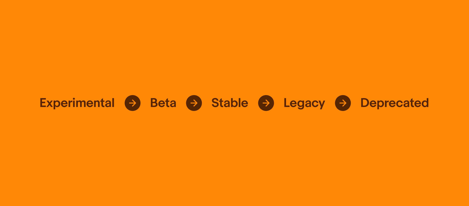
    Experimental

    Experimental components or features are still in their early stages and are not yet ready for widespread use. Experimental features are released to gather feedback on new ideas or concepts, and they may not be fully functional or stable.

    Beta

    Components or features in beta are nearing completion and are being released to a limited group of users for testing and feedback. Beta features are released to identify and fix any remaining bugs or usability issues before being officially released to the general public.

    Stable

    Stable components are fully functional and available for use in most, or all, circumstances.

    Legacy

    Legacy components are stable but discouraged due to availability of a newer or better alternative.

    Deprecated

    Deprecated components are marked for removal in next major version and should no longer be used.
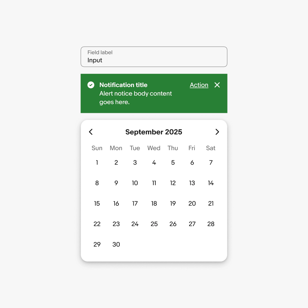
    Three components stacked visually. The top is text input, middle is alert notice, and bottom is date picker.
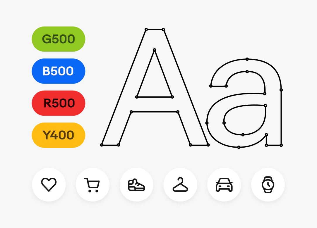
    Four color chips labeled G500, B500, R500, and Y400. Large graphic letters Aa are next to them, followed by 6 icon buttons with different icons placed in a row below them.
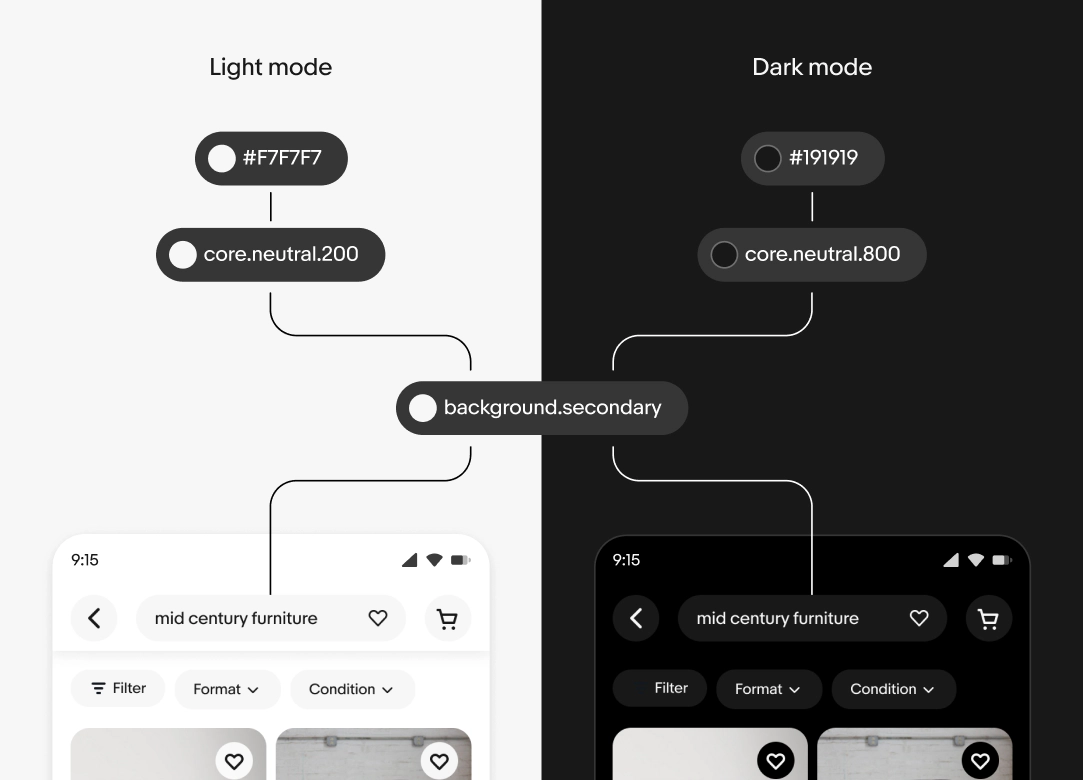
    The background.secondary token points to core.neutral.200 in light mode and core.neutral.800 in dark mode. These core tokens point to #F7F7F7 and #191919, respectively.
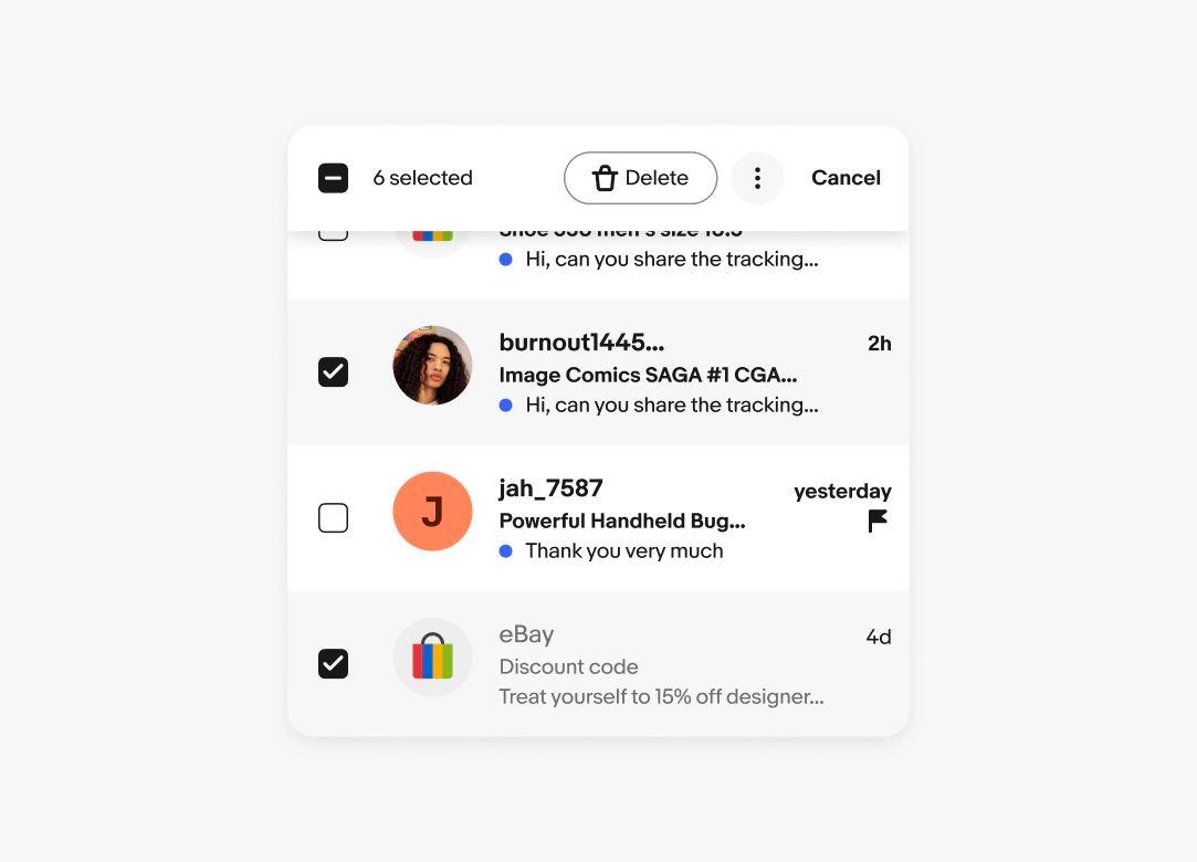
    A mobile view of a bulk edit pattern. The bulk edit controls are on the top above selected messages.
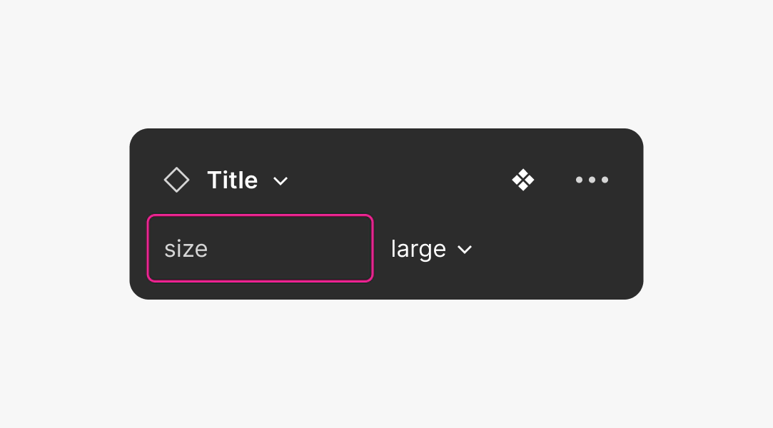
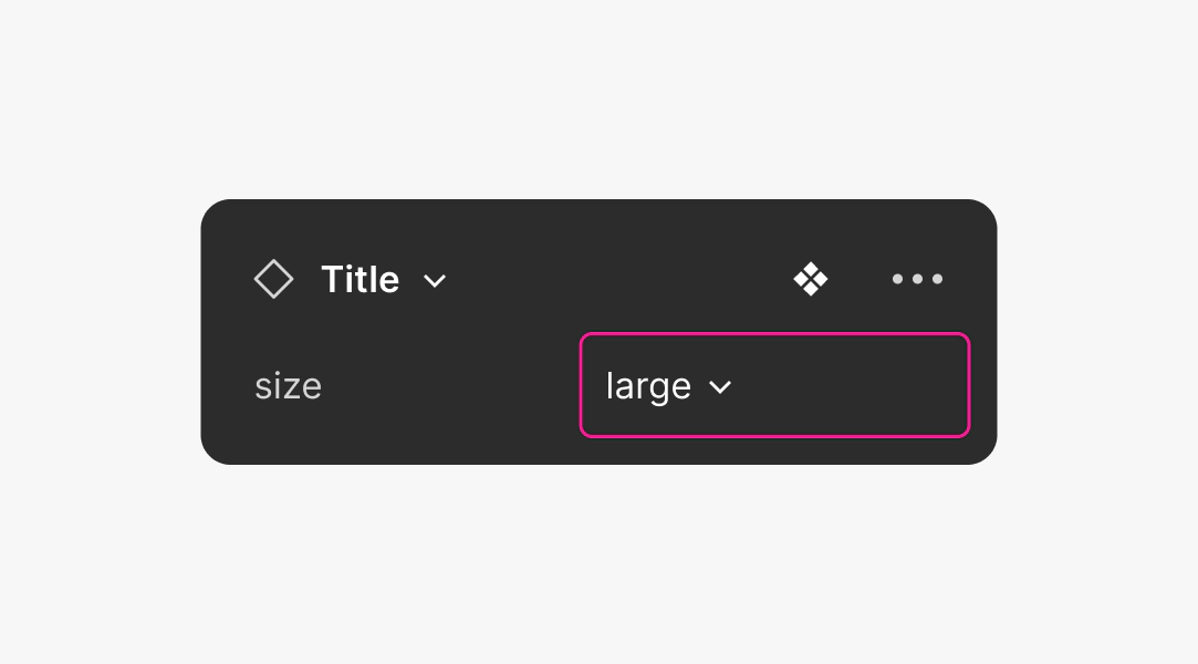
    A figma UI graphic with a pink box around the “size” property. “Large” with a dropdown is on the right.
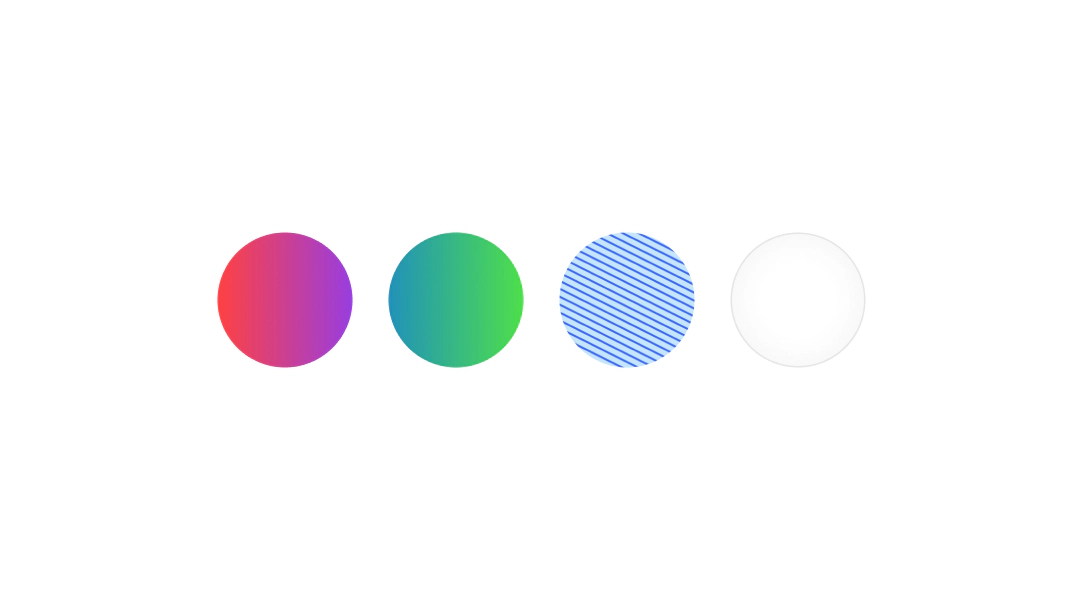
    Four color swatches in a row including gradients, patterns, and scrims.
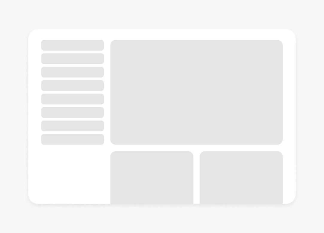
    A wireframe of a UI page design.
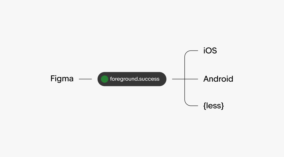
    A visual hierarchy graphic. From left to right Figma points to a pill shape with the token “foreground.success” in it. The pill points and branches out to 3 items. From top to bottom is IOS, Android, and {less}.
    A figma UI graphic with a pink box around the “large” value with a dropdown. The “Size” property is labeled on the left.
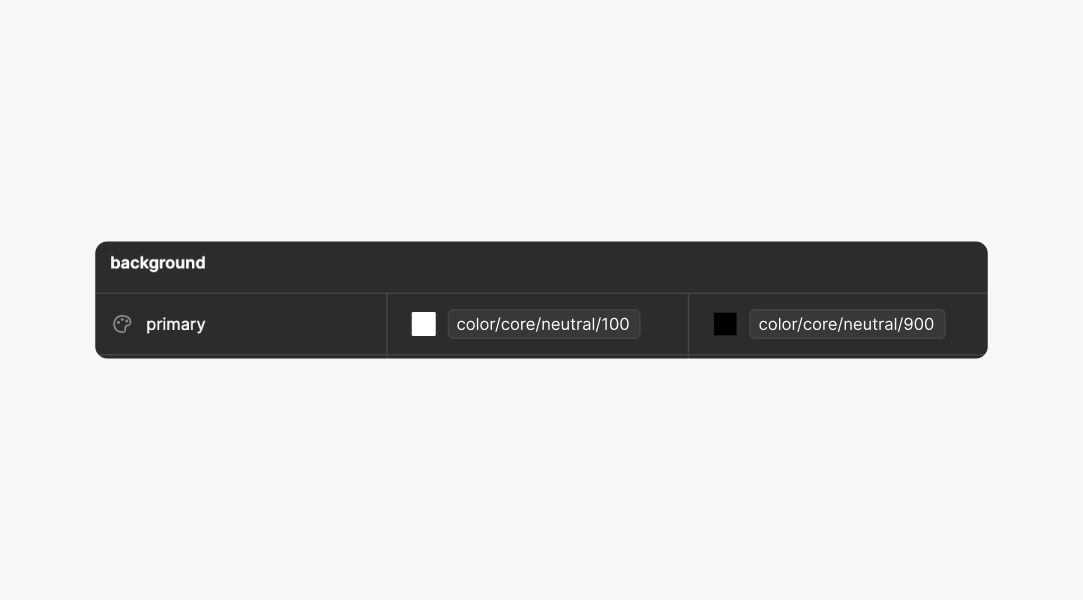
    A figma UI graphic highlighting the variable “primary”. Light mode is labeled color/core/neutral/1. Dark mode is labeled color/core/neutral/9.
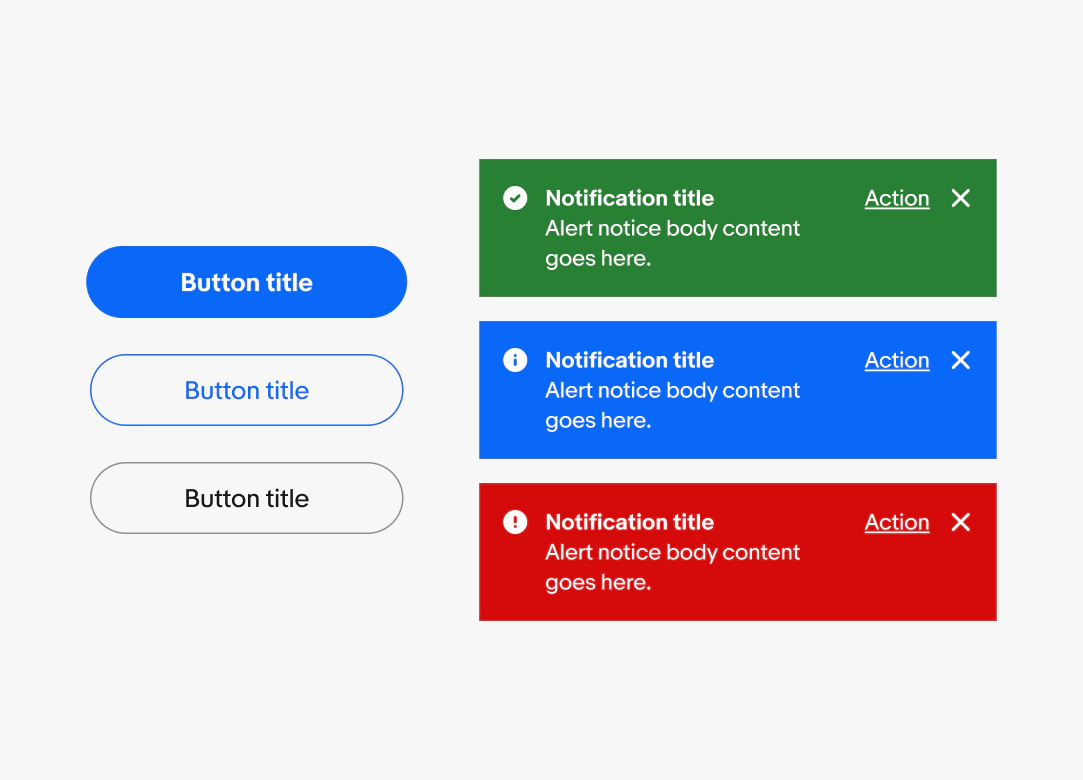
    Two columns of components with variants. The left column are button variants, while the right column are alert notice variants.
    A lifecycle graphic with experimental > beta > stable > legacy > deprecated.

    Video description: A 5-second video shows a collection grid of different micro interactions. The top left tile reads “Hang tight.” and then “Almost done.” while a dashed line in ebay colors animates below. To the right is a tile with 5 icons: home, profile, search, notification, and selling. A blue indicator hovers over each icon and the icons have a popping wiggle motion. The bottom left tile shows the filled AI icon centered that swipes to the left and gets smaller, while a chat bubble appears with a typing indicator and a message. To the right of that is a bright green illustrated tile with a handbag and watch in a box. There is a white button reading “Luxury”. The illustration has a pop motion and a black outline appears around it. The button turns black and in white reads a checkmark and “Luxury”. The last tile is a shopping cart icon in a white circle on a pink background. The icon has a popping motion and a small red circle with “1” appears on its upper right. The popping motion happens as the red circle changes from “1” to “2” to “3”.