Filtering
Filtering allows users to narrow down a set of results by applying criteria that refines the current view.

Clear
Make it obvious what criteria are available, what is currently selected, and how selections affect the results. Applied filters should be visible or easy to review, especially when filter controls are hidden in a menu, sheet, drawer, or overflow area.
Simple
Use the simplest filtering UI that supports the user's task, from quick single-value filters to advanced filtering with multiple categories, values, and ranges.
Contextual
Filters should help users refine their current view. Avoid using filters for navigation, input, or switching between unrelated views.
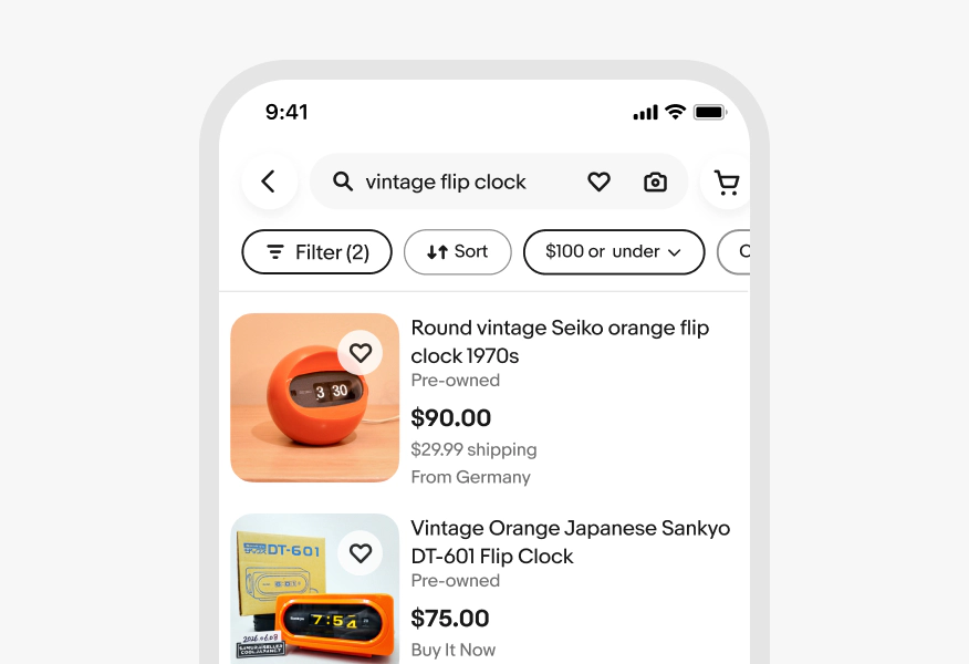
Quick filter
Allows users to apply commonly used filters directly without opening the full filter experience. Use them for high-priority refinements that help users narrow results quickly, such as buying format, shipping, or condition.
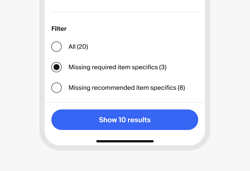
Single-select filter
Allows users to choose one option from a set. Use them when selecting more than one option would not make sense, such as a condition, status, or range. Provide a clear default state, such as Any, or a way to clear the selection so users can return easily to the unfiltered view.
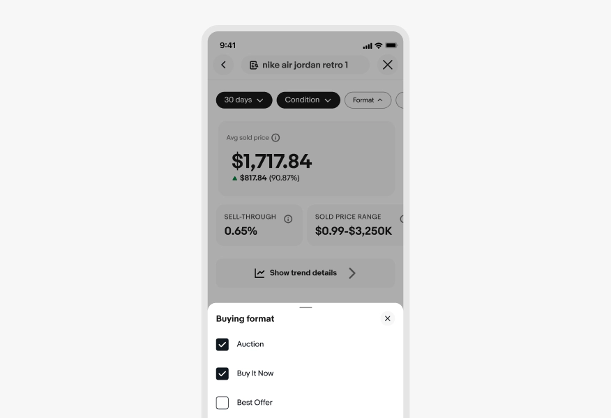
Multi-select filter
Allows users to choose one or more options from a filter group. The filtered data will show items that match any of the selected values.
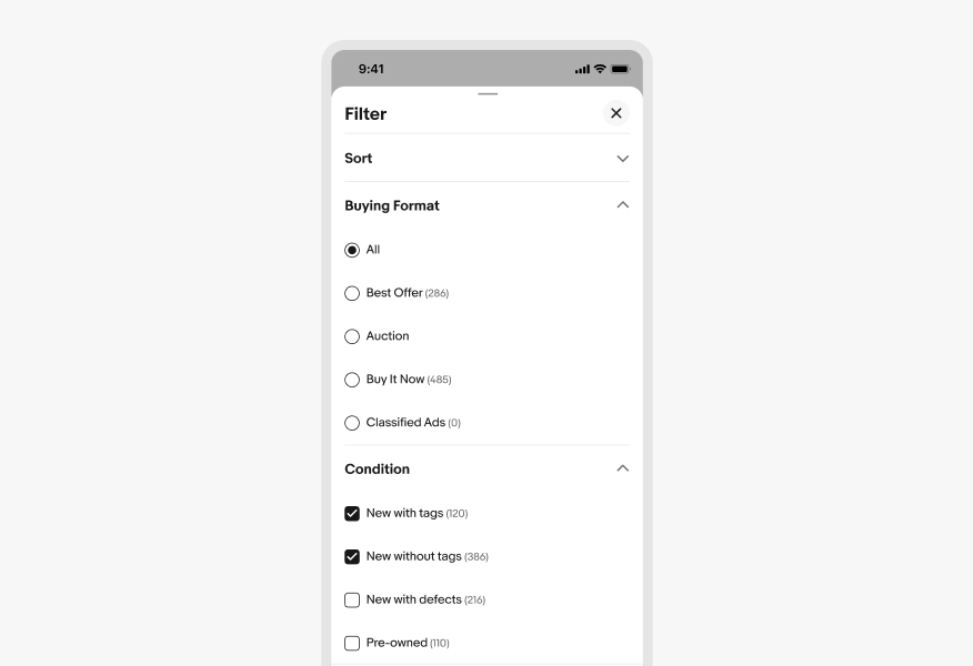
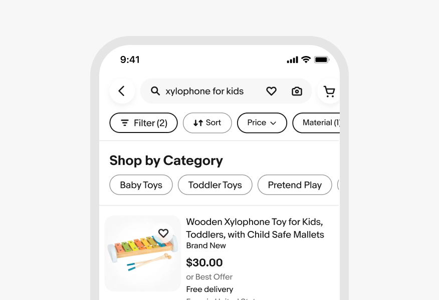
Multi-category select filter
Allows for filtering across separate filter groups, like “Price”, “Style”, and “Size”. All selections across categories are applied together to the data.
Multi-category selection is presented in a modal panel, filter rail, or filter bar.
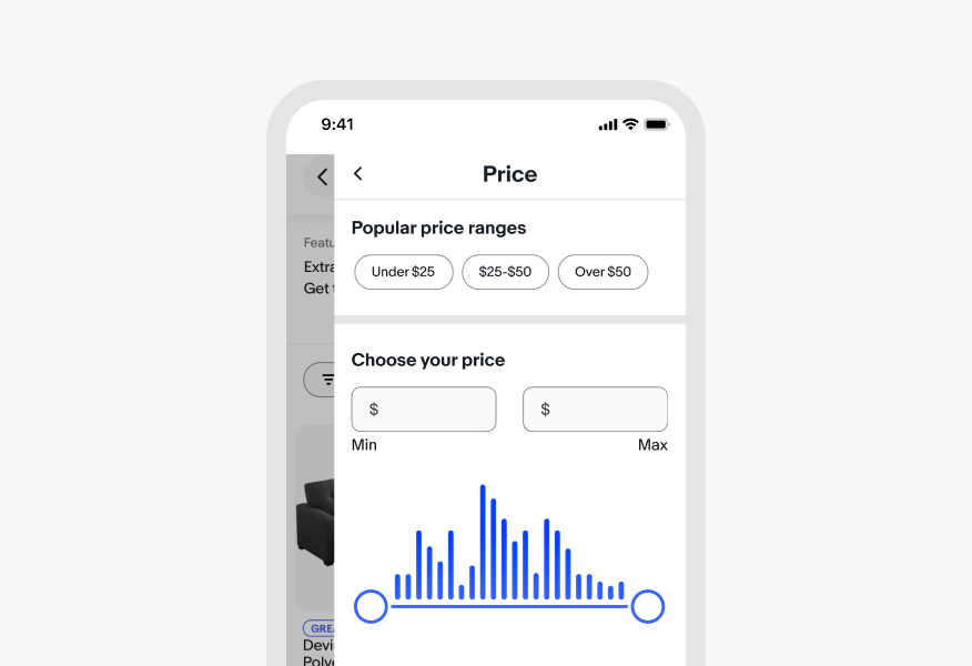
Range filter
Allows users to filter by numeric attributes, such as price, distance, or date. Used to narrow results by setting or entering a minimum value, a maximum value, or both.
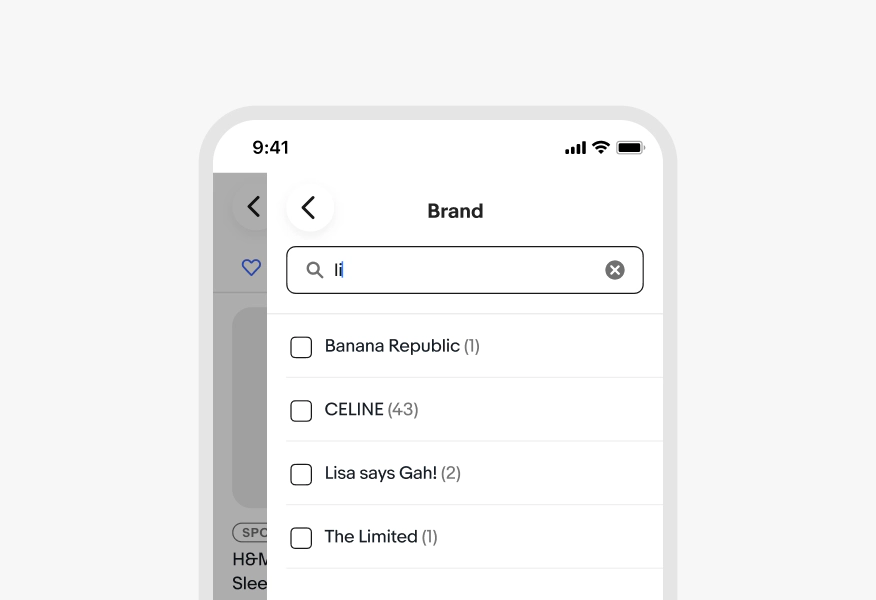
Text filter
Allows user to search within a large list of filter values to find and select a specific option. Use them when a filter group contains many values, such as brand, model, or seller, and keep the search scoped to that filter group.
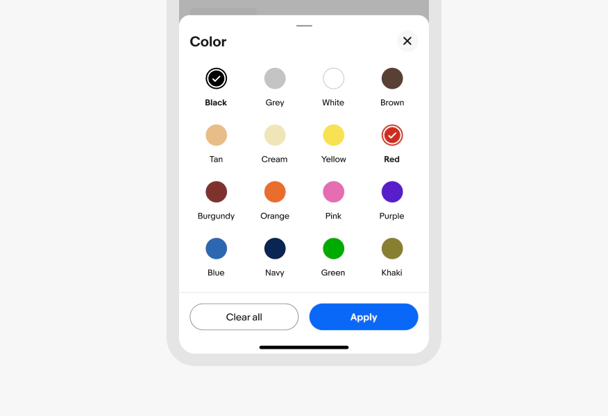
Visual filter
Allow users to select a visual representation of the filter being applied when it would be quicker than using a text attribute. Use visual filters sparingly as they may not always be the quickest or clearest to read.
Choosing filters
When choosing a filter type, consider:
- Can users select one value or many?
- Is the value numeric, categorical, date-based, visual, or require user text input?
- How many options are there? A few or dozens?
- Is this a common refinement?
- Should results update immediately or after the user confirms?
- What surface or context will the filter appear in?
| Filter types | Best for | Evo components | Related components |
|---|---|---|---|
Quick filter | High-value, commonly used refinements | ||
Single-select filter | Mutually exclusive values, where only one can be applied at a time | ||
Multi-select filter | Broad exploratory searches within large sets of results | ||
Multi-category select filter | Narrowing down large sets of data by combining search criteria | ||
Range filter | Numeric attributes such as price, distance, year, dimensions, rating, etc. | ||
Text filter | Finding specific search criteria within a large list | ||
Visual filter | Attributes that users can identify faster by sight | - |
Filter order
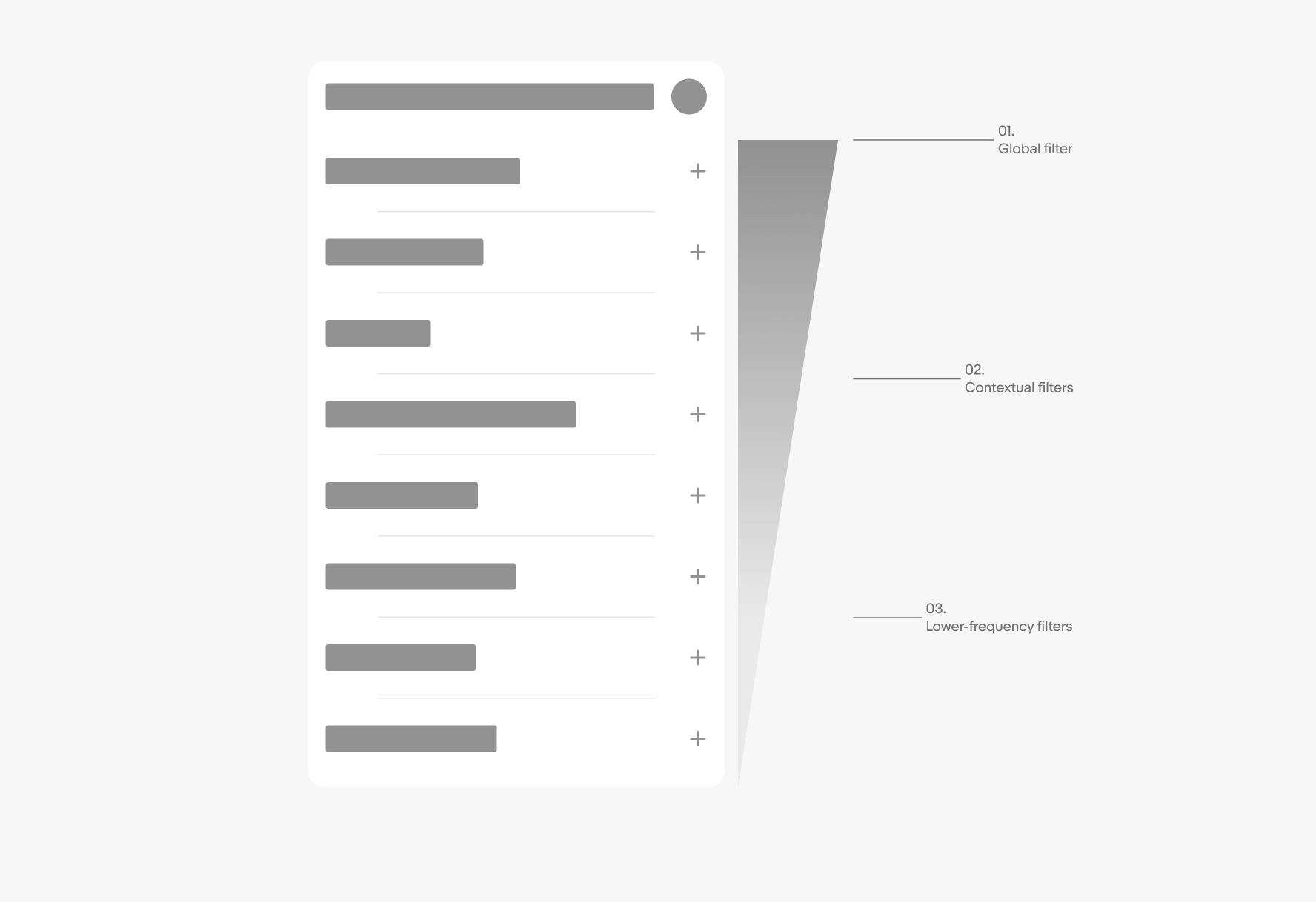
When there's a list of filters, they are organized from most important to least important:
- Global filters: Prioritize filters and sort options that affect the entire set (e.g., condition, format, sort by)
- Contextual filters: Secondary filters that are relevant to the user's current task or domain (e.g., Category, Seller type, or Buying format)
- Lower-frequency filters: Less common or advanced options (e.g. Zip code, return type)
Filter labels
Use concise, scannable labels. Filter group labels should usually be nouns or noun phrases. Filter value labels should be short, user-facing values and may include established marketplace terms. Action labels should use clear verbs.
Within each filter group, order labels on the type of values:
- Use a logical order for ordinal, numeric, or semantic sets
- Use popularity, relevance, or personalization for large exploratory lists with a strong demand signal
- Use alphabetical order, ideally with a search function, for long flat text lists with no other strong signal
When aligning on the label copy:
- Use sentence case
- No ending punctuation
- Use short noun or noun phrases, adjectives, or marketplace terms
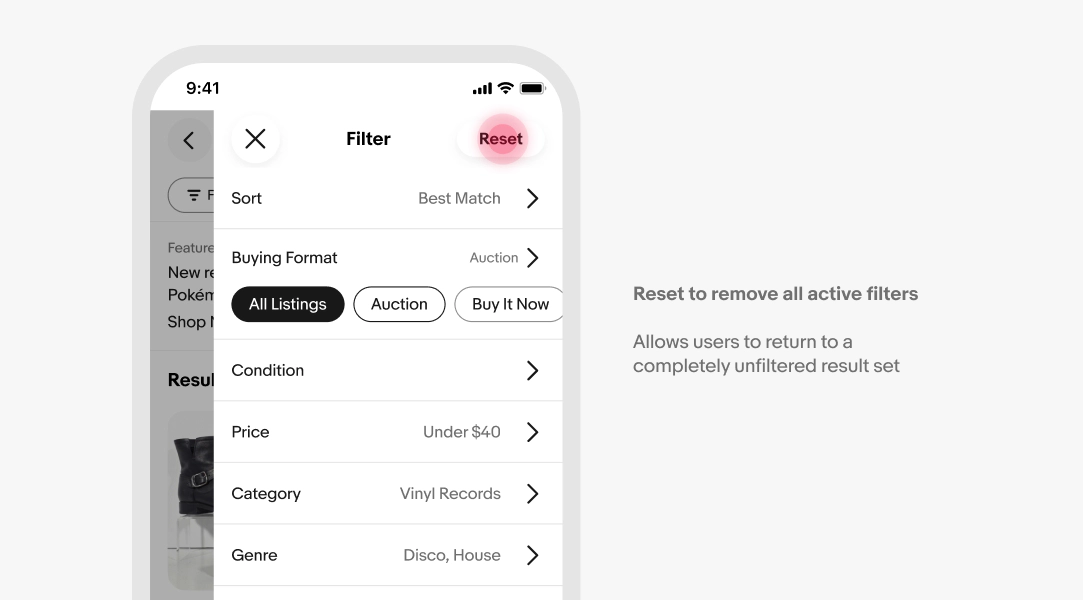
Resetting filters
Ensure that users have access to clear or reset actions so that they can remove multiple filter selections or return a filter back to its default state. Avoid clear or reset actions when a single selected filter can be removed directly.
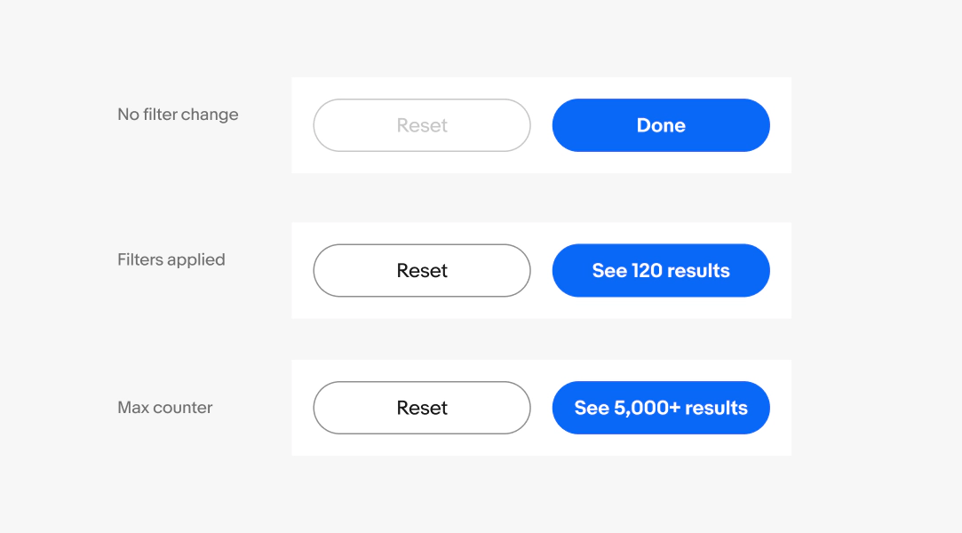
Result count
When filtering within a panel, the primary call to action (CTA) updates with a count in numerals to show the total number of results. See formatting numerals and counter guidance for Filter chips.
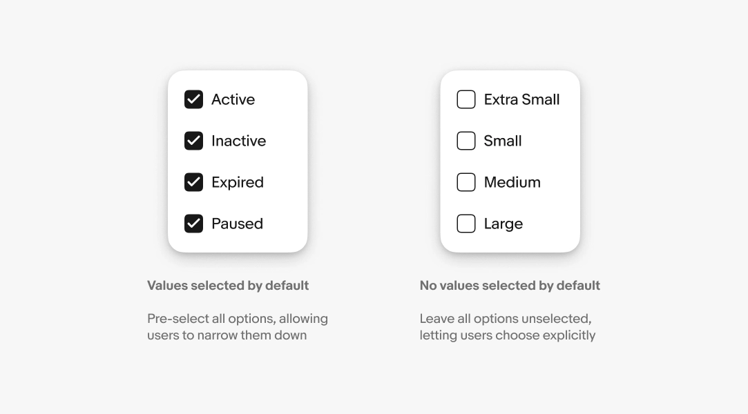
Default selections
A multi-select filter group can start with either all filter values selected or no values selected, depending on how the filter is used.
Use no values selected by default when users are expected to select their own values to narrow results.
Use all values selected by default when the filter acts as an inclusion list, excluding the unchecked values from the results list.
Immediate apply vs explicit apply
Results can update as the user selects (Immediate apply) or only after they submit their choices (explicit apply).
Use immediate apply when results can update instantly after the user makes a selection. This works best for simple filters with known values, especially when the data is already loaded or can update without a noticeable delay.
- Filter chips: Use for common, high-priority filters that users can quickly turn on or off, such as Free shipping, Buy It Now, New, or Ending soon.
- Menu or dropdown filters: Use when users are choosing from a defined set of values, such as Condition, Status, Category, Seller type, or Delivery options.
- Checkboxes in a menu: Use when users can select multiple known values and see the result set update as each option is selected, such as filtering orders by Paid, Shipped, or Delivered.
- Single-selection menu: Use when only one option can be active at a time, such as Buying Format: All listings, Auction, Buy it now, or Accepts offers.
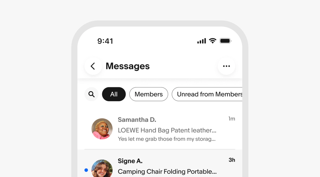
Use explicit apply when users need to submit criteria before results update, such as applying filters in a panel or popover.
- Input field: Use when users enter a keyword, item number, order number, buyer username, or SKU and the system needs to fetch matching results.
- Range fields: Use when users enter a minimum and maximum value, then apply the filter after both values are complete.
- Location or distance fields: Use when users enter a ZIP code, city, or radius and the result set needs to be recalculated.
- Advanced filter panel or sheet: Use when users need to make several selections before updating the result set, especially on mobile or in data-heavy tools.
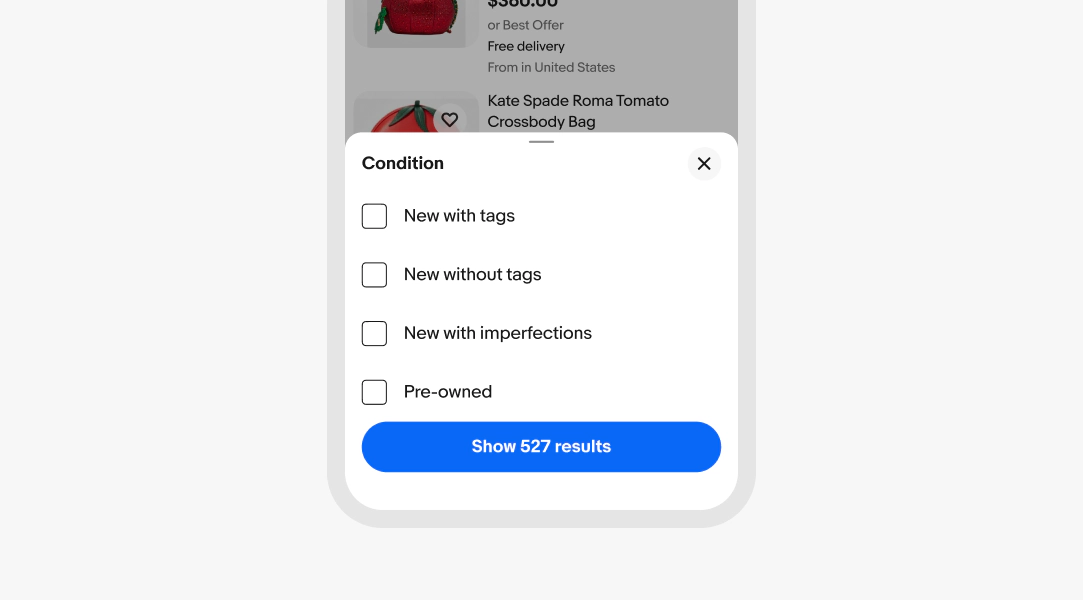
An empty state occurs when results exist in the data set but none match the current filter criteria. Keep filter controls visible and always offer a way to move forward, such as a "Reset" button, a prompt to broaden the selection, or a "Save search" option for inventory-scarce categories.
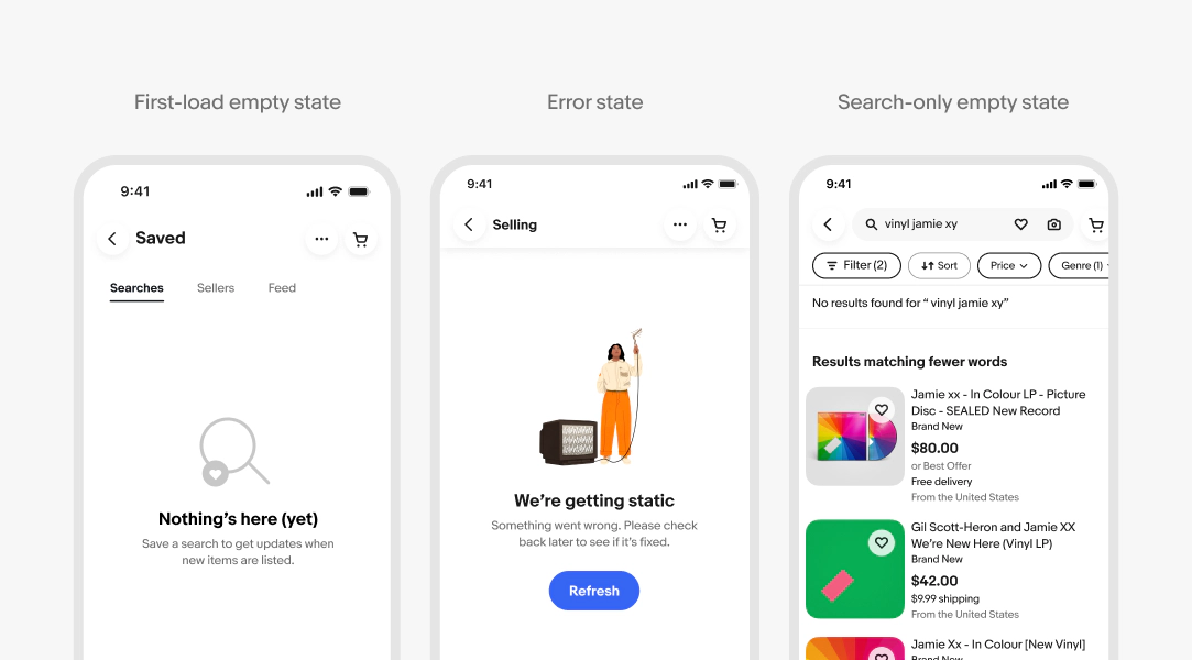
Note that not all empty-looking states are filter-induced. First-load empty states (e.g. a user with no saved searches or purchase history), error states (e.g. a server error or network timeout), and search-only queries with no filter involvement each have distinct causes and require different recovery paths.
For further guidance see empty states.
Overview
Filtering accessibility requirements vary significantly depending on which components are used in the pattern. Always refer to the accessibility guidance for each individual component (i.e. filter chips, toggles, checkboxes, etc.) in addition to the guidance on this page.
Communicating filter controls to assistive technology
Control type and role: Each filter control must accurately convey what kind of control it is. All filter controls must also have a visible, descriptive name — the text label that identifies what the control does. How this is implemented varies by component; refer to each component's accessibility guidance.
State and value:
- Filter chips with an active selection should announce the selected value and the category (e.g. Condition: New with tags)
- When a filter control opens a popover or dialog, its open/closed state must be communicated to screen readers — without it, a blind user has no way of knowing the panel is currently open or closed
- Applied filter states must be surfaced to screen readers
Consistent terminology
Use identical labels for the filter criteria across all surfaces. If an option is called “Best Offer” in a filter sheet, it should also be called that if the same filter group appears in a quick filter.
Reordering
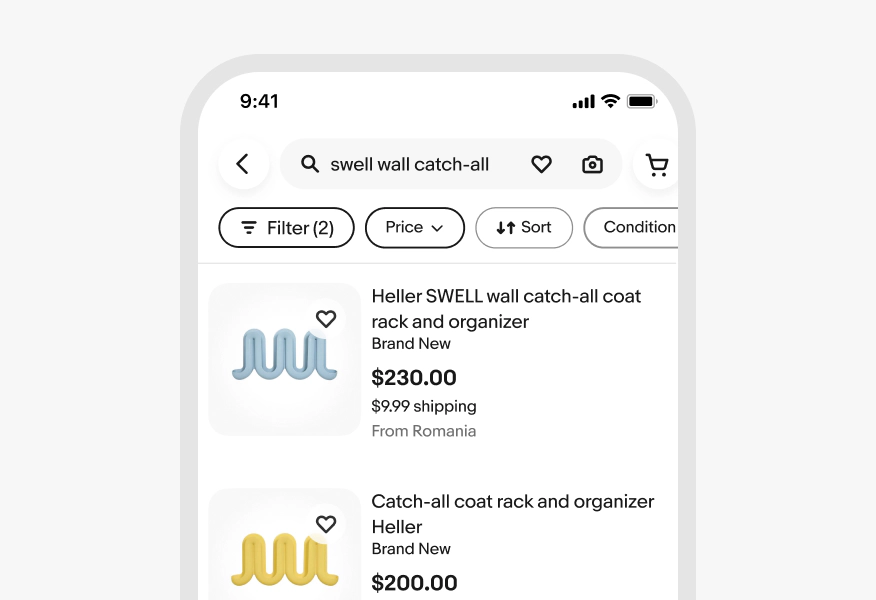
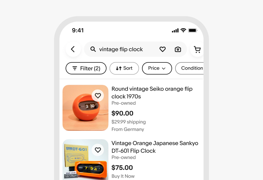
Do keep filters in their original position when selected. For more details see Filter chip guidance.
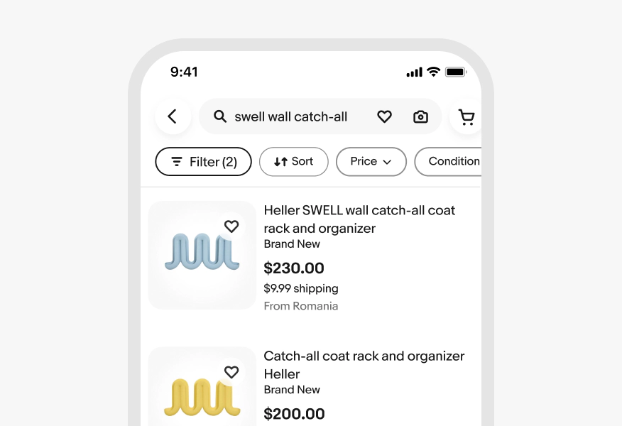
Don’t change position of filters when they are selected.
Persistent labels
Do keep filter chip labels persistent when a filter criteria is selected.
Don’t change the label of a chip after a value has been selected.