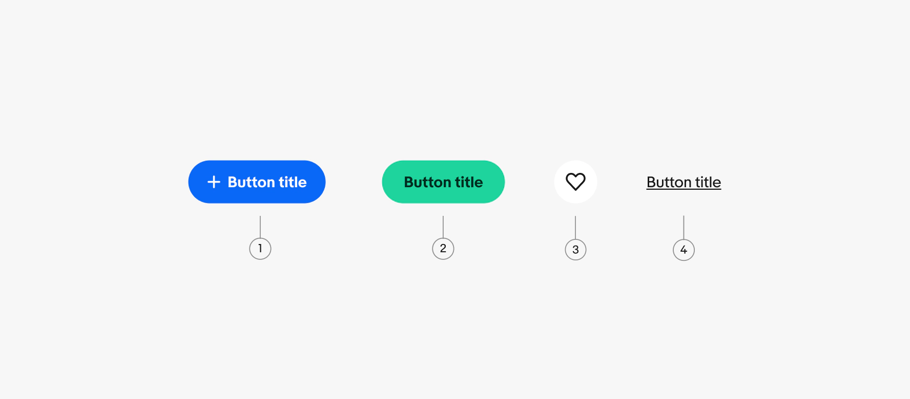
Button
Buttons help direct and capture user action and intent.
Buttons help direct and capture user action and intent.
A button that triggers the primary action in a flow. Use when there is one clear, high-priority action to complete. Learn more about using CTA buttons.
A button that triggers an action using only an icon. Best for familiar, universal actions where the meaning is clear without a label. Learn more about using Icon buttons.
A button that triggers actions that keep users on the current page, like expanding content or clearing a form. Learn more about using Link buttons. Don’t confuse link buttons for standard text links. Buttons take action, links navigate. Learn more about Text links.
Use a single primary button for the most important action on the page.
Use a vertical button stack when the space is narrow and the buttons have titles.
An overflow icon button can be placed inline next to a CTA button when there are two or more related, but low-priority actions.
Use a horizontal stack when there is enough room. This is common in dialogs and cards. The highest emphasis button is aligned to the trailing edge of the container in a horizontal stack.