Combobox
The combobox combines a text field with a popover menu, allowing users to filter and choose an option from a list or enter their own value.
- CSS
- Marko
- React

Speed
Comboboxes provide the benefits of a menu with the speed of a text field.
Convenience
Comboboxes improve decision-making and entry speed by allowing for quick typing and matching.
Flexibility
Comboboxes empower users by allowing them to type or select an item, and enter a value of their own if one doesn’t exist.
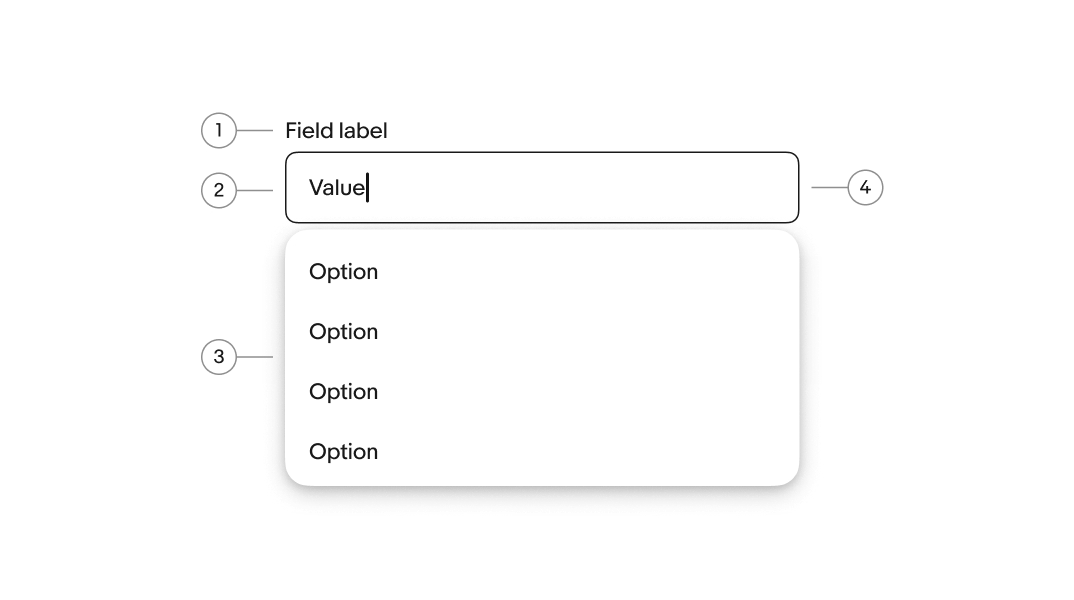
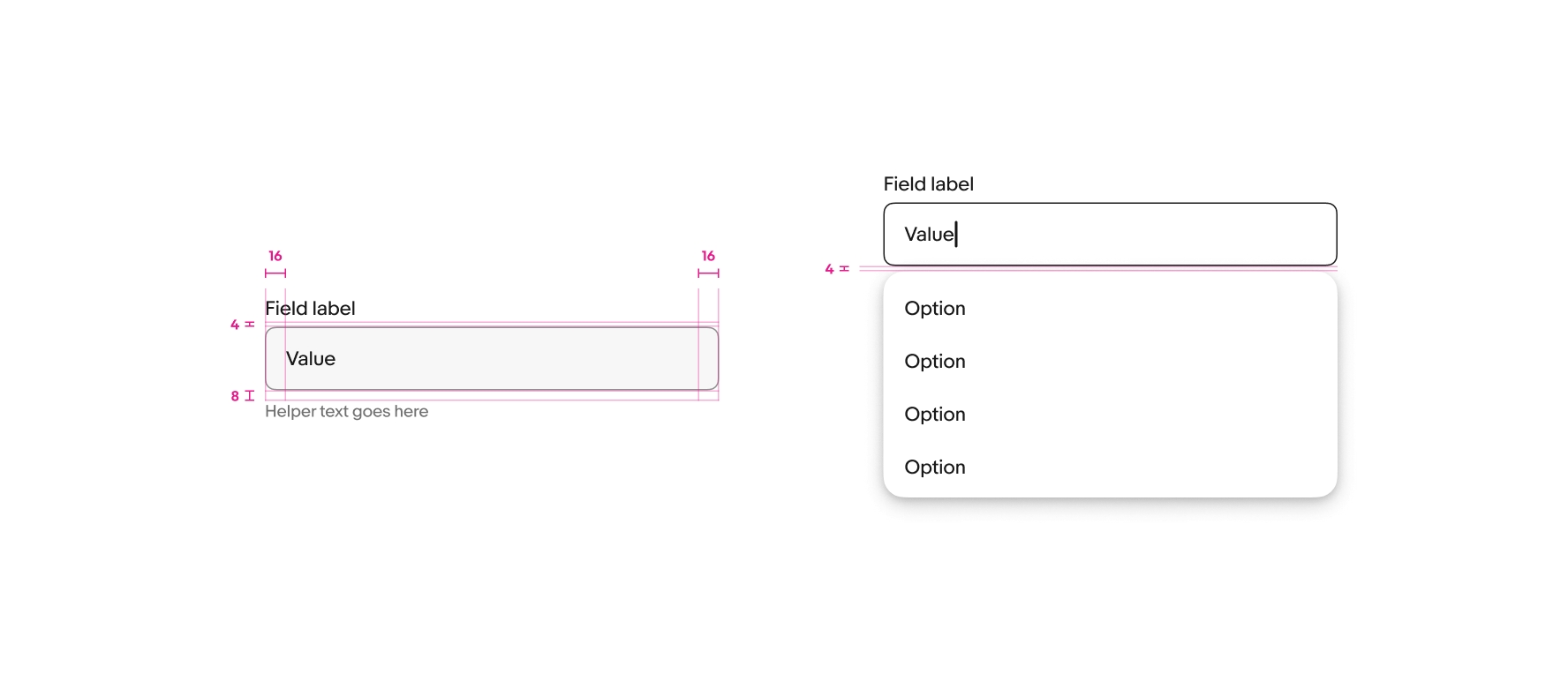
- Label
- Value
- Menu
- Field container
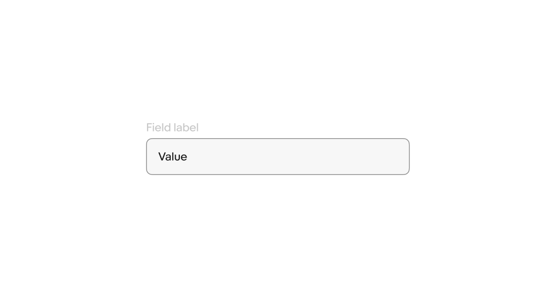
Label
The label identifies what the field collects. Use a noun or noun phrase specific enough that users know exactly what to enter.
- Use sentence case
- No ending punctuation
- Keep to 1–3 words
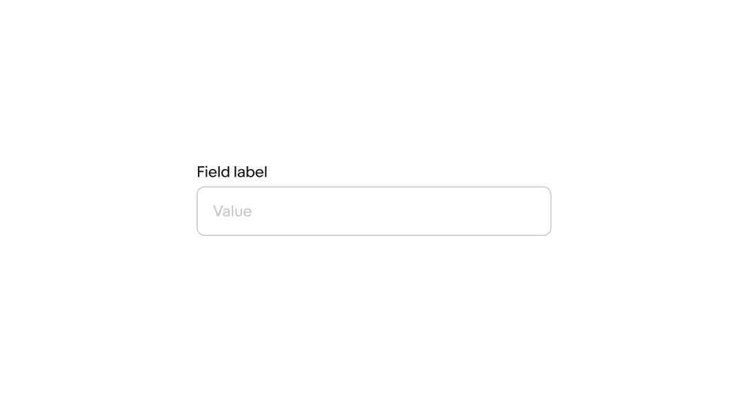
Value
A value can be optional or required depending on the context.
A default value can be automatically populated, or the field can remain empty until a character is entered. Default values should not be used instead of field labels to give context.
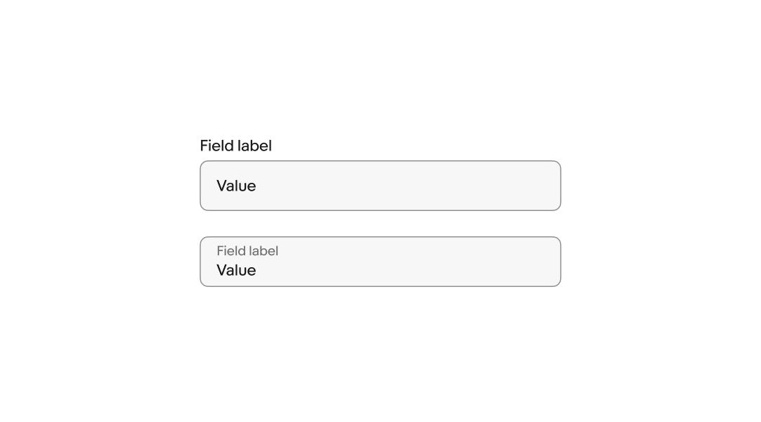
Layout
The field label can be stacked above the field or float within the field. Whichever is chosen, a single style should be used within a single form.
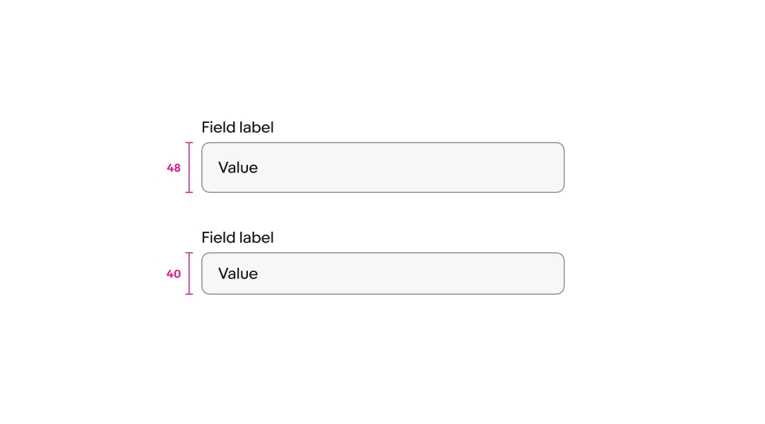
Size
Comboboxes are available in a small and large size. Large is the default and preferred size on compact screens.
Popover menu
The popover menu progressively reveals available values. Open it on focus for more complex content, or as users type when the content is familiar.
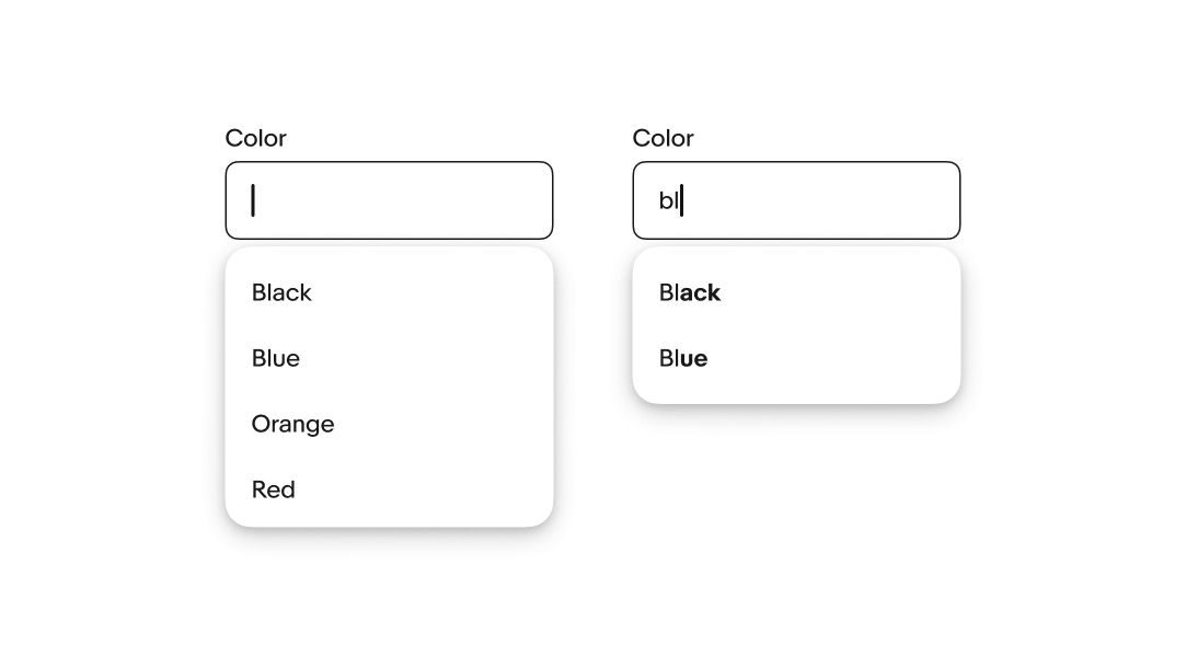
Autocomplete
Autocomplete can be enabled to fill in a value without needing to type out all of the characters. The autocomplete value is selected when users leave the field.
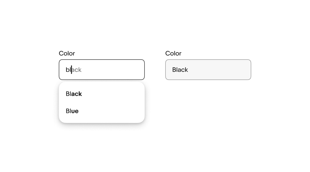
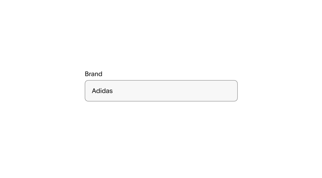
Single-select
Comboboxes that take a single value collapse the menu, set the value, and show the value as a single text element.
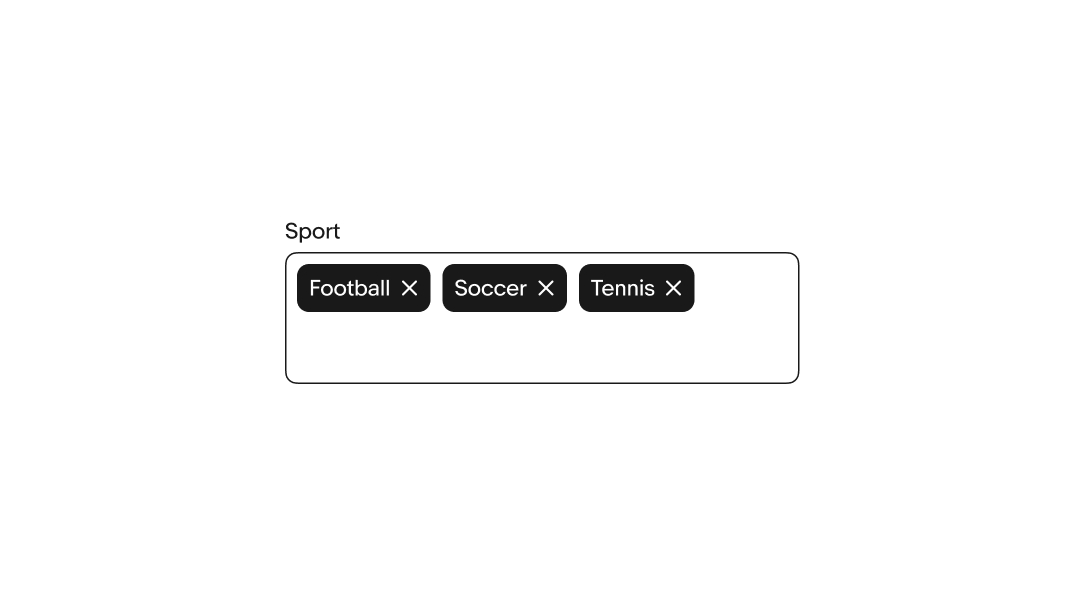
Multi-select
Comboboxes can accept multiple values in a single field. Each value converts to an input chip when selected from the menu list.
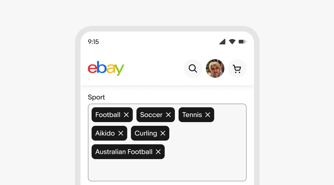
Height
When using input chips, the height of the combobox can adjust to wrap values to a new line.
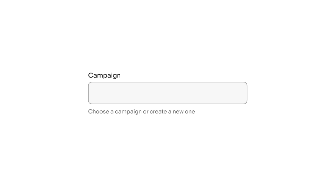
Helper text
Optional. Use it when the label alone doesn't provide enough context to clarify format, constraints, or how the input will be used. Do not restate the label.
Helper text can appear persistently (always visible) or on focus (visible only while the field is active). Write for whichever mode the design specifies.
- Use sentence case
- No ending punctuation, unless using more than one sentence
- Keep to 1–2 sentences
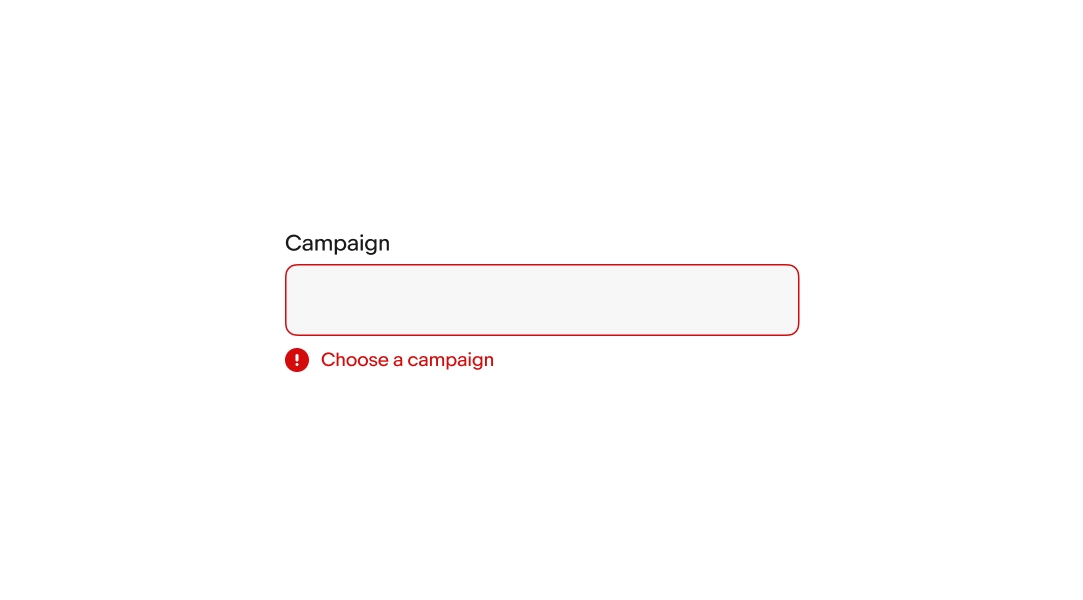
Error messages
When a field fails validation, the helper text produces an error message to help the user successfully fulfill the input requirements. The error message replaces any existing helper text when present.
Keep the tone neutral, don’t blame or scare the user. State the required remediation clearly and concisely.
- Use sentence case
- Don’t use ending punctuations
- Avoid technical language or filler words like “please”, “sorry”, or “oops”.
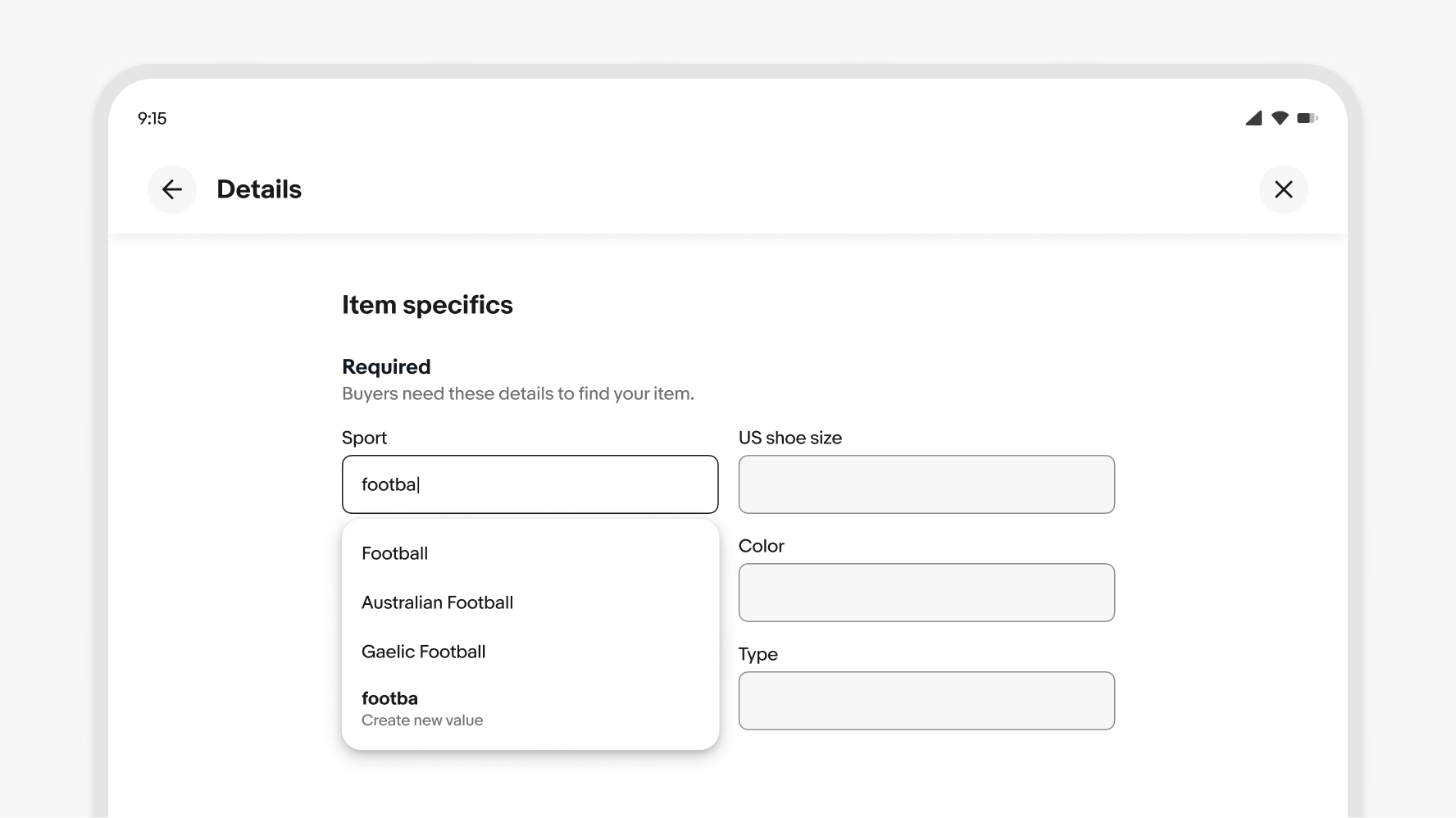
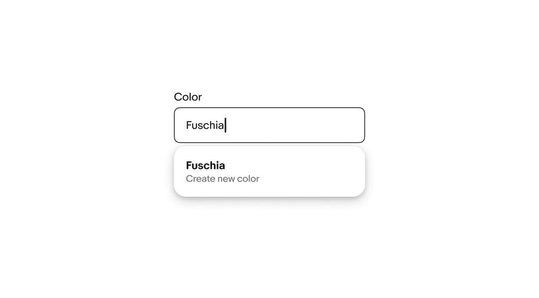
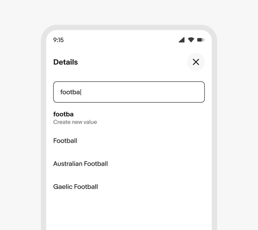
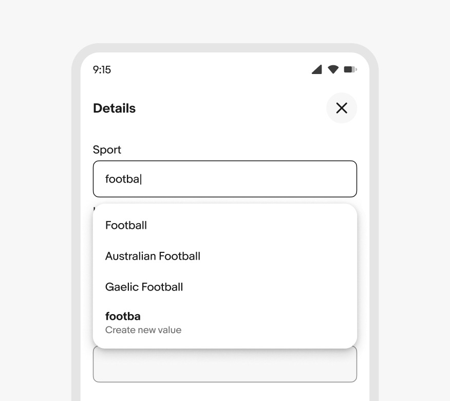
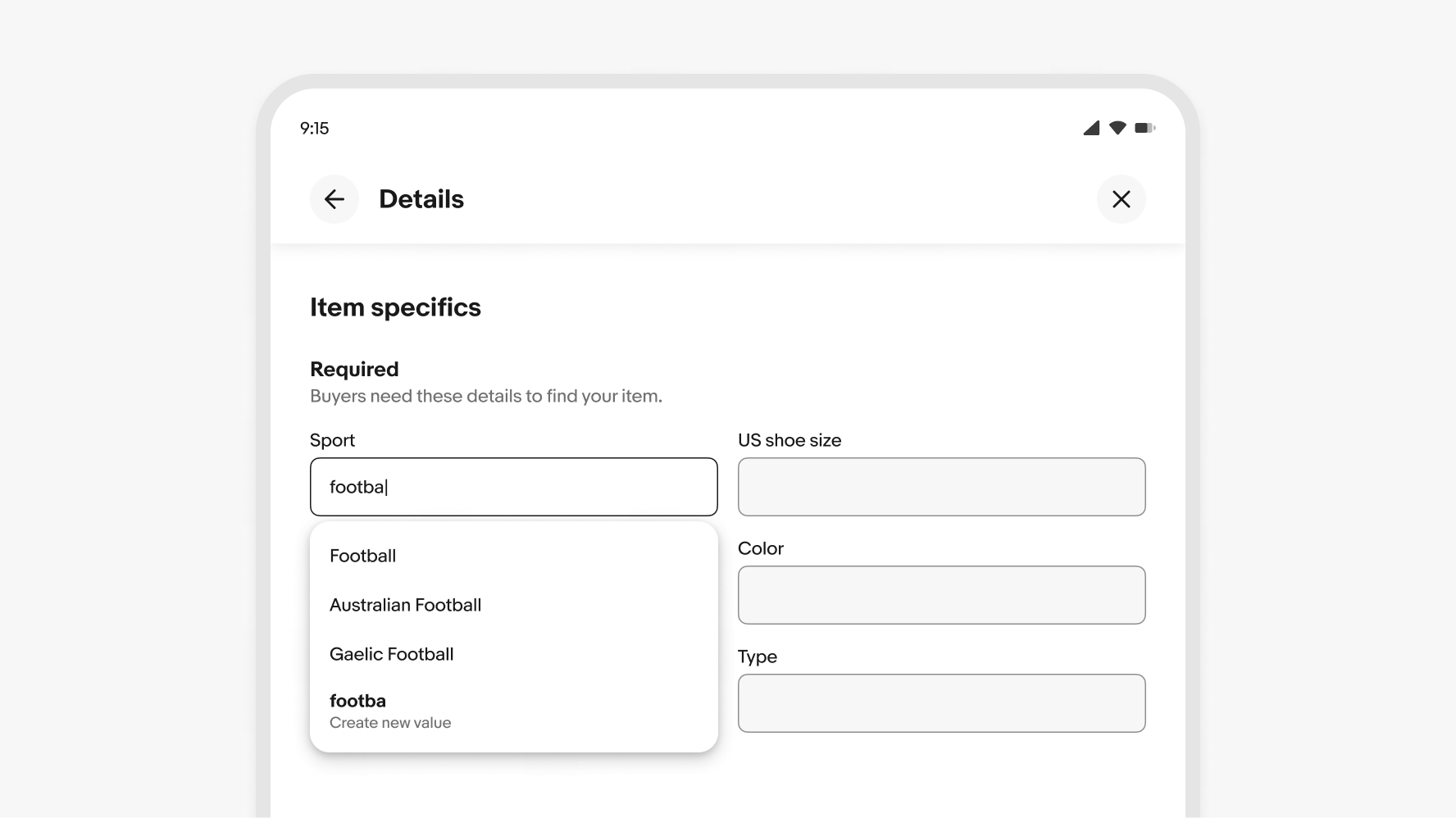
Creating values
Comboboxes allow users to create new values. A “create new” option appears in the menu if there are 3 or fewer options matching an entry. The new value is added to the list when submitted.
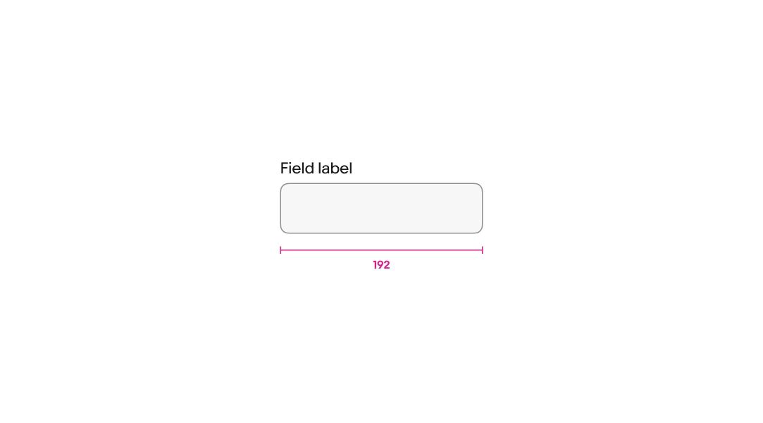
Min width
Comboboxes have a minimum width of 192px.
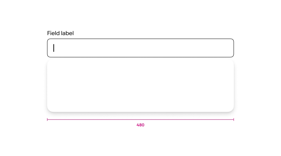
Max width
Comboboxes have a max width of 480px.
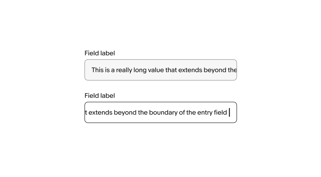
Horizontal overflow
For fields that don’t grow and wrap their content, the content overflows to keep the cursor visible as characters are entered. The field returns to the start of the input value when the field loses focus. Focusing on the field again returns to the end of the entry.
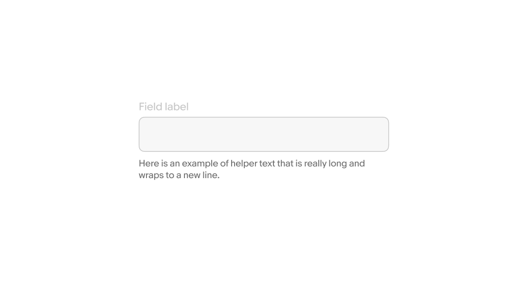
Helper text overflow
Helper text spans the width of the field and wraps to a new line when extending beyond the field’s width.
Small
Comboboxes present differently according to platform on small screens.
Native
Comboboxes on small screen native apps disclose values in a fullscreen modal when the field is active.
Web
Small screens on web disclose values in a popover menu when the field is active.
Medium
Comboboxes use a popover menu on medium screens.
Large
Comboboxes use a popover menu on large screens.