Text area
v4.0
Text areas allow for input that extends across multiple lines.
- CSS
- Marko
- React

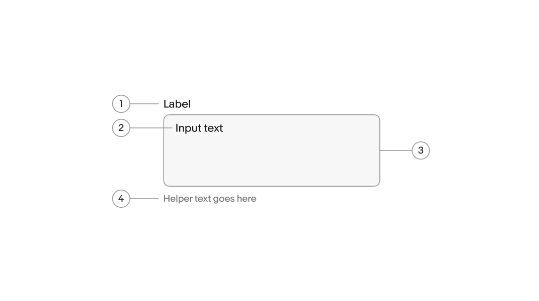
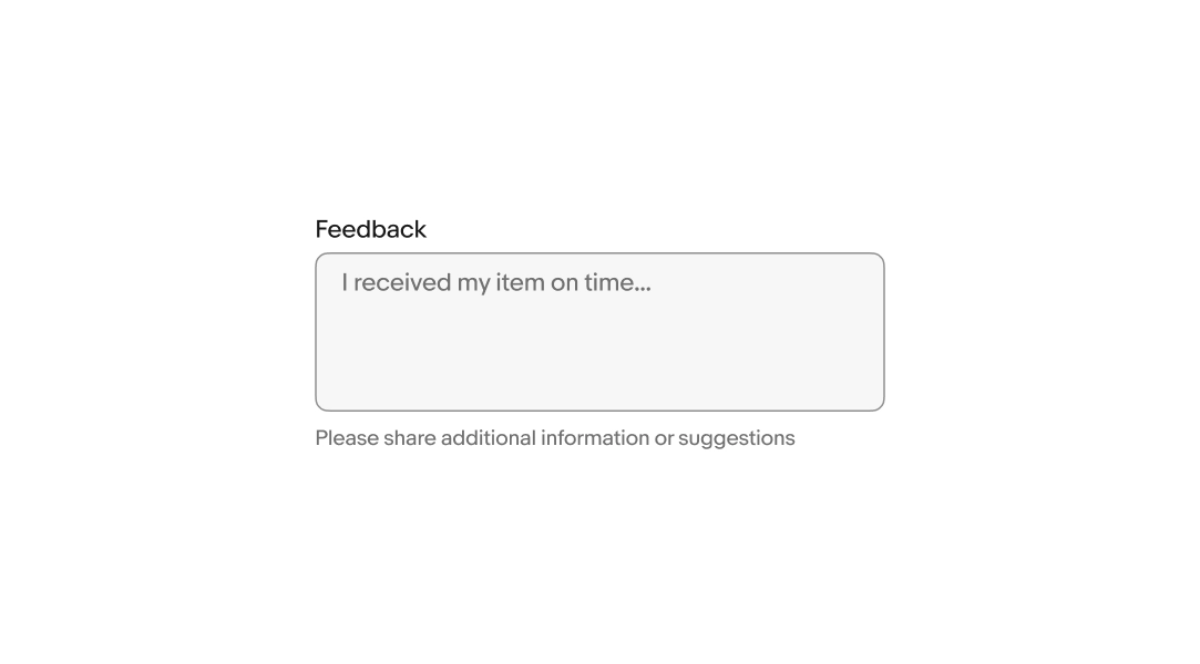
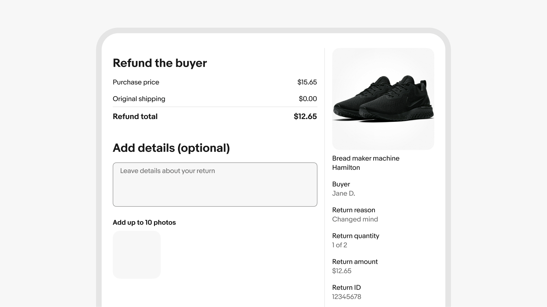
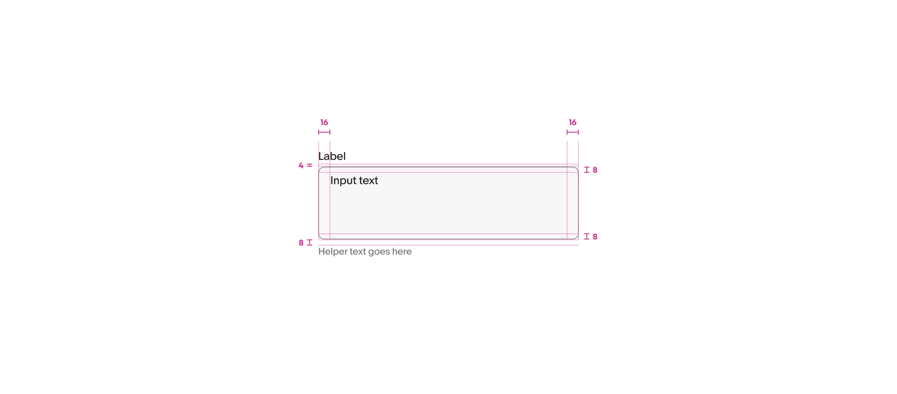
Include a label unless another adjacent element already serves that purpose. The label names what the user enters in the field.
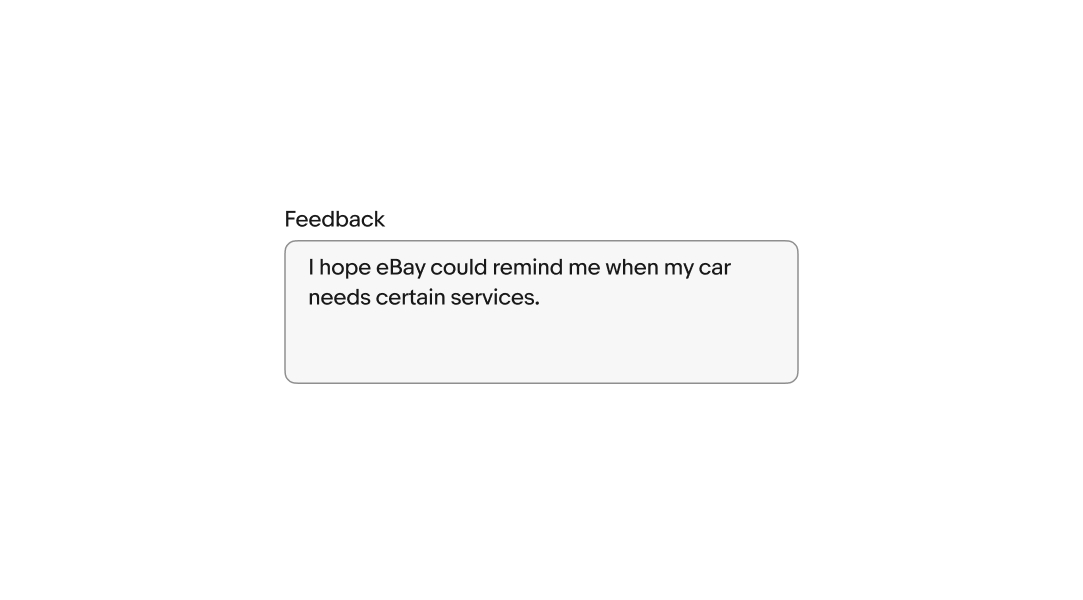
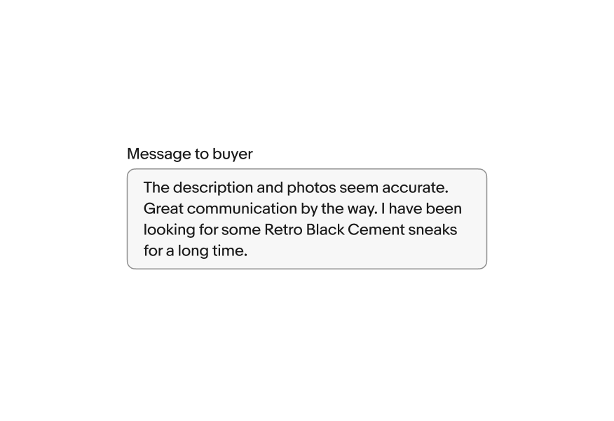
The value is the text the user enters and submits with the form. User input replaces any placeholder text after the first character is entered.
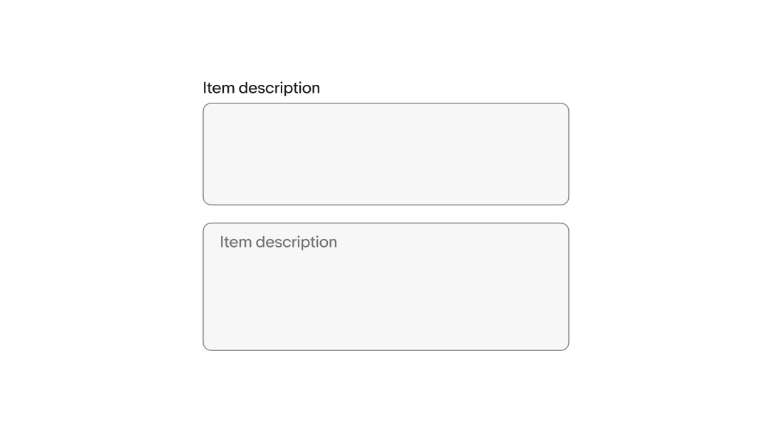
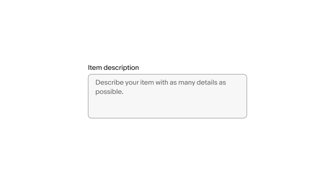
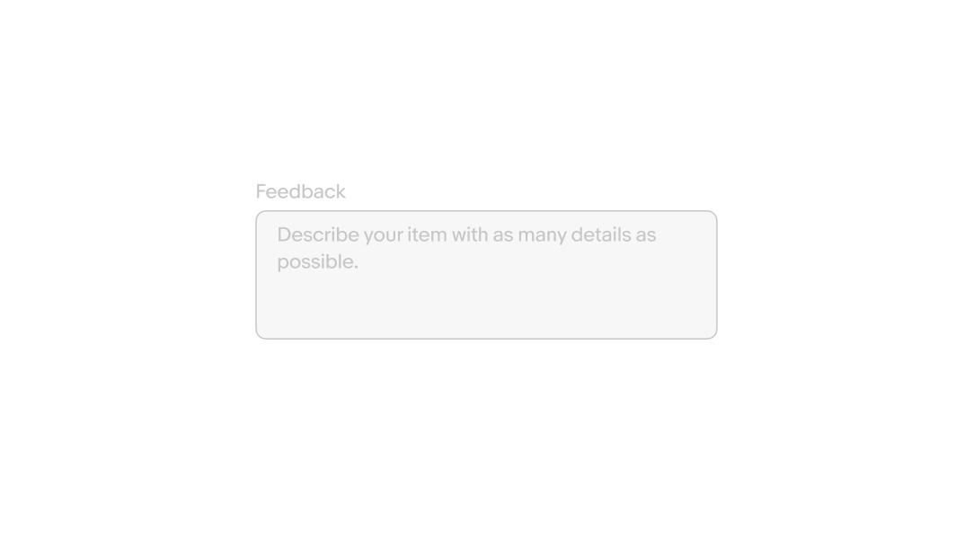
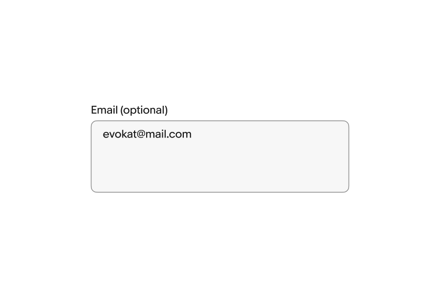
Placeholder text, or “ghost text,” gives users a hint about the expected input format. Use realistic examples of what a user might enter, not descriptions of the field.
Placeholder disappears when the user starts typing, so don’t use it for instructions or required information.
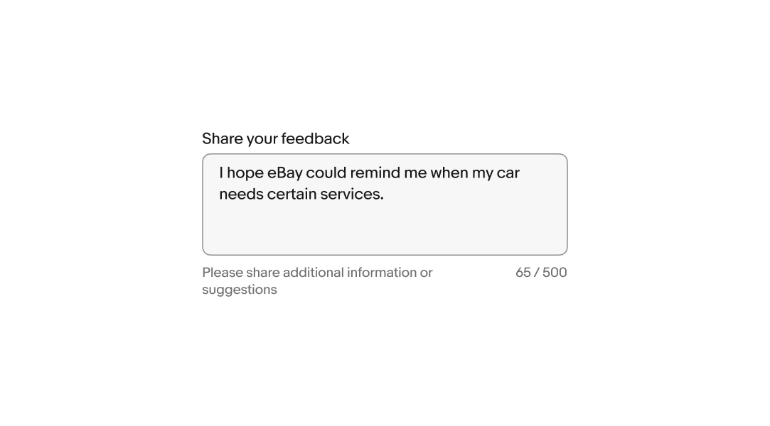
Helper text is placed below the field and informs the user of any requirements or disclaimers. It's shown persistently or on focus. Don't repeat the label.
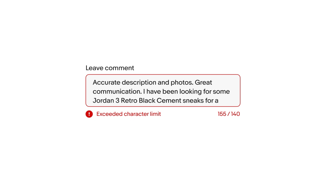
A character counter appears when a character limit is set. It updates in real time as the user types.
Format as xx / n (with spaces for clarity).
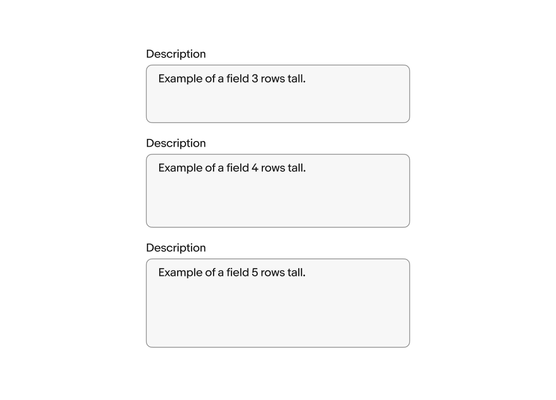
The default number of rows can be customized to increase or decrease the height of the field. The default is 4 rows.
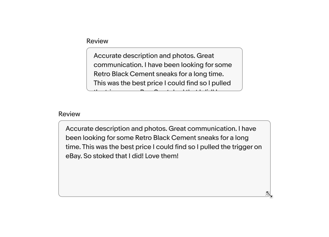
Web browsers add a resize indicator to the bottom right of text area fields by default. Dragging the corner adjusts the field’s width and height. Resizing can be disabled if the behavior isn’t desirable.
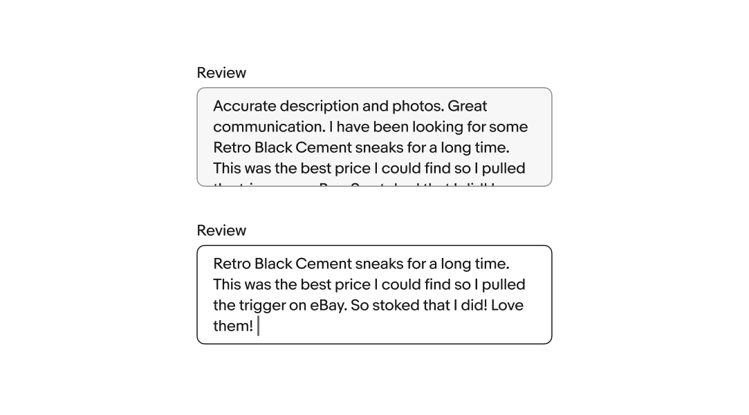
Text area fields overflow top and bottom. While focused, the content will shift to keep the cursor in view as the user enters characters. When the field loses focus, the content will scroll to the beginning. Focusing on the field again returns the user to the end of the content.
Error messages appear below the field when the input doesn't meet the required format or conditions. The error message replaces any existing helper text.
Keep the tone neutral, don’t blame or scare the user. Clearly inform users the requirements so they know how to fix it.
Users cannot focus on or change disabled fields. Their availability depends on certain requirements. No value will be submitted from disabled fields.
Text area fields expand the full width of the screen up to the page margins on small screens.
Text area fields expand up to their full width on larger screens. Web devices will have the browser’s native text area resize indicator in the bottom right corner.
Do use text area fields when longer values and sentences are encouraged.
Don’t use text area fields when the expected value is short. Use a simple text field instead.