Icon button
v3.1
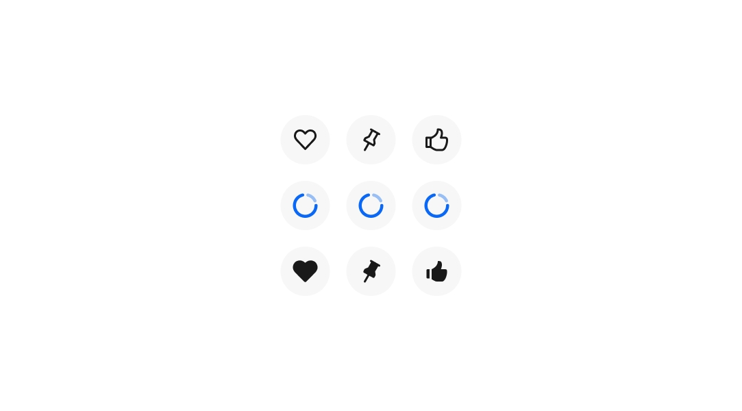
Icon buttons trigger an action using only an icon, with no visible text label.
- CSS
- Marko
- React
Recognizable
Icons used within icon buttons should be easily recognizable. Avoid ambiguous icons that could mean different things in the same context.
Distinct
Each icon button on a page should be distinct. Avoid using duplicate icon buttons for the same function on a single page, except for common actions like save or overflow.
Compact
Icon buttons are helpful in dense layouts like tables and dashboards. Their smaller footprint allows for more visible actions before collapsing into overflow buttons.