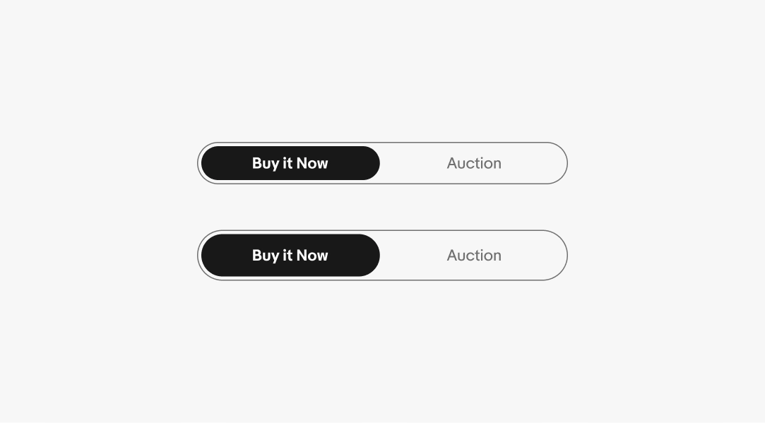
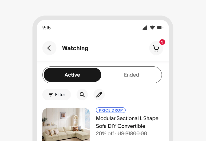
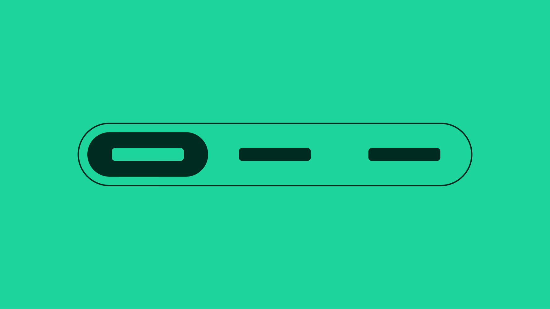
Segmented button

v1.0

Segmented buttons provide closely related choices that affect an object, state, or view.

  • Skin
  • Marko
  • React
Stylized artwork of a segmented button.

Considerations

Concise

Segmented buttons help reduce cognitive load and keep things simple.

Control

Segmented buttons give quick control to swap choices, states, or views.

Focus

Segmented buttons give more affordance to available controls and actions.

Anatomy

When to use

Segmented buttons provide a compact way to display multiple mutually exclusive options. They can also be used to switch or sort views such as switching between a list view and a grid view.

Segmented buttons affect section-level views and should not be considered a replacement for navigational tabs.

A flowchart determining when to use segmented buttons.

The chart starts with ‘Can you select more than one option?’, with ‘Yes’ and a ‘No’ options. The ‘Yes’ path takes you to another question: ‘Are the options short & concise?’, with a ‘Yes’ and a ‘No’ option. If you choose ‘Yes’, the final answer is ‘Use checkbox / selection cell’, and if you choose ‘No’ the final answer is ‘Use quick filters’.

If you choose ‘No’ for the first question presented (‘Can you select more than one option?), you are taken to another question: ‘Does the selection change content panels?’. This question has ‘No’ and ‘Yes’  options. Selecting ‘Yes’ will present you with a final option: ‘Use tabs’. Selecting ‘No’ will then take you to another question: ‘How many options can you select from?’. This question has three options: ‘1’, ‘2 to 4’, and 4+’. 

Selecting ‘1’ will take you to another question: ‘Do you need to confirm selection?’. This question has ‘No’ and ‘Yes’  options. Selecting ‘No’ will present you with a final option: ‘Use toggle’, and selecting ‘Yes’ will present you with a final option: ‘Use checkbox’. 

Selecting ‘4+’ will present you with a final option: ‘Use dropdown / radio / selection cell’.

Selecting ‘2 to 4’ will take you to another question: ‘Are the options short and concise?’. This question has ‘No’ and ‘Yes’ options. selecting ‘No’ will present you with a final option: ‘Use radio button’. Selecting ‘Yes’ will present you with a final option: ‘Use segmented buttons’.

The path from the first question to the final answer of ‘Use segmented buttons’ is highlighted in blue and emphasized as the best use case of using segmented buttons.

Properties

Segmented buttons can have two to four segments and may contain a text label, an icon, or both and come in two visual styles.

Behavior

Behavior

Screen sizes

Best practices

Specs

A large segmented button is shown with specs highlighted. The segmented button border is 1px, and the color is border.medium. The height of the button is 48px. The padding around the active button fill is 4px. The padding inside of the active button fill is 12px, and the height is 40px. The padding between the icon and label text is 8px.

Large segmented button

A small segmented button is shown with specs highlighted. The segmented button border is 1px, and the color is border.medium. The height of the button is 40px. The padding around the active button fill is 4px. The padding inside of the active button fill is 8px, and the height is 32px. The padding between the icon and label text is 8px.

Small segmented button