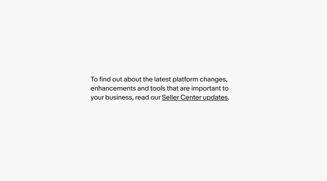
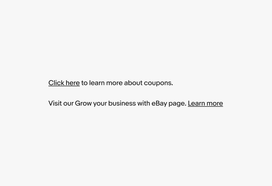
Text link

v2.1

Text links take users to a new location within the product, to external content, or to an anchor point. Selecting a text link always results in a URL change or new browser tab.
Considerations

Clear

The link text makes it clear where it will take the user.

Identifiable

Links are familiar and easily identifiable amongst other content.

Concise

Link text is short. Aim for fewer than 5 words.

Usage guidelines

When to use

  • Navigating within the app
  • Navigating externally
  • Navigating to an element on a page (anchor link)
  • Email addresses and phone numbers

When not to use

  • Actions that manipulate data or how it's displayed
  • Actions that change state
  • Navigating to legal or policy documents

When do I use a text link versus link button?

Both use an underline as visual affordance, but they behave differently and serve different purposes.

Choose based on what happens when selected

It takes them somewhere new — a new page, external site, anchor point, or browser tab → use a text link
It performs an action on the current page — expands content, triggers a change, submits something → use a link button

Why it matters

  • Browsers and assistive technologies treat them differently: text links can be opened in a new tab, bookmarked, or copied as a URL. Link buttons can't. Using the wrong one creates unexpected behavior for keyboard and screen reader users.
  • Quick check: Does selecting it change the URL? Yes → text link. No → link button.

Anatomy

Text

Link text names the destination or content, not the act of selecting it. Avoid generic phrases like “click here” or “learn more” on their own. For readability, position links at the end of sentences.

  • Use sentence case, except for branded terms
  • No ending punctuation
  • Fewer than 5 words
A sentence with a link highlighted with underlines.

Behavior

Inline

Inline links appear within paragraphs and sentences. They always have an underline to differentiate between non-link content.

A sentence with two links highlighted with underlines.

Color

Links should generally match the color of the content around it. Standalone links can use a secondary color within a list to avoid overwhelming the UI or a primary color for more emphasis.

Exception: Legal links must use the specific legal link color.

Two text blocks in black and gray. Each has a text link that matches the color of the surrounding text.

Size

Text links inherit their size and styling from the content around them.

Three different text blocks in different sizes. The text links in each are the same size and color as the surrounding text.

State

Text links use state layers for interaction states. The available states are enabled, hover, focused, visited, and disabled. Learn more about the state layer color values in Color tokens.

The different states lined up for text links. From left to right are enabled, hover, focused, visited, and disabled.

Background

Links placed on backgrounds using our expanded color palette should use the coordinating foreground color to match. This ensures we meet WCAG’s 4.5:1 ratio standard for AA contrast. See Accessibility foundations for more info.

A marketing banner with a text link under the call to action. The text link matches the blue color theme.

Platforms

Native

Keep in mind that on native devices, it's common for an entire line of text to be tappable when it contains a link. This is particularly important if multiple links are close together, as it could lead to accidental taps.

A mobile screen with a block of text with three lines. The last line has a text link and a pink shape overlapping the full width of the text line to indicate the line itself is tappable.

Best practices