Skip to main contenteBay Playbook
  • Get started
  • Foundations
  • Design system
  • Expressions
  • Resources
  • Articles

Foundations

  • Overview
    • Our logo
    • Using our logo
    • Using our tagline
    • Showcase
    • Our colors
    • Using color
    • Using color in product
    • Using color in marketing
    • Using color in illustration
    • Best practices
    • Showcase
    • Our typeface
    • Using type
    • Using type in digital
    • Using type in print
    • Best practices
    • Showcase
    • Our photos
    • Visual tone
    • Image types
    • Showcase
    • Our icons
    • Using icons
    • Confirmation indicators
    • Icon library
    • Best practices
    • Showcase
    • Our illustrations
    • Visual tone
    • Using illustration
    • Sizing and placement
    • Best practices
    • Showcase
    • Our motion
      • Using motion in product
      • Volume of motion
      • Product transitions
      • Expressive animation
      • Using motion in marketing
      • Layout in motion
      • Typography in motion
      • Depth in motion
    • Overview
    • Include plugin
      • Overview
      • Responsive layout
      • Image ratio
      • Uniform
      • Masonry
      • Mosaic
      • Overview
      • Stacks
    • Interaction levels
    • Interaction states
    • Using object styles in product
    • Using object styles in marketing

Accessibility overview

We all differ in our abilities to interact with our world and consume information. At eBay, we believe in design that includes as many people as possible by default.

Universal access icon with examples of accessibility tools overlaid on top of it: a label reading out "Watchlist" to assistive technology, a color picker tool verifying that the icon's dark purple has a passing contrast ratio of 5.47:1 with its light purple background
Accessibility overview

On this page

  • Overview
  • An accessible foundation
  • Platform differences
  • Resources
NextInclude plugin
Things.People.Love.
  • Get started
  • Foundations
  • Design system
  • Expressions
  • Resources
  • Articles
  • About eBay Design
  • Careers
  • Press
  • Privacy policy
© 2026 eBay. All rights reserved.

eBay Evo, the eBay trademark, and the eBay logo are the intellectual property of eBay Inc.

    Overview

    eBay is committed to building a community enabled by people and supported by technology that’s open to the broadest audience possible. We’re committed to ensuring digital accessibility for people with disabilities, and making eBay available and usable for all people.

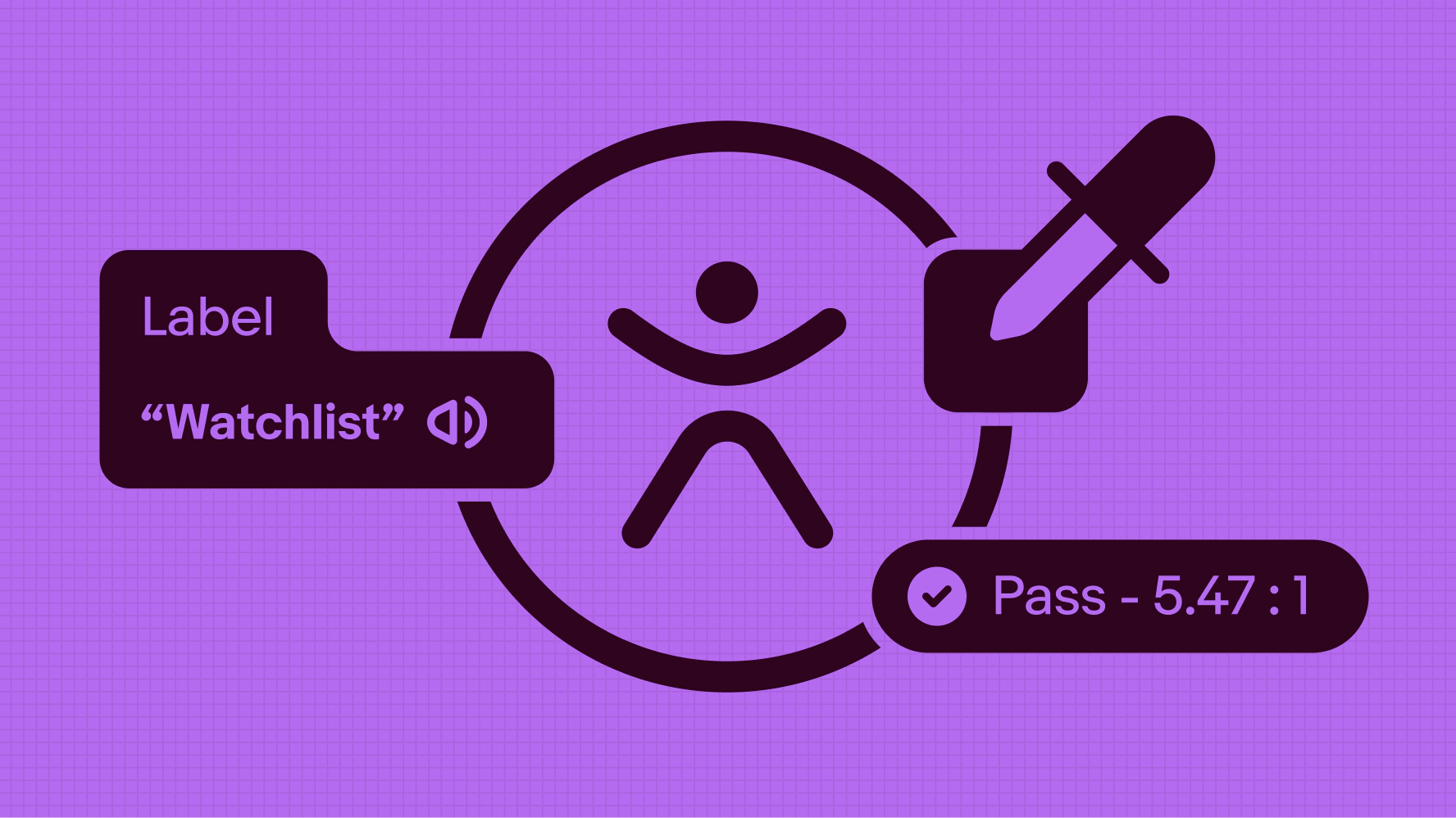
    For designers working in Figma, we developed Include, an open-source plug-in to help think through accessibility requirements and annotate them along the way.

    Patterns and components defined in the eBay Evo Design System aim to conform to WCAG 2.1 AA by providing an experience that is Perceivable, Operable, Understandable and Robust as defined by the Web Accessibility Initiative (WAI) Working Group of the W3C.

    An accessible foundation

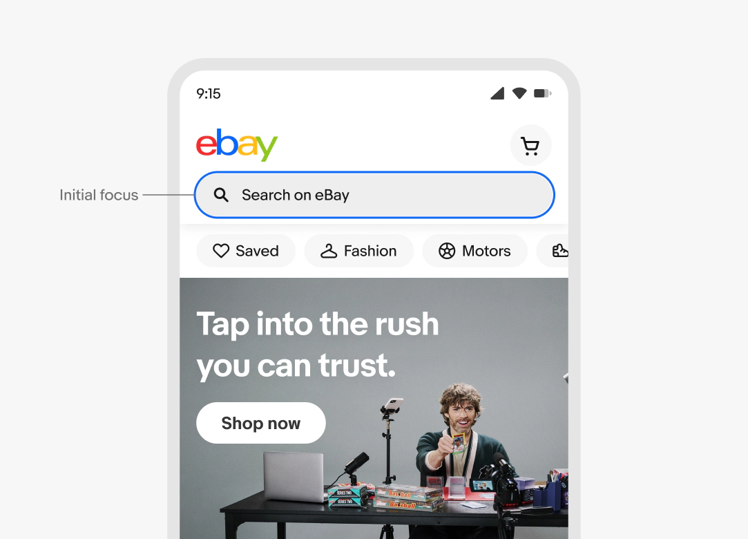
    Our main goal is to design, develop and maintain an accessible experience for all people, including those living with disabilities. The population we consider includes those living with disabilities related to hearing, vision, mobility, and cognitive—which may be situational, temporary or permanent. Anybody should be able to to use eBay however they want, using whatever device or technology they may need.

    Platform differences

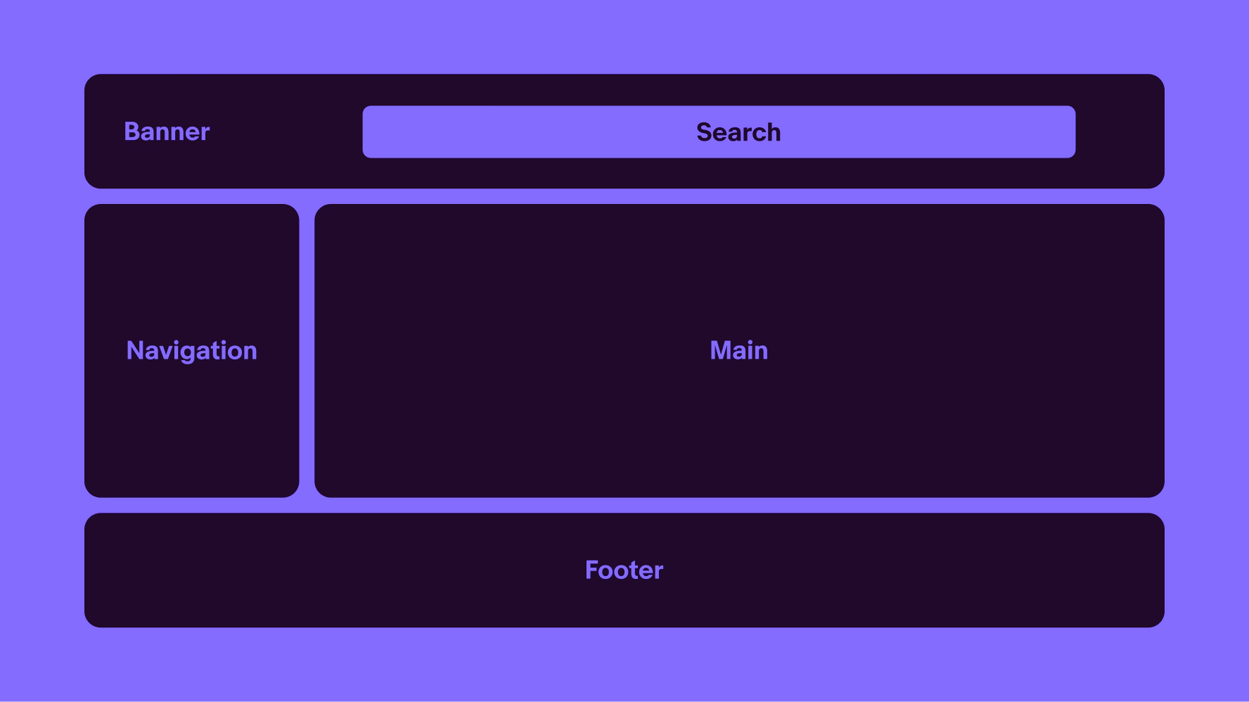
    We recognize there are different expectations and how people interact with, and consume content on, the web versus native apps. Throughout this site, the patterns, components and linked implementation guidance recognize these unique environments.

    In general, the spirit of WCAG is still applicable even if the implementation methods are distinctly different. Where appropriate, accessibility-specific guidance can be found on the “Accessibility” tab within each component page.

    Resources

    Structure & meaning

    • Use of landmarks (web) and headings
    • Consistent styling and layout
    • Semantic markup and use of ARIA only where necessary
    Wireframe that outlines the page layout. At the top, there's a header featuring a search bar, complemented by a navigation menu on the left. The main content is prominently displayed on the right side. A footer extends across the bottom of all content.

    Form controls

    • All form elements have a visible label
    • Using proper markup to group radio buttons and checkboxes
    • Clearly summarized errors and guidance to resolve
    • Real radios/checkboxes vs menu radios/checkboxes
    Edit address page with multiple inputs where the user can add or edit their information.

    Focus indication and management

    • Visible location within the site or app, especially when dialogs or layers appear
    • Clear and obvious location, actions, and available options while navigating the UI
    eBay homepage with a search bar highlighted by a blue outline, indicating it's selected. The pointer is  showing its initial focus point.

    Color contrast and use of color

    • Meeting or exceeding WCAG 2.1 AA contrast minimums.
    • Not relying on color alone to convey meaning. 
    UI elements, highlighting contrast ratios and colors of input fields and buttons for accessibility. The left example is in dark mode, while the right is in light mode.

    Alternative text for non-text content

    • Provide alternative text for meaningful/informative images, including SVGs
    • Using methods to ignore decorative images
    • Alternative text (WebAIM)
    Image tiles showing the focusable areas, with the alt text and purpose defined for each one of them. Number 1 highlights a decorative image element. Number 2 highlights an icon button with the alt text of “Add to watchlist”.

    Touch/click targets

    • Sufficient activation areas for interactive elements
    • Adequate padding between interactive elements
    Buttons with different sizes showing the height variations. On the left are 3 CTA buttons at sizes 48, 40, and 32px. A pink overlay highlights the tap target is 48px across each. On the right side are 3 icon buttons at the same sizes with the same 48px tap target highlight.

    Reading & Focus order

    • Screen content is presented in a meaningful reading order
    • Focus order of interactive elements generally follow the visual order
    eBay homepage with visual indicator showing the reading order for the screen content.

    Keyboard-only use

    • All functionality (web and mobile apps) must be operable with keyboard-only
    • Access to all interactive elements, keyboard focus must not land on non-interactive elements
    • All interactive elements function via the keyboard
    • Focus management – when activating an element, focus should remain clear (limit/avoid highjacking user focus)
    • Hover states have an equivalent focus state
    • Web: basic keyboard navigation (i.e TAB) vs advanced/widget navigation (i.e. ARROW keys)
    Variation of buttons showing the focus state for each one of them.

    Content & writing

    • Use of plain language
    • Clear, easy to understand

    Following these foundational considerations will result in a more consistent, predictable, and familiar experience from screen to screen, allowing people to use eBay however they need. For example, those using assistive technology like screen readers or refreshable braille displays, those using larger text or screen magnification, or those using only a keyboard to navigate and operate the interface.

    • Include plugin

      Use the Include plugin to annotate your Figma designs with accessibility requirements.

    • eBay Skin

      Explore eBay’s official CSS framework.

    • eBay Accessibility

      Read eBay’s accessibility statement.

    • eBay MIND Patterns

      This guide helps frontend developers build accessible e-commerce sites and components.

    • eBayUI-core

      Explore the core building blocks for all eBay components, pages, and apps on web.

    • Inclusive Design (Microsoft)

      Check out Microsoft’s comprehensive introduction to the world of inclusive design.