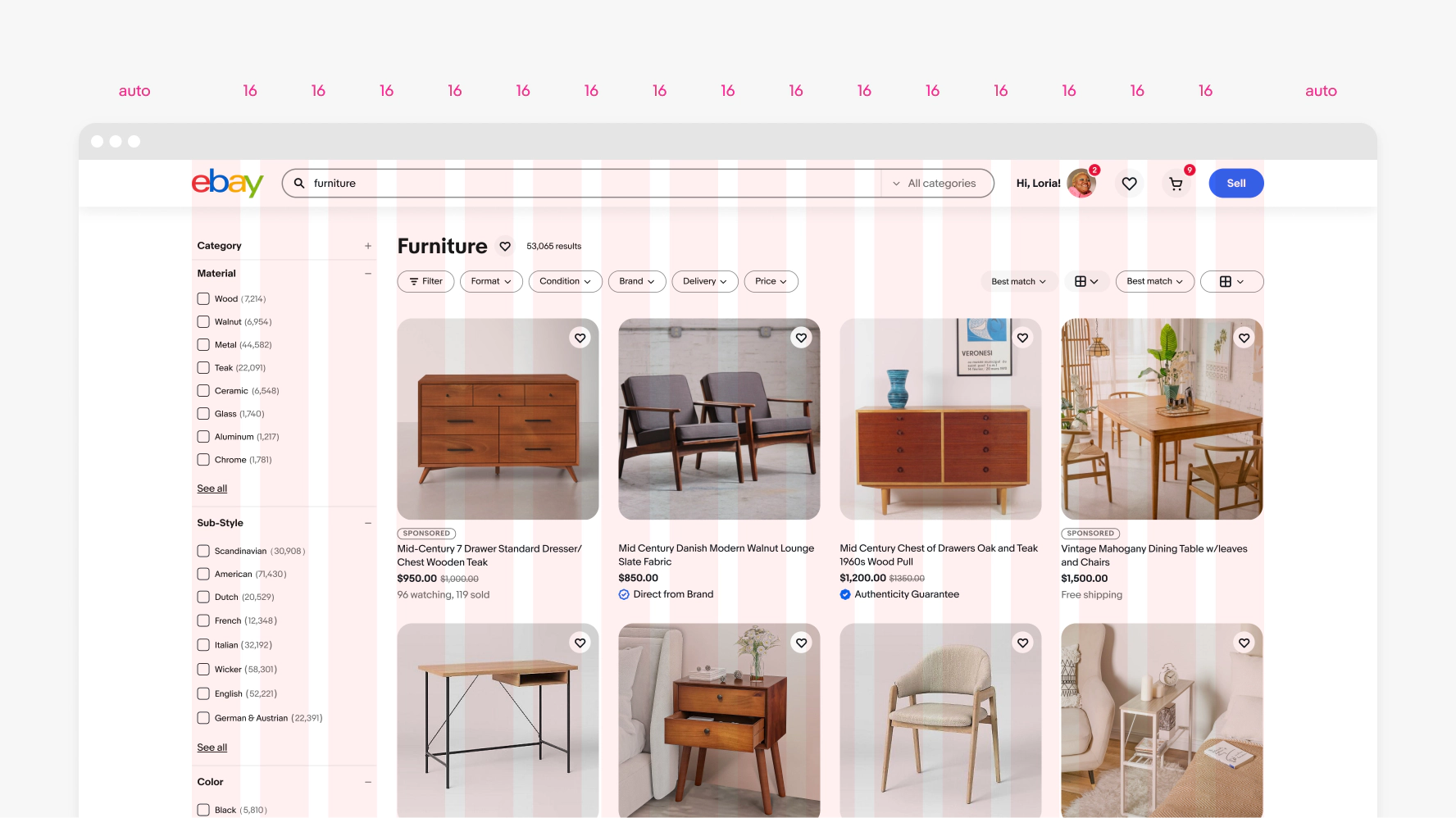
Layout in product
A responsive grid dynamically updates the page layout according to viewport size. The use of a grid allows us to remain consistent throughout our products and platforms.
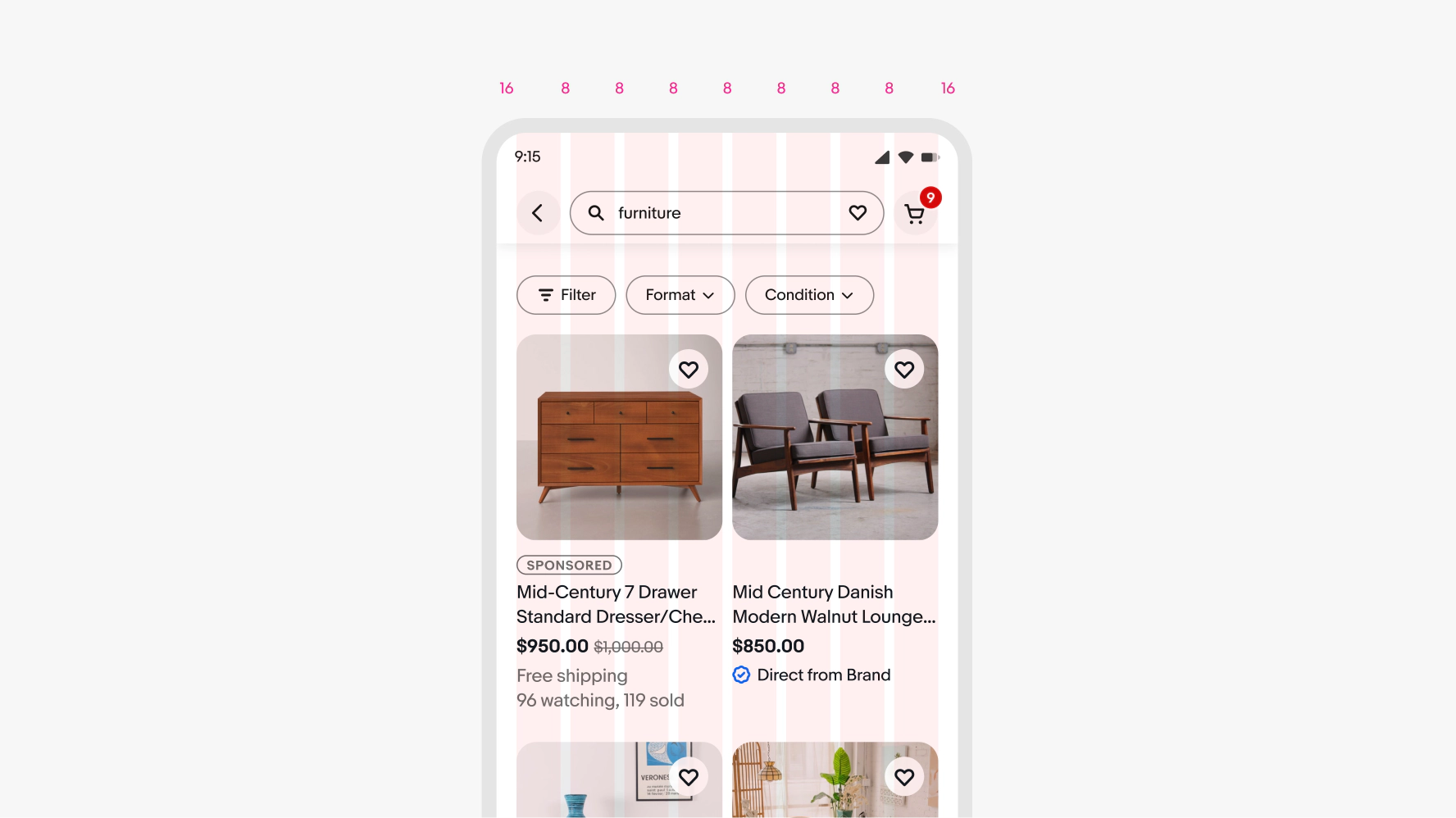
Small 8 column (320–511px)
Use for small to medium screens.
Construction
- 8 columns flexed
- 8px gutters
- 16px margins fixed
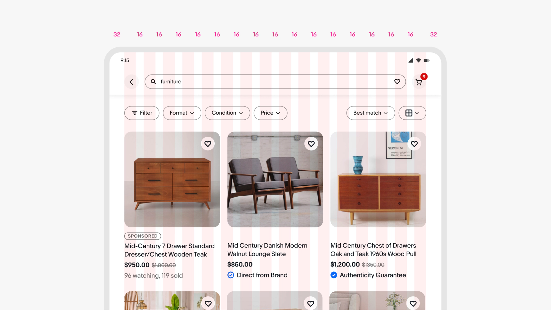
Medium 16 column (512–1279px)
Use for medium to large screens.
Construction
- 16 columns flexed
- 16px gutters
- 32px margins fixed
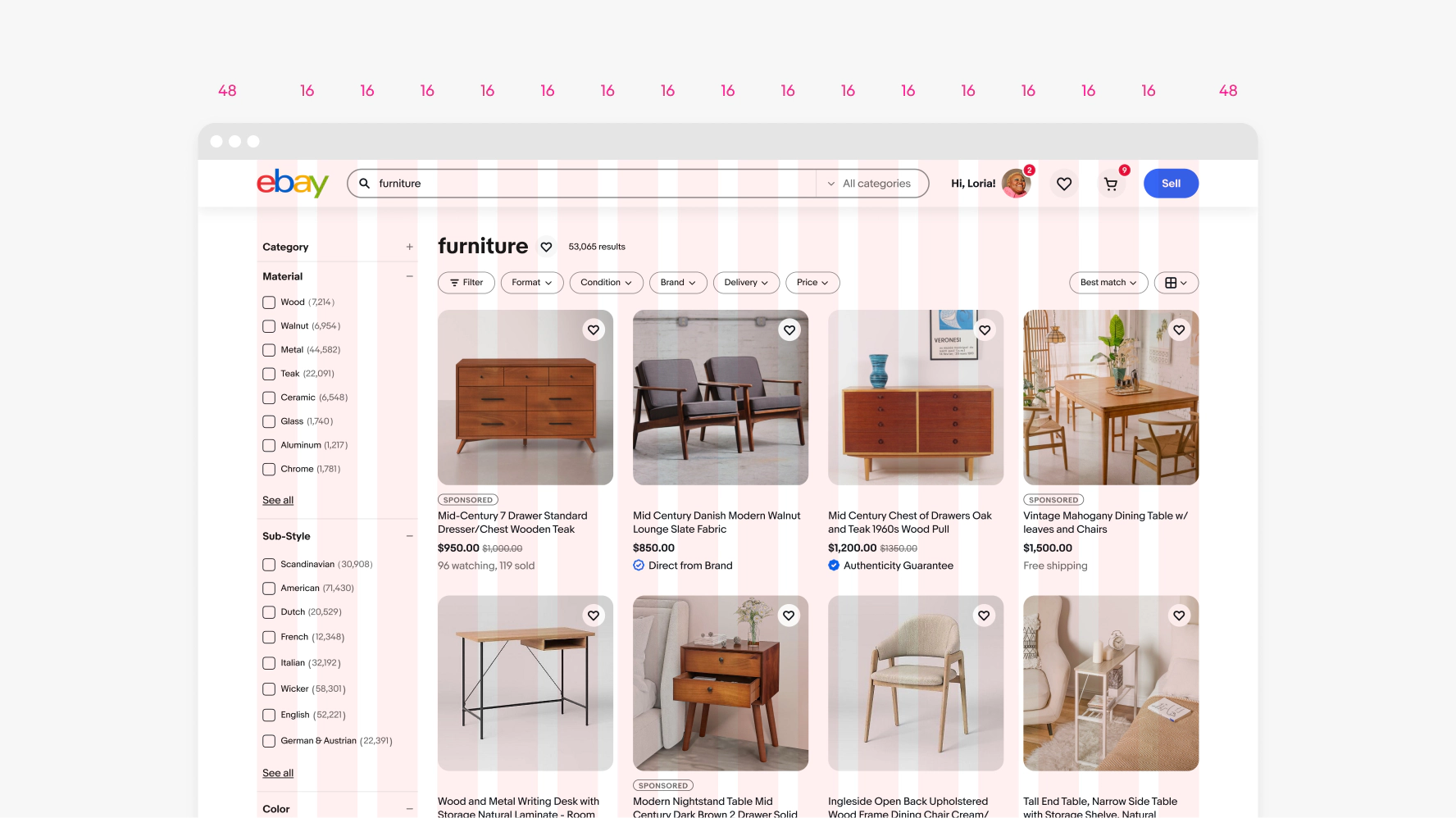
Large 16 column (1280–1679px)
Use for large to x-large screens.
Construction
- 16 columns flexed
- 16px gutters
- 48px margins fixed
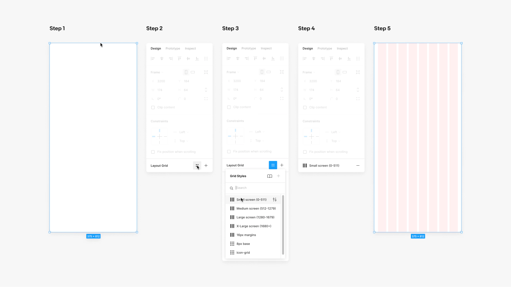
X-large 16 column (1680px+)
Use for x-large screens. The columns are fixed-widths with auto margins from 1680px+. Max design area excluding margins is 1584px wide.
Construction
- 16 columns fixed
- 16px gutters
- Margins auto/flexed
8px Baseline
Evolution uses a proportional layout system anchored around a base value of 8px. For detailed and complex components, factors of 2 may be used sparingly to create additional hierarchy. See spacing tokens for more information.

Designers should create focused layouts for at least three core screen sizes—small (375px), medium (768px), and large (1280px)—to effectively collaborate with development partners. While (320px) widths may not be a standard design size, it is our minimum supported viewport and should remain a consideration. Whenever possible, we recommend designing across the full range of screen sizes listed below to ensure optimal behavior at all breakpoints and a smoother development handoff.

Our breakpoints
On web, we utilize eight breakpoints for maximum scalability and control over layouts and components. These breakpoints are 320, 512, 768, 1024, 1280, 1440, 1680 and 1920px. Refer to the eBay skin page grid documentation for the latest resources.
Min and max widths
Designs need to flex down to 320px and up to 1680px. Through our mobile-first approach, our official support for the smallest viewport width is 320px. However, technically speaking, there is no “minimum” breakpoint required.