Skip to main contenteBay Playbook
  • Get started
  • Foundations
  • Design system
  • Expressions
  • Resources
  • Articles

Foundations

  • Overview
    • Our logo
    • Using our logo
    • Using our tagline
    • Showcase
    • Our colors
    • Using color
    • Using color in product
    • Using color in marketing
    • Using color in illustration
    • Best practices
    • Showcase
    • Our typeface
    • Using type
    • Using type in digital
    • Using type in print
    • Best practices
    • Showcase
    • Our photos
    • Visual tone
    • Image types
    • Showcase
    • Our icons
    • Using icons
    • Confirmation indicators
    • Icon library
    • Best practices
    • Showcase
    • Our illustrations
    • Visual tone
    • Using illustration
    • Sizing and placement
    • Best practices
    • Showcase
    • Our motion
      • Using motion in product
      • Volume of motion
      • Product transitions
      • Expressive animation
      • Using motion in marketing
      • Layout in motion
      • Typography in motion
      • Depth in motion
    • Overview
    • Include plugin
      • Overview
      • Responsive layout
      • Image ratio
      • Uniform
      • Masonry
      • Mosaic
      • Overview
      • Stacks
    • Interaction levels
    • Interaction states
    • Using object styles in product
    • Using object styles in marketing

Using type in digital

We use pre-defined type styles in our type ramp for all typography used in product, landing pages, digital ads, and emails.

Using type in digital

On this page

  • Our type ramp
  • Type hierarchy
  • Type styles
  • Decoration styles
  • Scaling
  • Examples
  • Resources
PreviousUsing typeNextUsing type in print
Things.People.Love.
  • Get started
  • Foundations
  • Design system
  • Expressions
  • Resources
  • Articles
  • About eBay Design
  • Careers
  • Press
  • Privacy policy
© 2026 eBay. All rights reserved.

eBay Evo, the eBay trademark, and the eBay logo are the intellectual property of eBay Inc.

    Display

    Display styles are 30px and larger and utilize tighter letter spacing. They are the largest and most expressive styles used in digital.

    Title

    Title styles are 16, 20, or 24px and are used as short headlines in ads, section titles, and notices.

    Subtitle

    Subtitles are 16 or 20px in regular weight. They're generally used for supporting larger title copy in ads, banners, and section titles.

    Body

    Body copy can be regular or bold and is always 14px. It’s used for descriptive text in short strings and paragraphs.

    Caption

    Captions are always 12px and used for disclaimers, legal copy, and terms & conditions. View more examples for styling legal content in Legal best practices.

    Signal

    Signals are in all caps with 5% letter spacing in either 10 or 14px. They’re used for short status tags in banners and signal components.

    Link

    Links are always underlined to show that they’re actionable. Links are used in body copy, subtitles, and captions to give users more info or take them to a new page.

    Strikethrough

    Strikethrough copy is used in prices to show a discount. They're always regular weight and sit next to the price.

    The headline “Motor culture lives here” highlighted with the number 1.
    The title “eBay Money Back Guarantee” highlighted with the number 2.
    The subtitle “Get 5.9% APR with 12 or 24 easy payments on eBay.” highlighted with the number 3.
    Body text highlighted wih the number 4.
    The caption “By tapping "Buy now," you agree to pay taxes and fees.” highlighted with the number 5.
    The signal “Authenticity Guarantee” in all caps next to an icon highlighted with the number 6.
    The link “Get in touch” highlighted with a gray dot.
    The strikethrough “$70.99” next to a bold price “$29.99” highlighted with a gray dot.
    Small range includes 320px min, 360px Android & HTML, and 375px iOS. Medium range includes 512px, 768px, and 1024px. Large range includes 1280px, 1440px, and 1679px max. 1680+ px are in a different range.
    Three smartphone screens displaying eBay advertisements. The first screen shows the eBay logo on a green background. The second screen features a luxury handbag as a large item tile with text. The third screen shows an older woman in a stylish dress with the large text 'Shop timeless style' on a green background.

    Our type ramp

    Our type ramp is made up of 14 named styles. Each style is a combination of pre-defined size, weight, line height, and letter spacing values.

    Type hierarchy

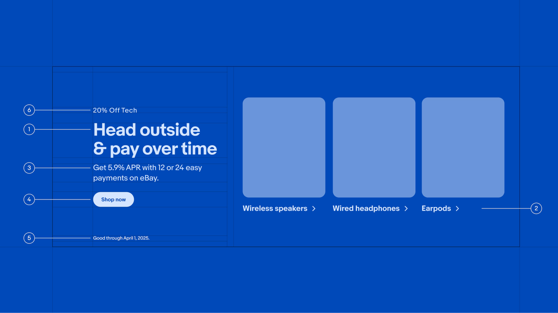
    Both the size and weight of our typography contribute to creating clear hierarchy. The type sizes we use in UI and digital marketing are pre-defined in our type ramp. They’re used for disclaimers, body copy, links, and headlines. See Using type in print for guidance on how to calculate type sizes for print material.

    Type styles

    Decoration styles

    Scaling

    This section shows how each type style scales from small to large screens. Dynamic sizing ensures that each page and component retains hierarchy and visual harmony at all screen sizes. Type styles 14px and smaller always stay the same size across screen sizes. Type styles 16px and larger generally stay the same on large and medium screens, and scale down one style on small screens. Scaling behavior is built into each component and some components scale type differently. See the Design System for specific scaling behavior of each component and/or pattern.

    Examples

    Resources

    ExamplesSmall screenMedium screenLarge screen
    Tall banner titles
    Display 3 (30px)
    Display 2 (36px)
    Display 1 (46px)
    Short banner titles
    Display 3 (30px)
    Display 3 (30px)
    Display 2 (36px)
    Page titles
    Title 1 (24px)
    Display 3 (30px)
    Display 3 (30px)
    Section header titles
    Title 2 (20px)
    Title 1 (24px)
    Title 1 (24px)
    Dialog titles
    Title 3 (16px)
    Title 2 (20px)
    Title 2 (20px)
    Navigation bar titles
    Title 3 (16px)
    Title 2 (20px)
    Title 2 (20px)
    Tall banner body
    Body (14px)
    Subtitle 2 (16px)
    Subtitle 1 (20px)
    Section header subtitles
    Body (14px)
    Subtitle 2 (16px)
    Subtitle 2 (16px)
    Item tile titles
    Body (14px)
    Body (14px)
    Body (14px)
    Signals in banners
    Signal 1 (14px)
    Signal 1 (14px)
    Signal 1 (14px)
    Disclaimers
    Caption (12px)
    Caption (12px)
    Caption (12px)
    Signal components
    Signal 2 (10px)
    Signal 2 (10px)
    Signal 2 (10px)
    Banner with text on left side and product links on right. Text is all labelled with a number. From top left to bottom right: #6: 20% off tech. #1: Head outside & pay over time, heading. #3: Get 5.9% APR with 12 or 24 easy payments on eBay. #4: Shop now, button. #5. Good through April 1, 2024. #2: Beats Fit Pro, link.
    1. Display
    2. Title
    3. Subtitle
    4. Button
    5. Caption
    6. Signal
    • Type tokens

      View the tokens that we use to consistently apply these styles to any string in development.

    • Color pairing tool

      Learn how to use approved foreground and background colors.

    NameSizeLine heightLetter spacingLetter space
    Display+Size 46+Line height 100%Letter space -4%
    Display 1Size 46Line height 56Letter space -2%
    Display 2Size 36Line height 46Letter space -2%
    Display 3Size 30Line height 40Letter space -2%
    Title 1Size 24Line height 32Letter space 0%
    Title 2Size 20Line height 28Letter space 0%
    Title 3Size 16Line height 24Letter space 0%
    Subtitle 1Size 20Line height 28Letter space 0%
    Subtitle 2Size 16Line height 24Letter space 0%
    BodySize 14Line height 20Letter space 0%
    Body boldSize 14Line height 20Letter space 0%
    CaptionSize 12Line height 16Letter space 0%
    Caption boldSize 12Line height 16Letter space 0%
    Signal 1Size 14Line height 20Letter space 5%
    Signal 2Size 10Line height 12Letter space 5%