Using color in illustration
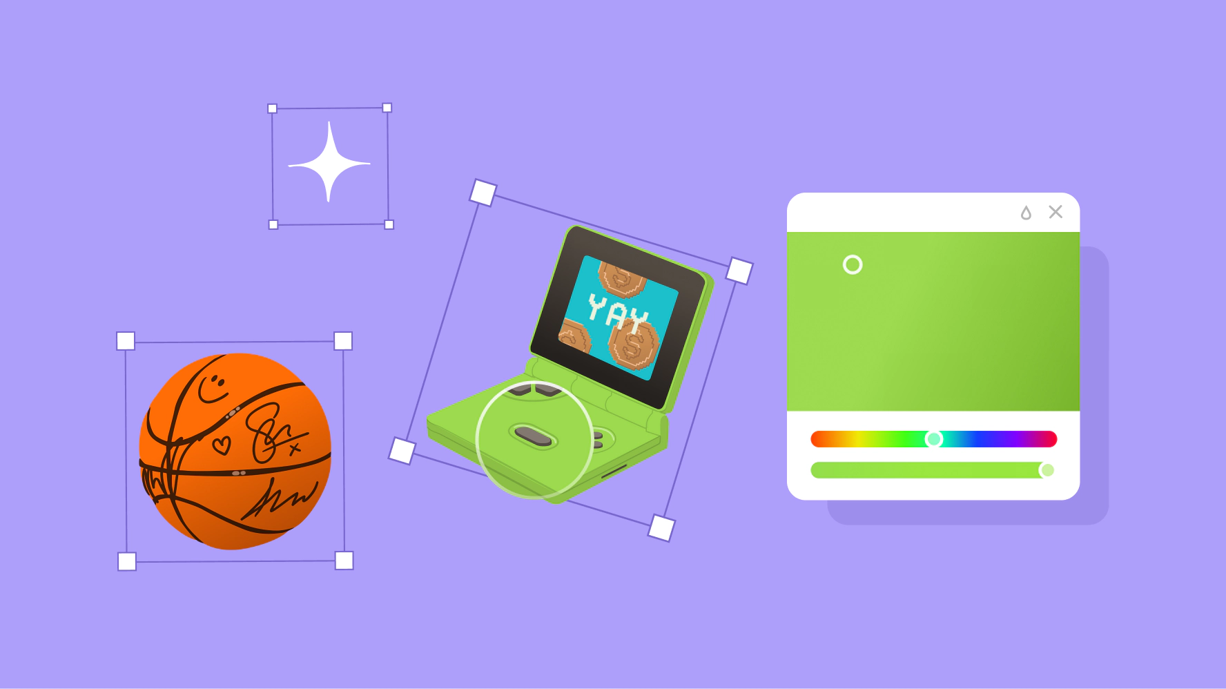
Our illustrations use our full color palette to evoke depth and reality. The broad range of colors and shades more accurately represents the people and objects in our storytelling. This is where we have the most fun with color.

Pink
Red
Coral
Orange
Marigold
Yellow
Dijon
Avocado
Green
Kiwi
Jade
Teal
Indigo
Blue
Violet
Lilac
Neutral
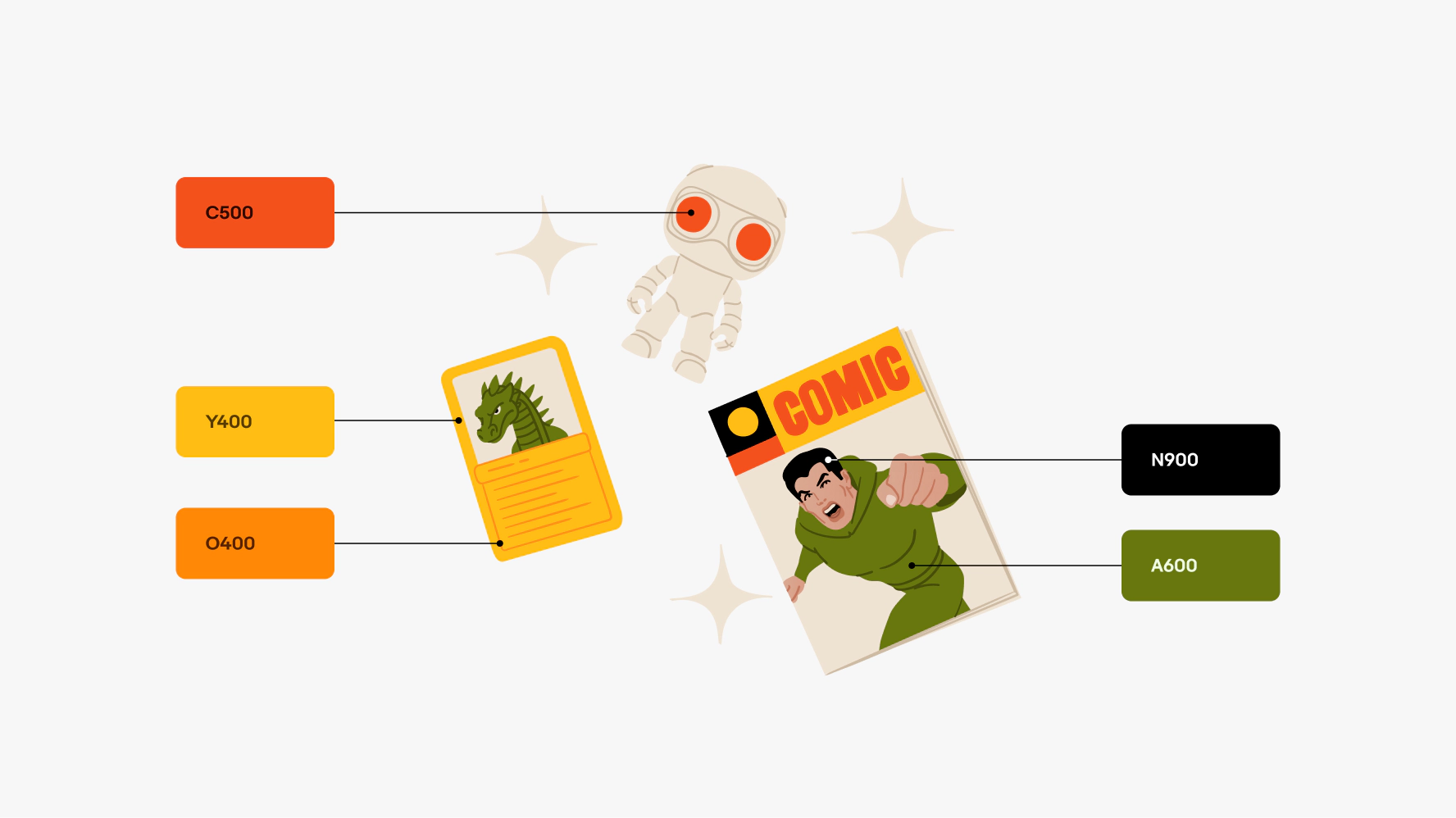
Every illustration has a primary color and 2 secondary colors associated with it. Generally, one secondary color complements the illustration's primary color and the other is a neutral. This strategy ensures that each illustration has a focus color that stands out on the background color. It's important for each illustration to have visual variety and not blend in too much with the background color.


Illustrations with colored backgrounds
Illustrations that use a background color (in things like banners, education cards, and modals) do not change color in dark mode. If there’s text above or below the illustration in a separate container, those colors will invert. The illustration itself is treated like an image and keeps its original background color.


Illustrations without backgrounds
When illustrations without a background color are used on plain white backgrounds (like our 404 states), all elements on the page will invert. Most illustrations work on both light and dark backgrounds, but some need adjustments to ensure legibility against black.


If you want a new color scheme for a specific illustration, do not re-color anything on your own. To discuss custom coloring, reach out to the OneExperience (OX) team or sign up for office hours.