Volume of motion
Establishing the volume of motion needed for your product experience can more efficiently help designers make decisions.

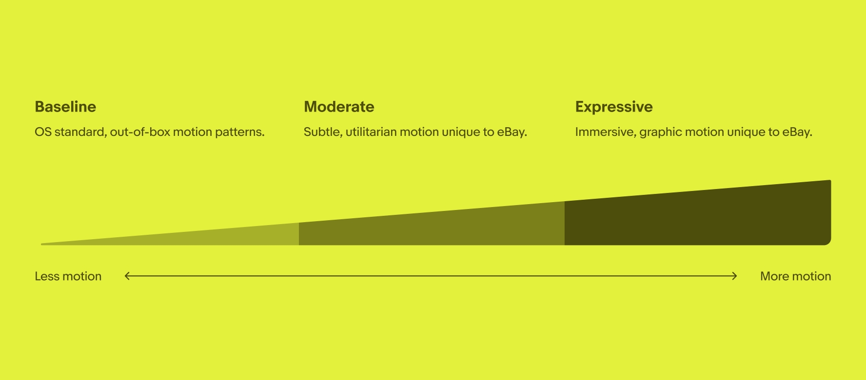
The lowest volume of motion includes basic OS motion patterns that help guide users through the experience, such as simply moving between pages and using pop-ups.
Video description: A 3-second video shows a mobile search page with “Your recently viewed items” on the top and “Your watched” section below. When the first product image of black headphones is selected the corresponding product page slides in from the right. It slides back to the right to return to the mobile search page.
Utilitarian motion patterns enrich the experience and guide users without distracting them. Examples of these patterns include loading and heart or checkbox fills throughout the eBay experience.
Video description: A 3-second video shows a search results page with stacked item tiles of sneakers. The top right image has the save icon selected. A “Sort & filter” panel slides out from the right. A checkbox is selected for “New with tags” under the “Condition” filter. Once selected the panel slides back to the right returning to the search results page.
The highest volume of motion includes immersive motion patterns that draw the eye, capture attention, and guide focus. This should be used purposefully and sparingly.
If using this volume of motion, carefully consider the experience before implementing. Too many expressive movements used simultaneously or even too closely to each other can have a negative effect.
Video description: A 3-second video shows two people driving in a yellow car with a white roof box on top. They are both smiling and raising their hands in excitement. The car has a quick bounce motion and the pine tree air freshener hanging on the rearview mirror swings. It is on a yellow background that reads “Your order is cruising’ your direction” with a brown “Track your order button”.