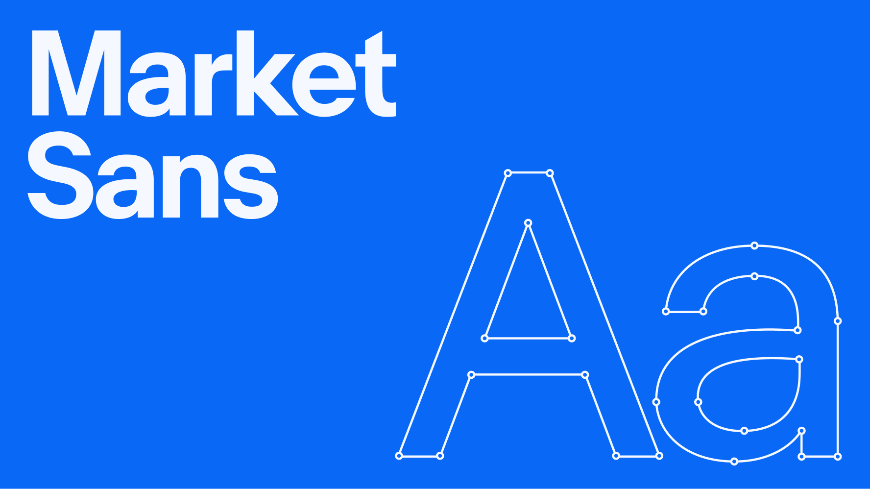
Our typeface
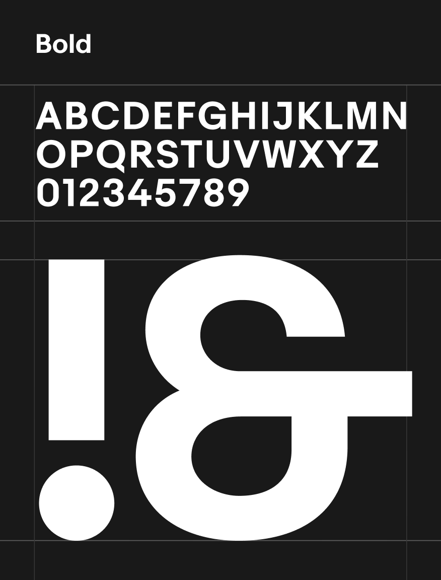
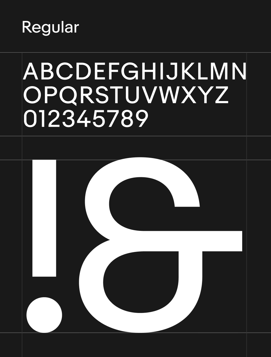
Typography brings our content to life. It’s how we welcome our users, tell stories, and direct their attention. We complement the vibrancy of our colors and imagery with a typeface that’s bold yet approachable—Market Sans.


- X-height is measured from the baseline to the top of the lowercase “x.”
- Ascender is the part of a lowercase letter that extends above the x-height.
- Letter spacing is the horizontal adjustment to the space between letters in a block of text.
- Line height is the vertical space between lines of text, measured from baseline to baseline.
- Descender is the part of a lowercase letter that extends below the baseline.
- Baseline is the invisible line that letters rest on.
Modern
Strong angles and simple geometric shapes lend a modern elegance to letter forms.
Approachable
Generous roundness and open counters create curves that feel accessible yet confident.
Distinct
Details like the angled terminal of the “t,” arrow-like diagonals of the “k,” and open counter of the “4” are fresh and unique.
Market Sans Regular and Bold support all the characters used in our major market languages — English, German, French, Italian, Spanish, Polish, Portuguese, Czech, Hungarian, and Russian.
Market Sans does not have character support for Dutch, Chinese, Japanese, or Korean. Strings in these languages revert to Google Sans on Android and San Francisco on iOS.

